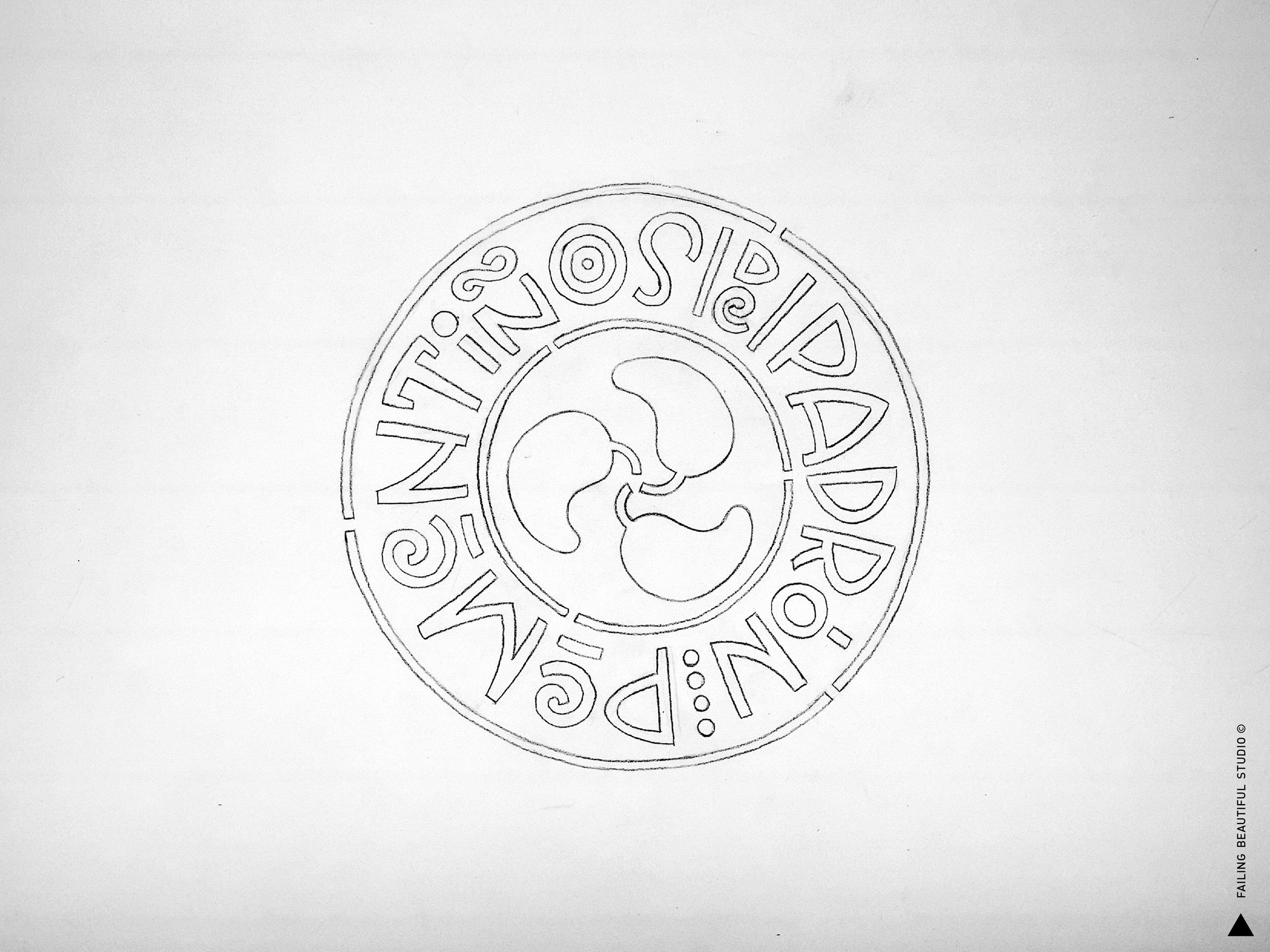
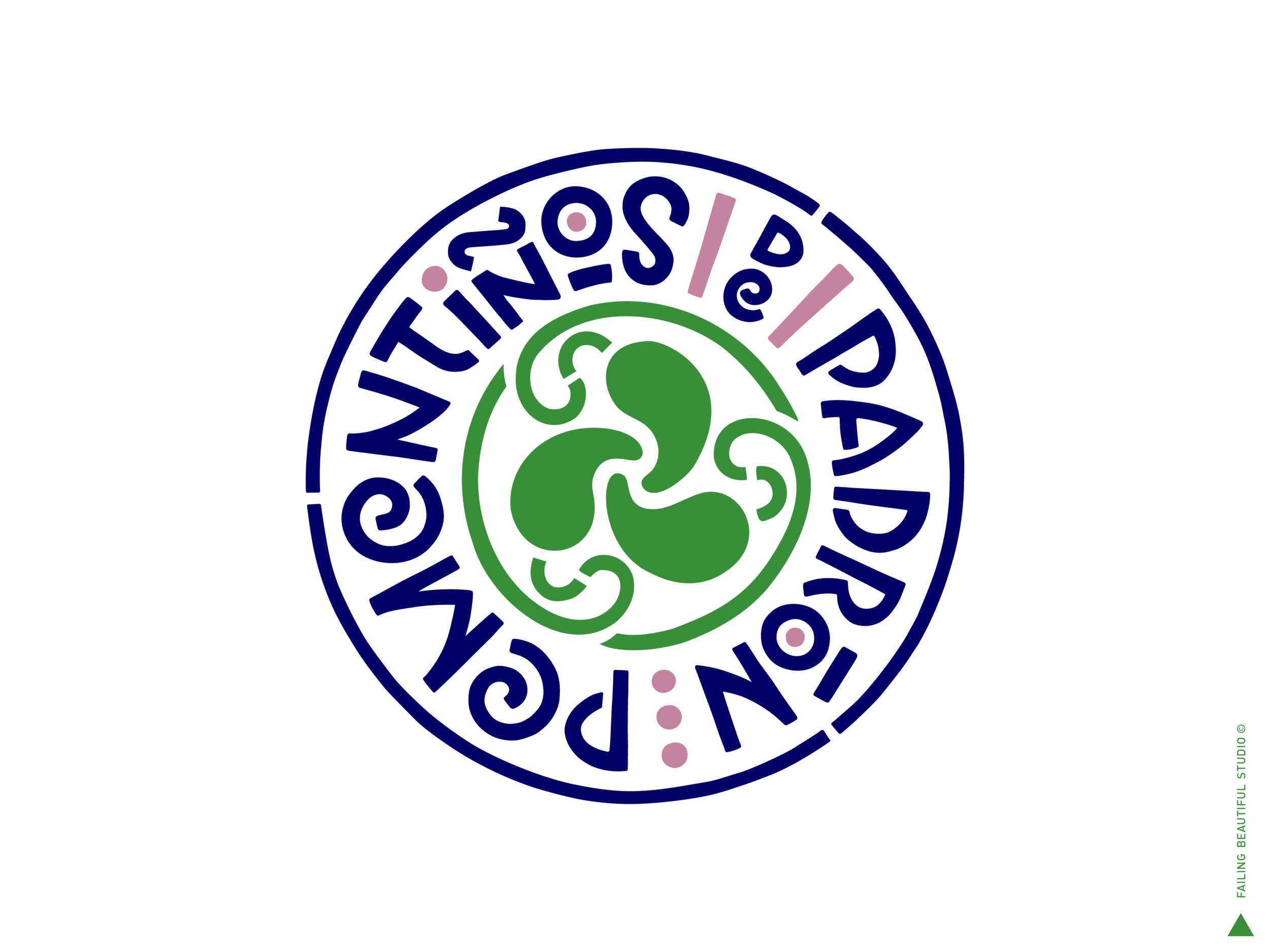
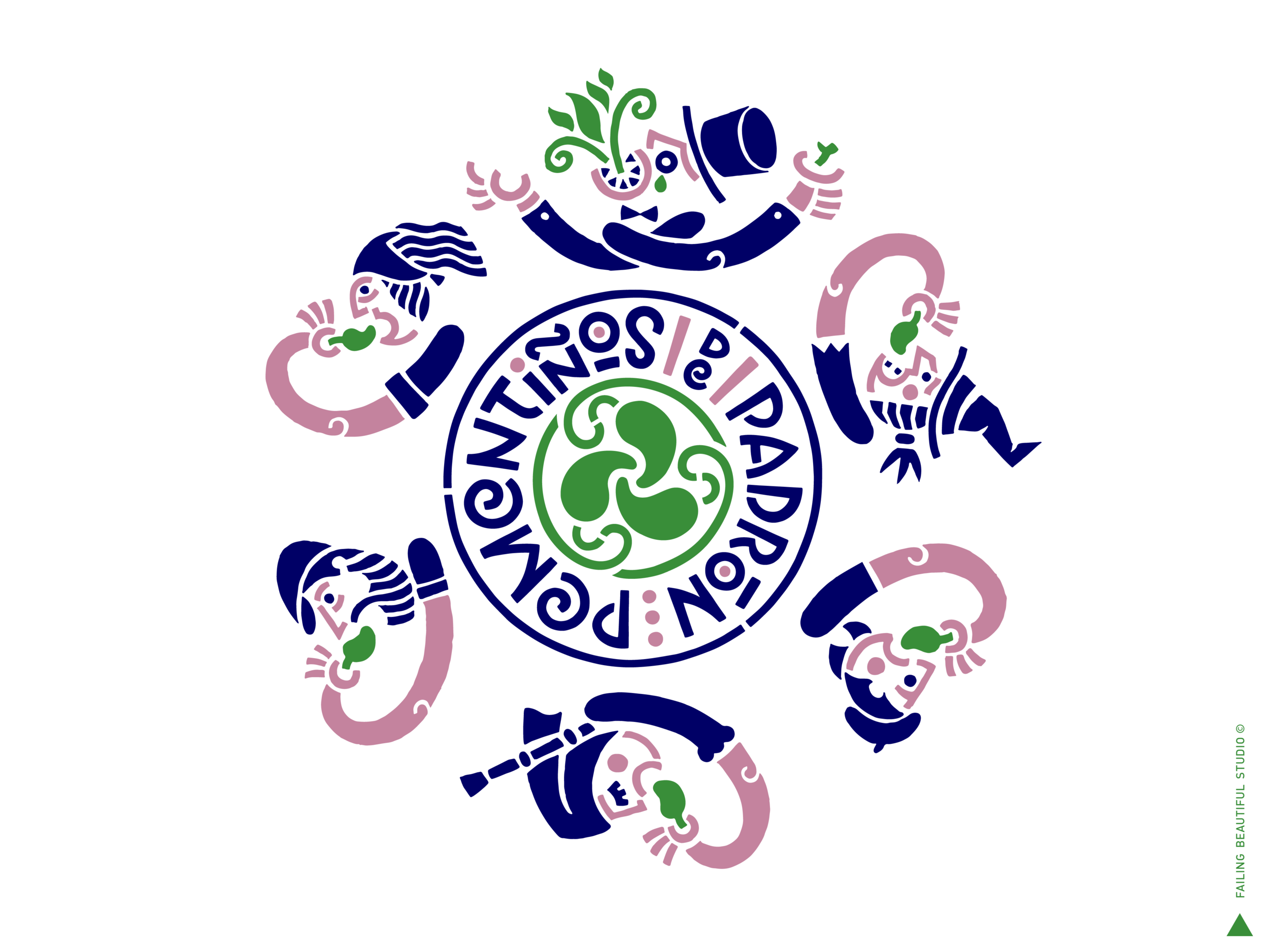
LOGO LOCK UP
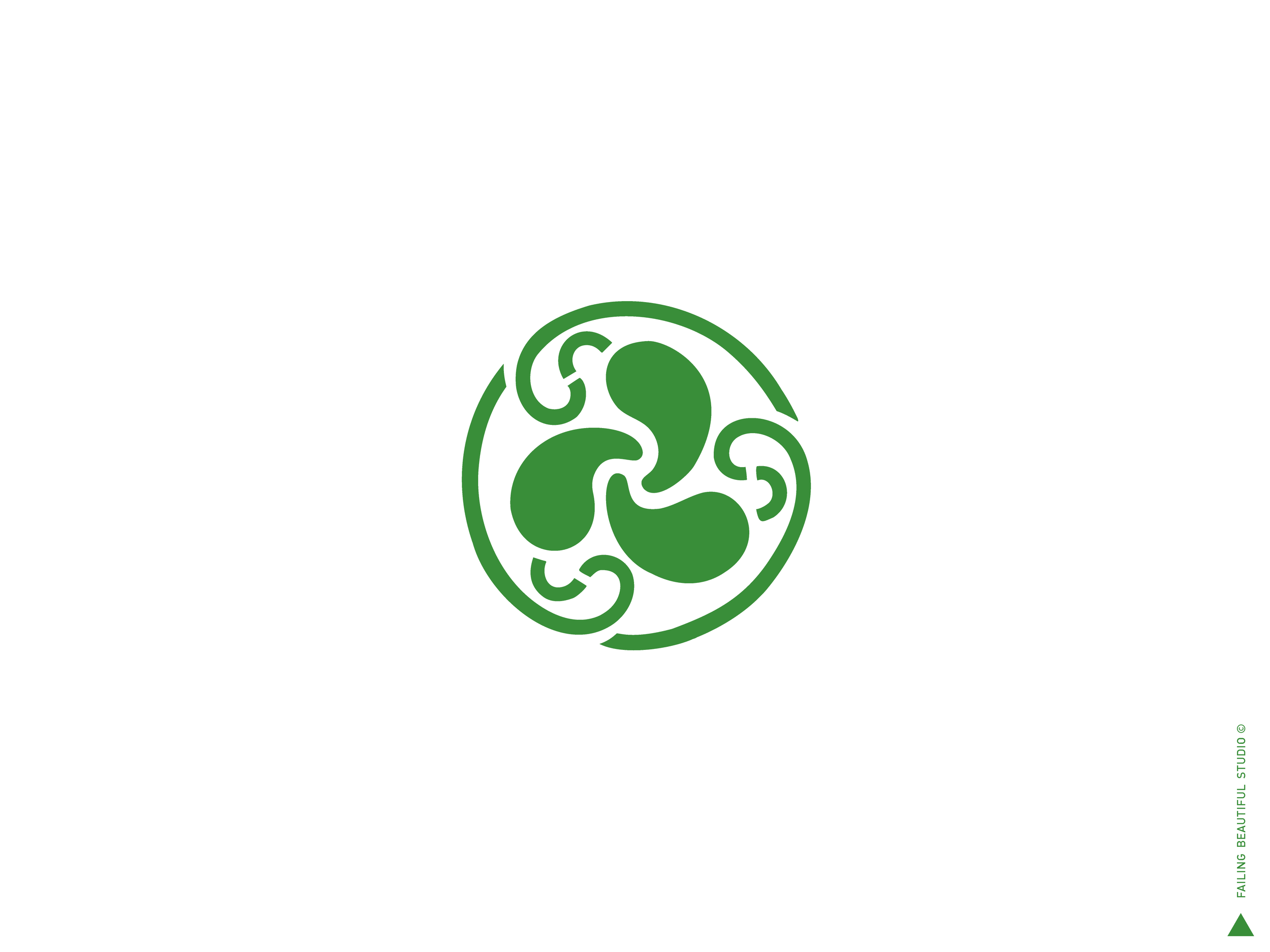
The 3X pepper isotype is based on Celtic motifs, typical from Galicia.
The lettermark supports the imagotype at a second level, resulting in the lock-up.
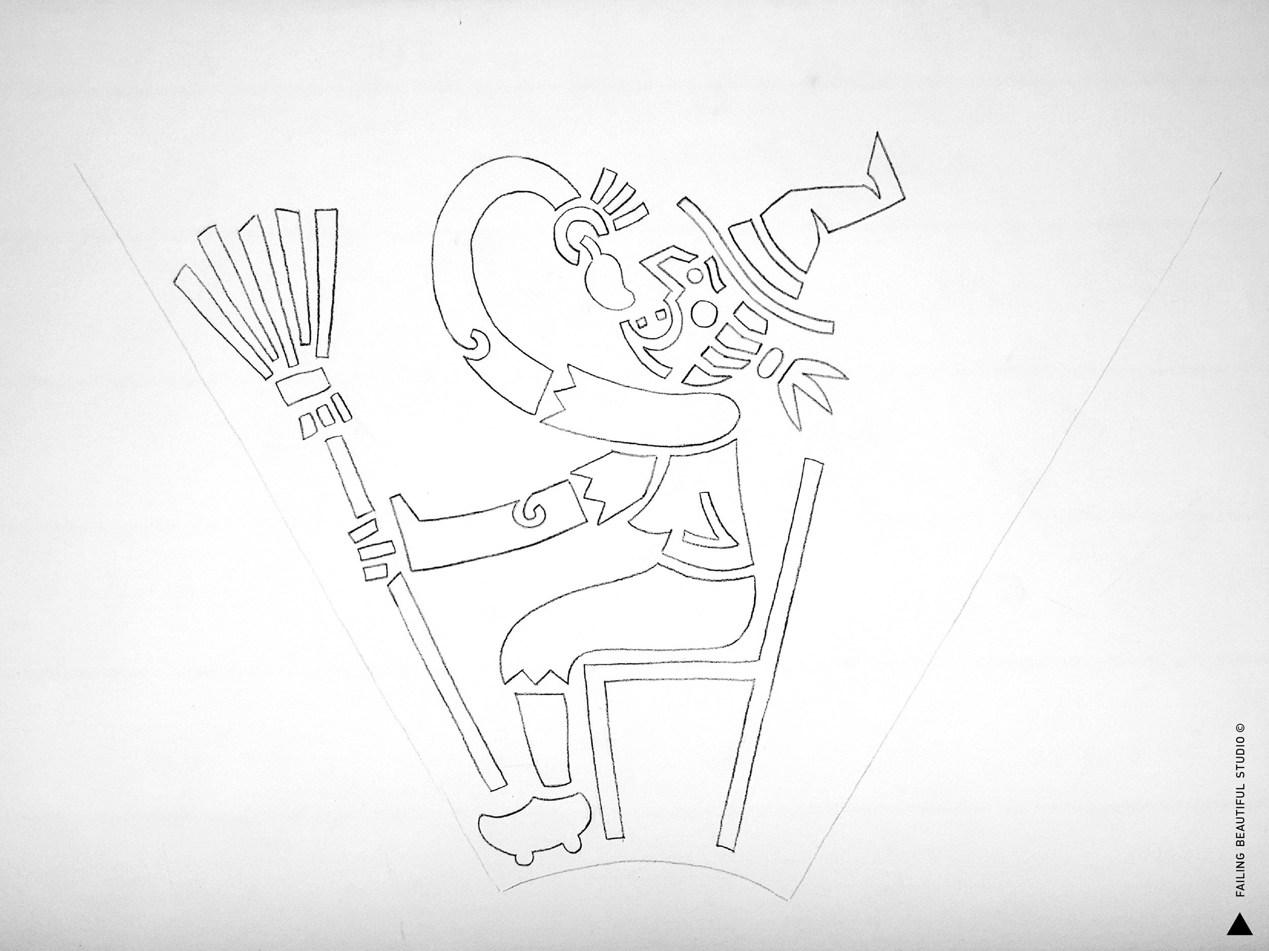
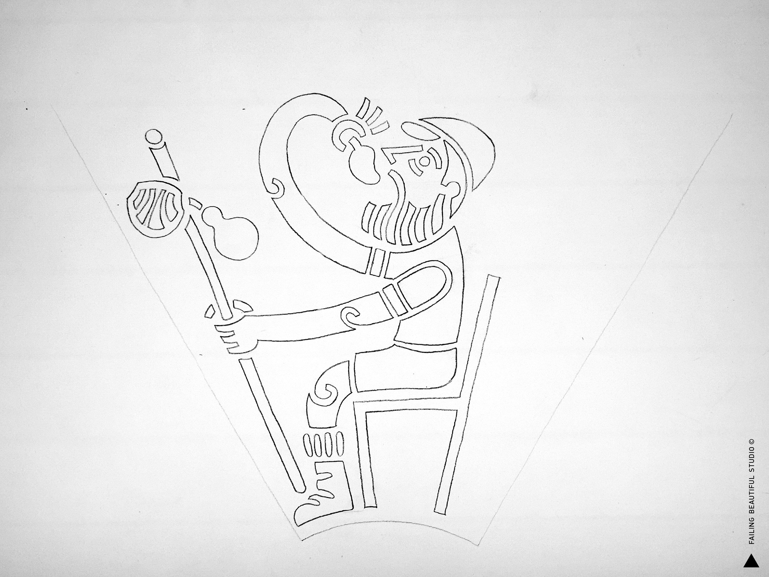
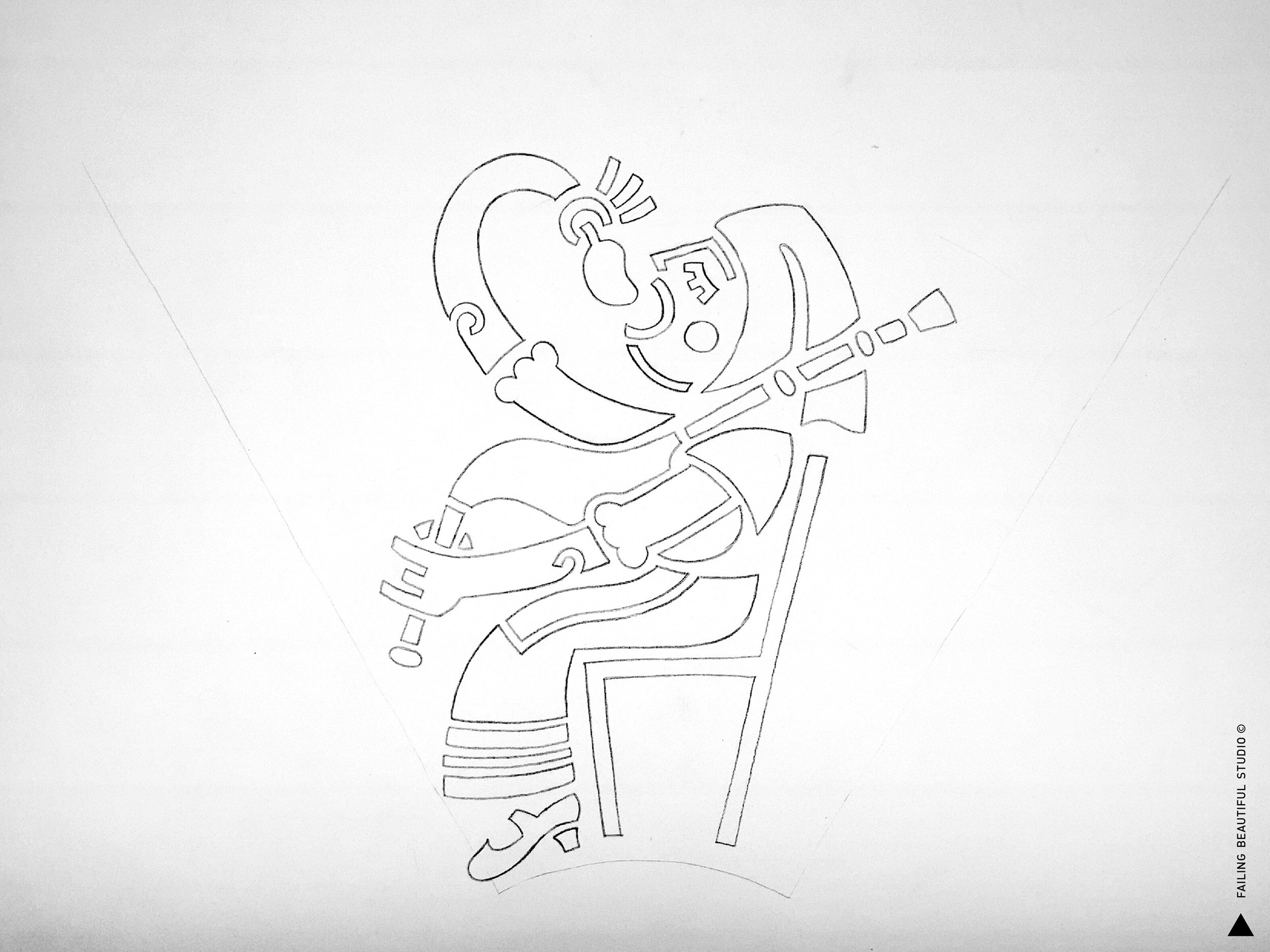
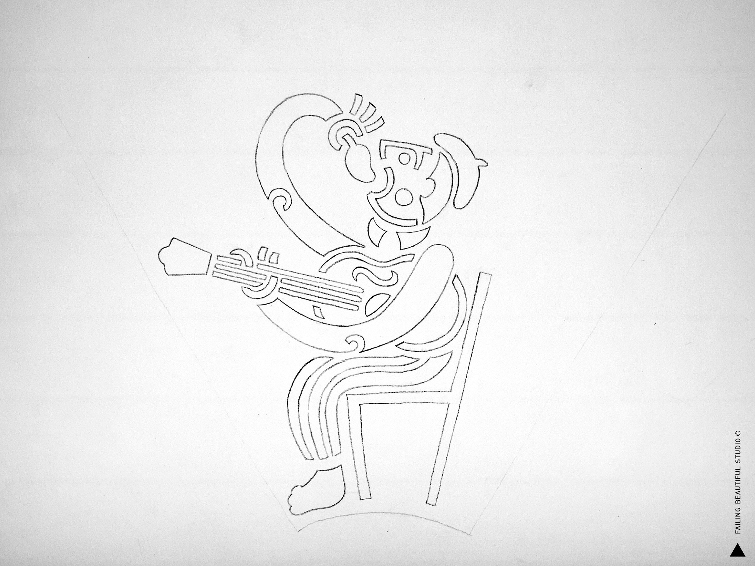
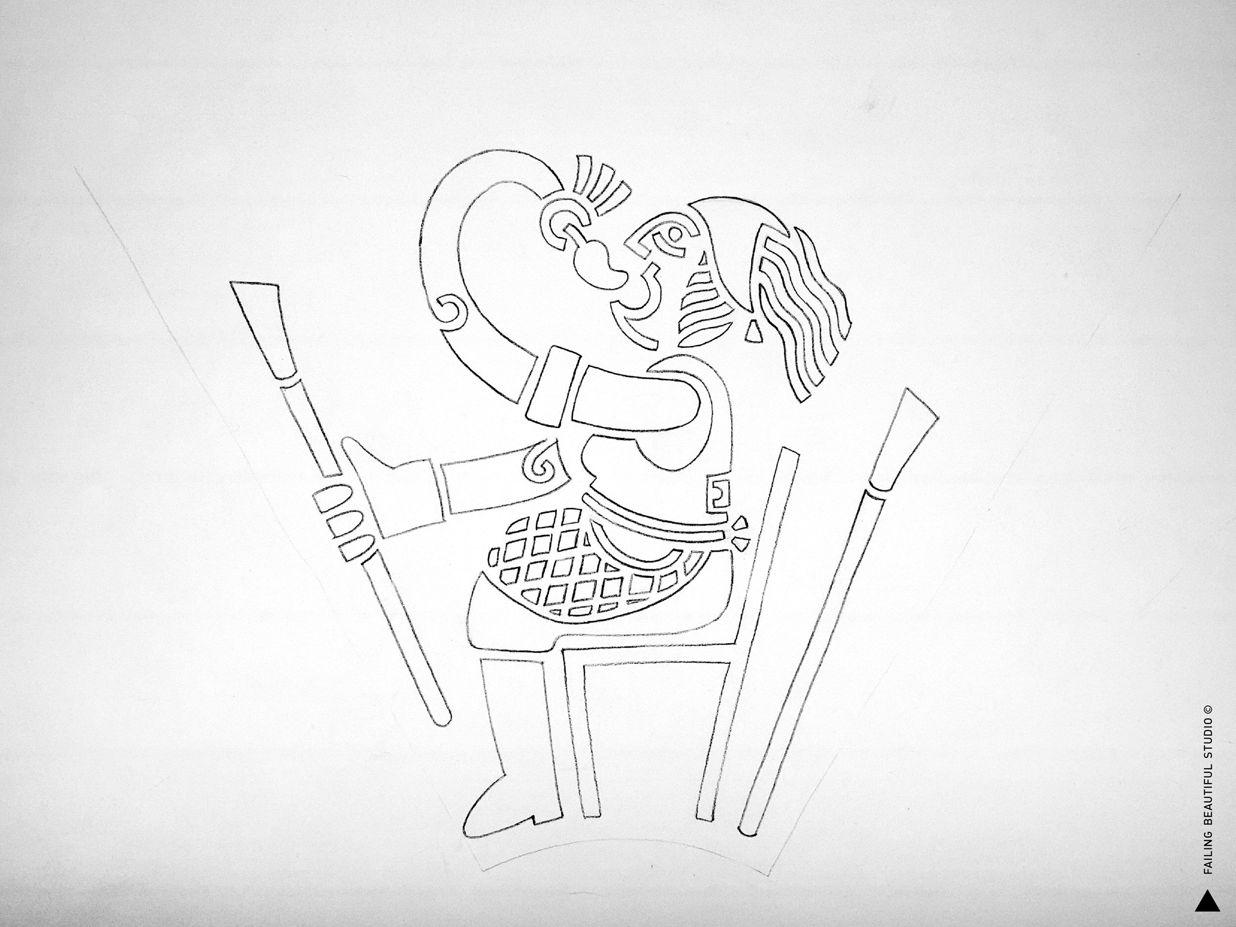
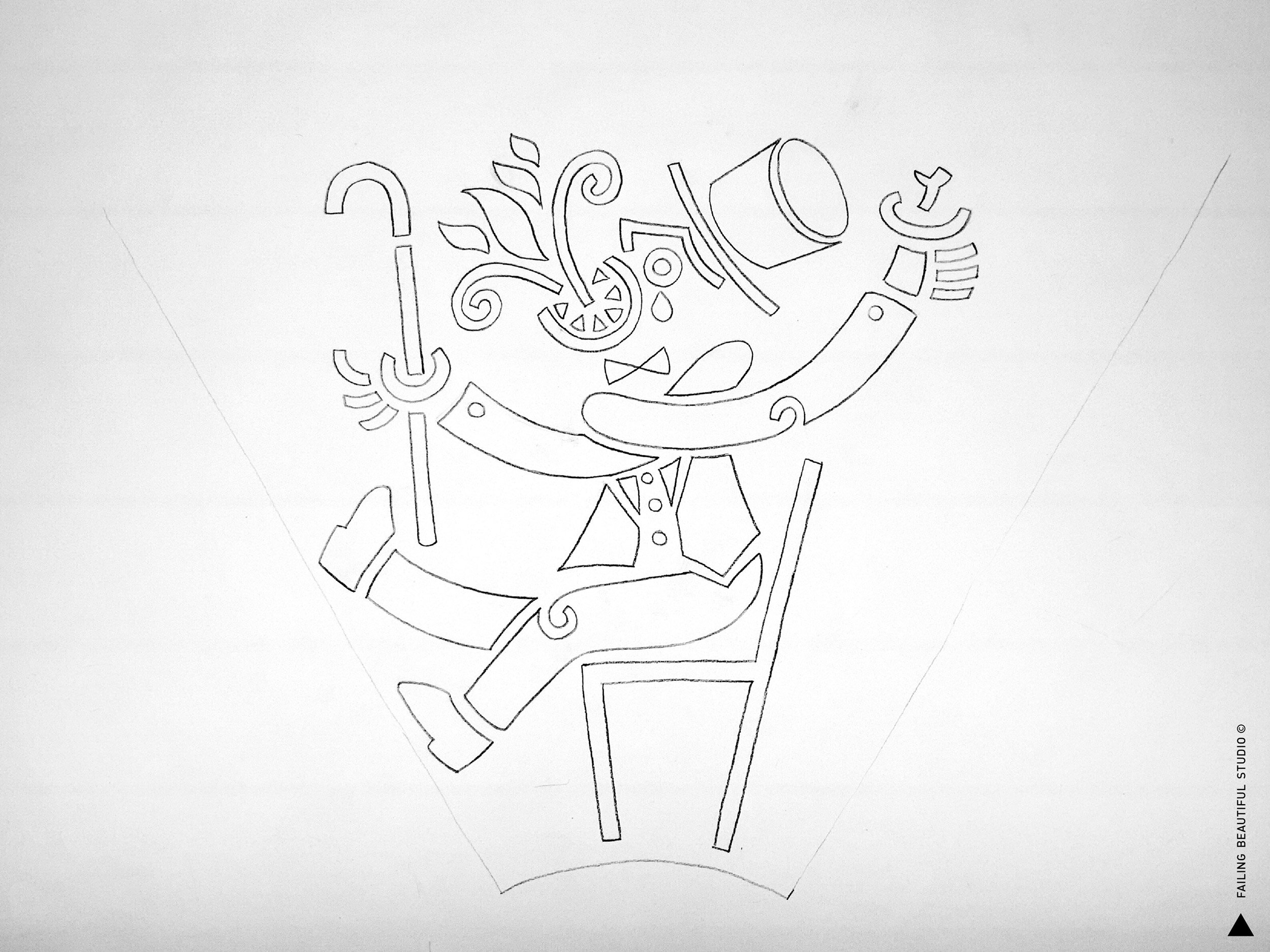
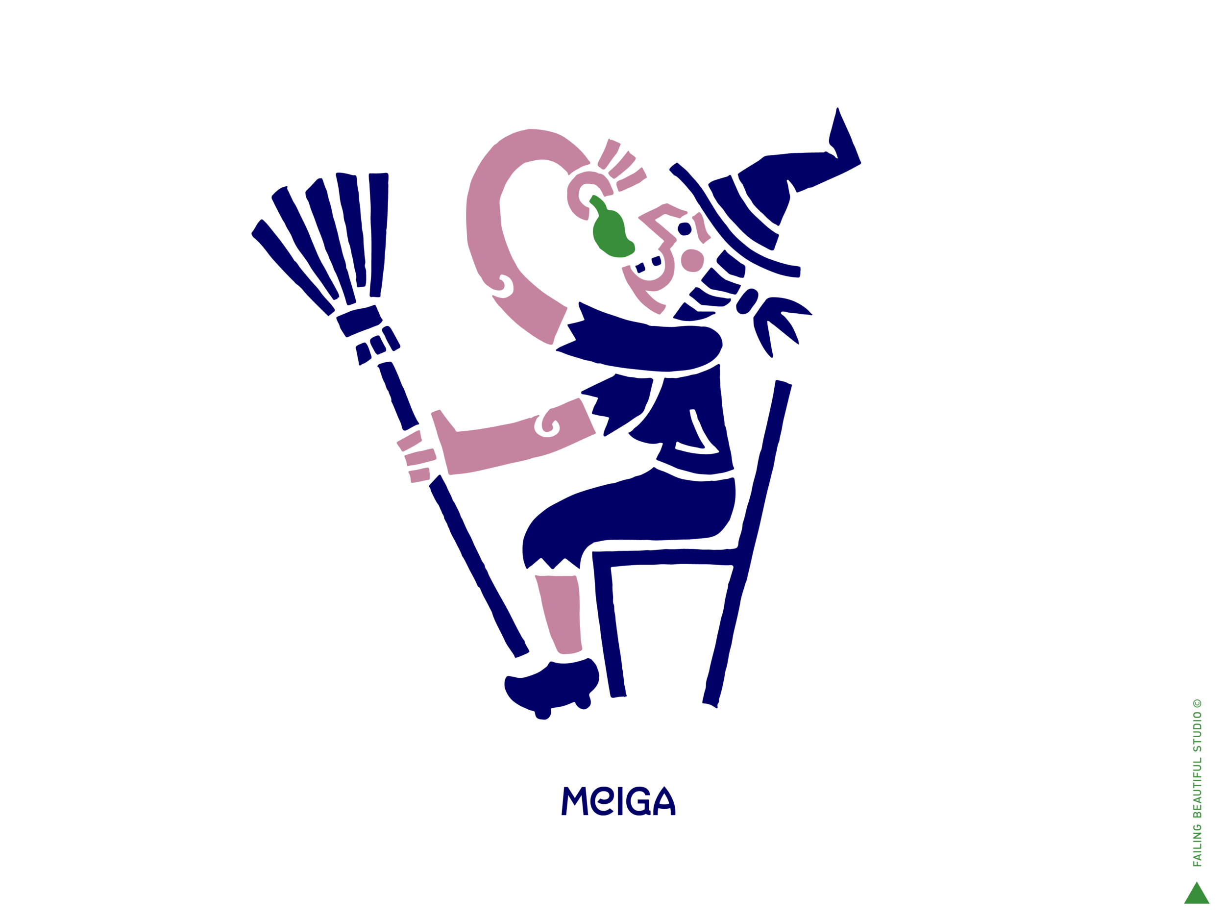
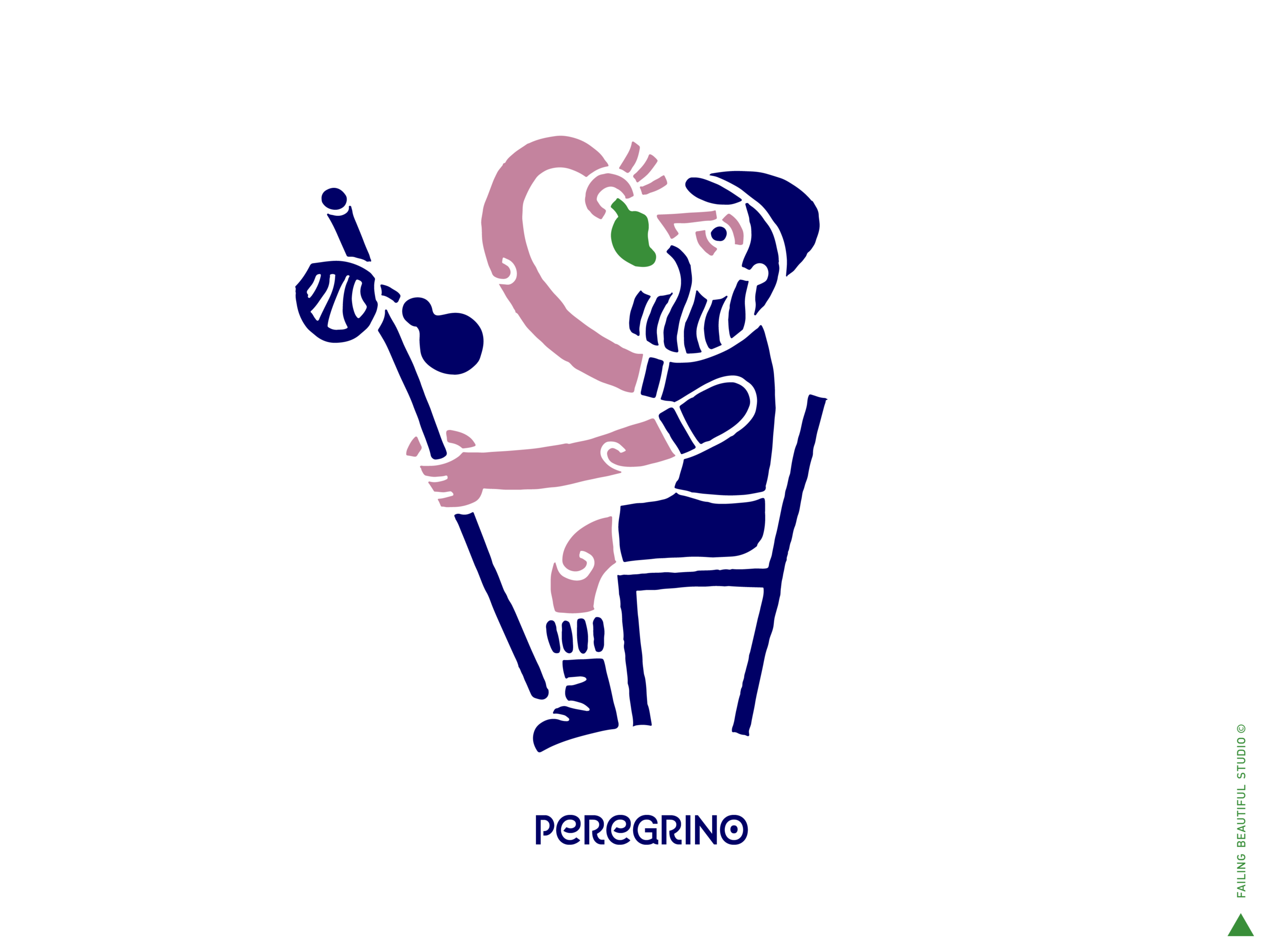
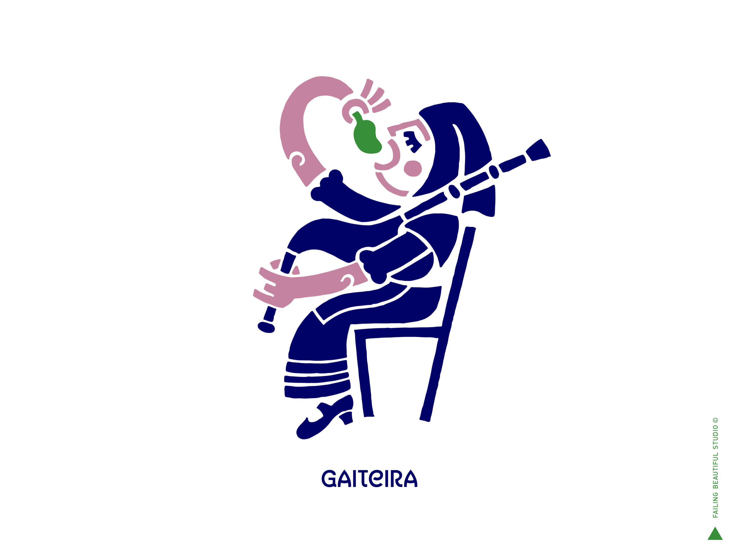
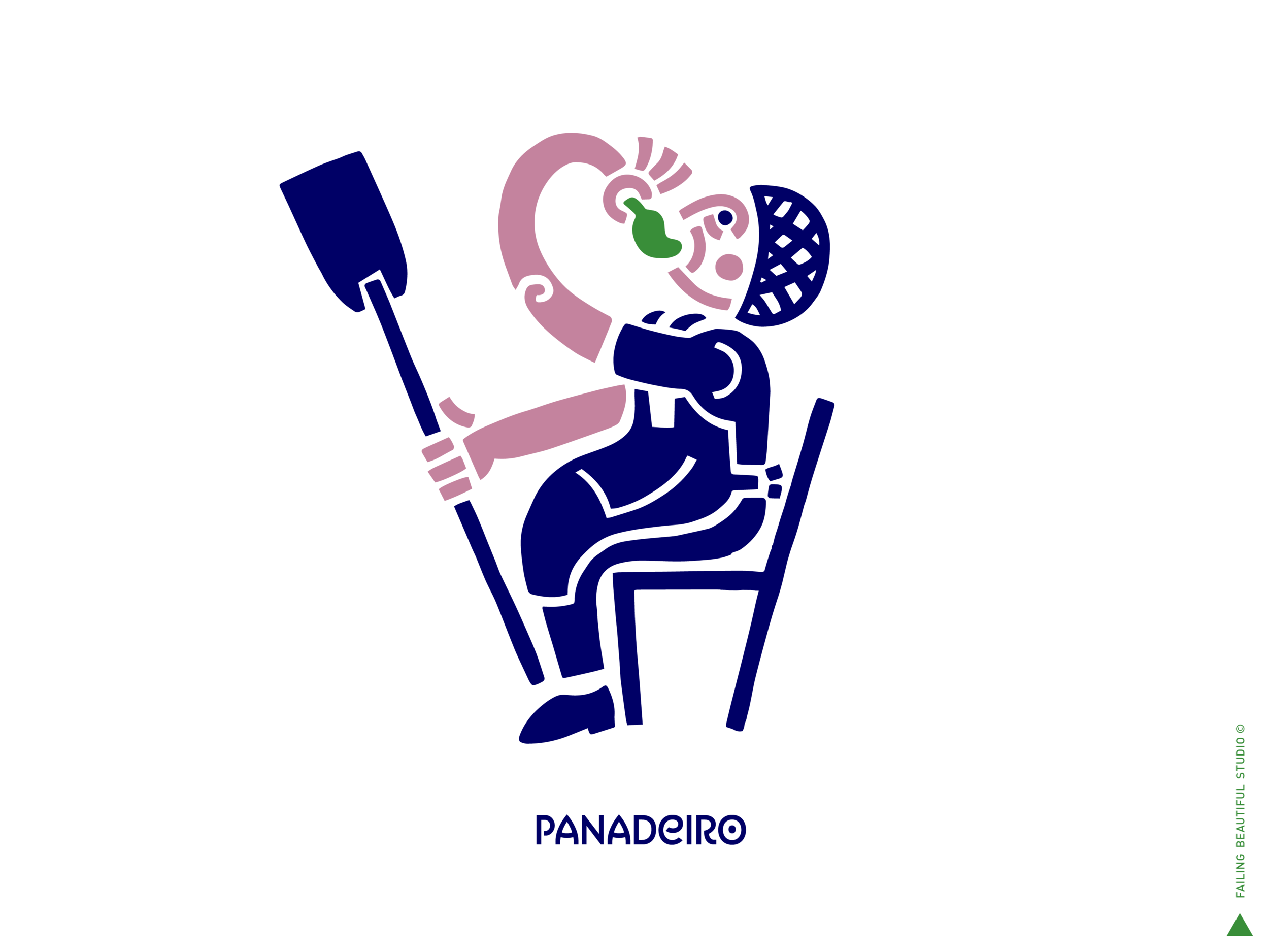
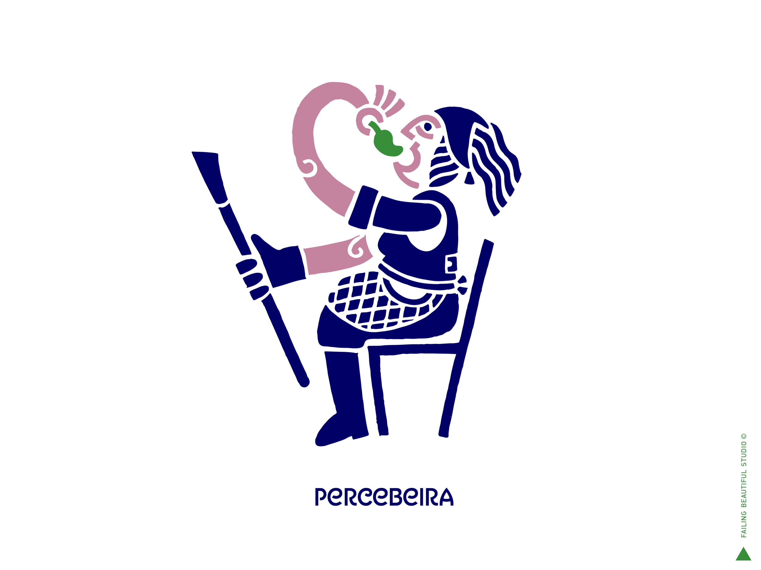
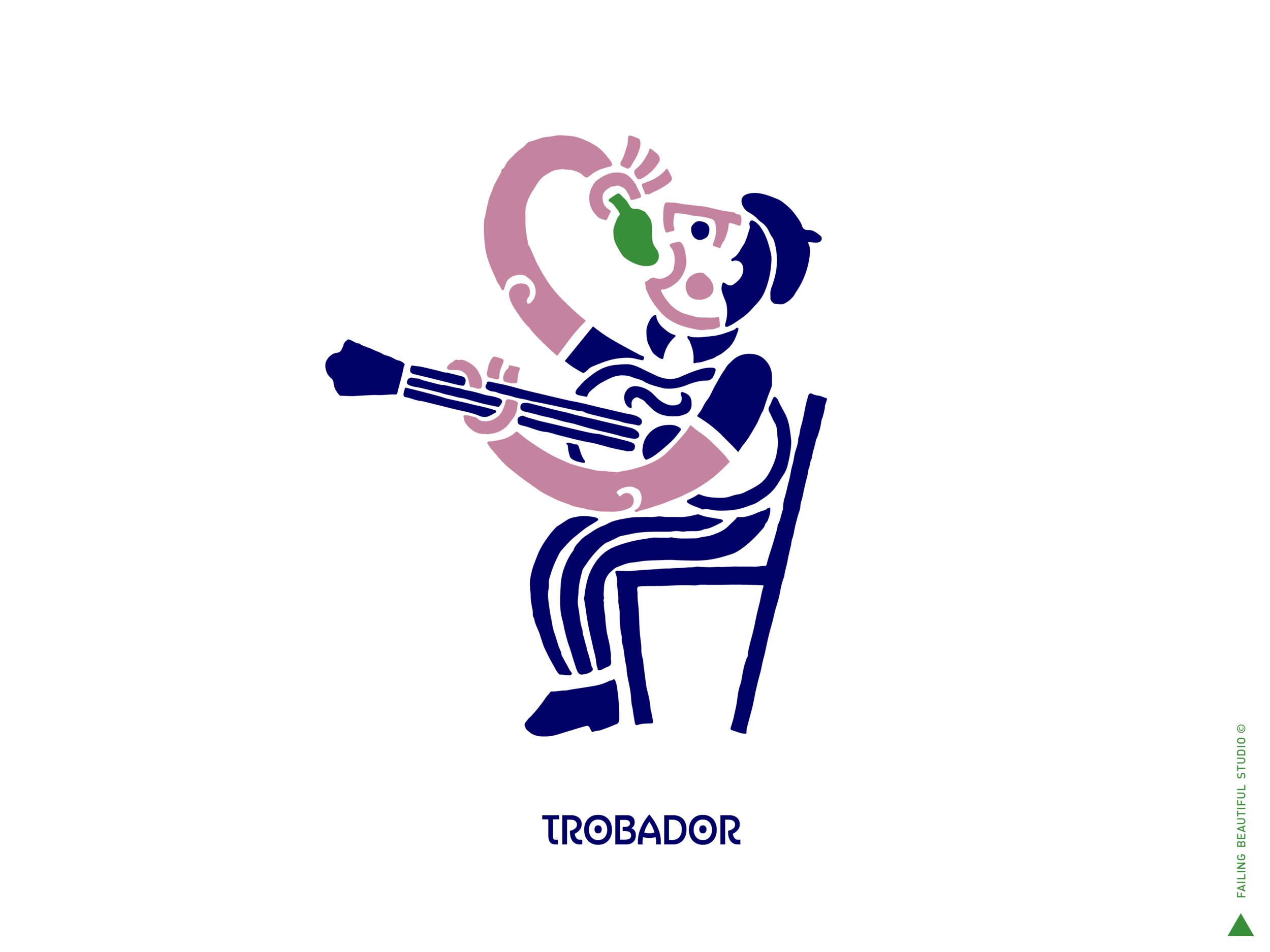
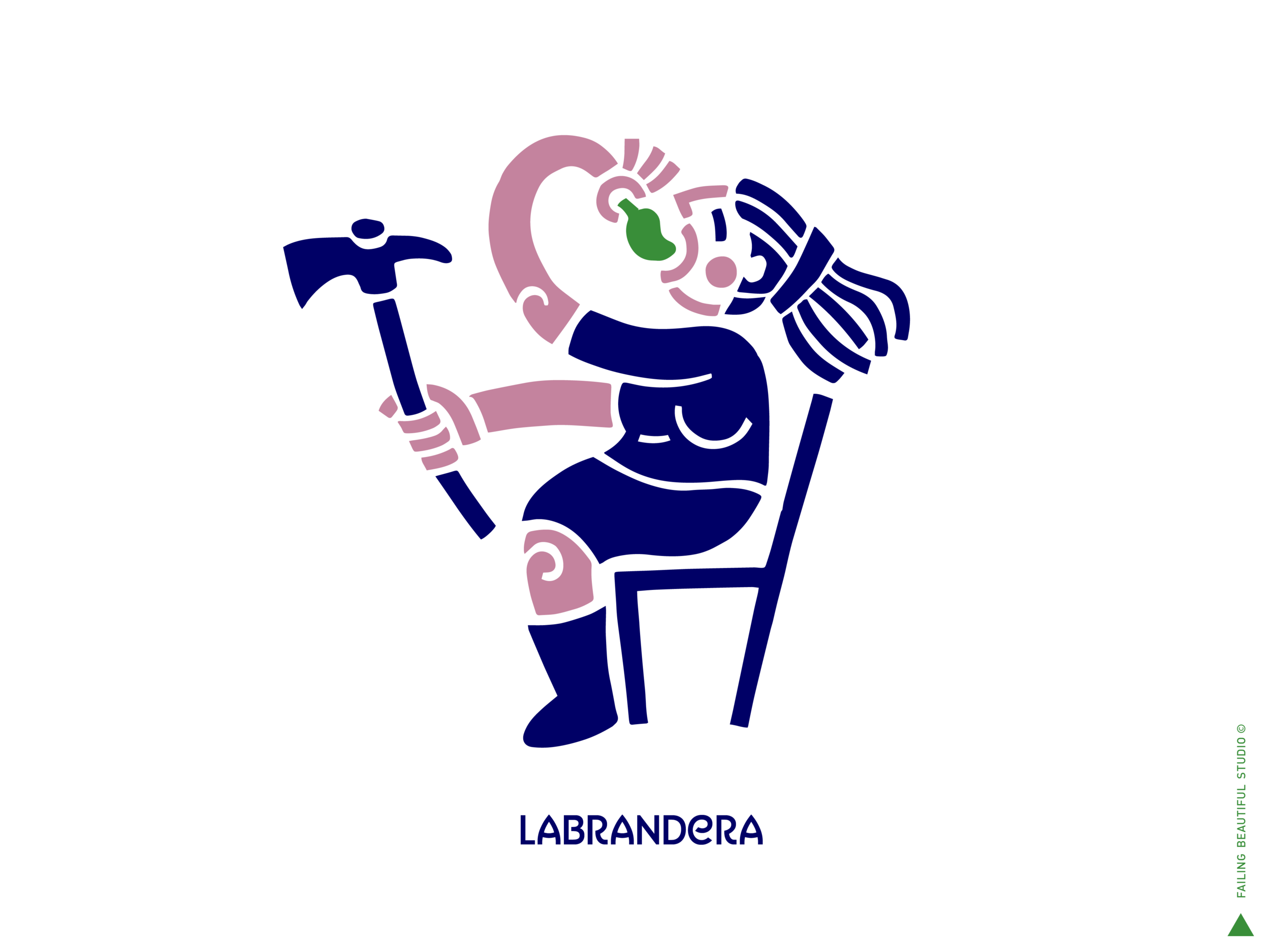
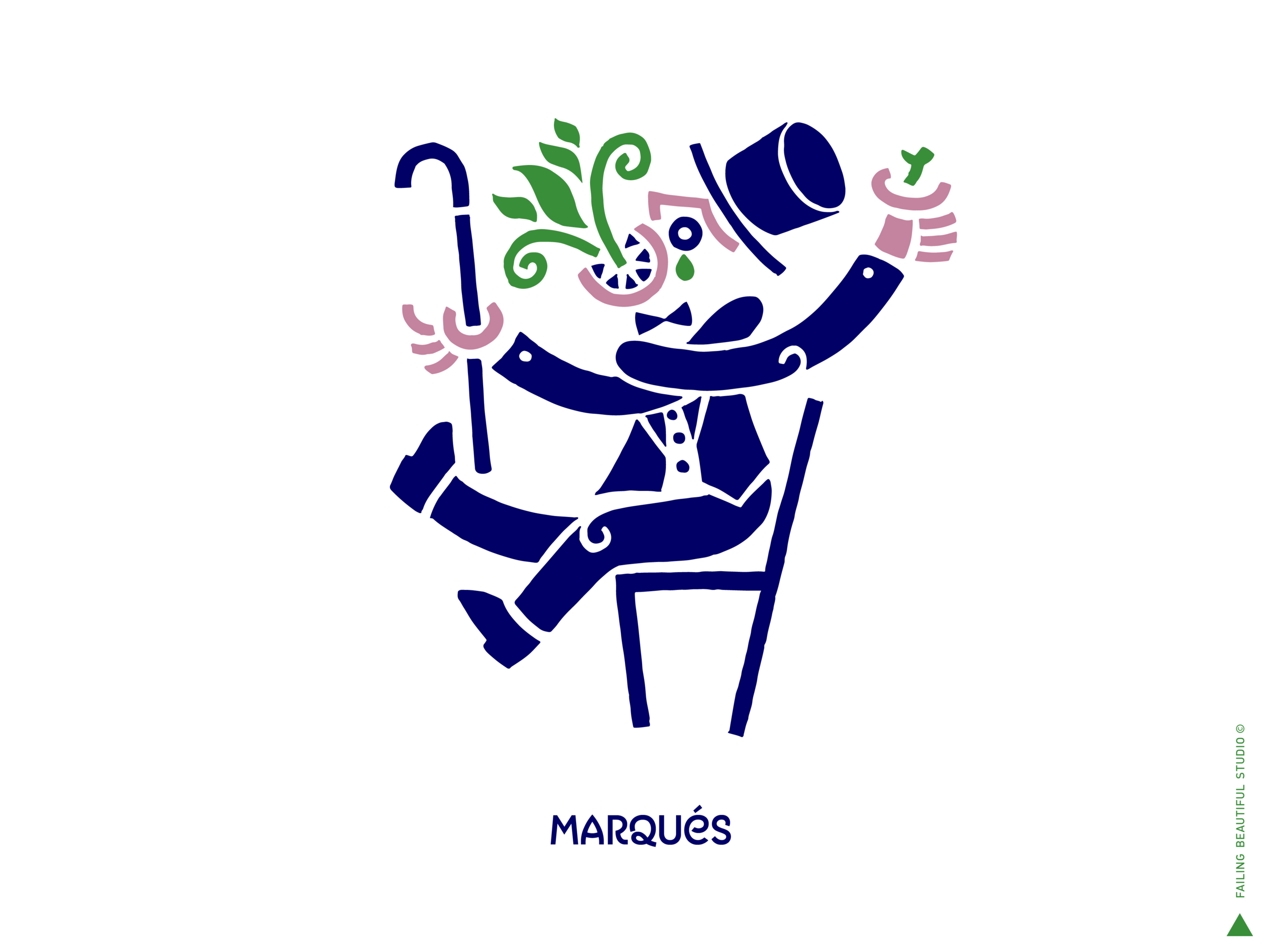
BRAND CHARACTERS
Classic characters from Galicia, in the act of eating Padrón Peppers.
The illustration style and cobalt blue are inspired in the wonderful ceramics of Sargadelos, which beautiful body of work is itself inspired in Celtic motifs.
HERO VISUALS
Conceptually the logo lock-up becomes a plate or table around which the different people of Galicia sit to eat Padrón Peppers. This goes to emphasize the act of eating Padrón Peppers as a social act.

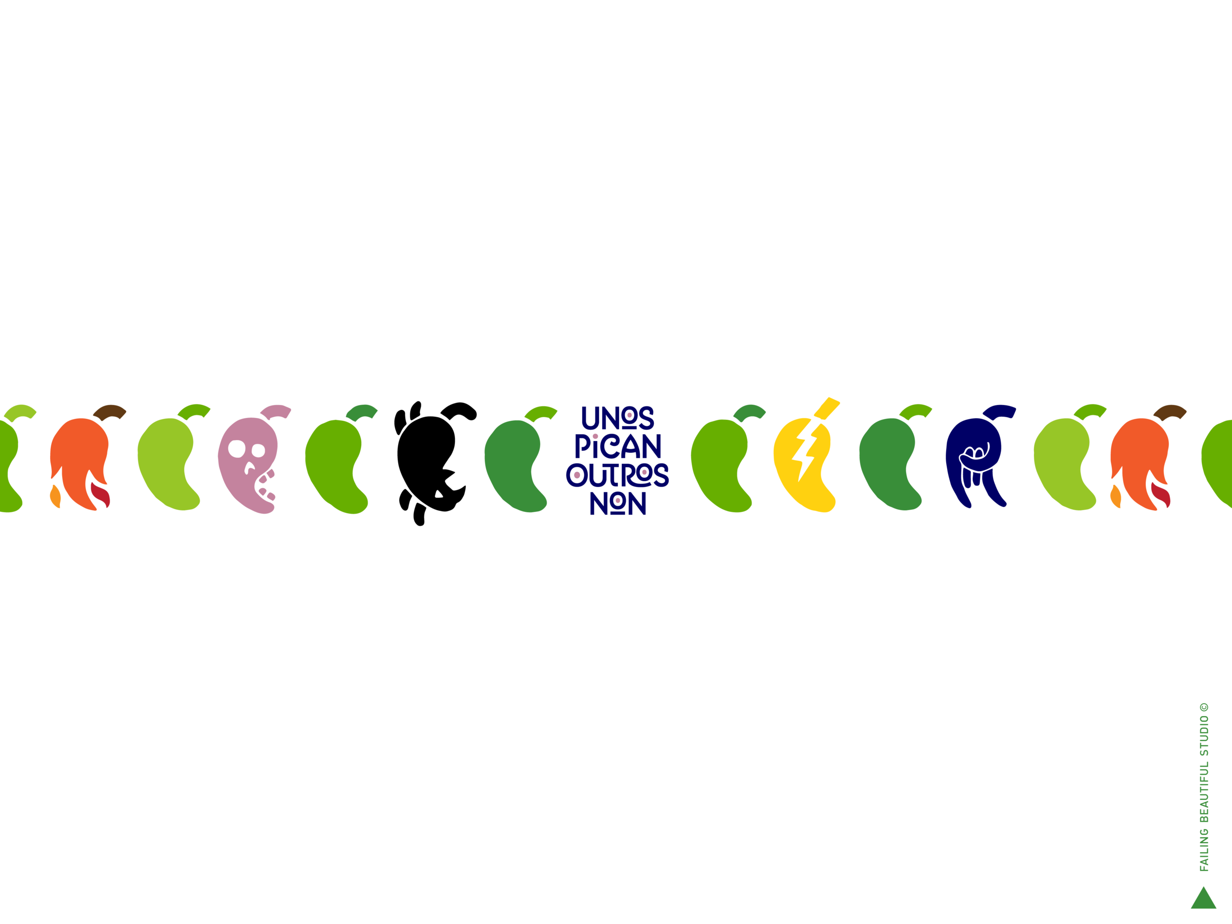
UNOS PICAN OUTROS NON
Galician for “Some are hot. Some are not”.
This popular tagline remarks why eating Padrón Peppers has such a playful component: some of them can be surprisingly hot.
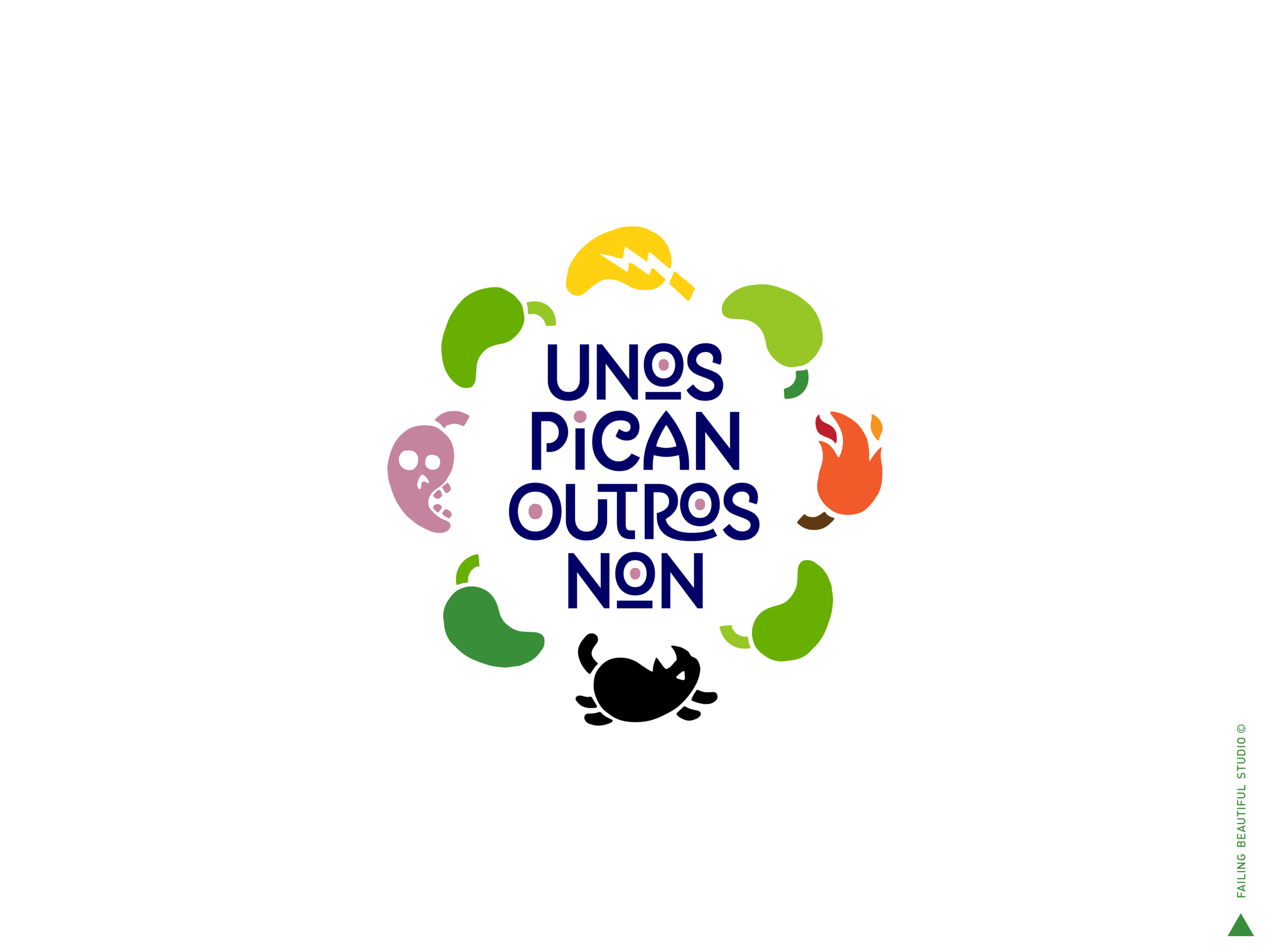
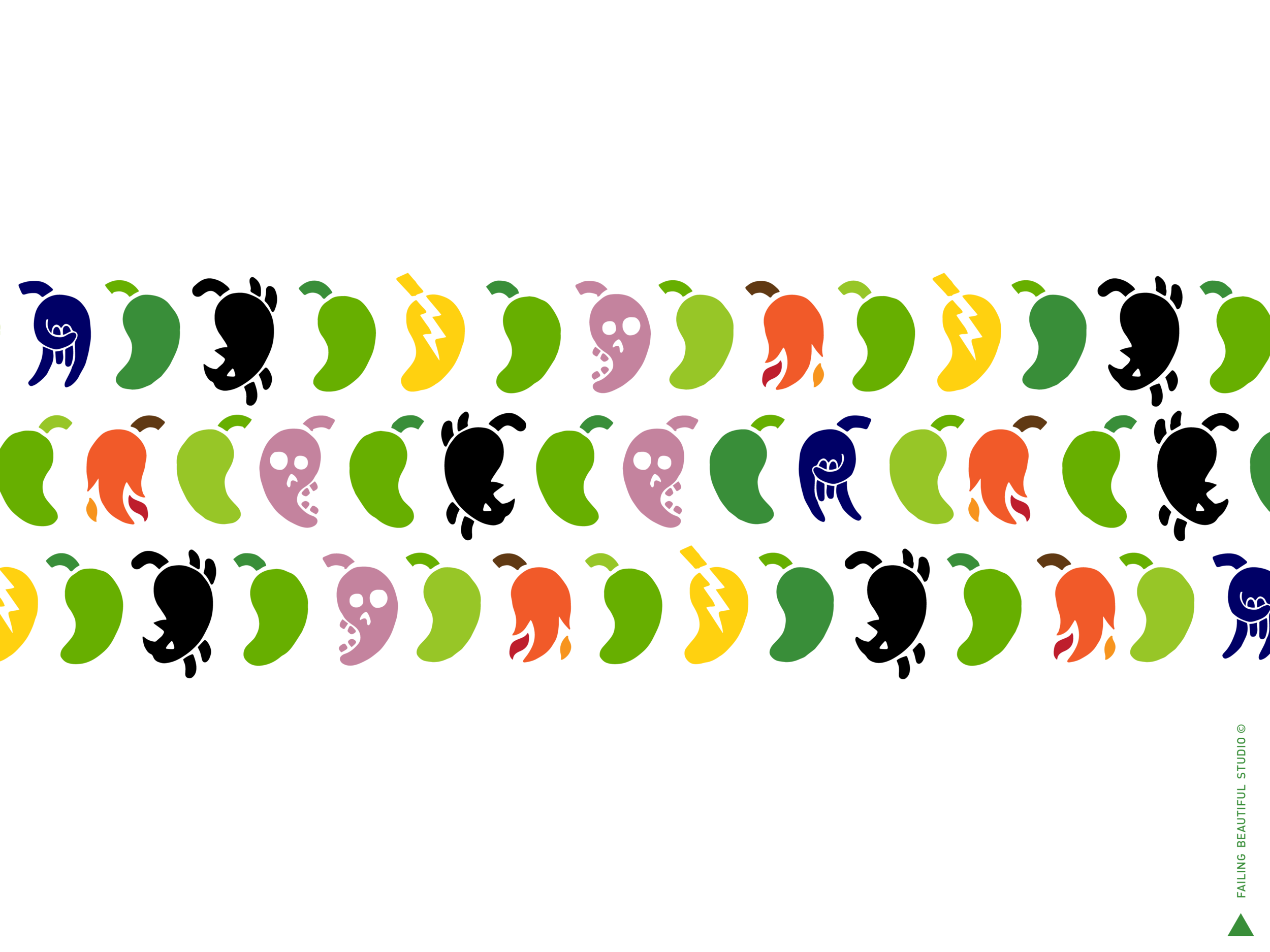
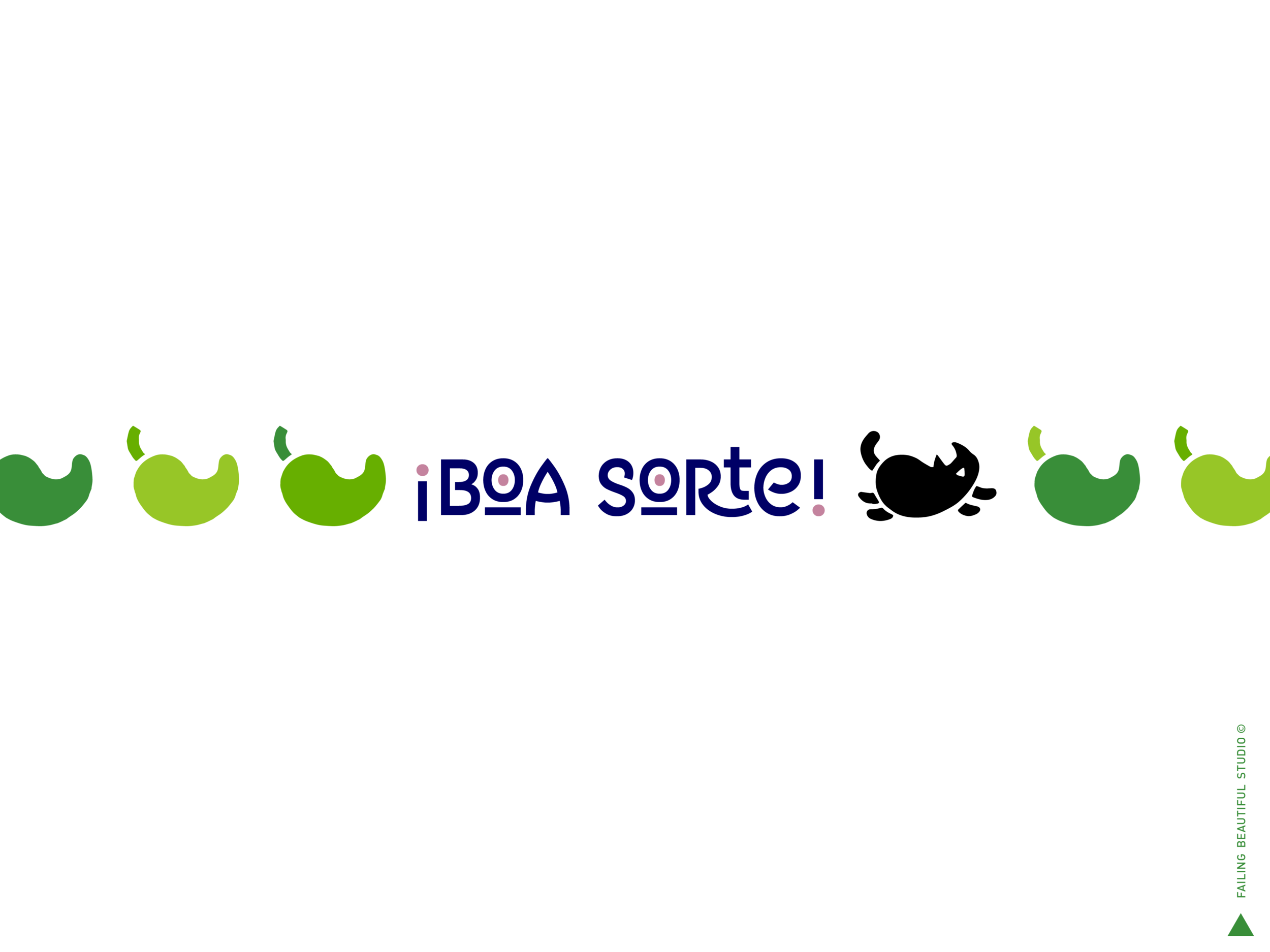
A lightning, a fire, a skull, and a bad-luck-black-cat hidden among Padrón Peppers.
This visual idea speaks to the witchcraft and superstition rooted in Galician culture.
Life is a lottery.
Good luck!
TYPEFACE
The typeface is ABISINIA REGULAR, created by Rubén Prol, also from Galicia.
This goes to remark the behind-the-scenes efforts to make this a truly Galician product.
DESIGN PROCESS