
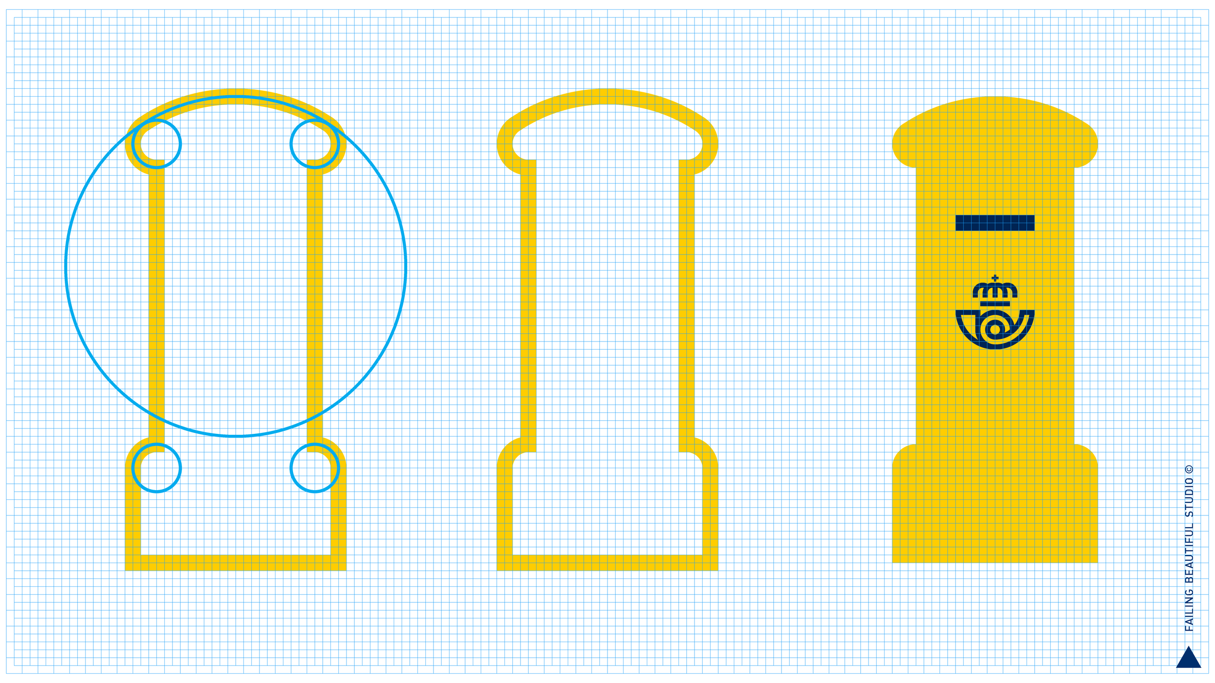
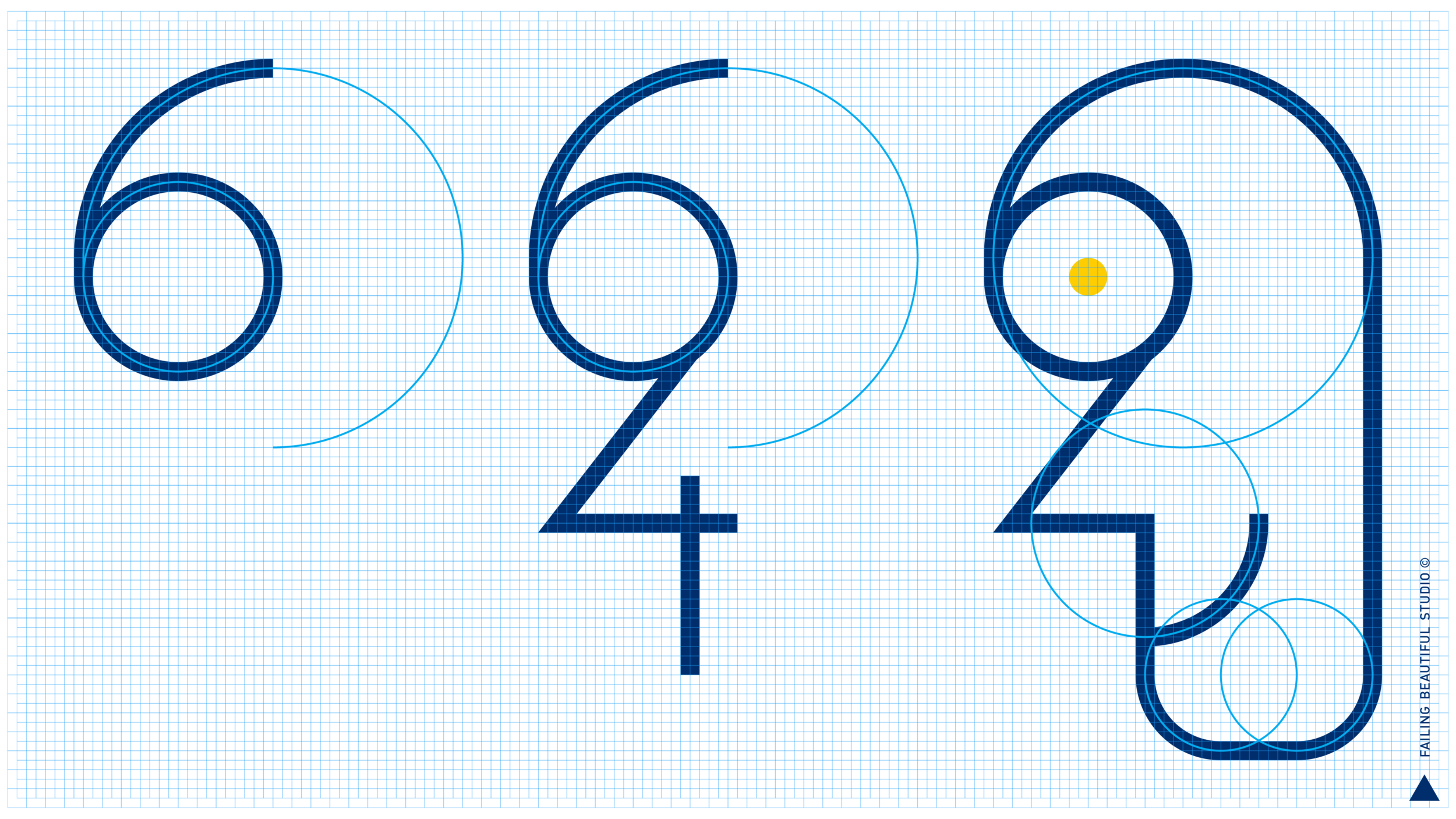
THE NOVILLOGRID
The original Correos logo was designed by legendary Spanish Designer Cruz Novillo using circular forms on a 16x16 square unit grid. All the artwork of the Brand World is created with multiples of 1/8 of a circle on a square grid rightfully called “NovilloGrid”.

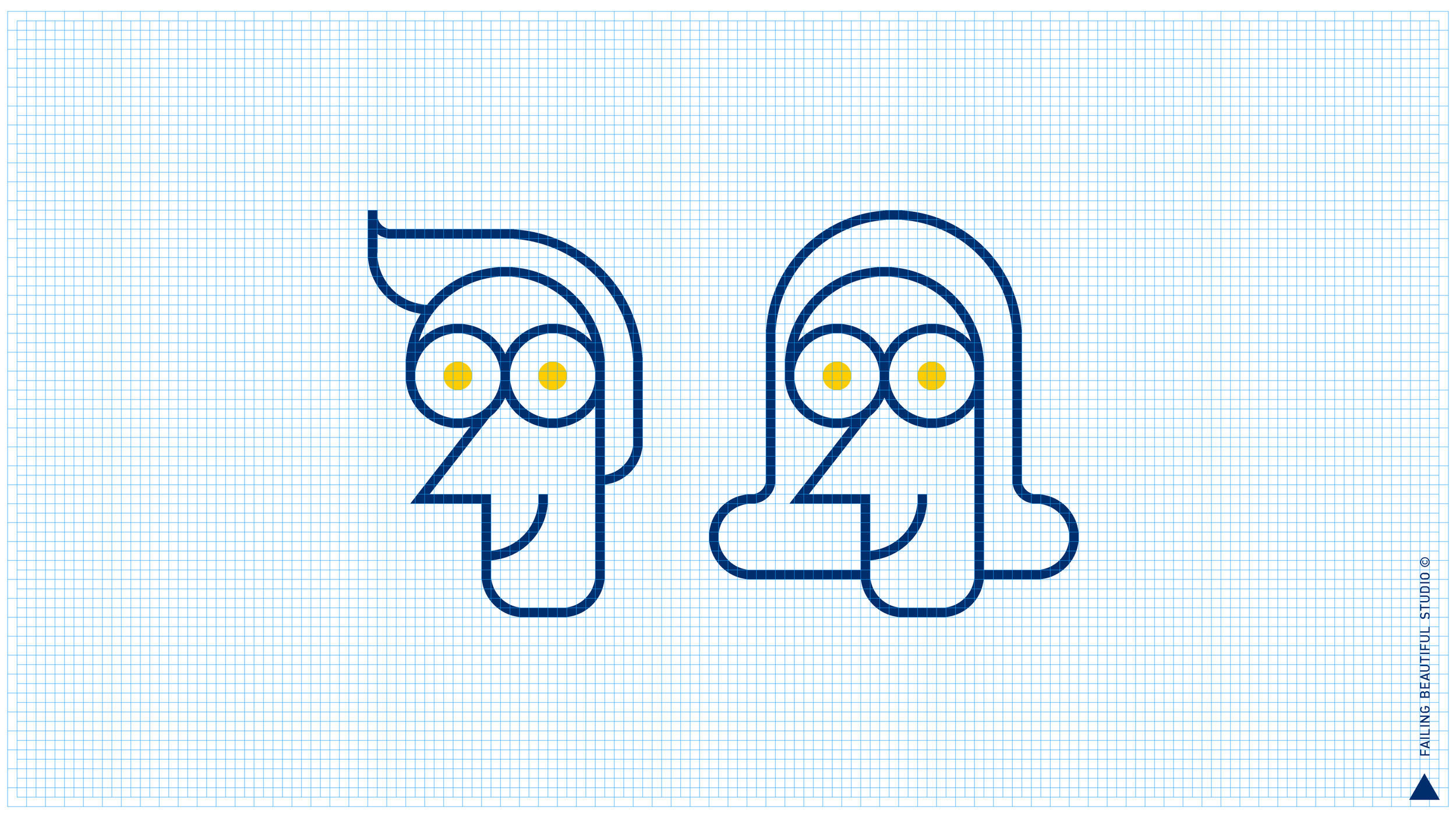

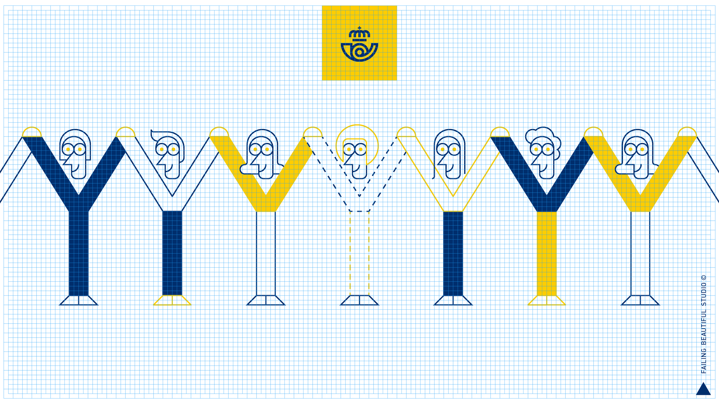
BRAND CHARACTERS
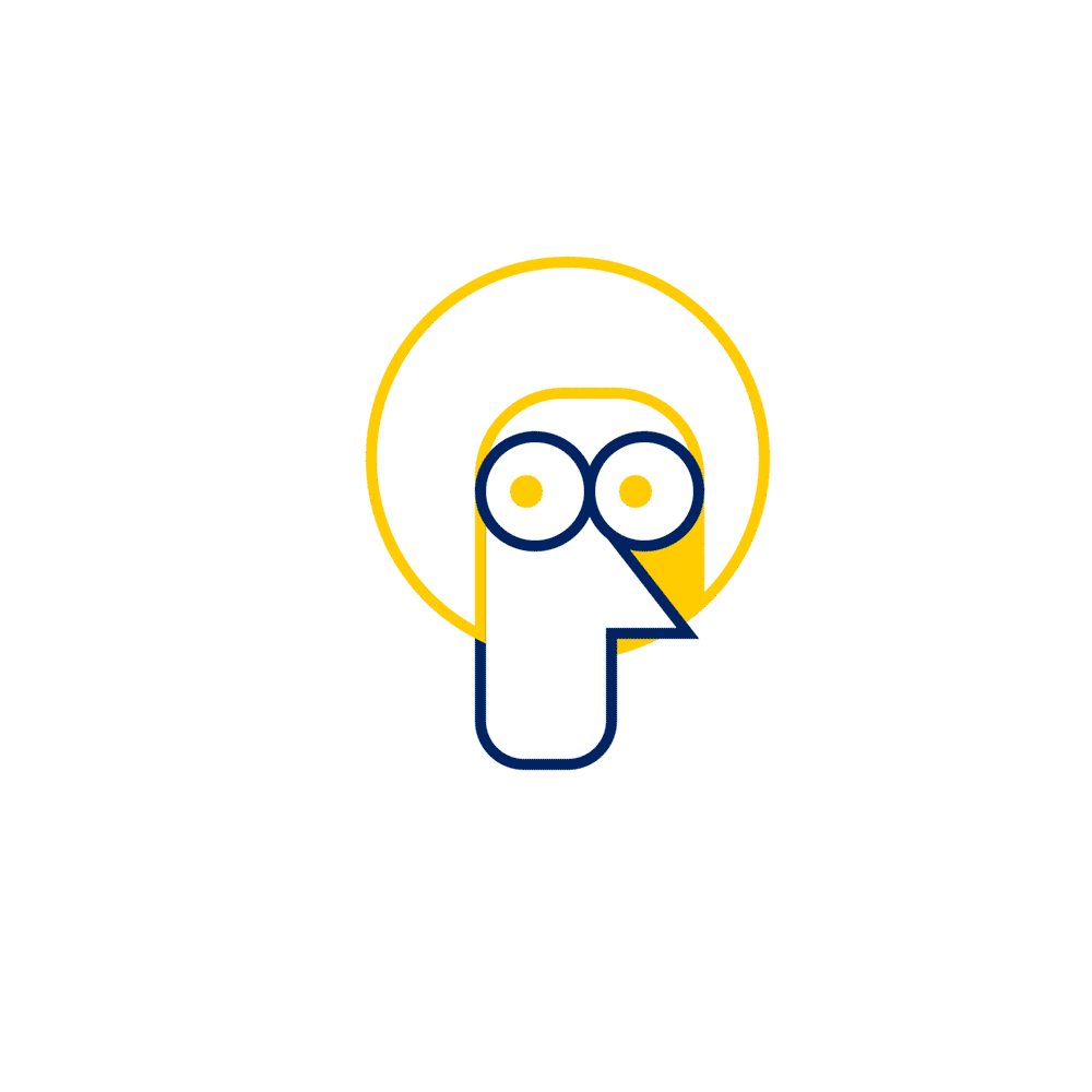
Correos, as a public company belongs to all spaniards. So when we had to design the “face” of the Correos brand, a very Spanish childhood memory came to mind:
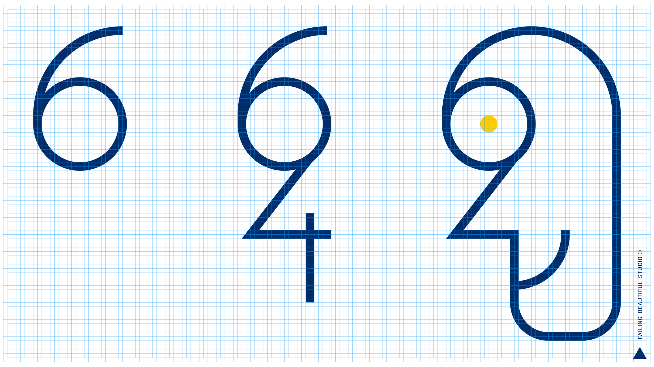
“Seis y cuatro… la cara de tu retrato”.
This catchy Spanish rhyme, that translates as “a six and a four, makes your face”, is how every single spaniard learned how to draw the face of a person as a child: Like Correos, is something we all have in common.
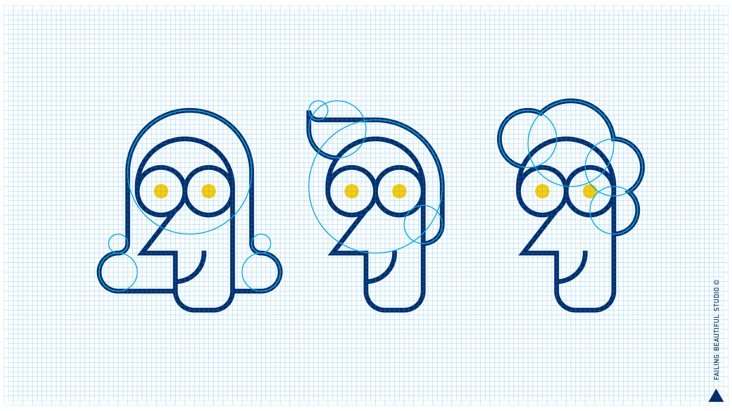
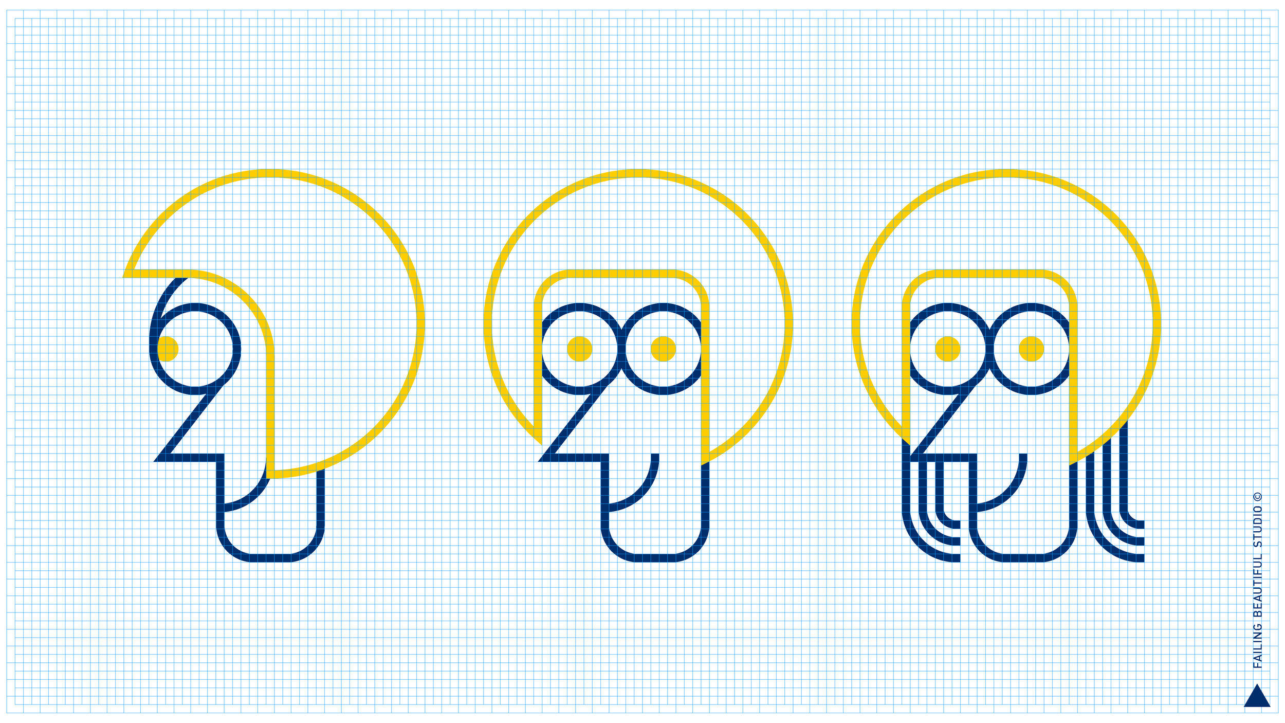
Here is how we started to bring this characters to live, also using increments of the NovilloGrid for the extreme poses:
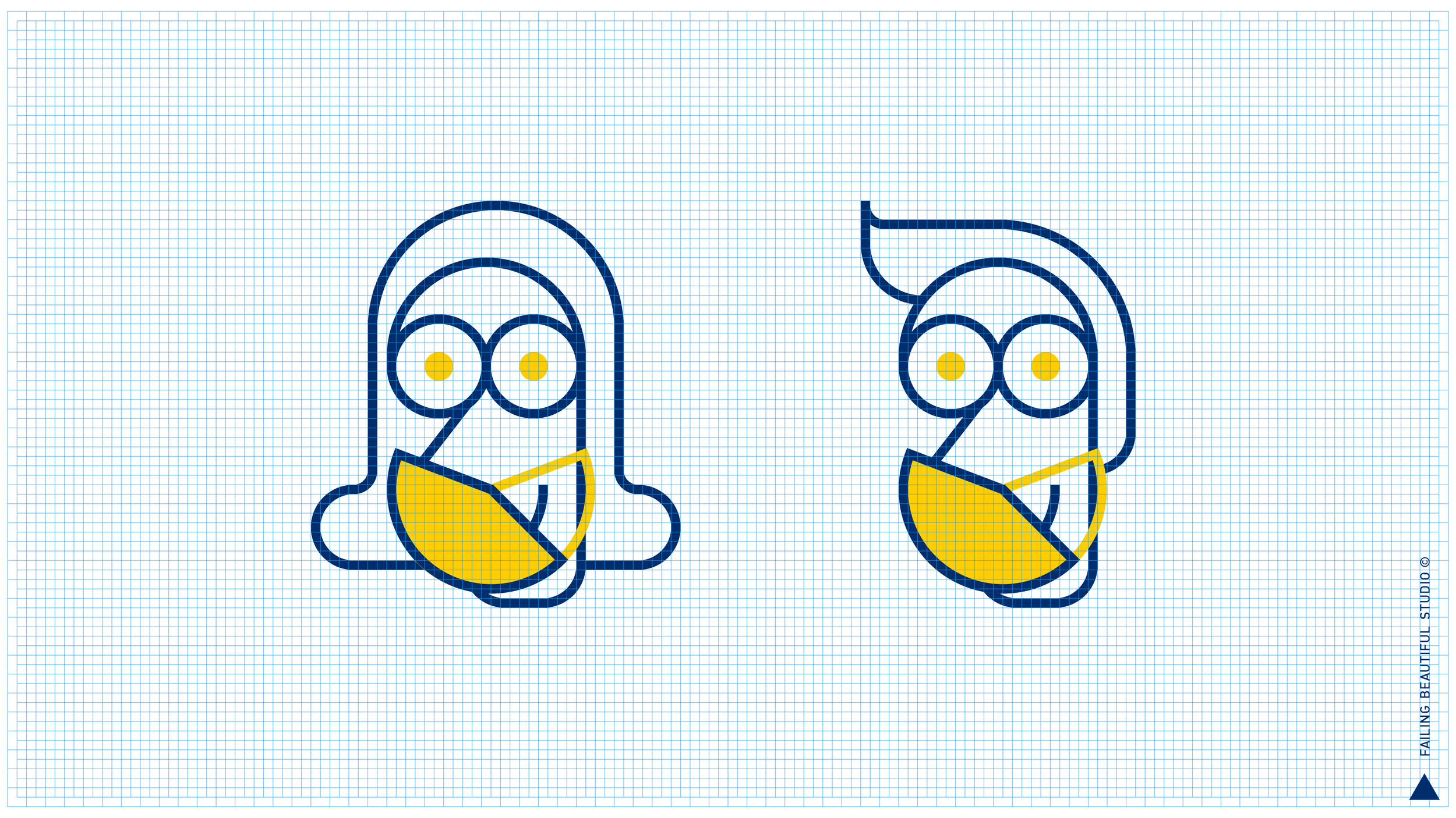
Despite its simplicity, a complete rig of the face allows a big range of expressions:
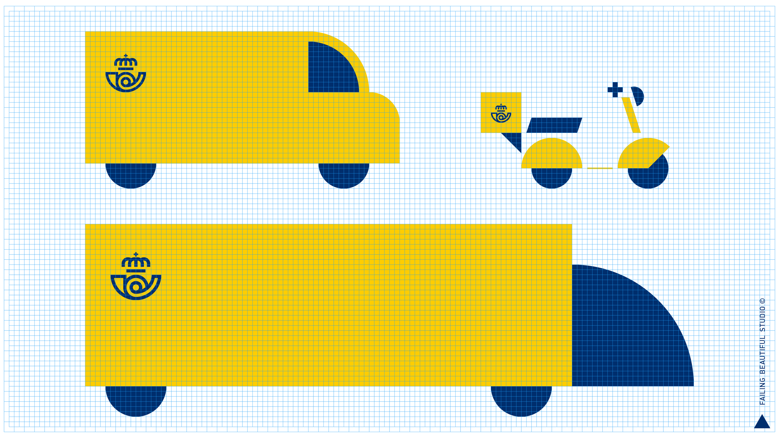
BODY & WALK CYCLES
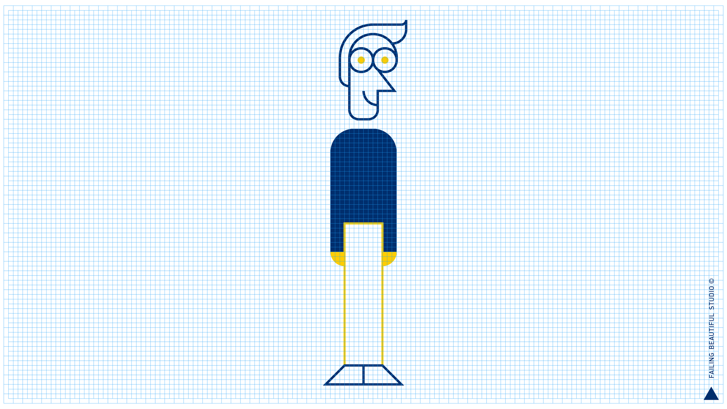
To create visually minimal scenes, the body profiles are simplified as much as possible.
We respect the Novillogrid and semicircular movements even when the characters walk.
To differentiate Correos workers from other characters, their body is drawn with discontinued lines constantly animated. This goes to emphasize how Correos, as a logistics company, never stops.
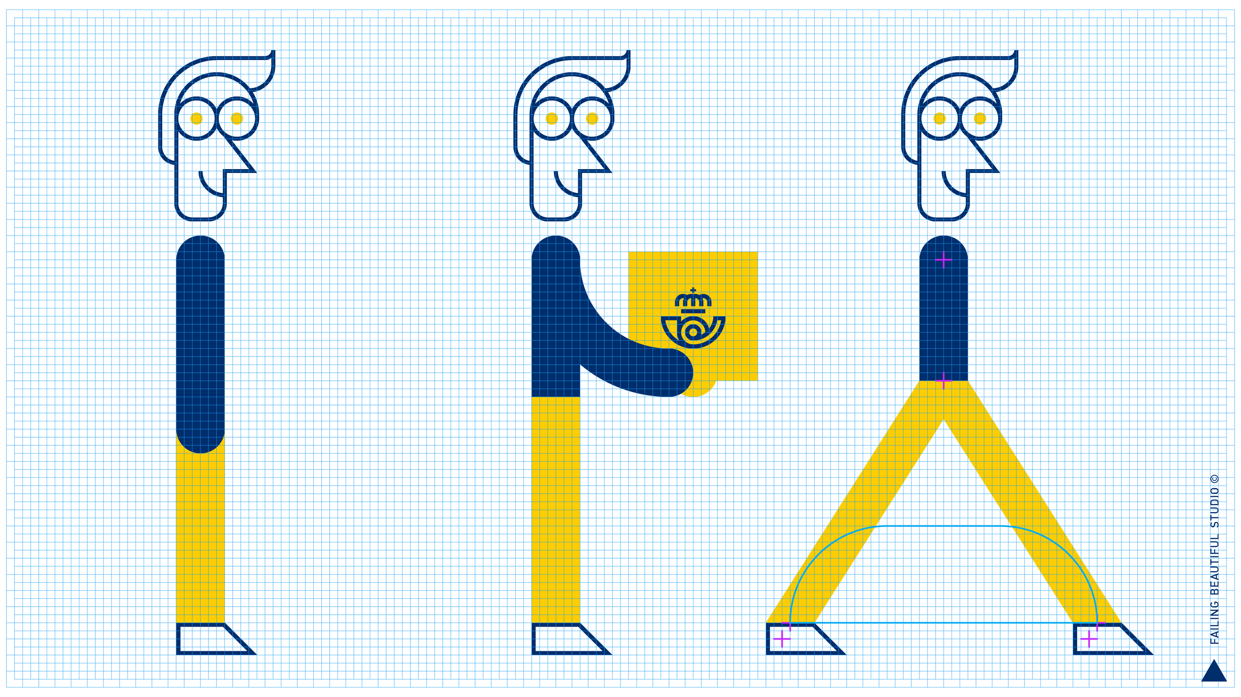
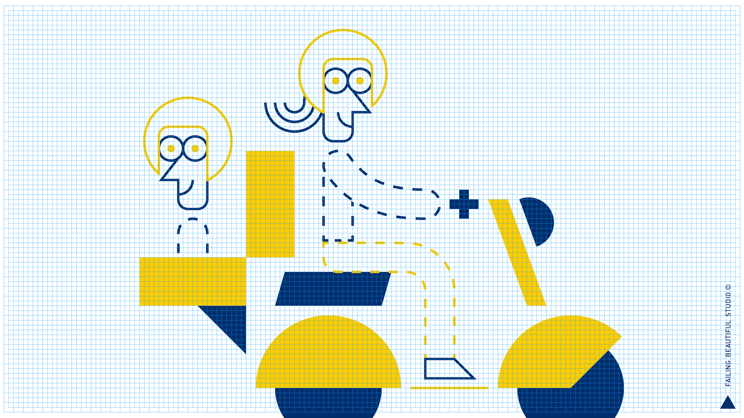
There are as many ways to walk as people walk the earth. The Correos workers walk with an attitude of “diligence” and positive energy:
ISOMETRIC 3D
To give a sense of “magnitude” of the Correos logistical operations, the Brand World makes ocasional use of 3D environments without characters. This birds-eye views use isometric perspective, that reinforces Correos as an efficiently “organised” company.
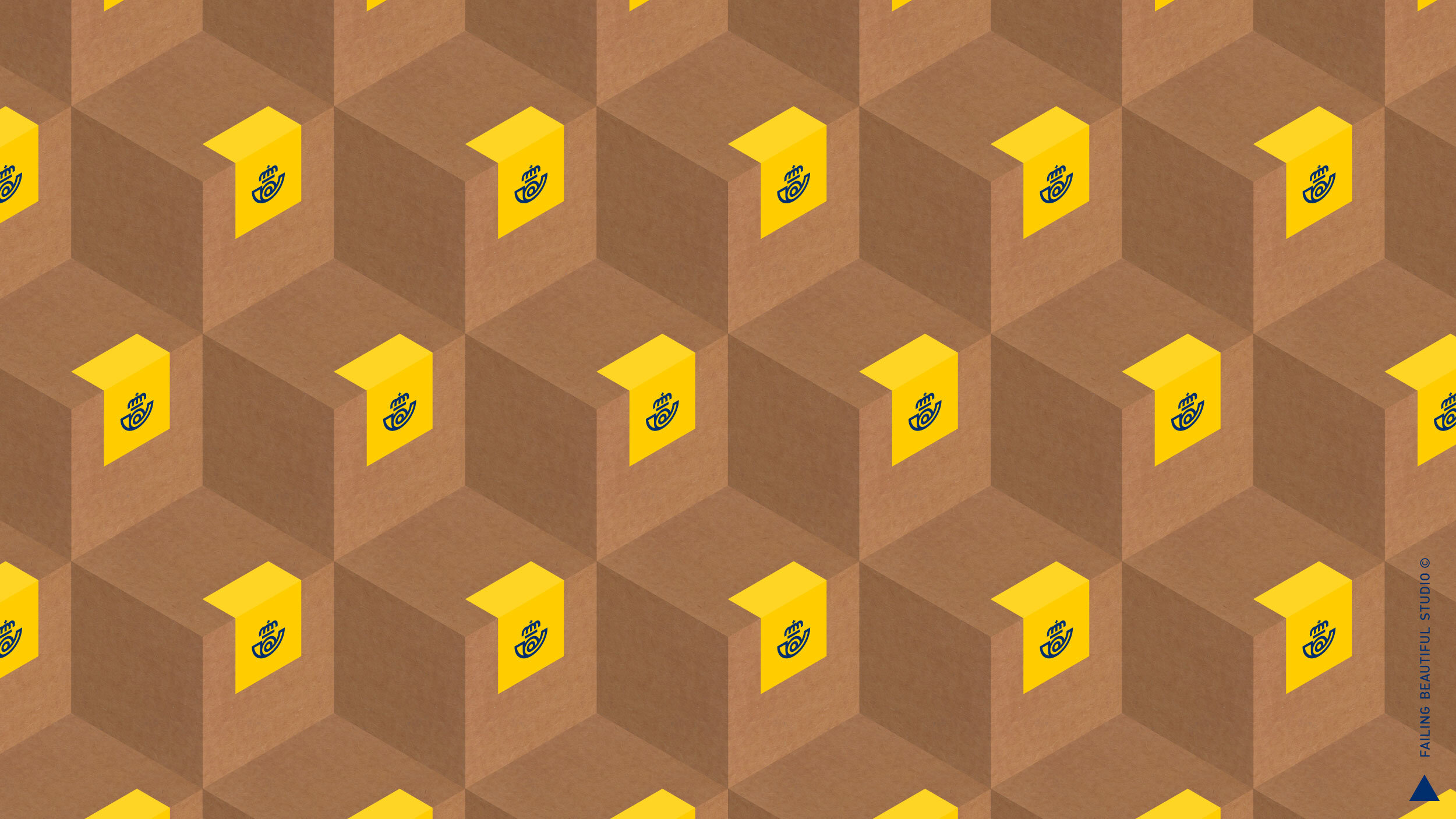
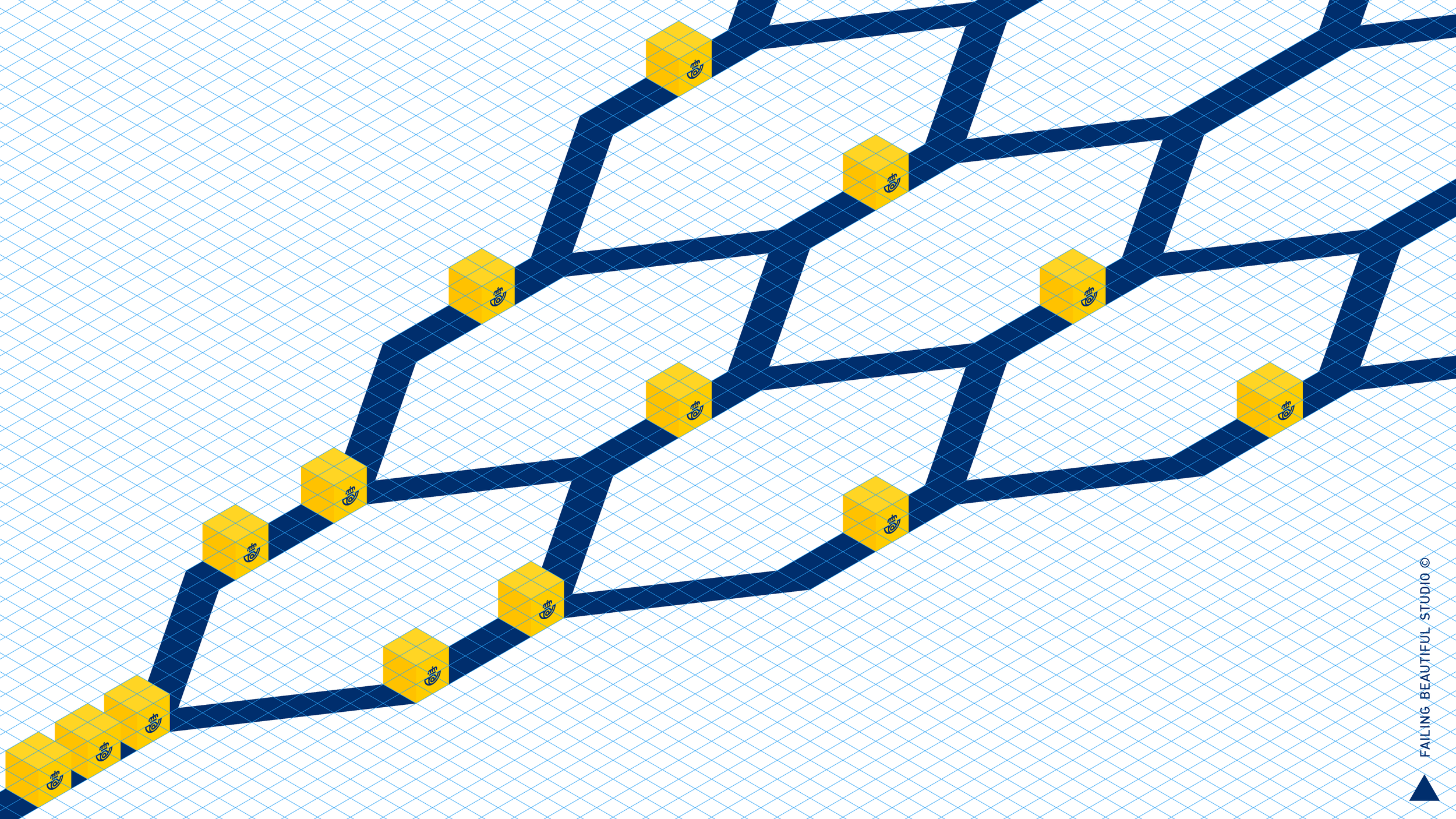

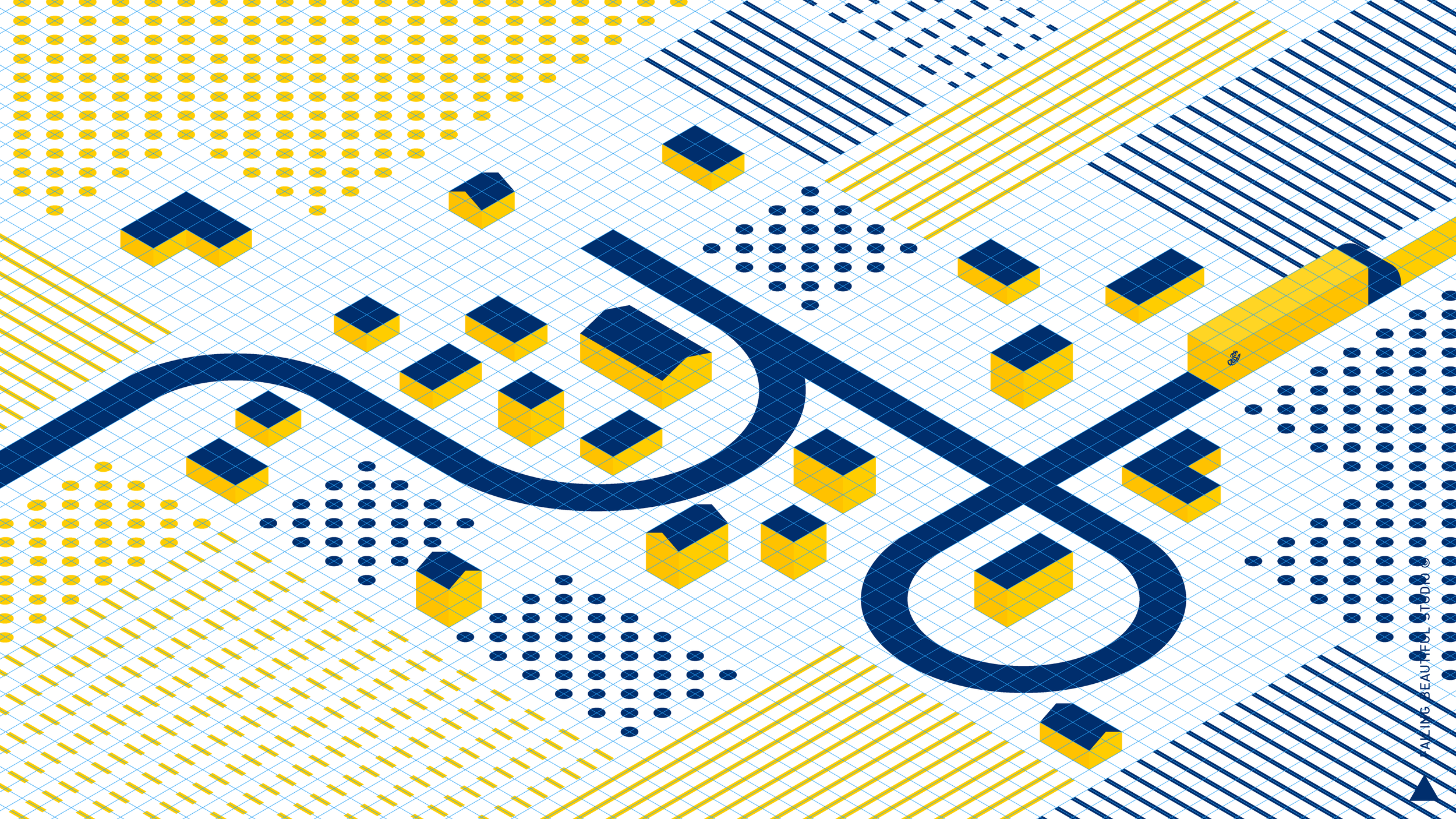
To move between 2D and 3D, we use camera transitions without perspective deformation. A simple forced-light environment also limits the shadowed areas to a minimum (1 or 2) number of variations of yellows and blues, for better color consistency:
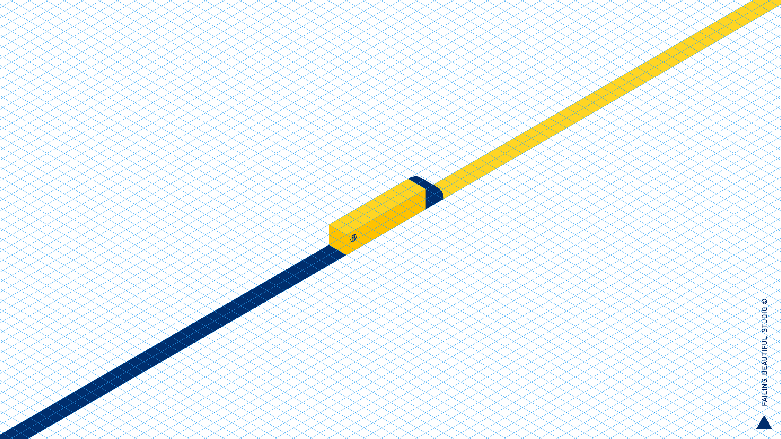
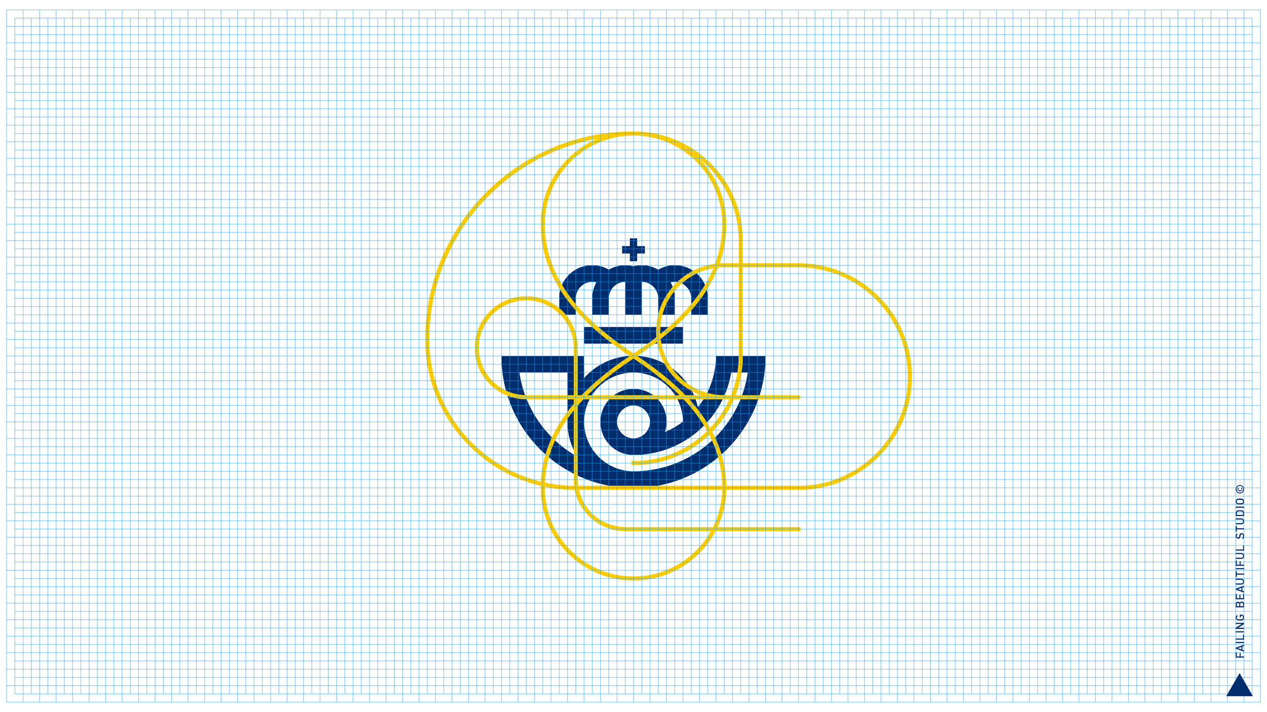
BRANDING IN MOTION
In a digital world every brand needs to have a defined motion personality. And as a logistics company in continuous movement, this is specially true for Correos. An example of how to animate the logo with “continuous” semicircular movements:
CREATIVE ROLE: Creative direction, art direction, animation, design.