

REBRANDING FILM

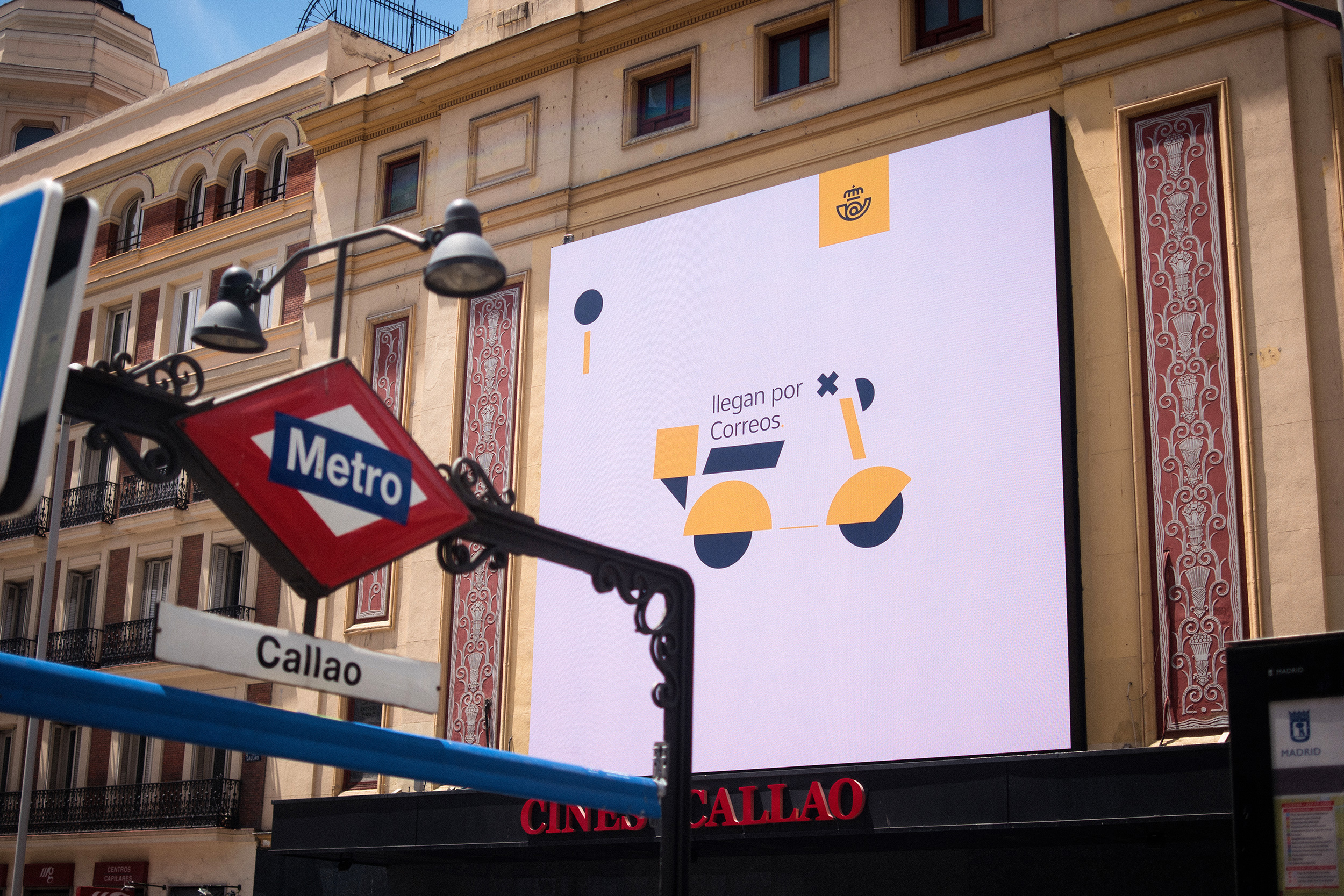
OOH
For a few days, digital windows and big screens of Madrid city center, were taken over with short animation pieces that focused on different aspects of the rebranding.
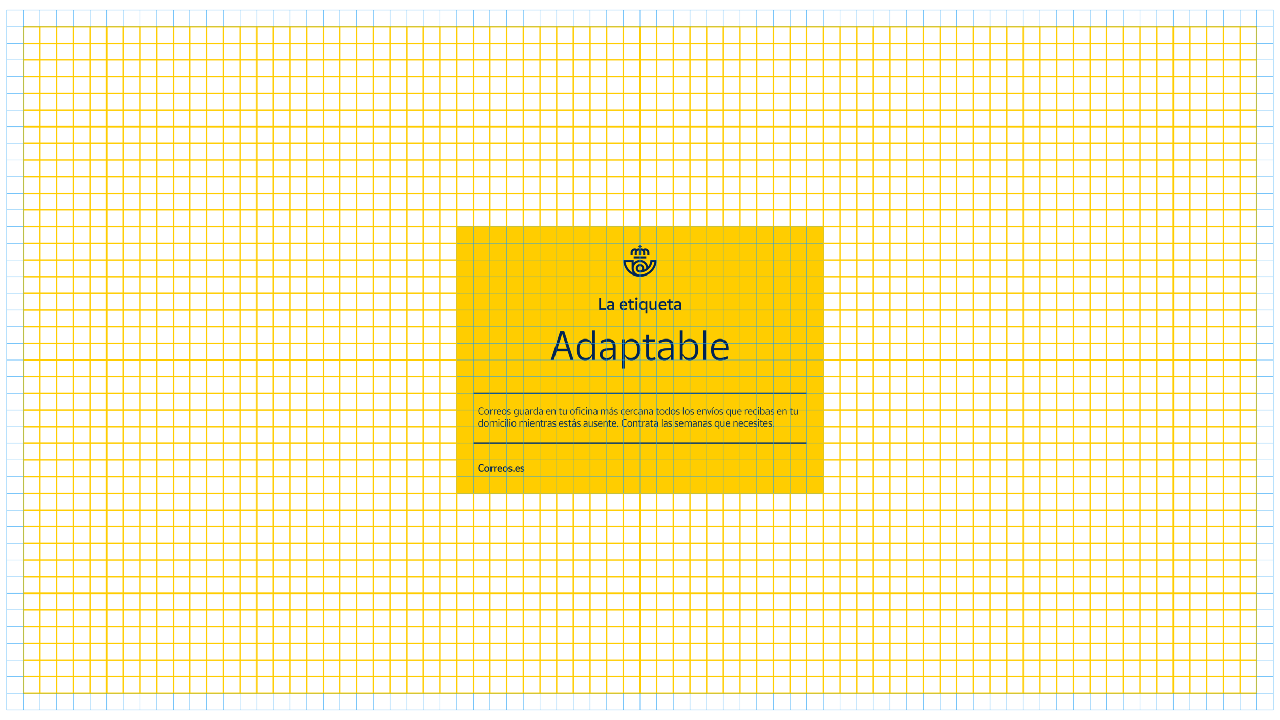
SOCIAL MEDIA
Shown below, some examples of pill-animations to explain further aspects of the rebranding on social media.
CINEMA 45s VERSION
To be projected in Cinemas, a 45s version of the film.
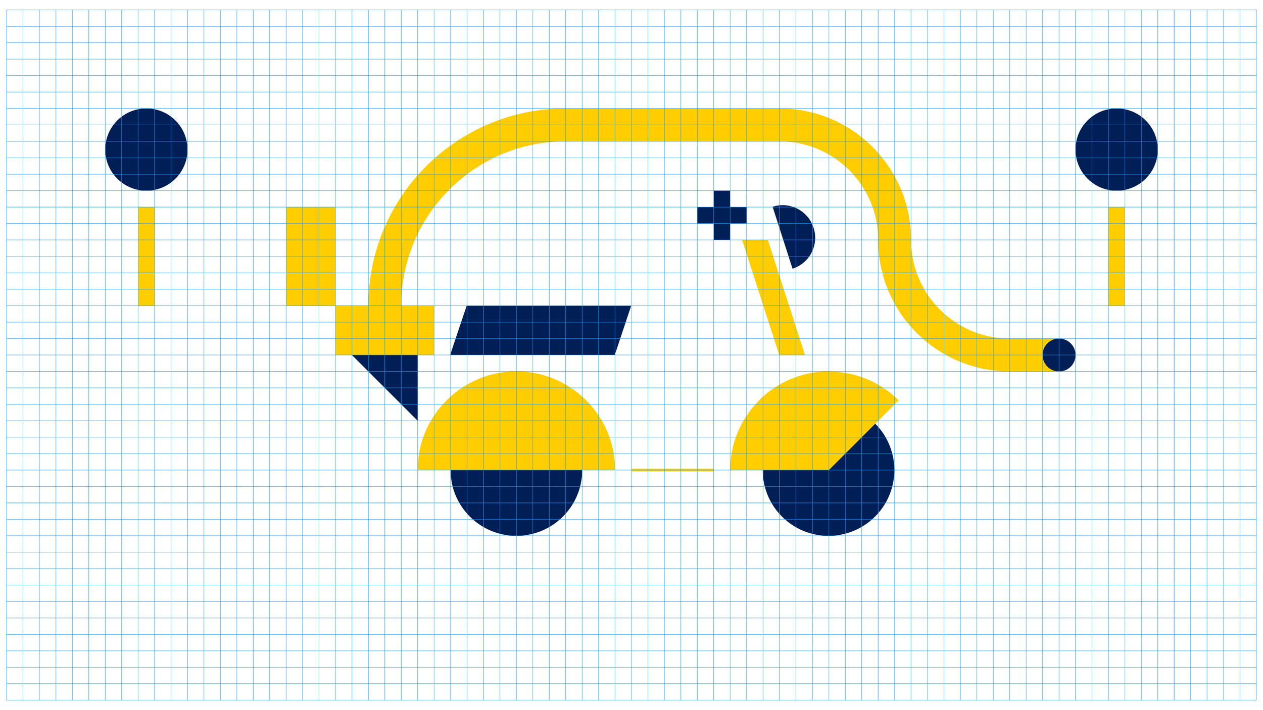
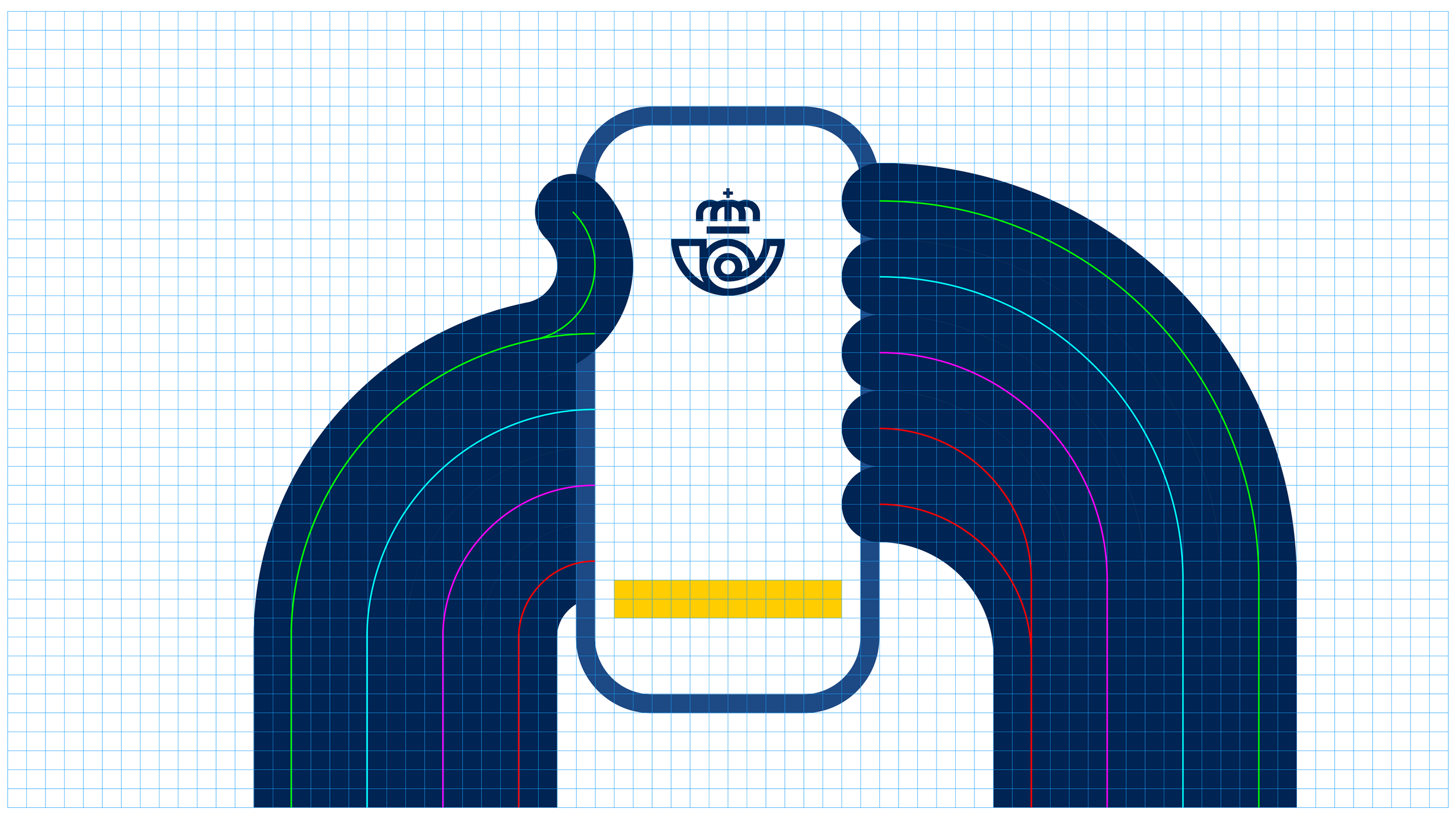
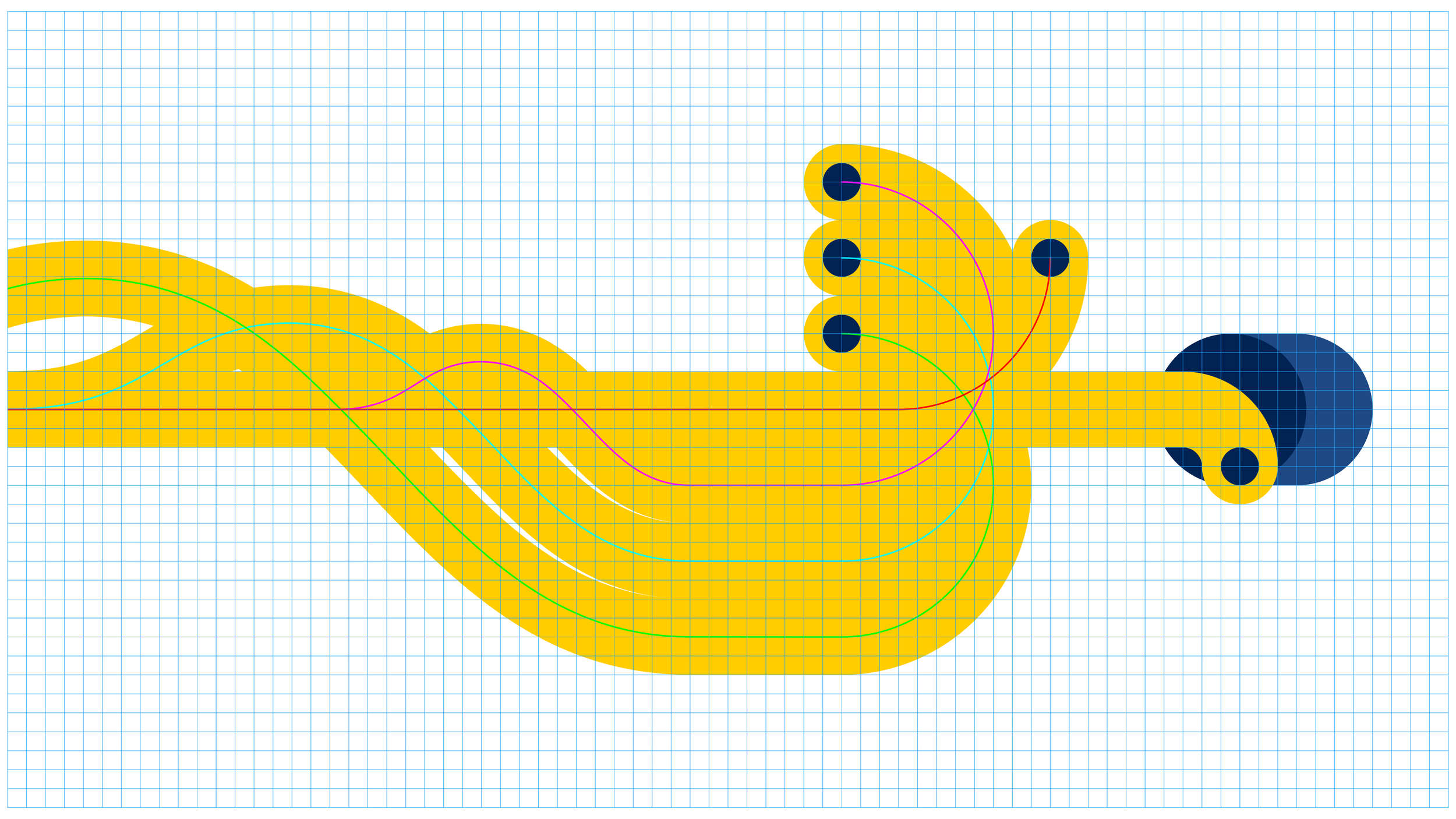
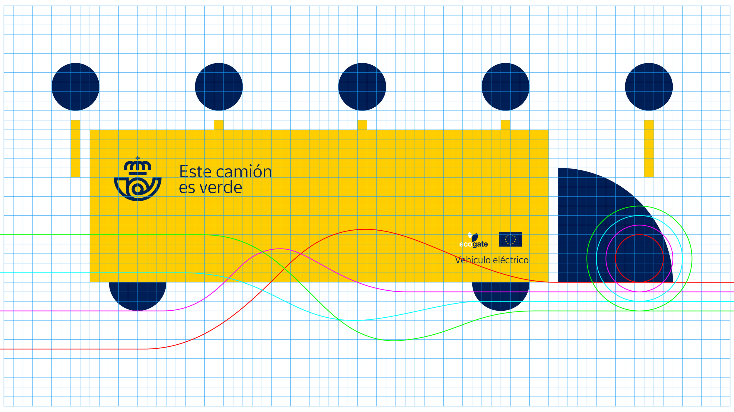
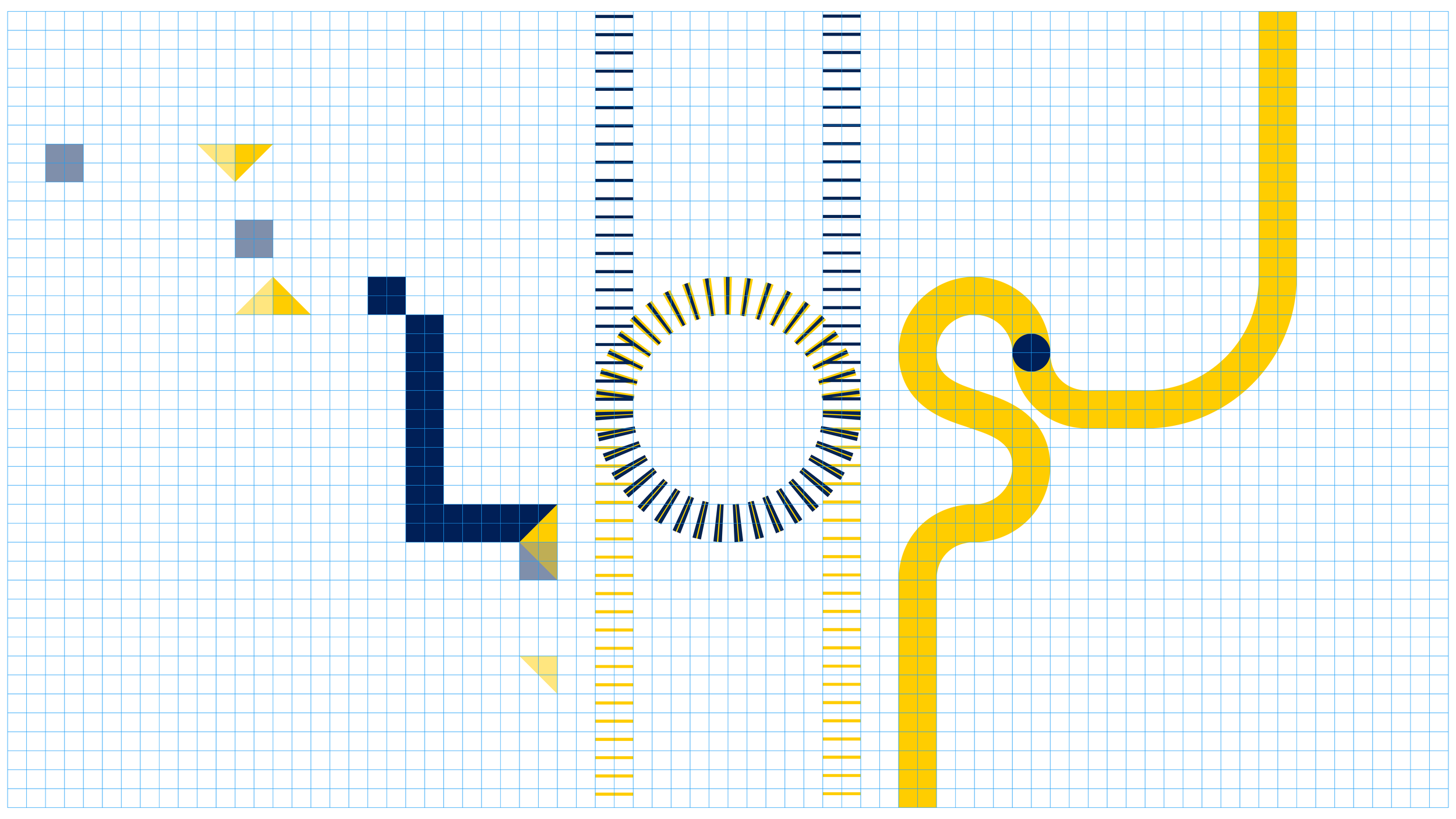
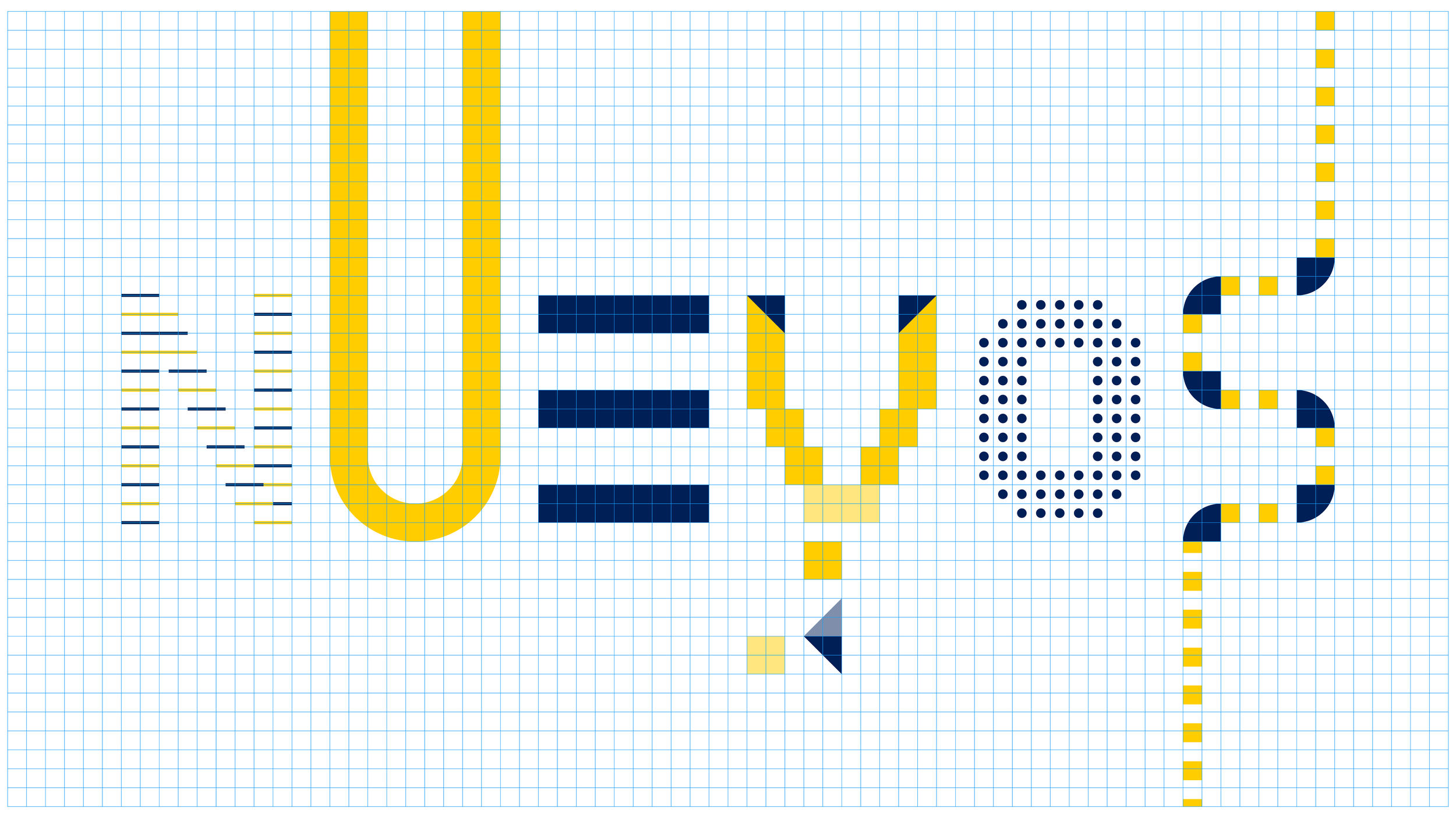
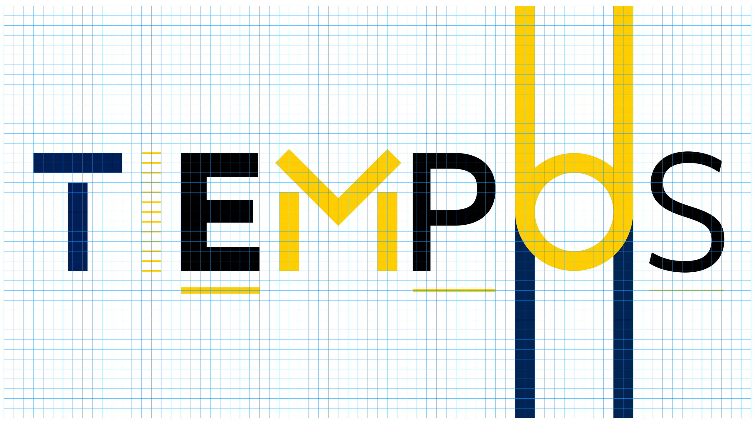
THE MOTION LANGUAGE
The proposed motion/design language can be stretched to all previous executions, but its minimal expression can be seen in this short loop. A simple solution that transmits the sense of a huge logistic operation that works efficiently under the radar. Never-stop motion and elements coming in and out of the borders of the frame, are also key parts of this language, that rings true to the brand business.
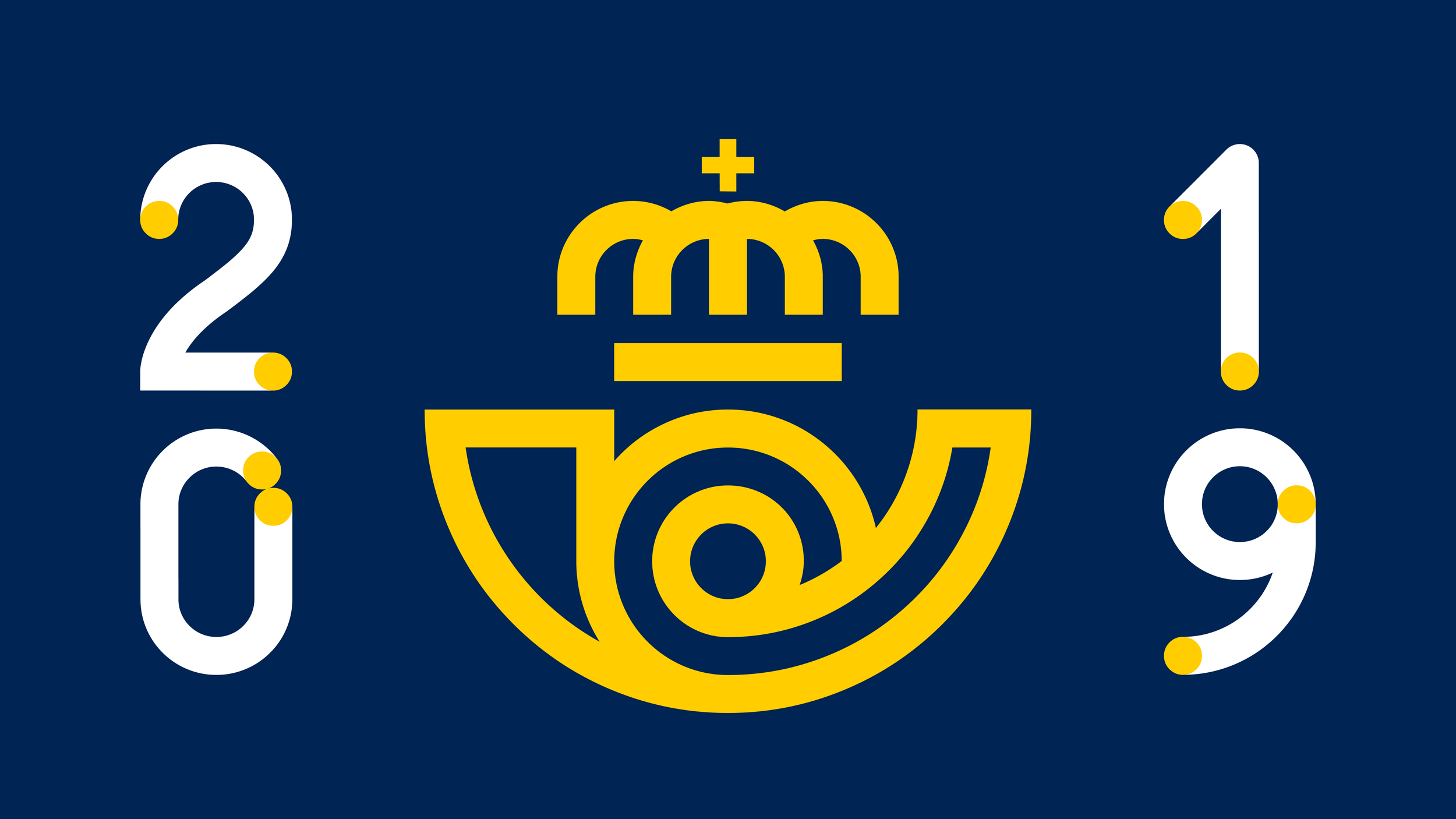
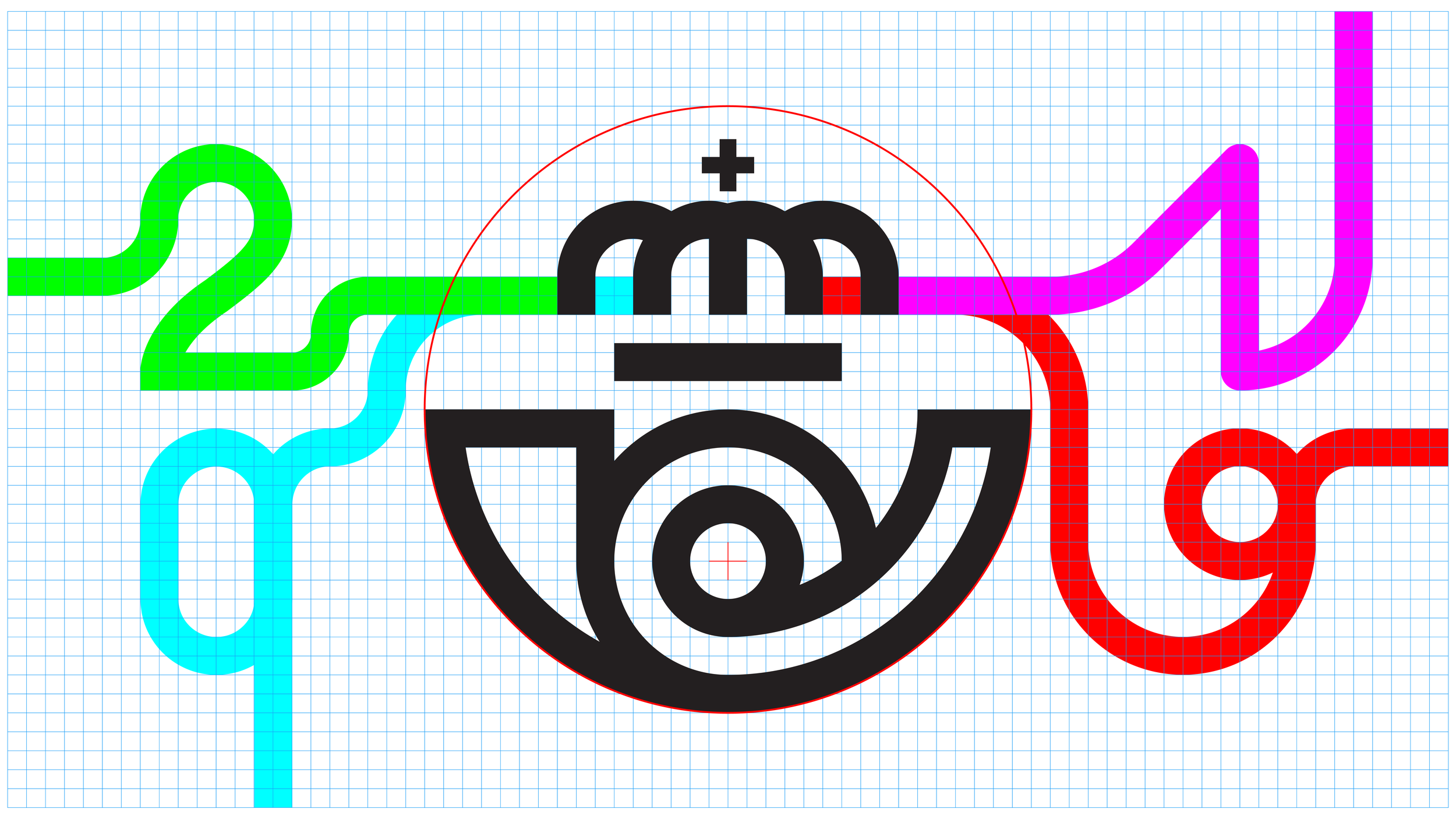
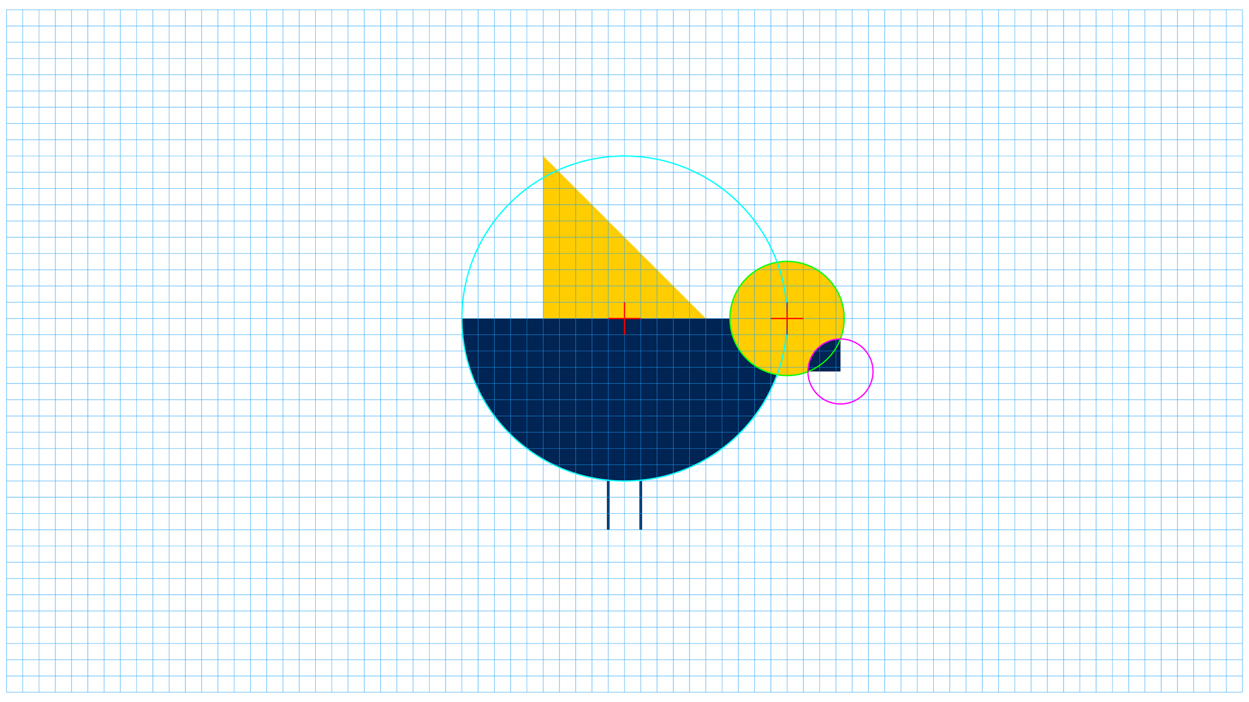
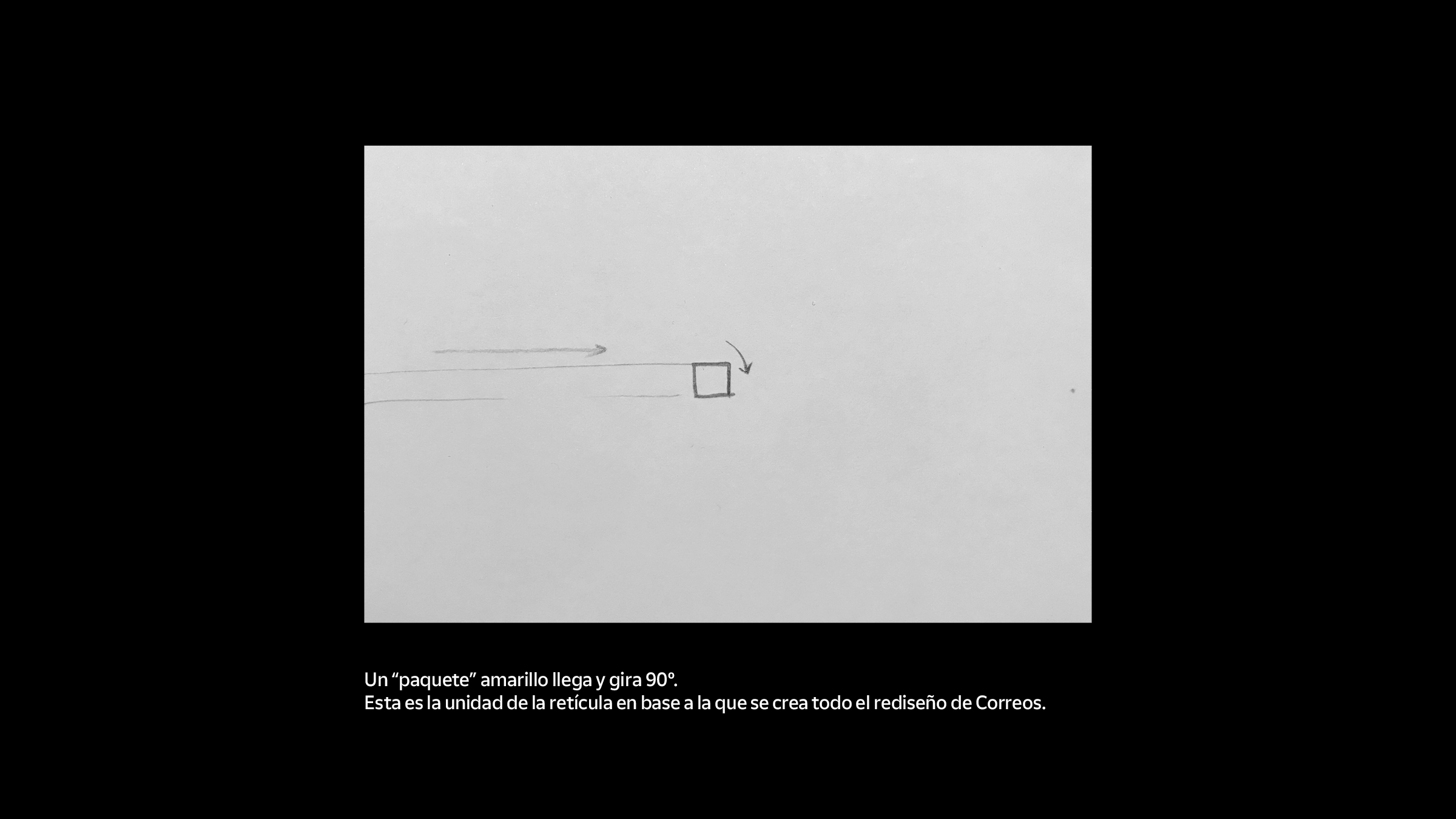
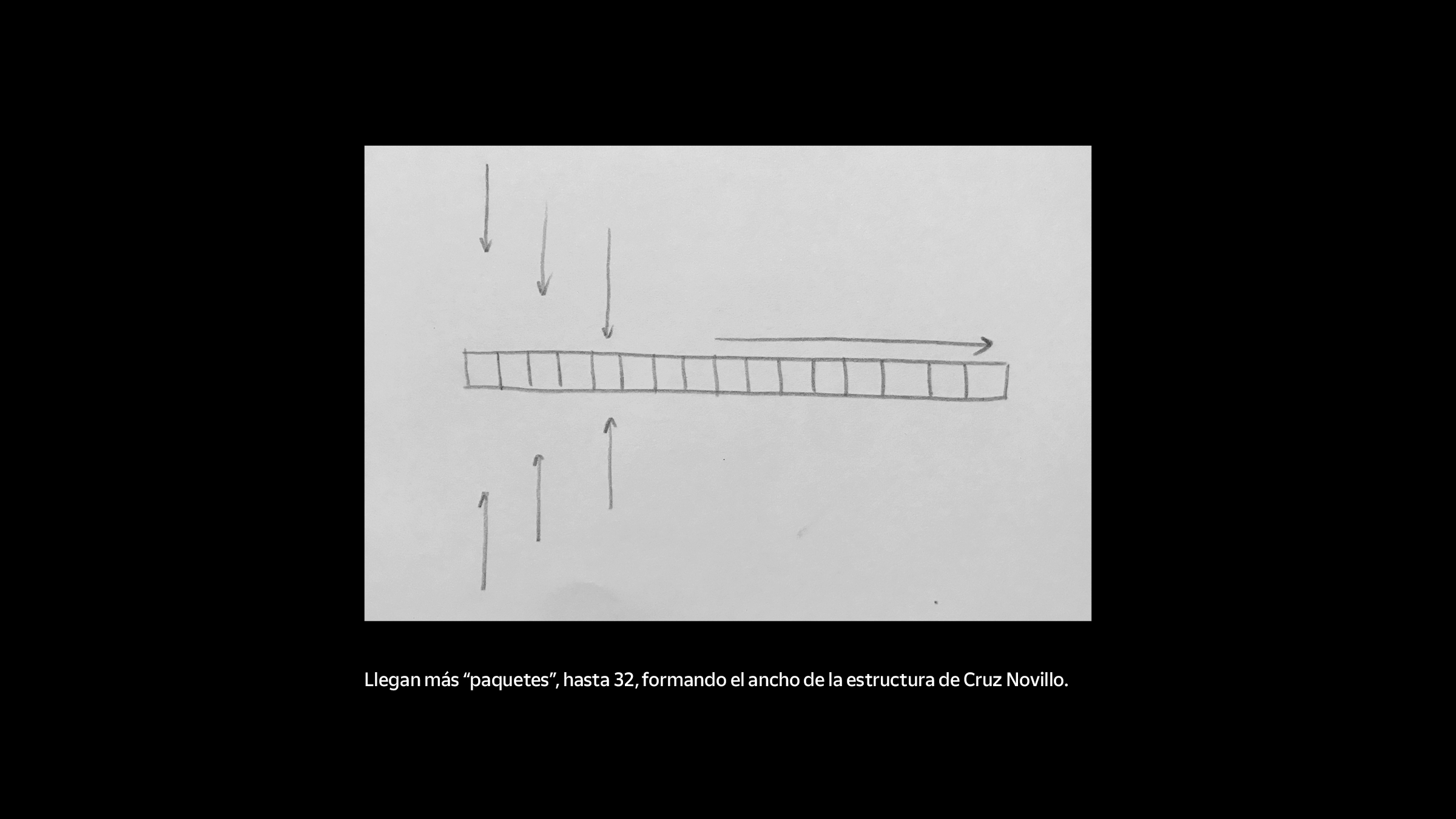
THE PROCESS
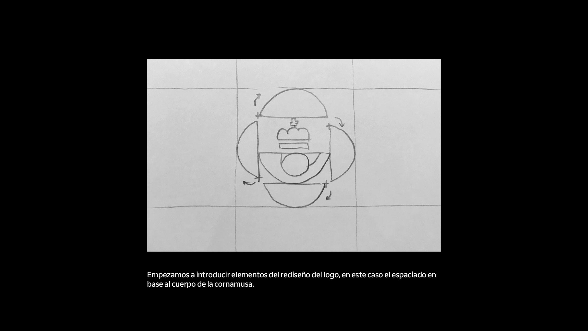
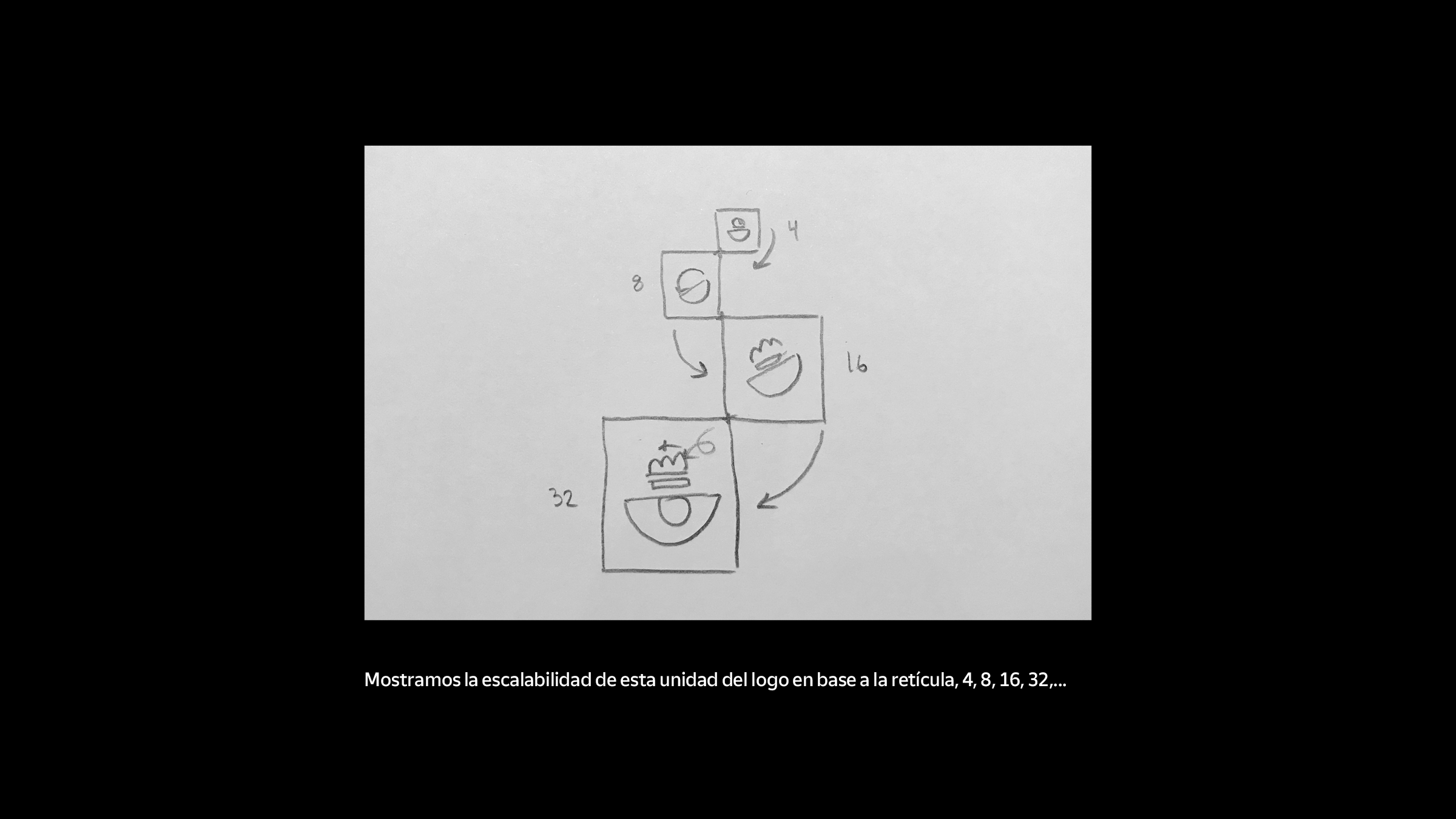
All the graphics are meticulously built from a 100 px square grid, in order to achieve perfect lines (for the same reason, strokes are always an even number of pixels wide). Given the circular nature of the original Correos logo, portions of circles (1/4, 1/2, 3/4 & 1/8) are mostly used to design the graphics.
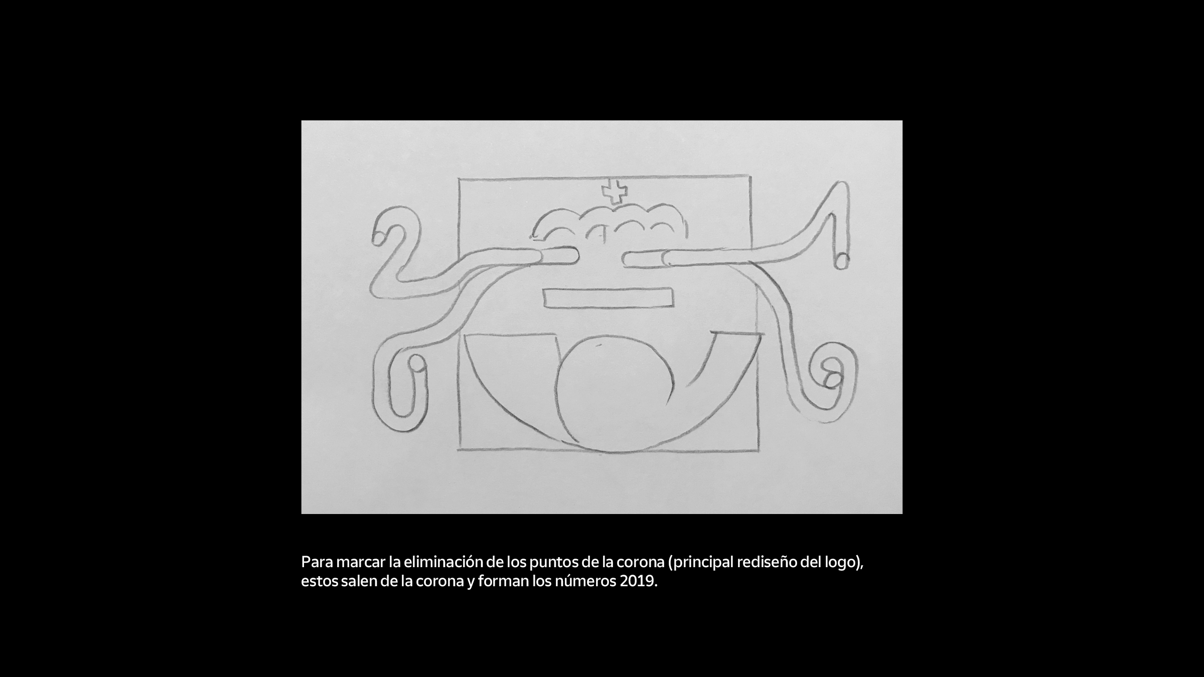
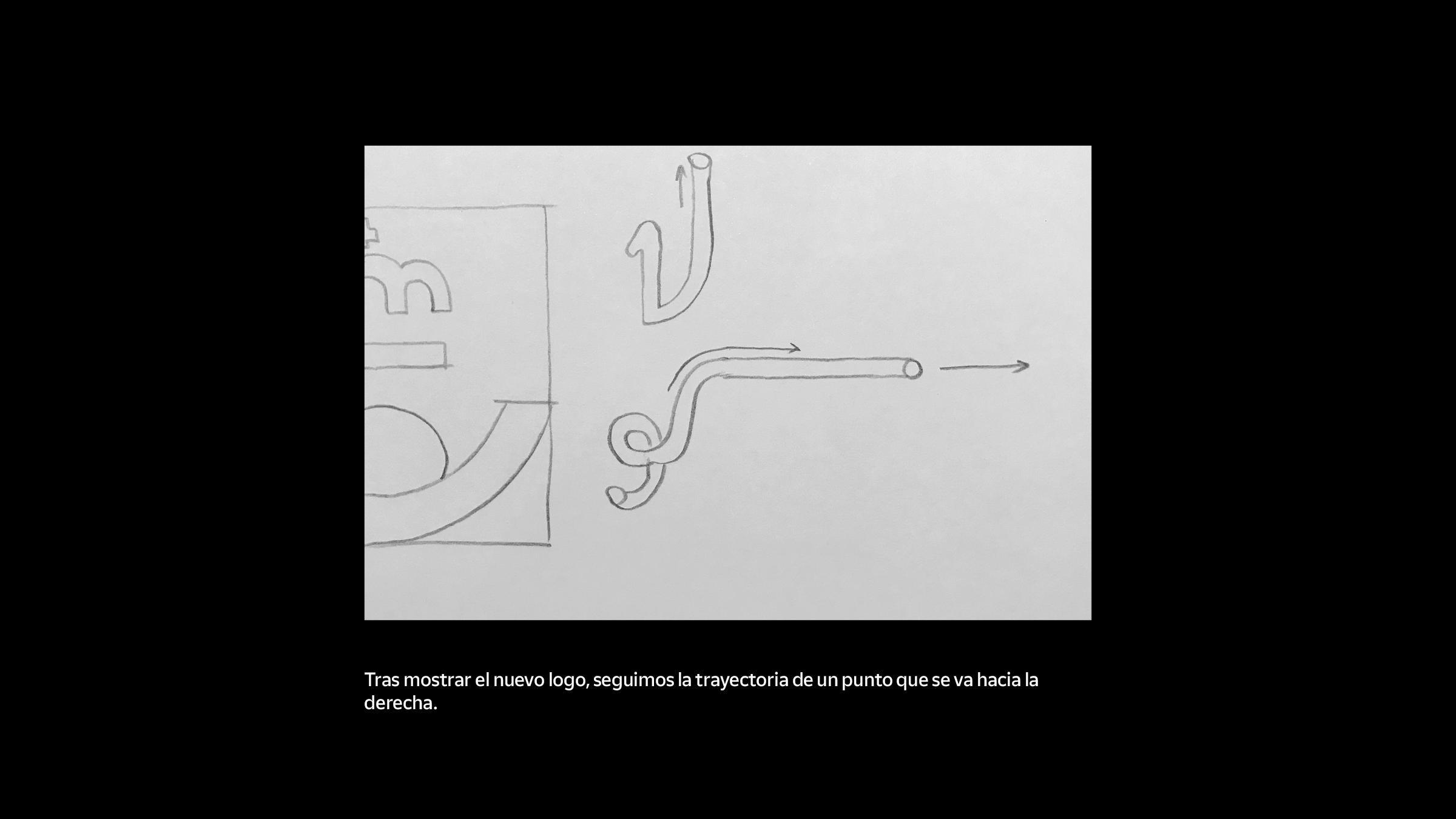
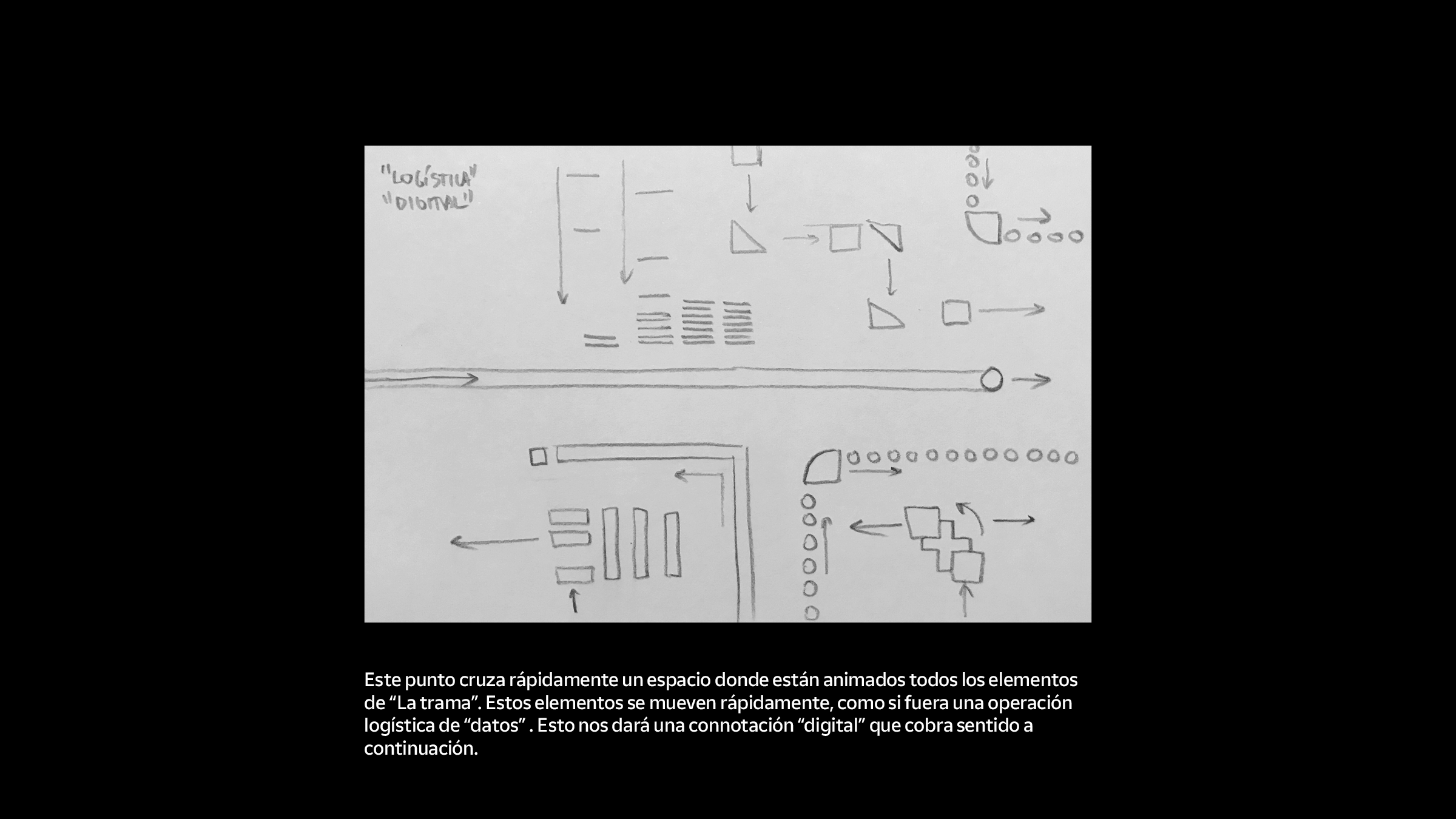
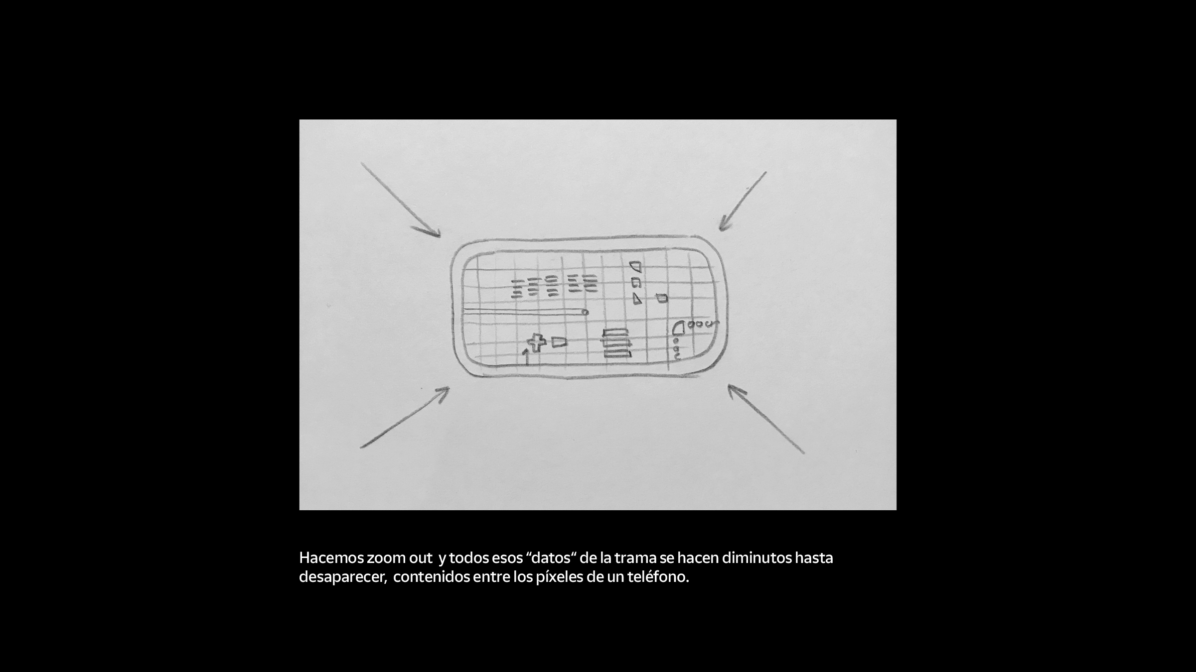
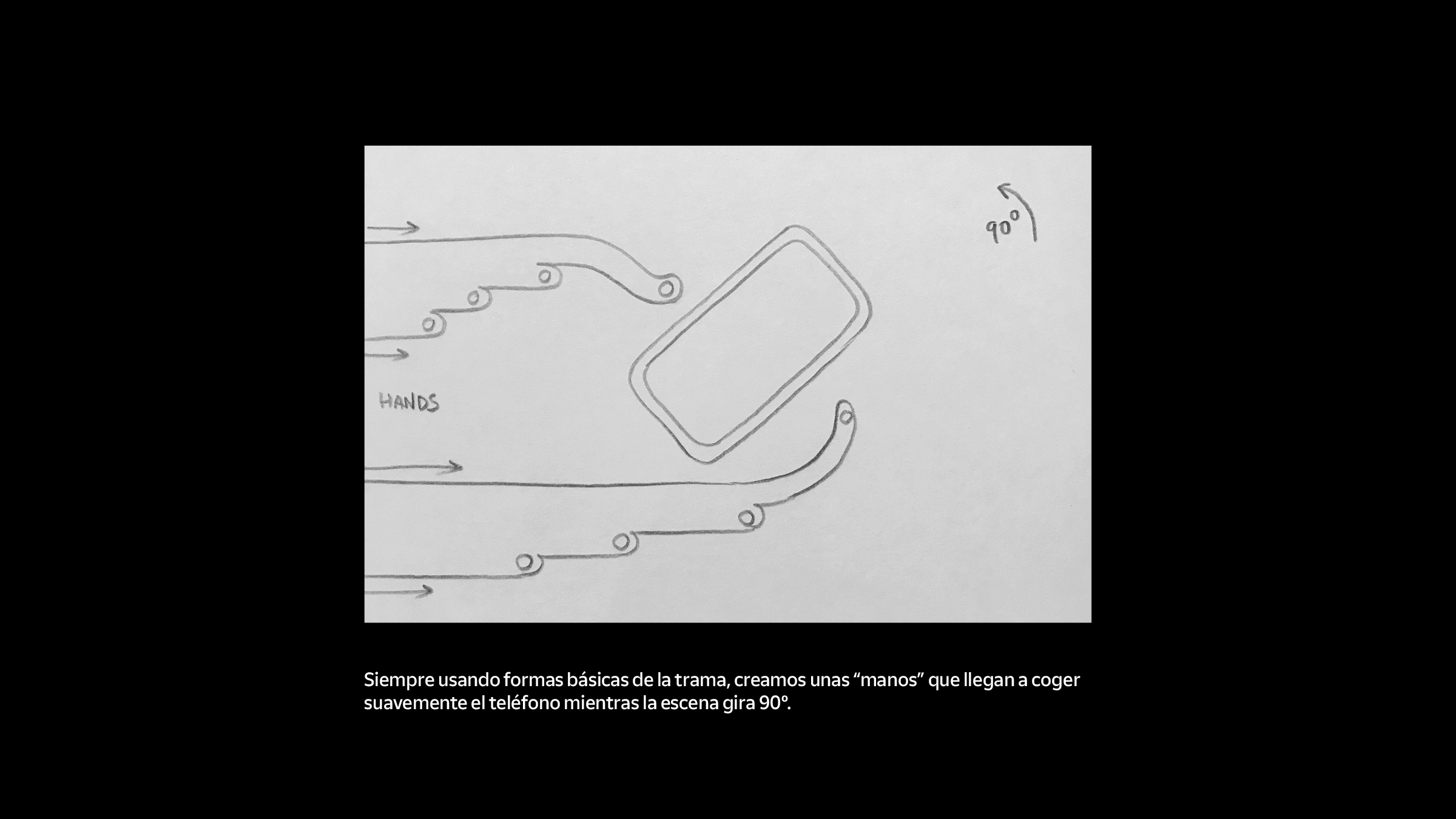
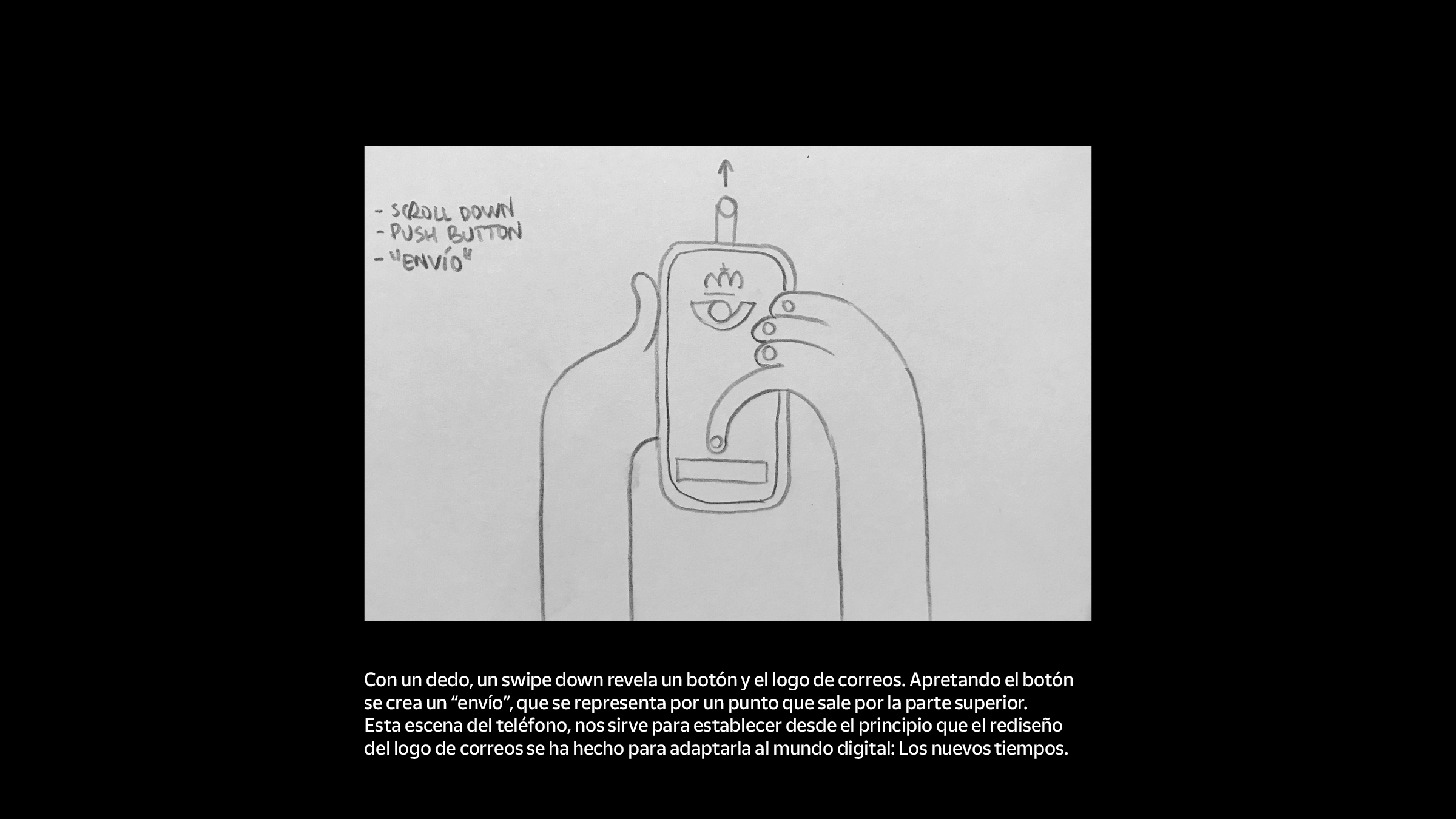
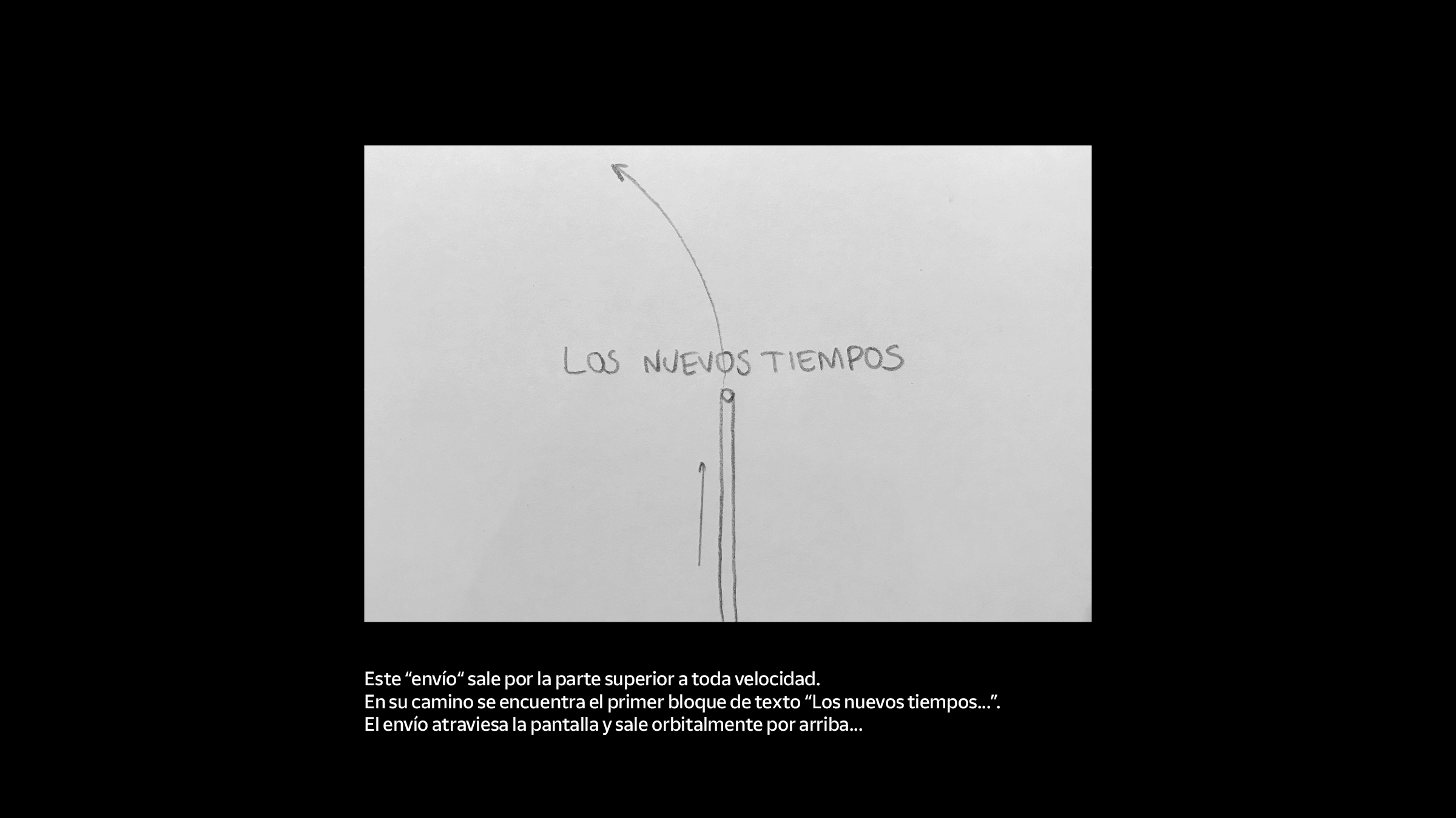
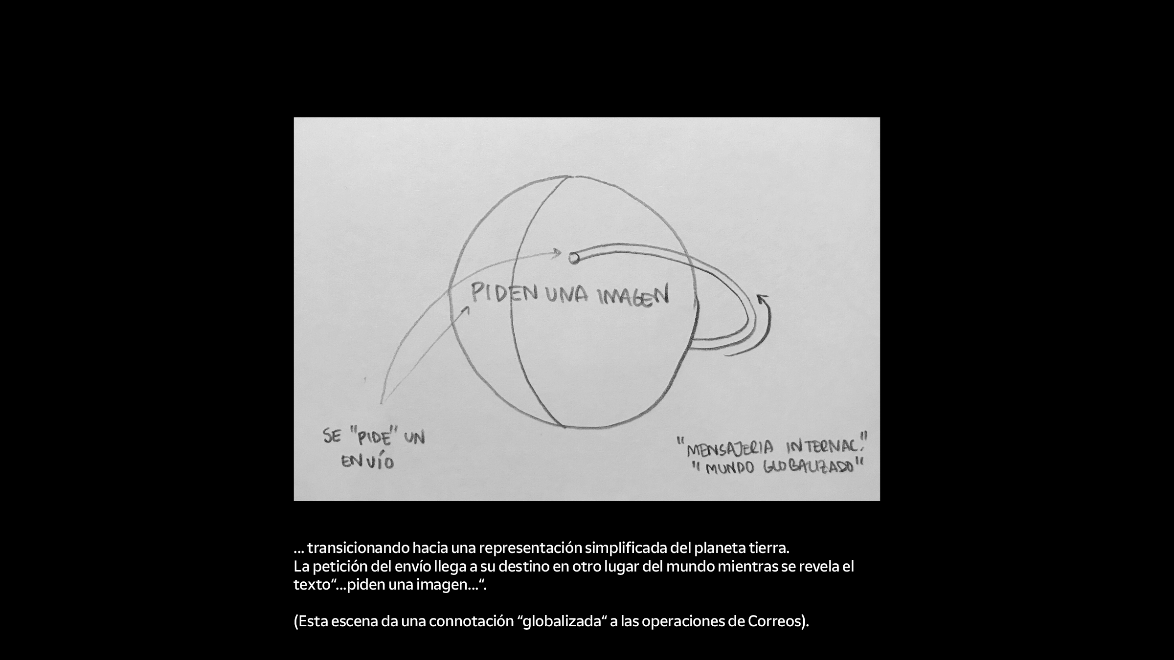
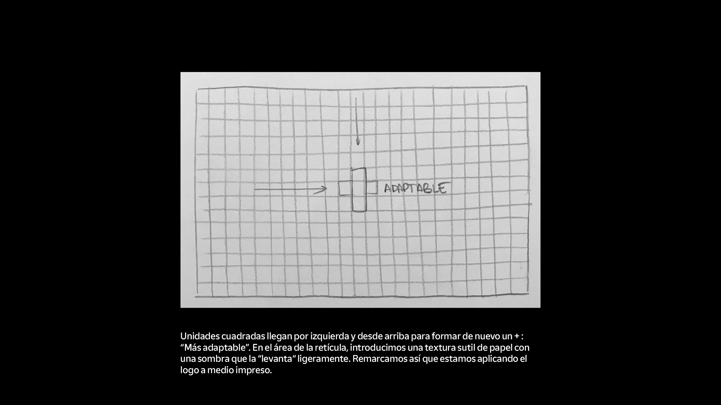
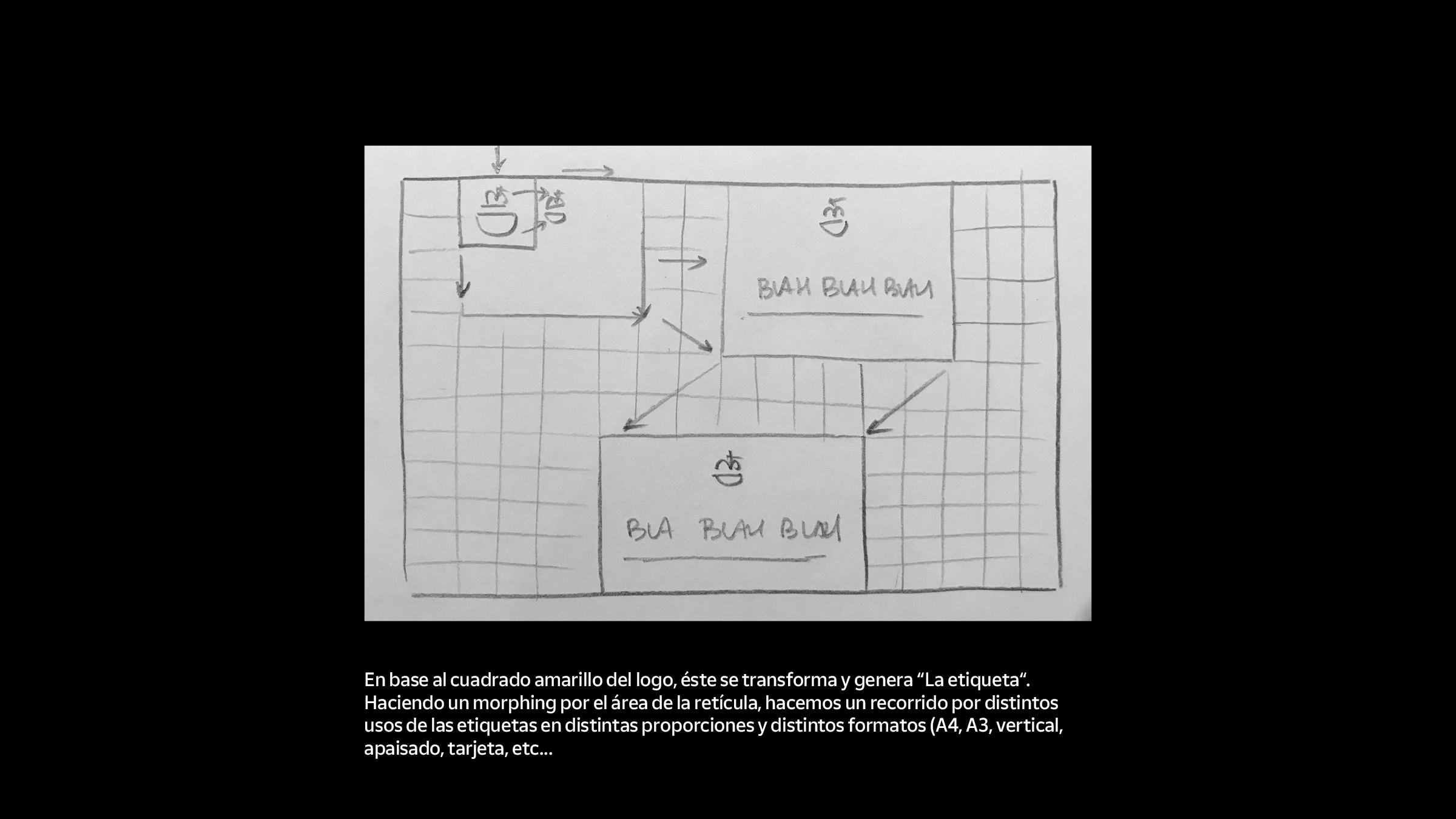
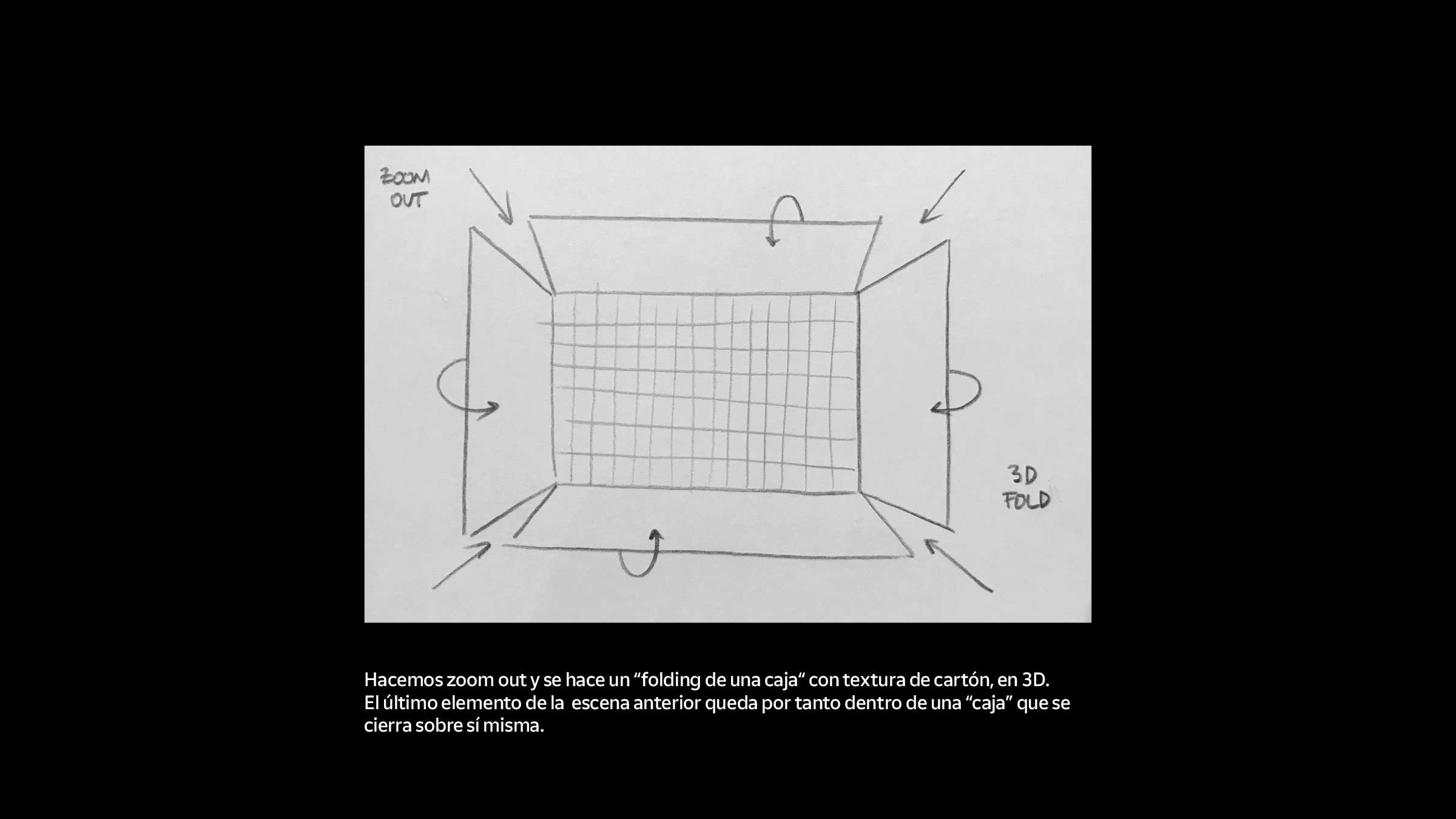
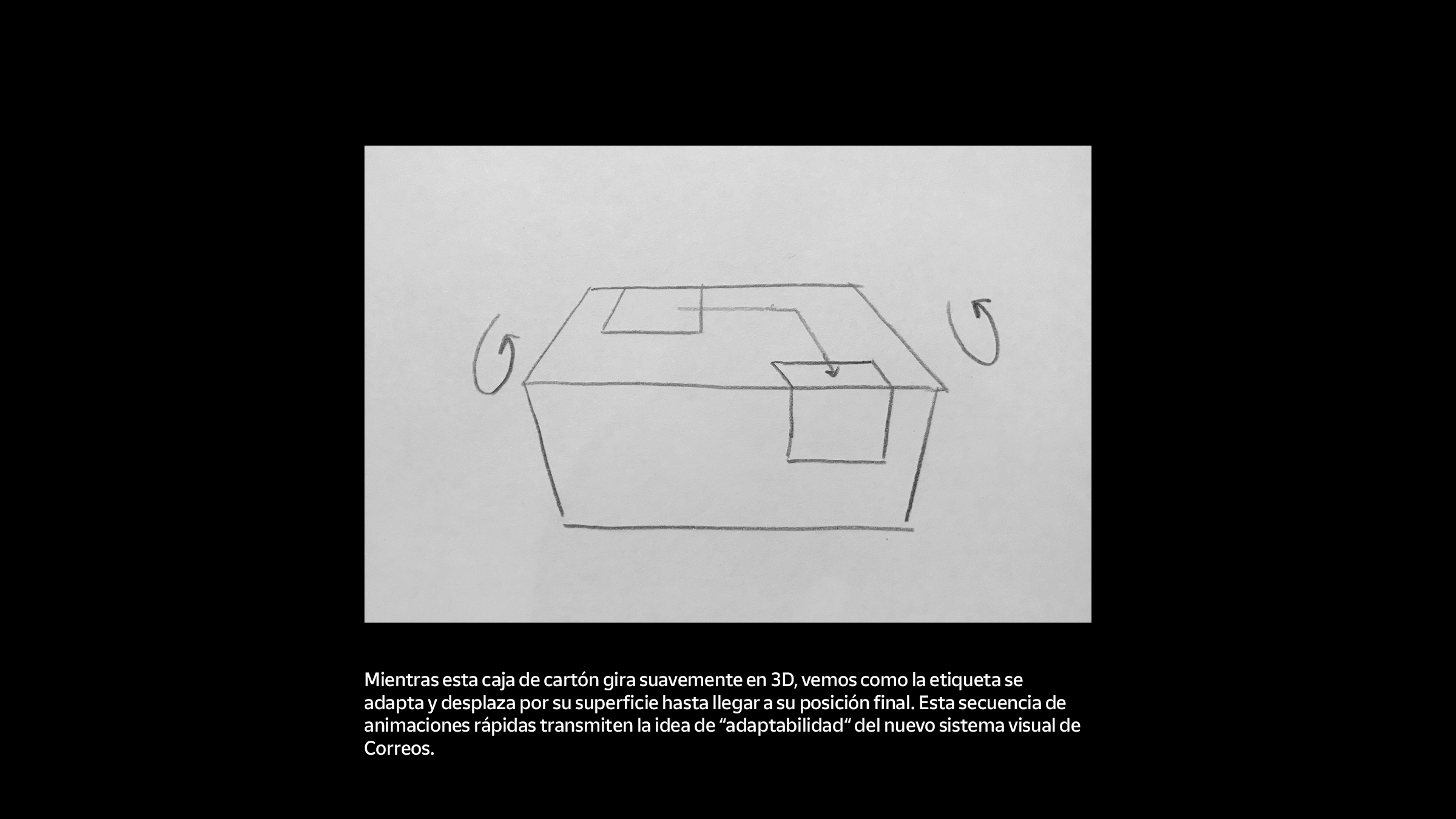
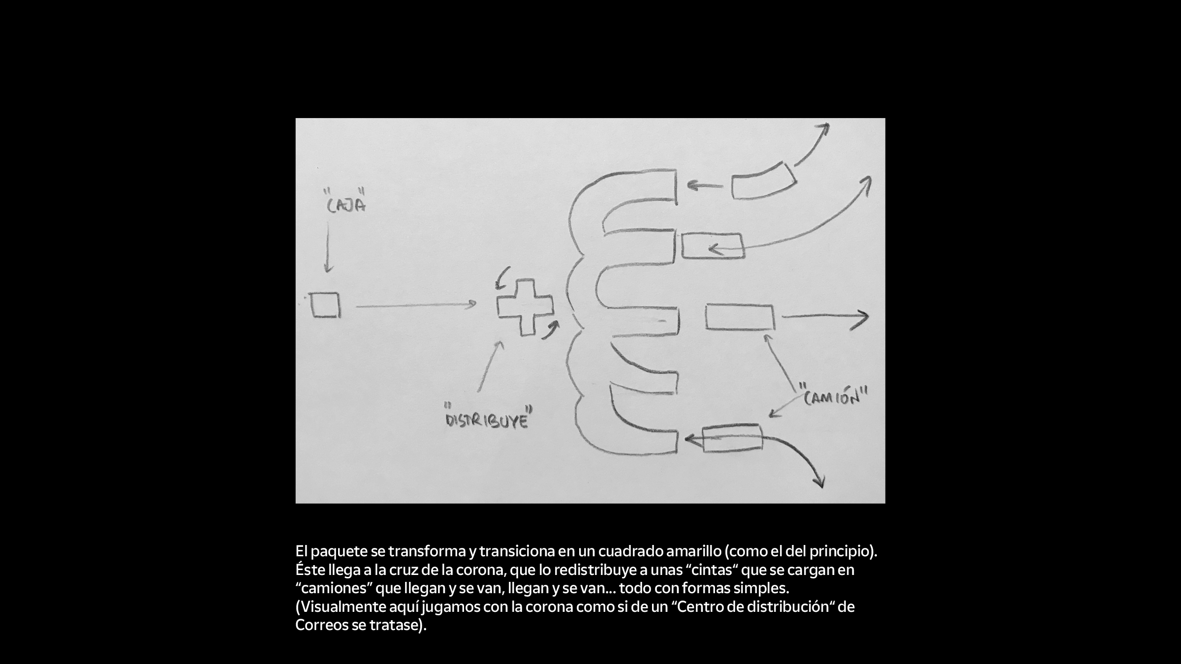
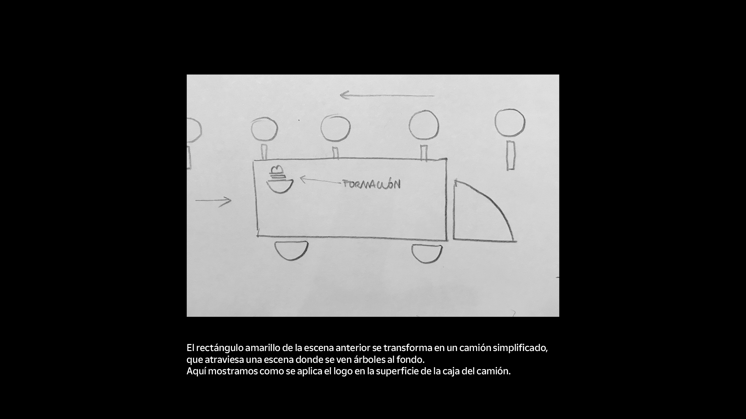
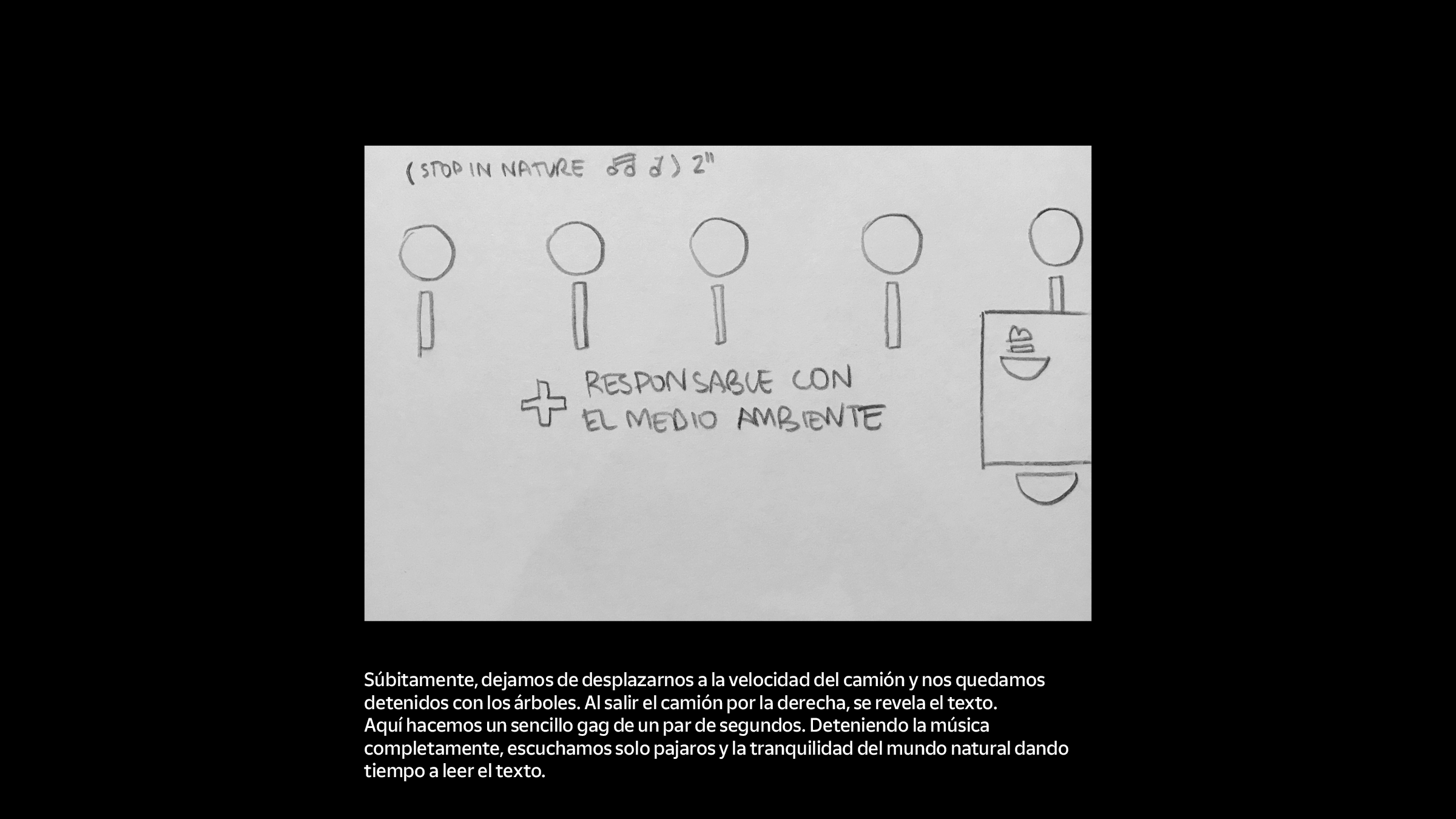
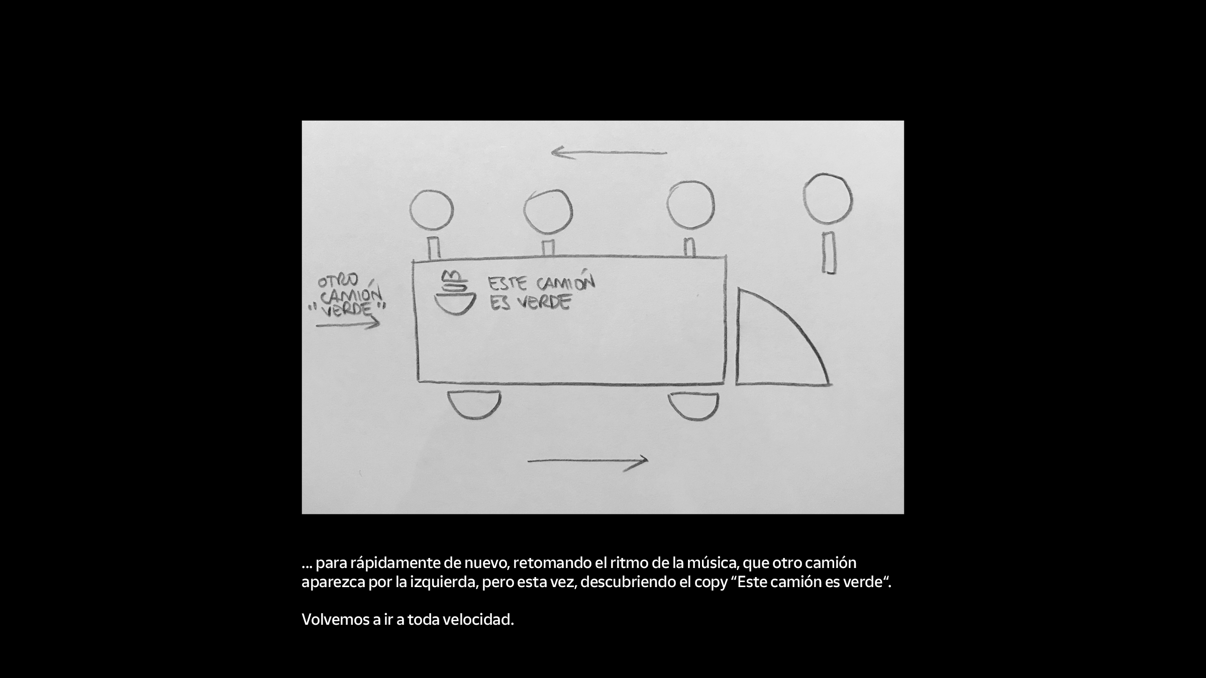
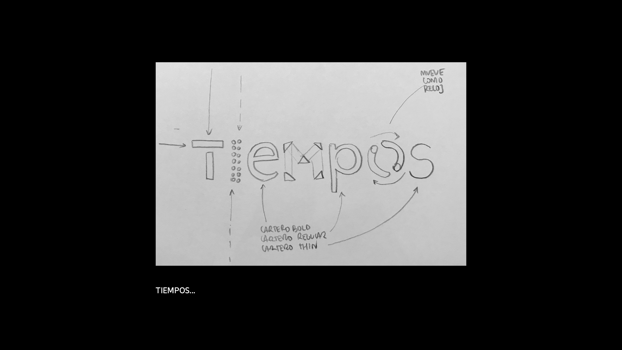
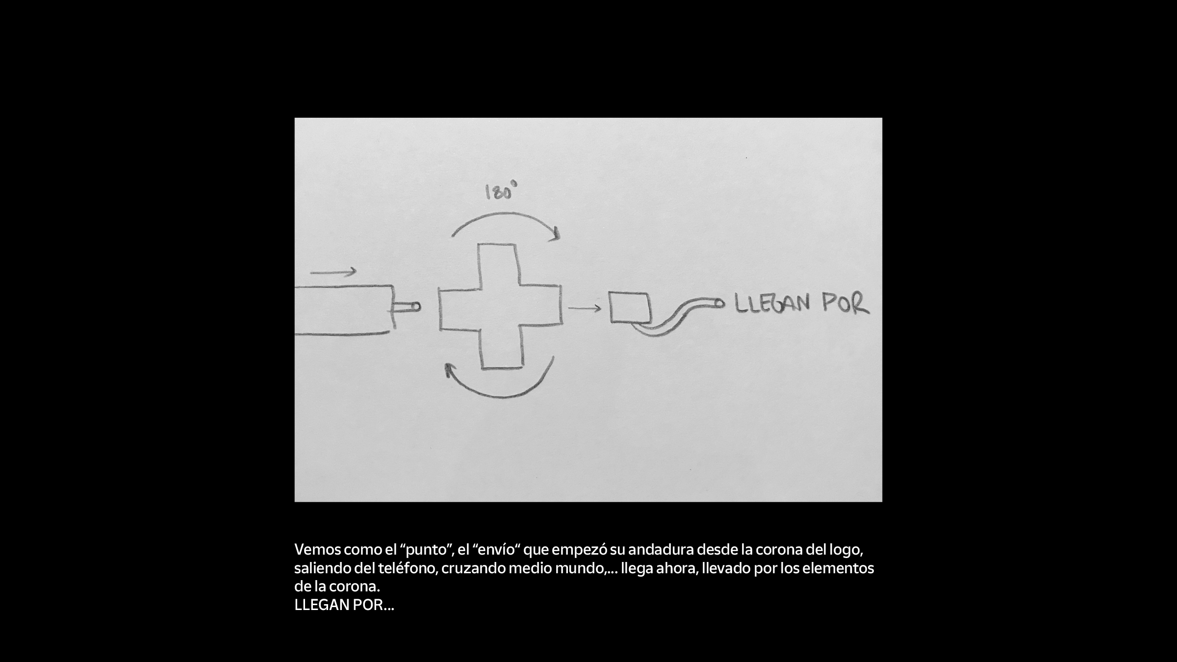
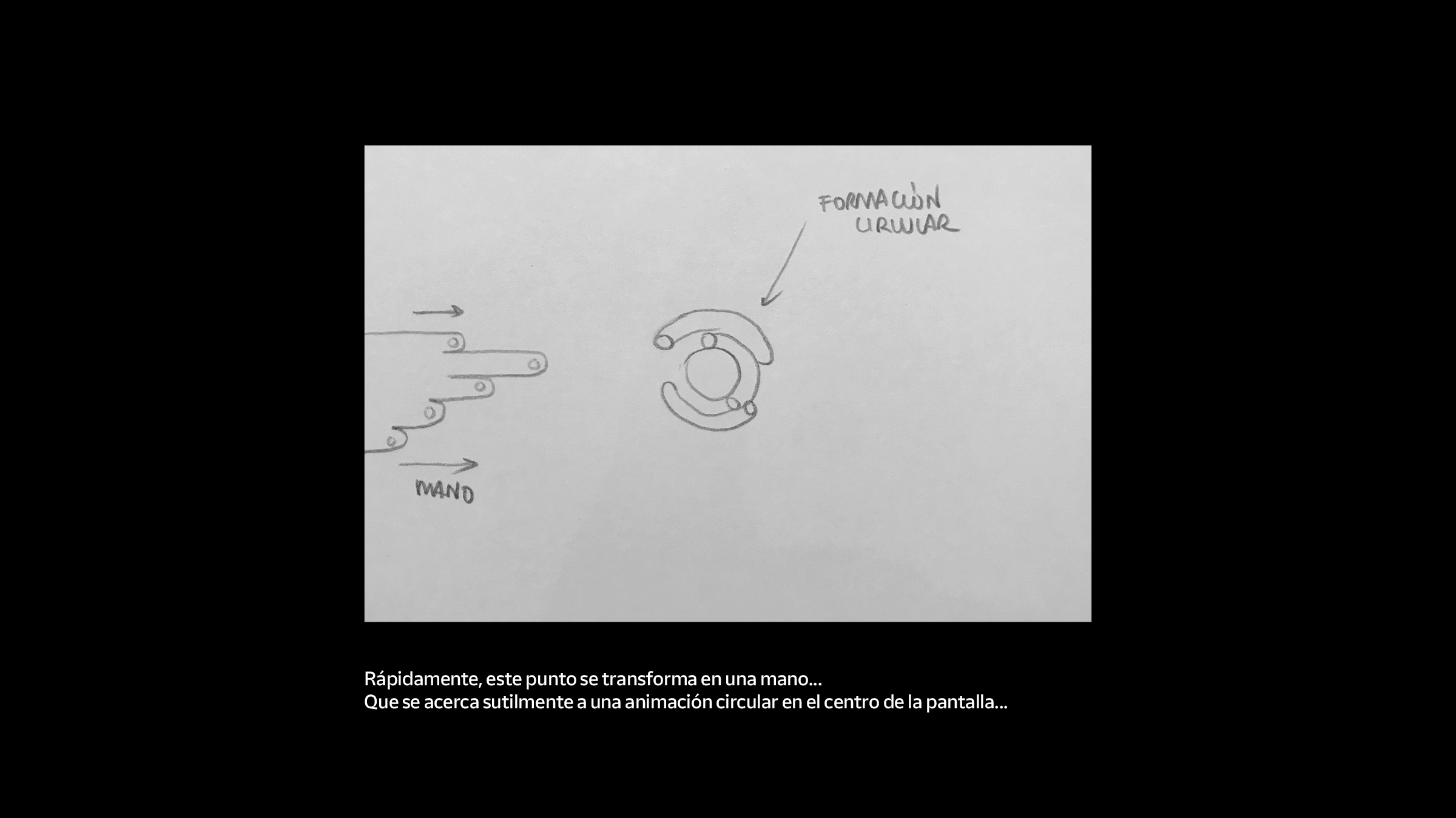
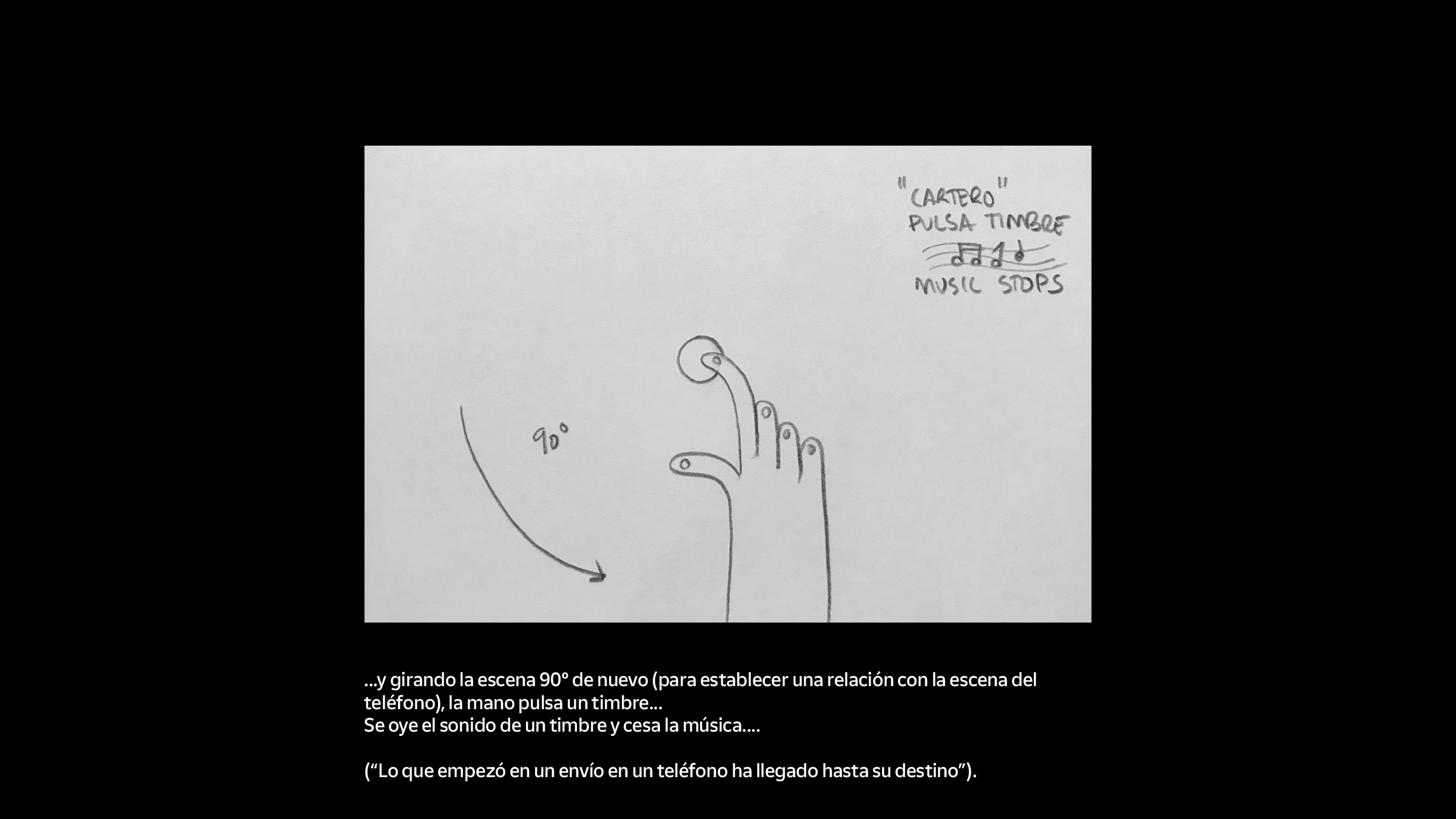
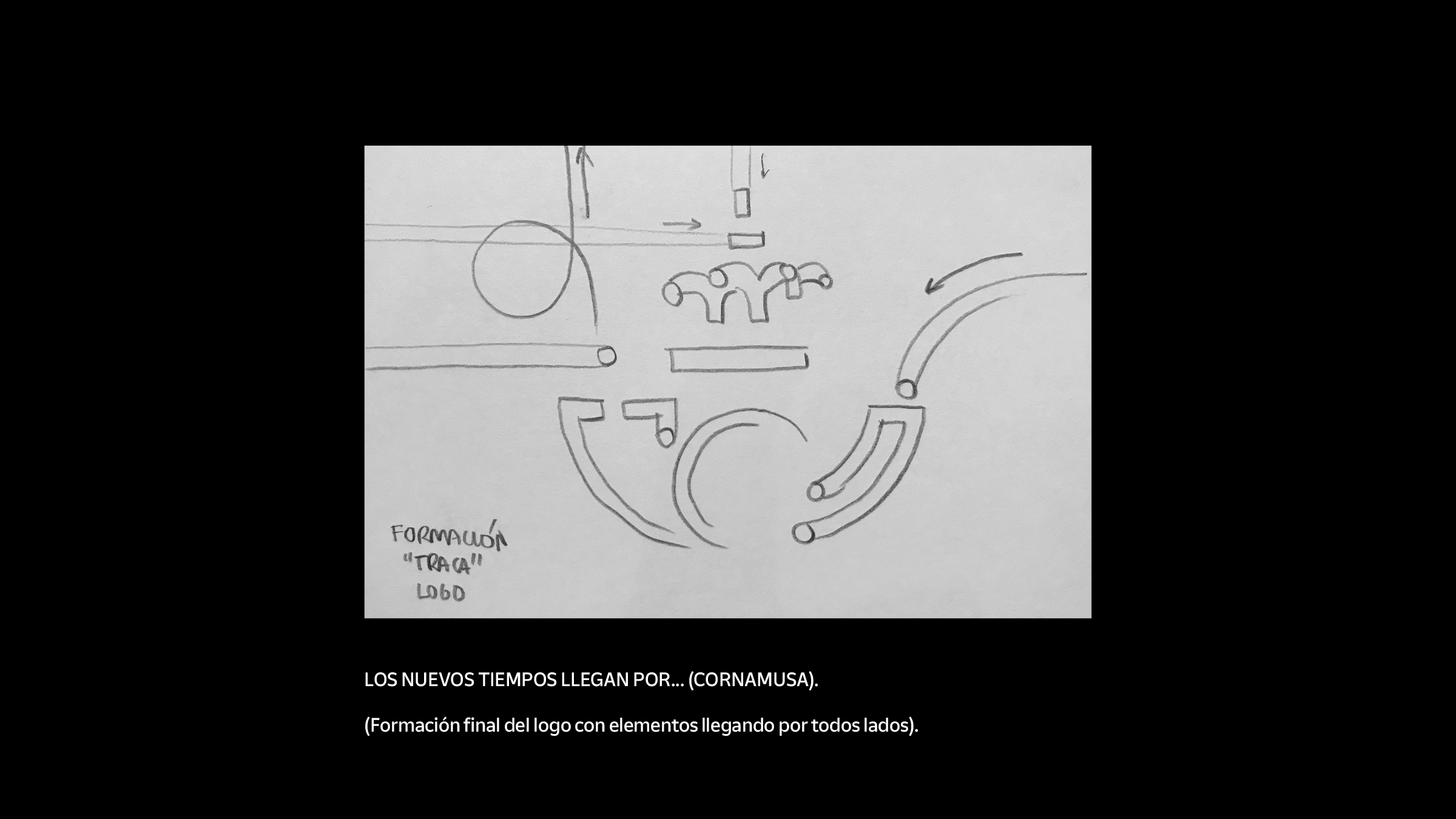
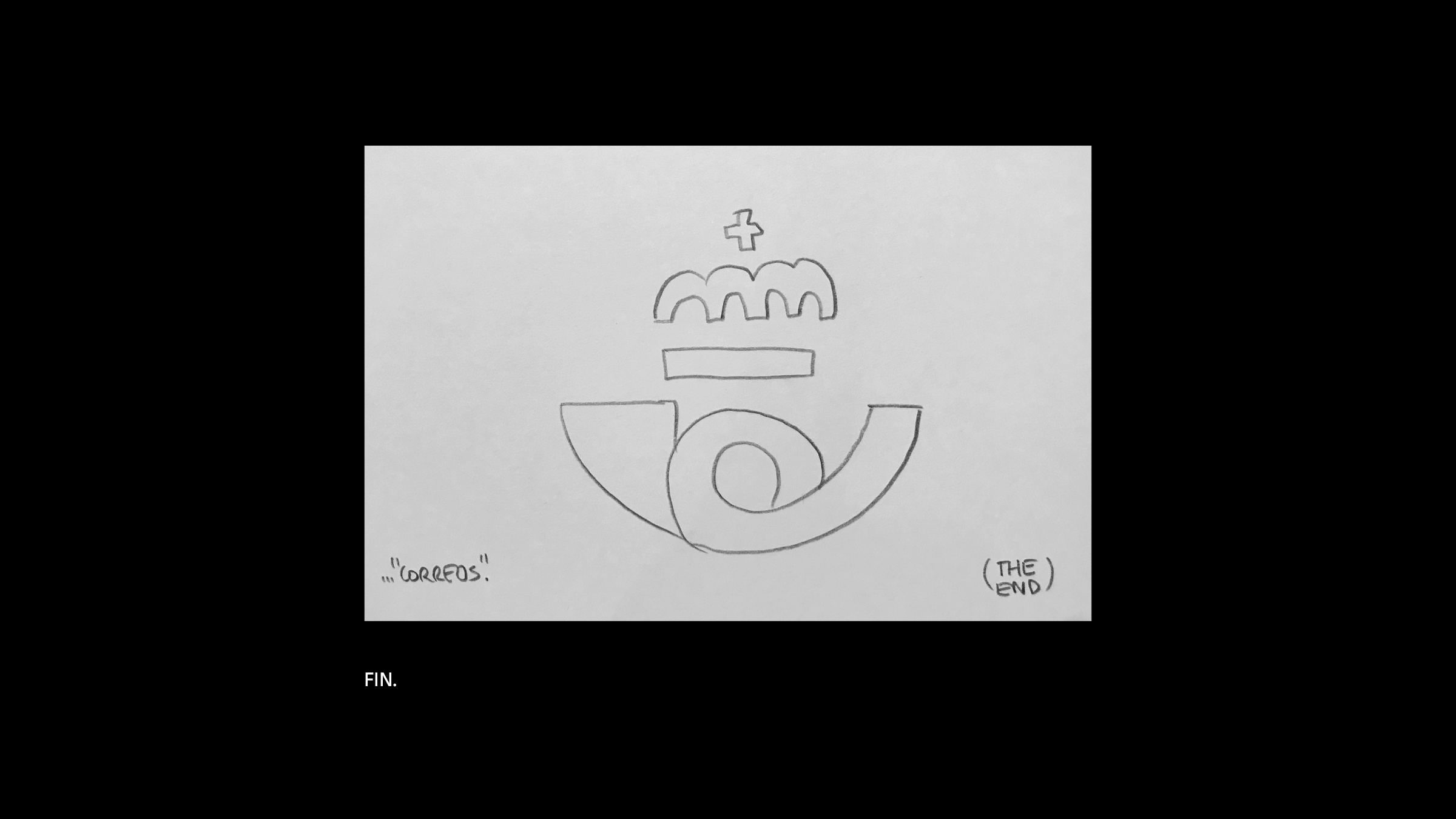
STORYBOARD
Even if many scenes were improved during production, the treatment storyboard shows a very close idea to the final solution, achieved weeks later. This goes to show the importance of locking a storyboard and having a clear direction, for a smooth production process and successful end result.

CREATIVE ROLE: Creative, art & film direction, design, story, animation.
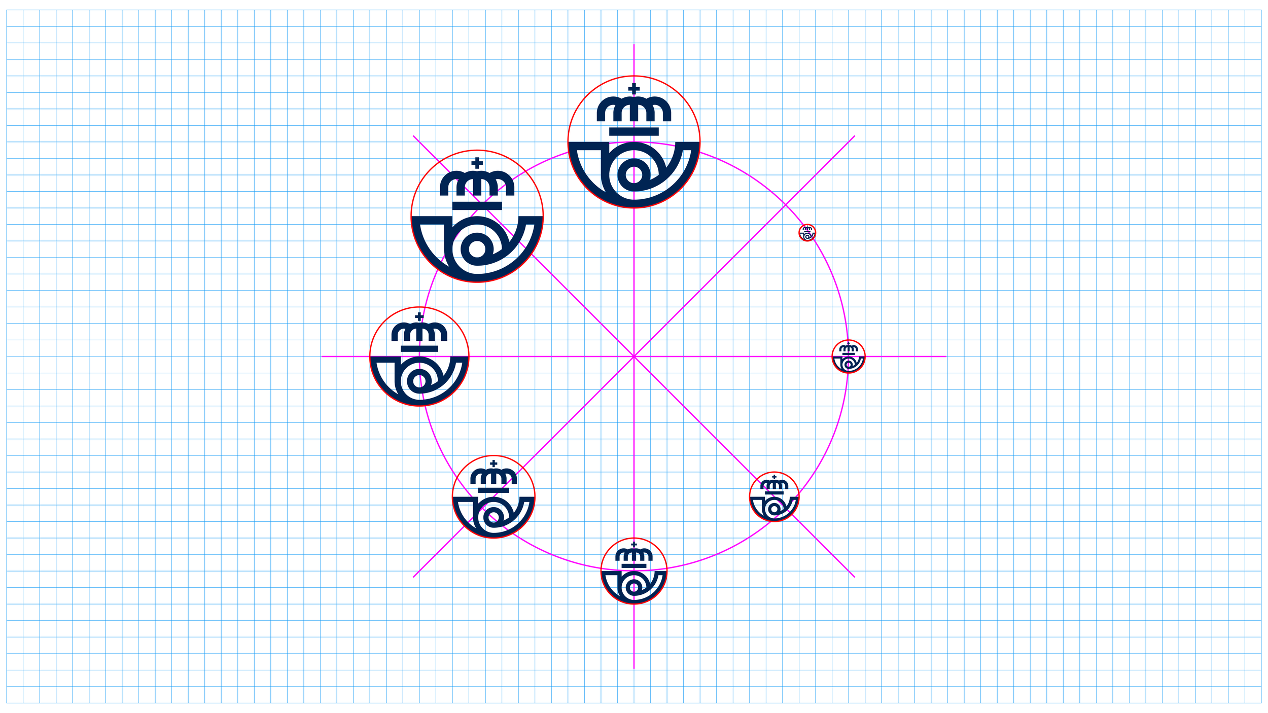
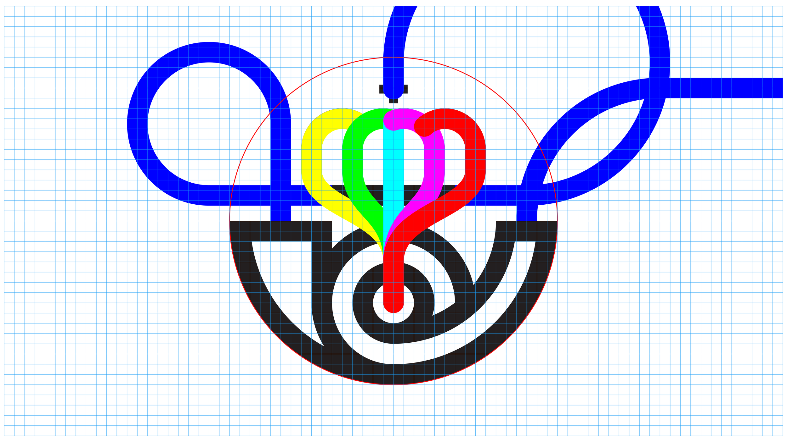
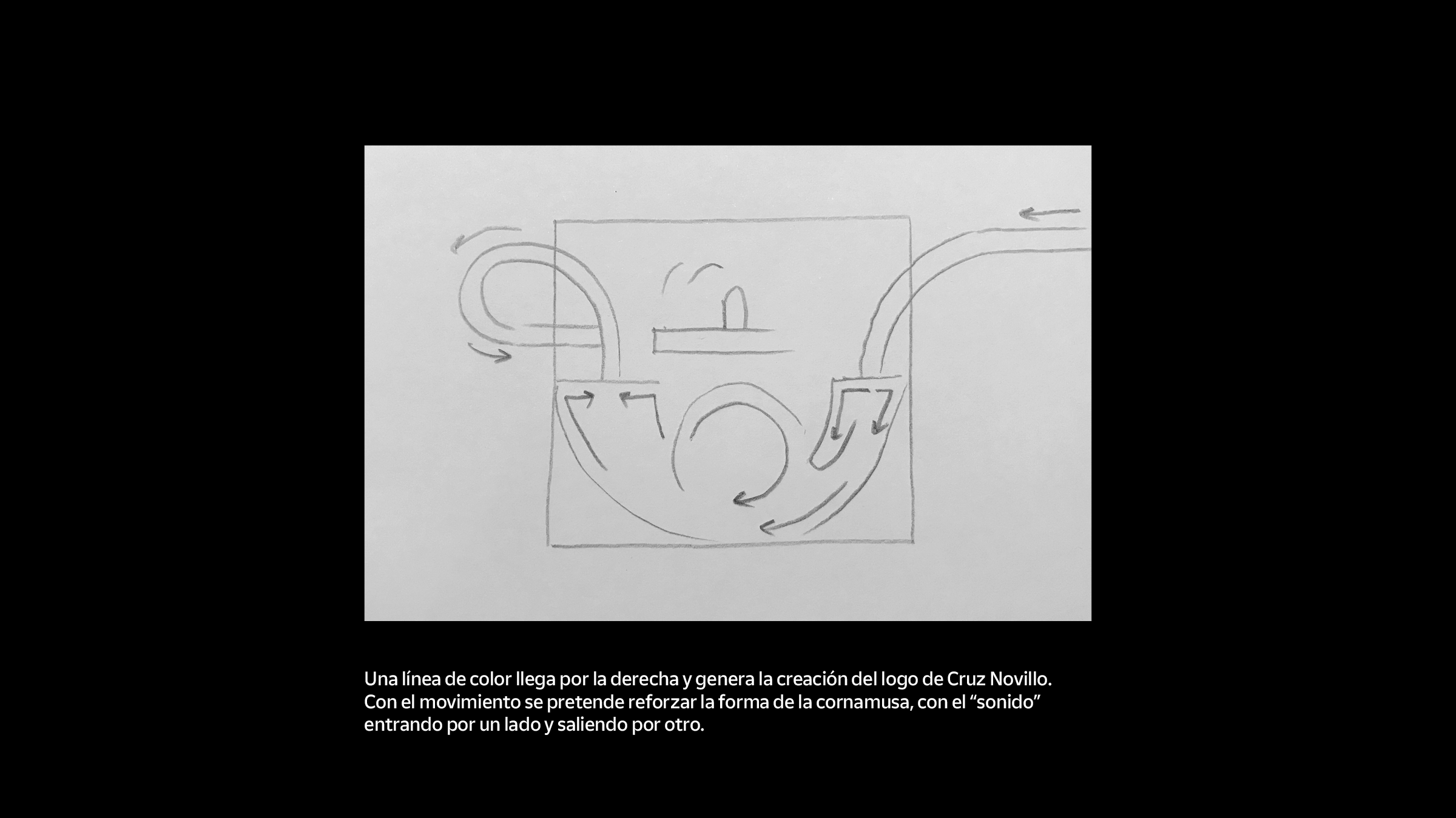
ABOUT CRUZ NOVILLO
The original Correos logo is one of the masterpieces of spanish graphic designer Cruz Novillo, arguably the most important visual artist of modern spanish history. Certainly the most mainstream as only this logo has over 300 million printed applications and he designed the bank notes of spanish currency “Peseta“.
He has masterfully chiseled the shapes of his logos and graphics in the spanish collective unconscious of past and present generations. Looking at his body of work, one wonders if this is what happens when a designer has learned to remove all ego from the design process, putting oneself in complete service to the idea: anonymous immortality.
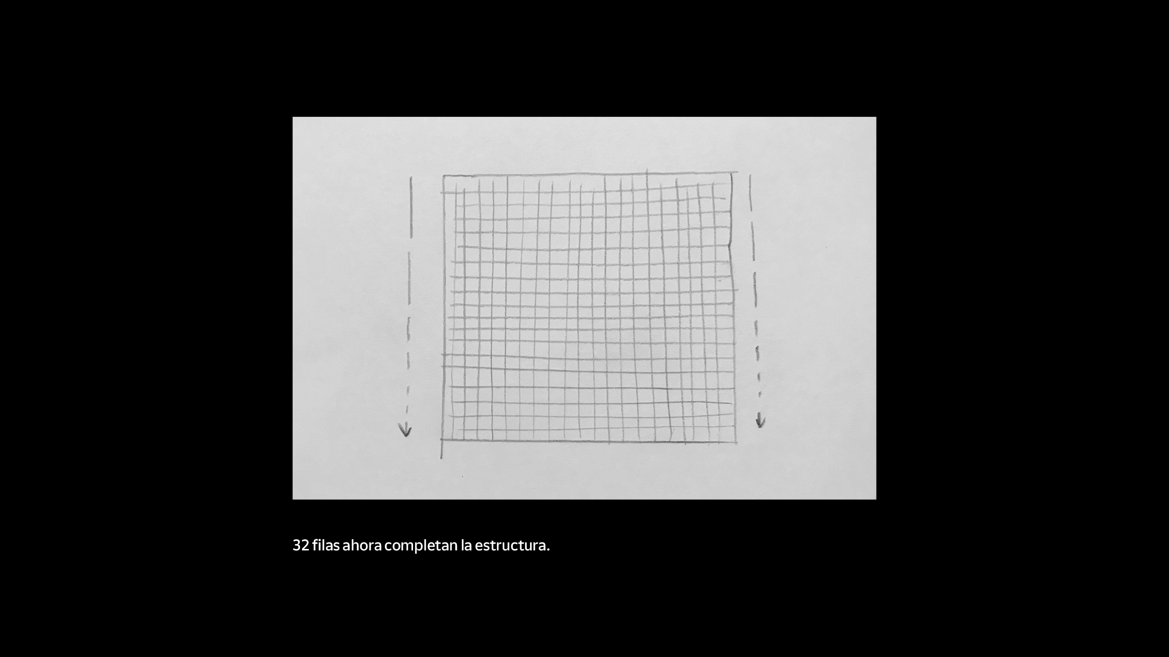
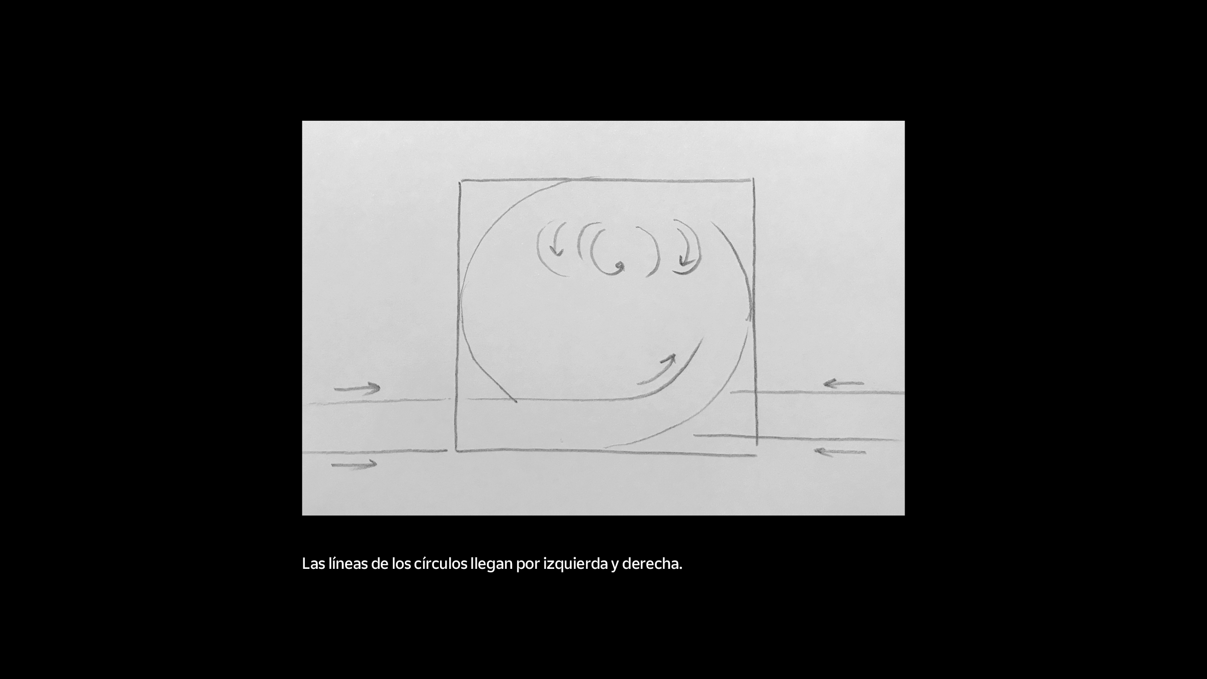
Shown below, the construction of the original Correos logo from 1977.

From the book "Cruz Novillo LOGOS" Published by COUNTER-PRINT · ISBN 978-0-9935812-3-6
“
First think and then draw. Never draw without having the idea in the head, or in the heart.”