

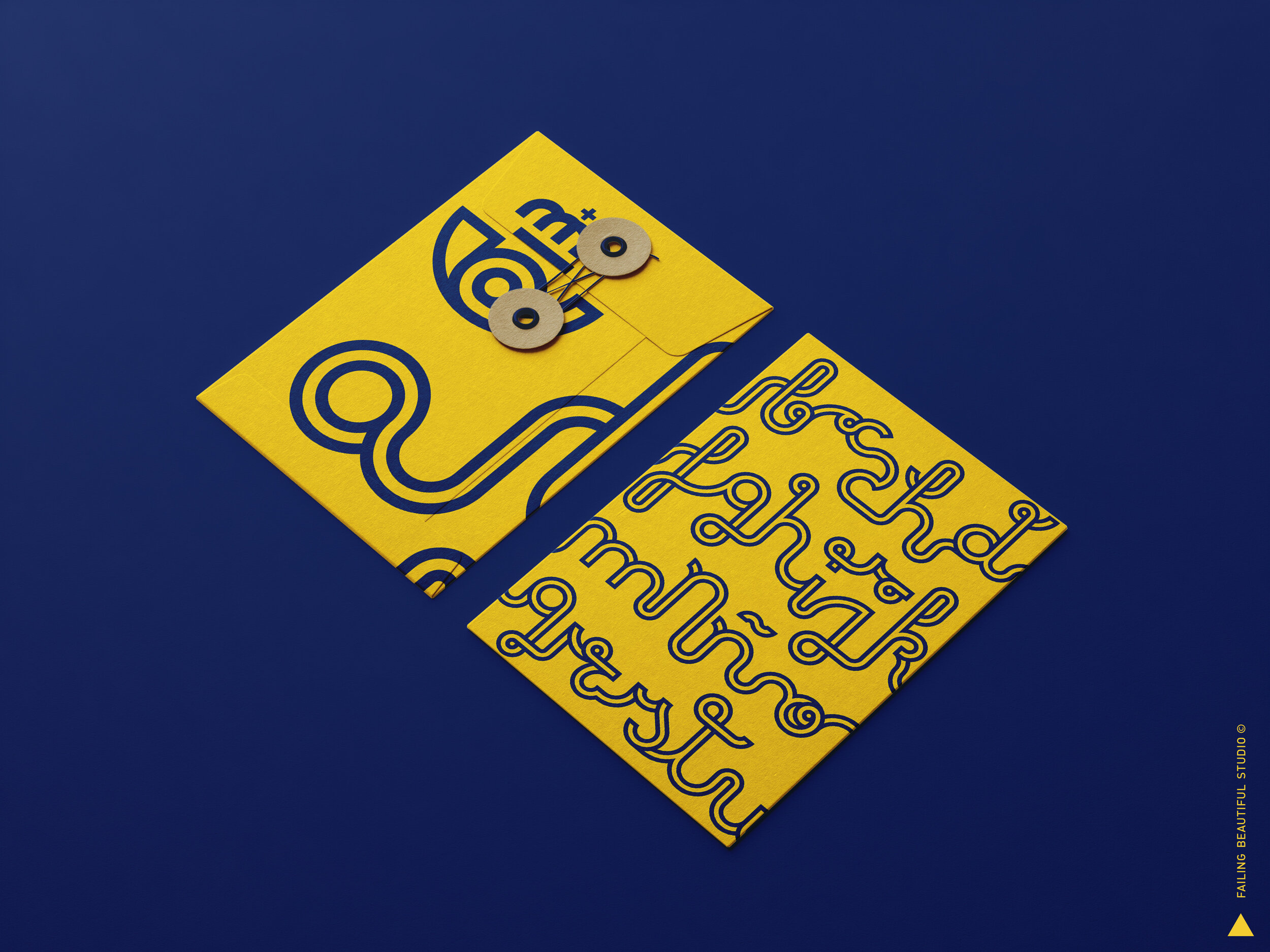
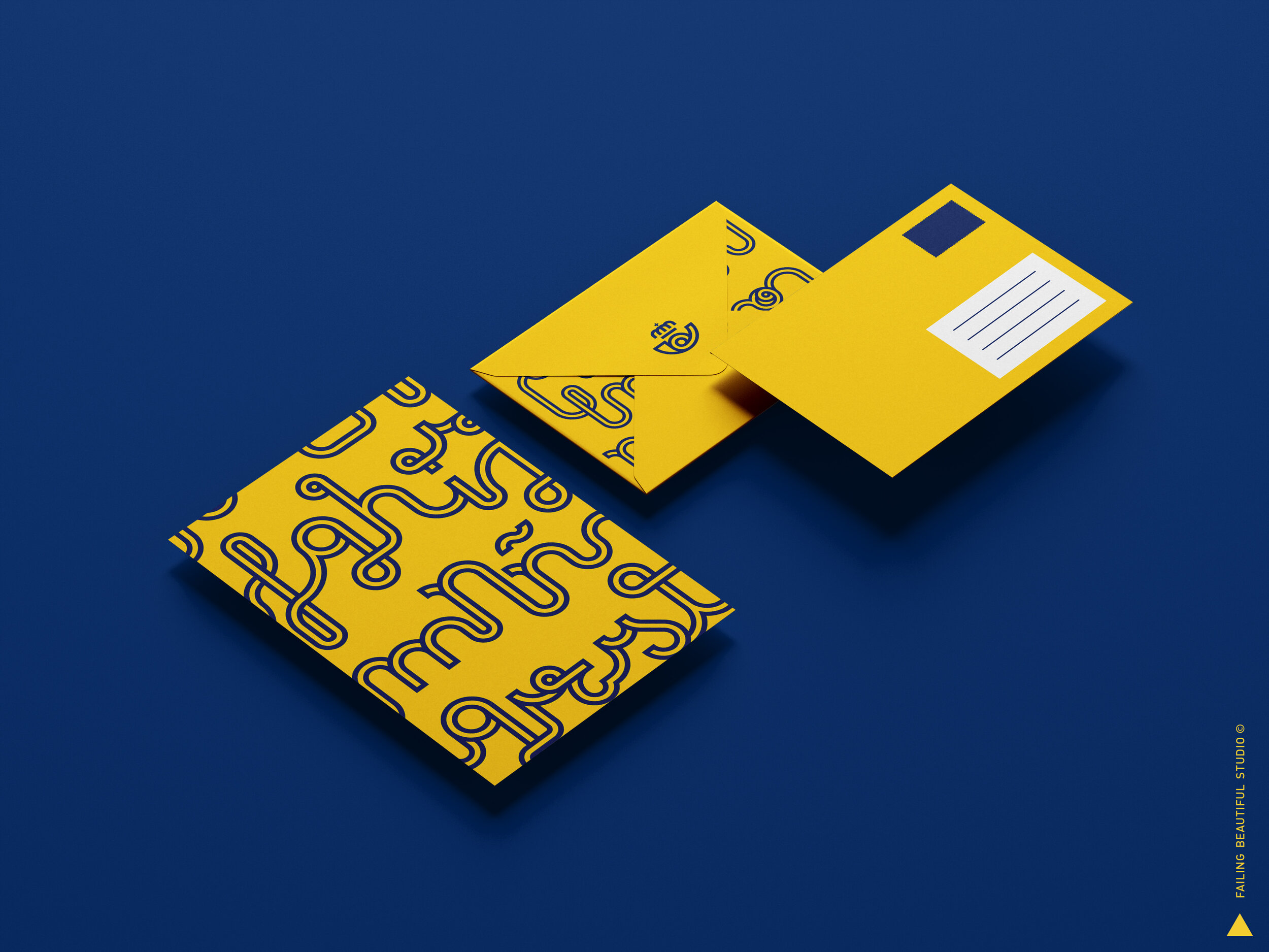
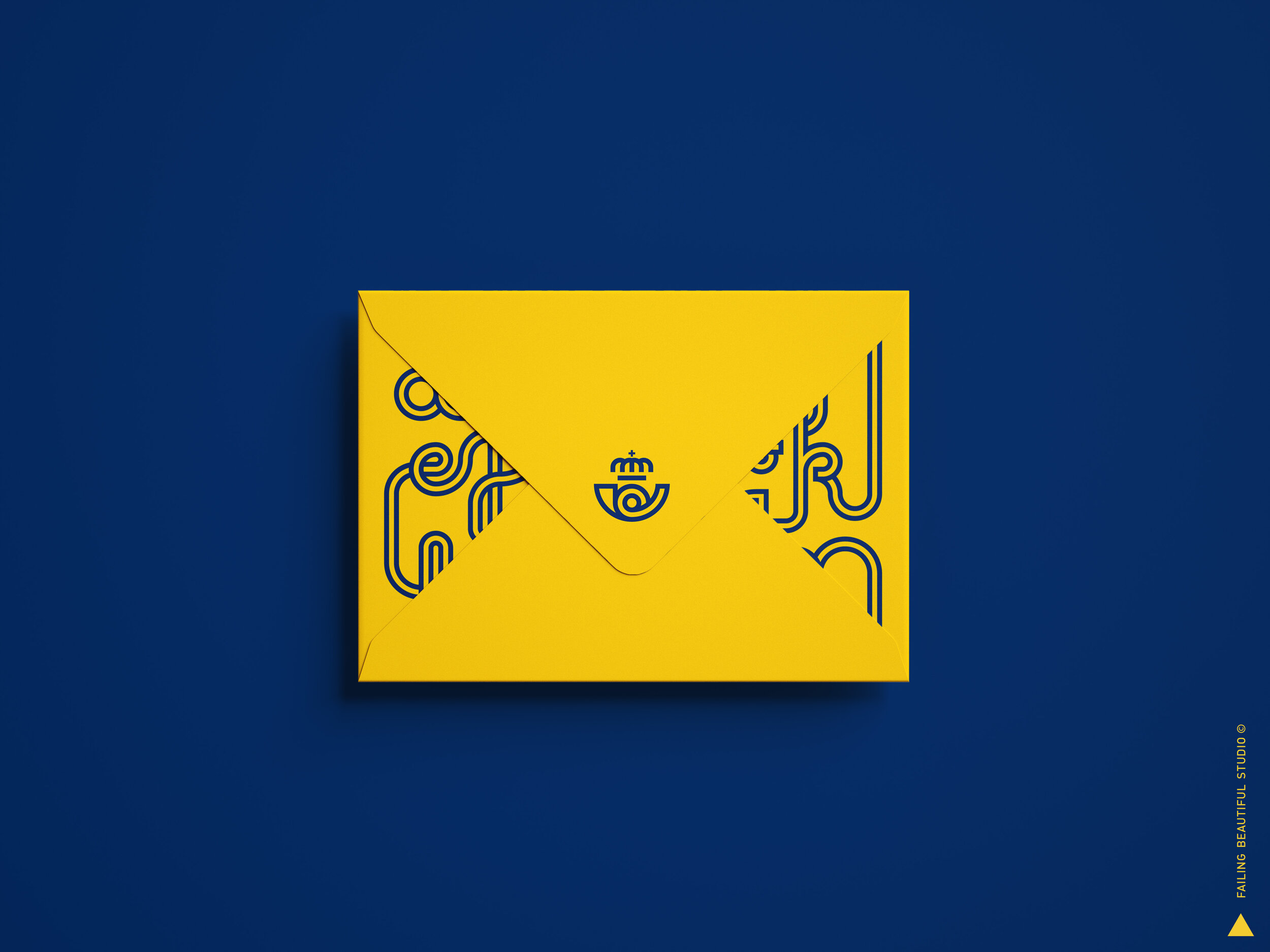
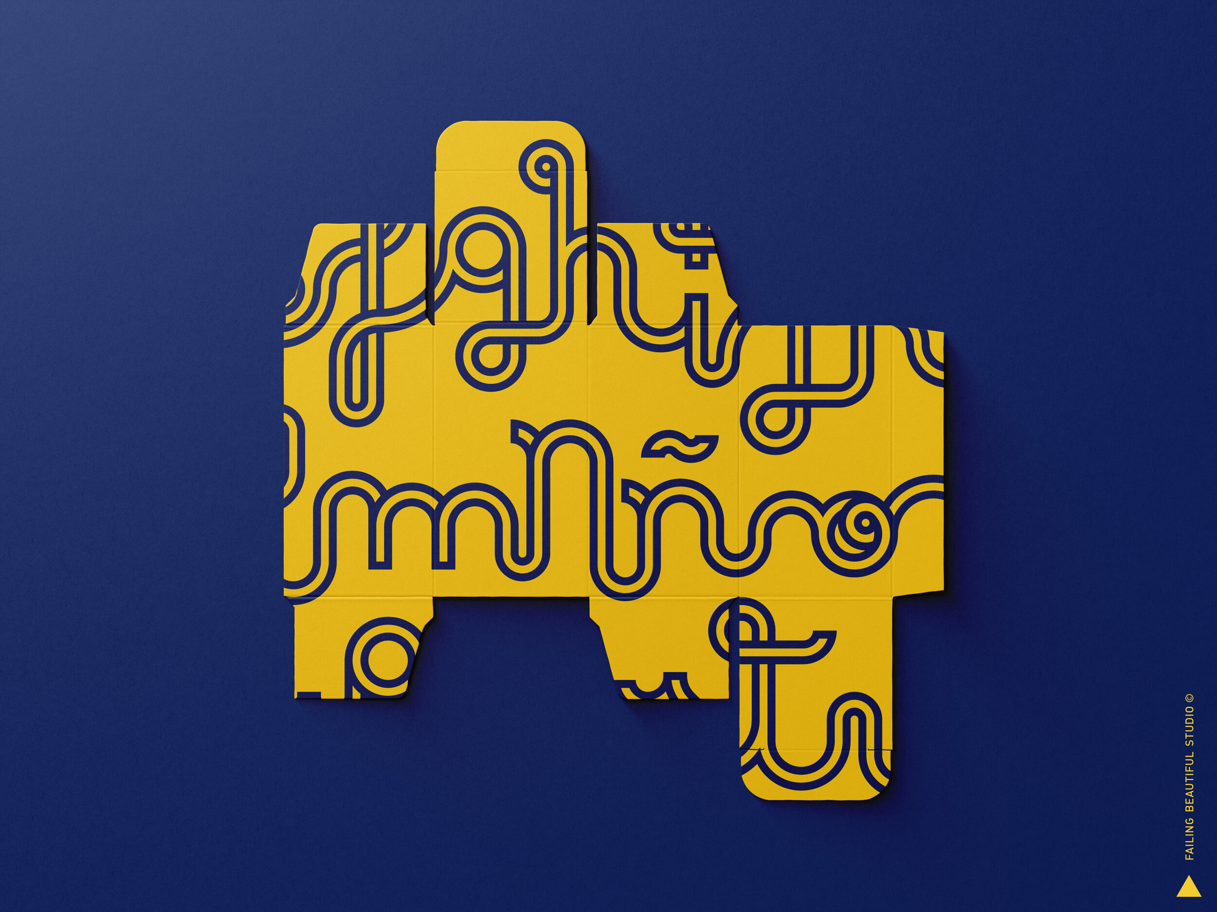
For more than 300 years, Correos has brought Spanish people together by means of sentences, words and characters. Hundreds of millions of personal letters delivered, bringing families, friends and loved ones, closer.
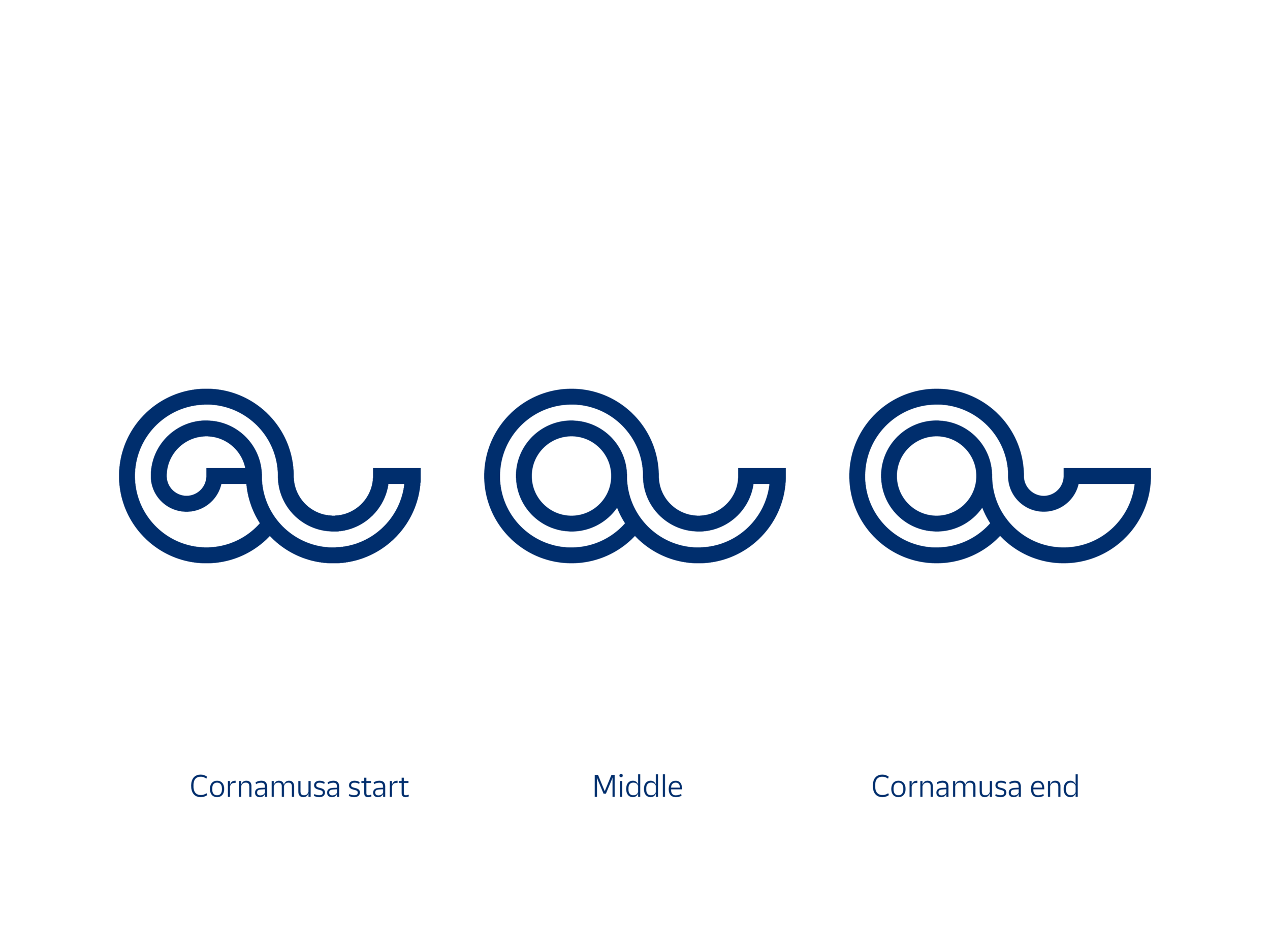
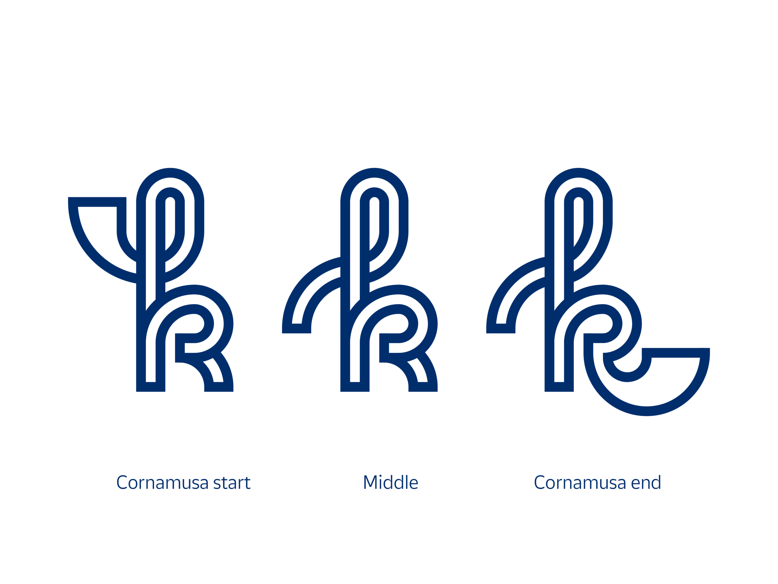
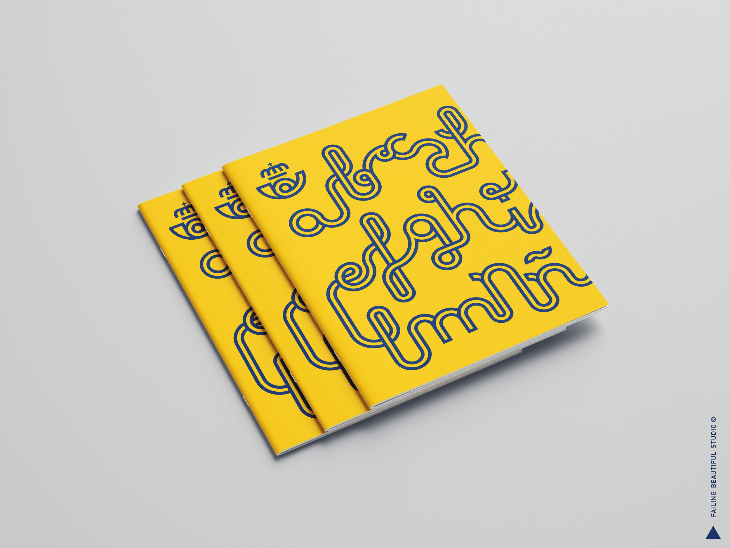
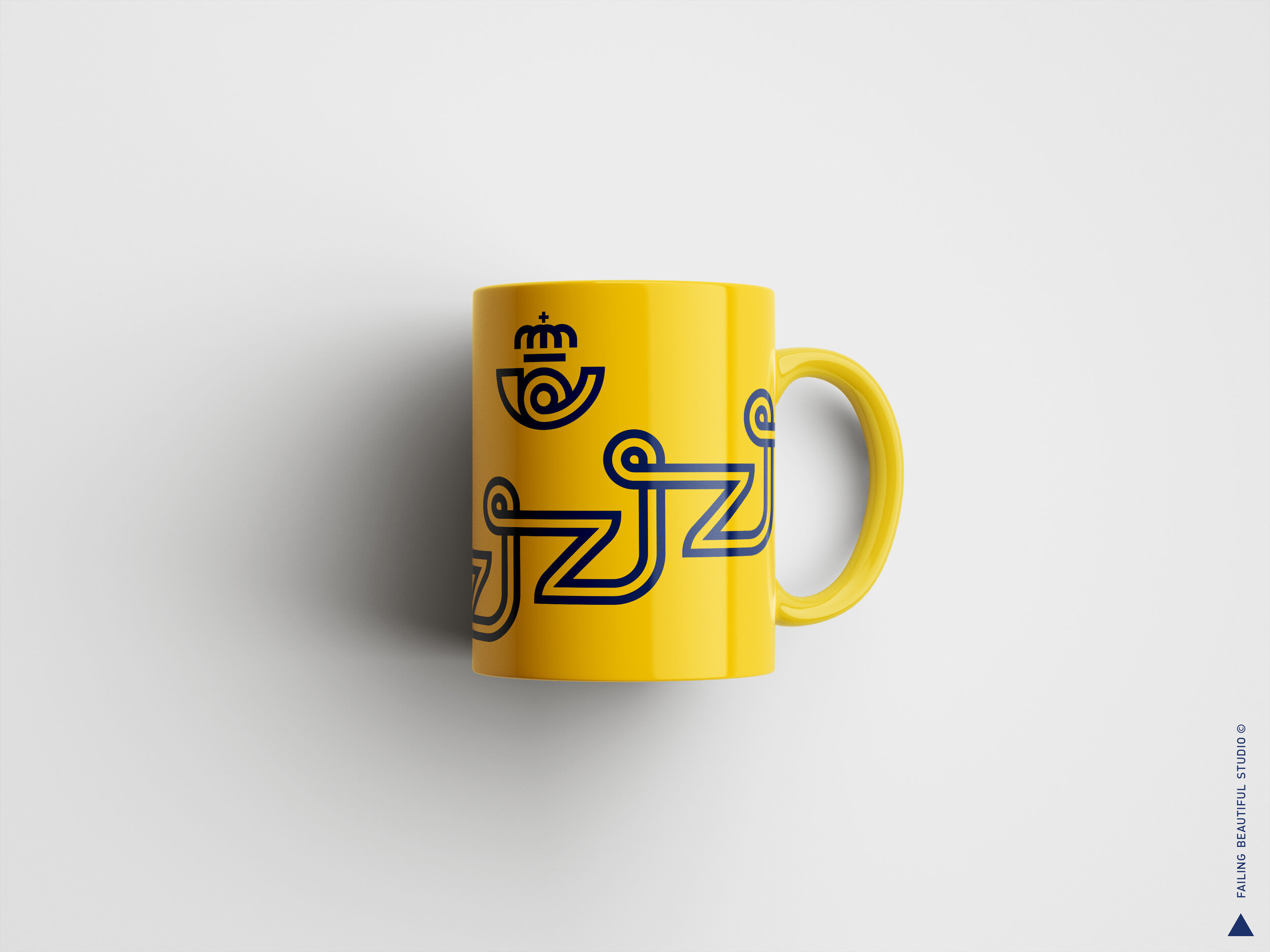
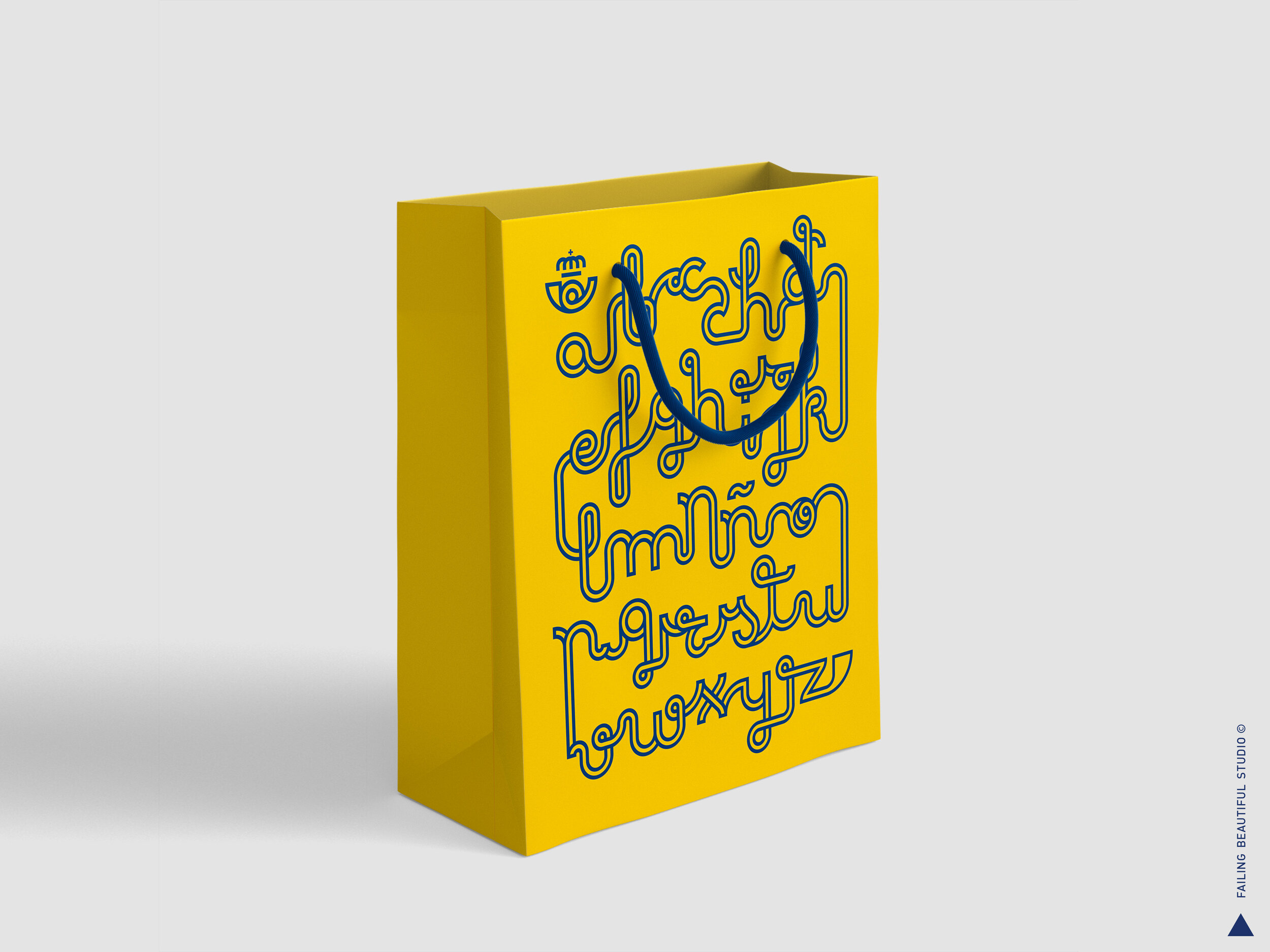
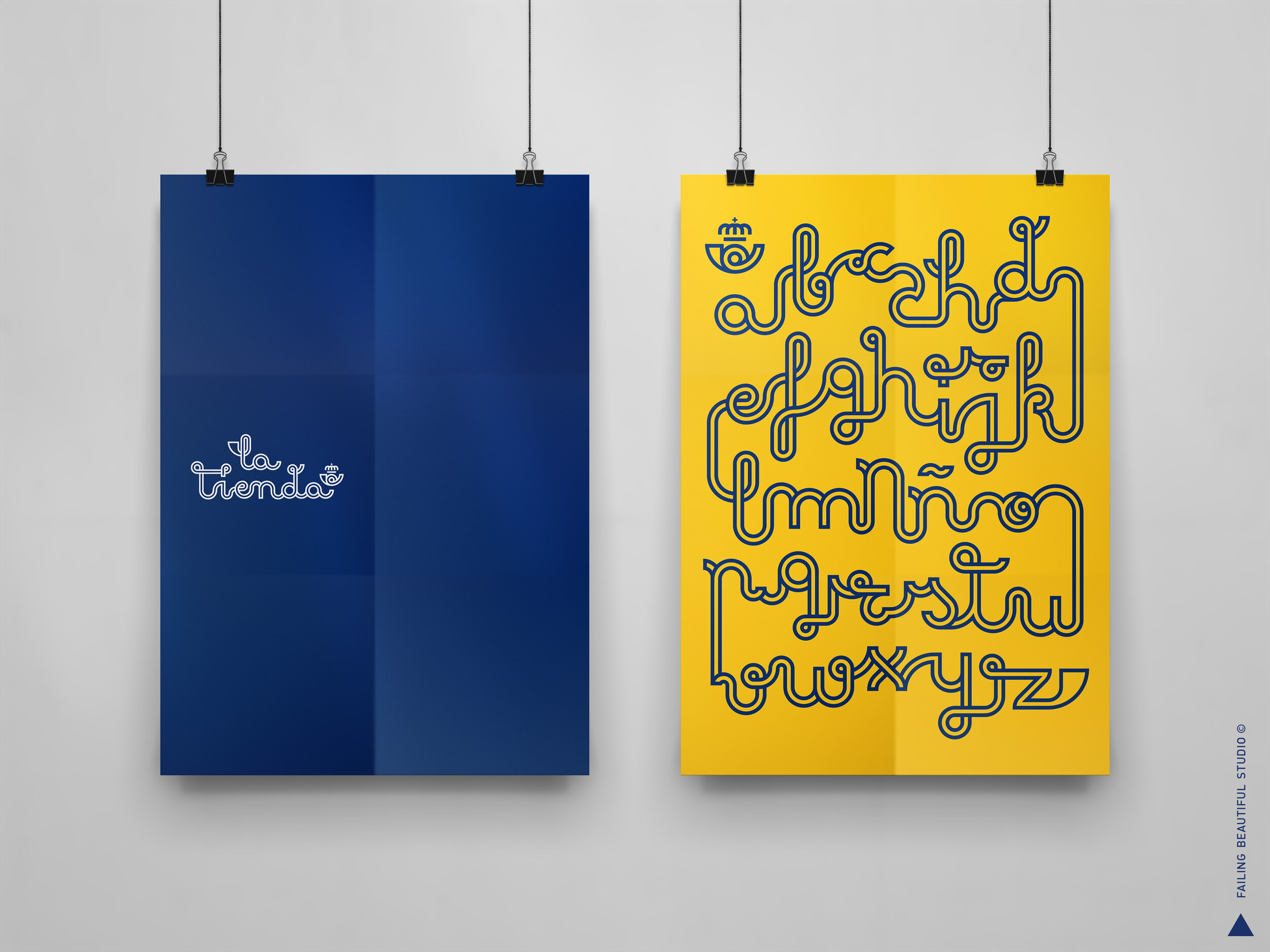
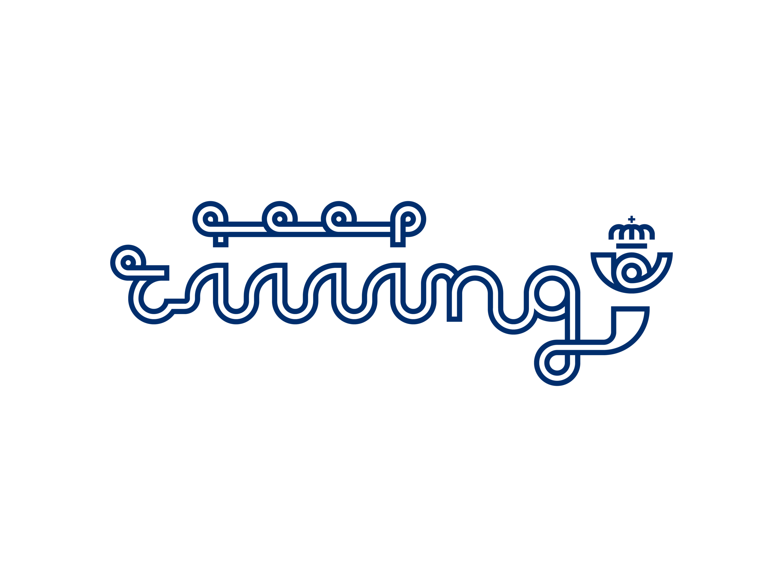
This display & script typeface is a celebration of that exchange made possible by Correos: A celebration of the written language itself. The connections between the characters speaks both to the nature of handwritten letters, as well as the physical journey these letters took to be delivered.
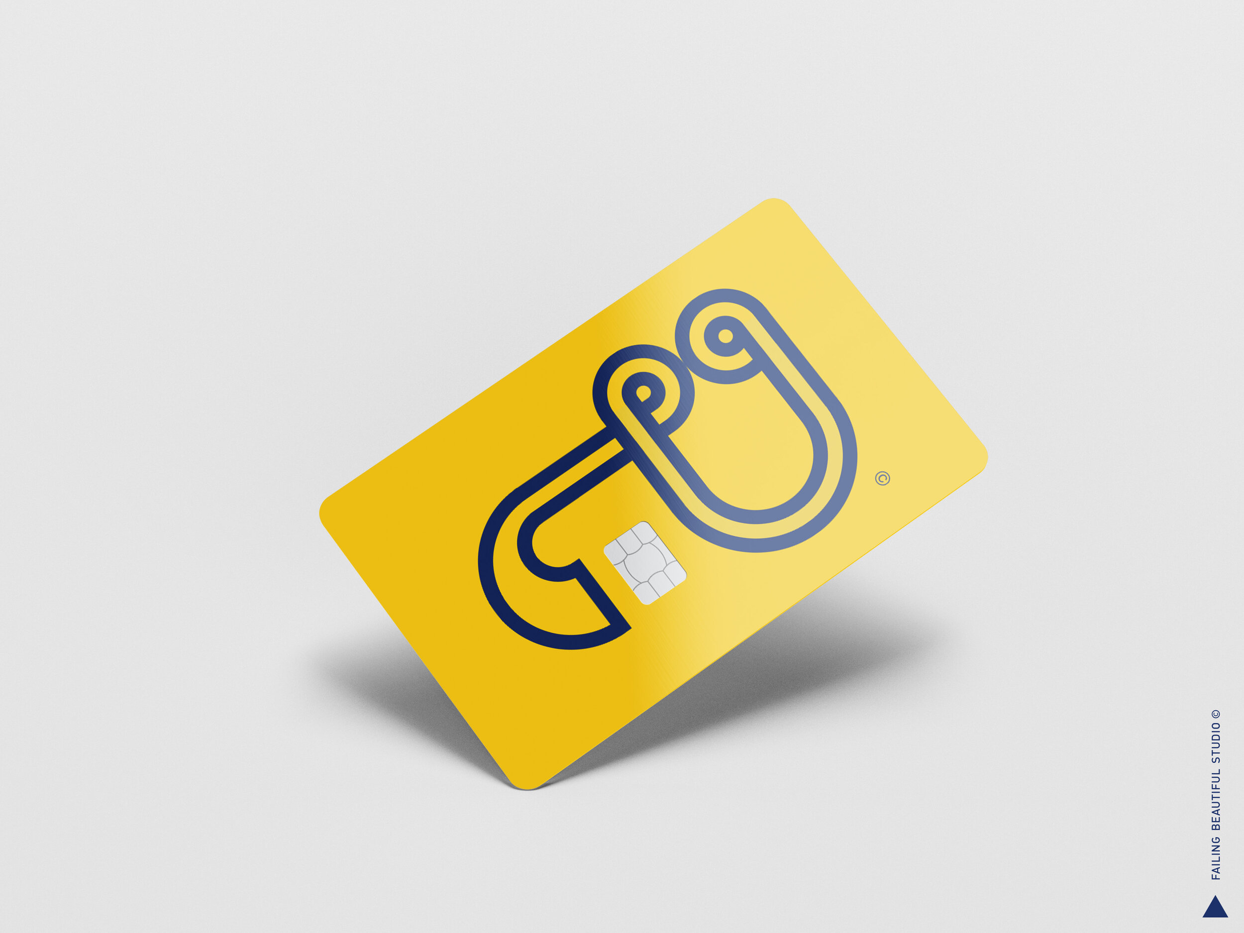
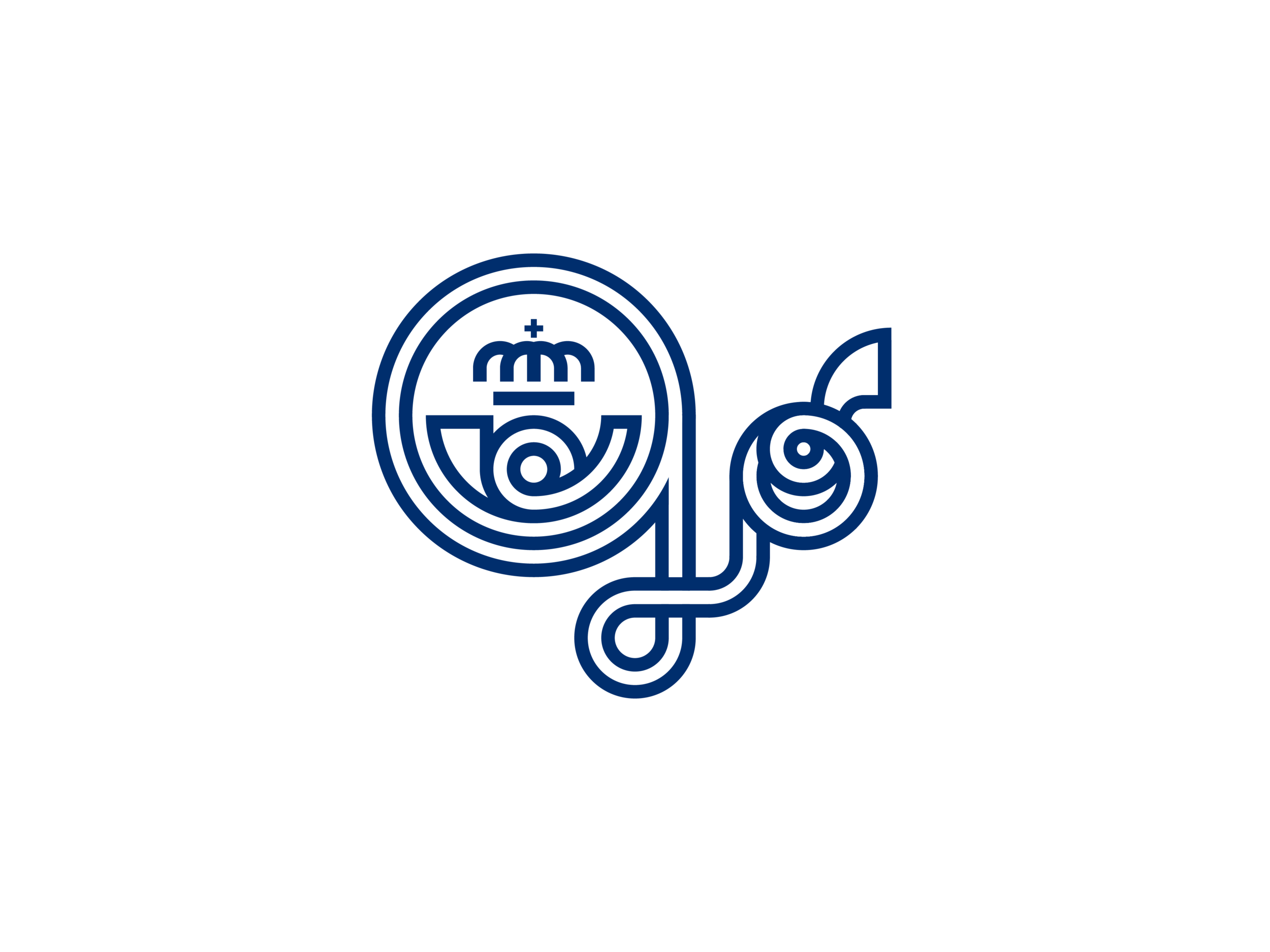
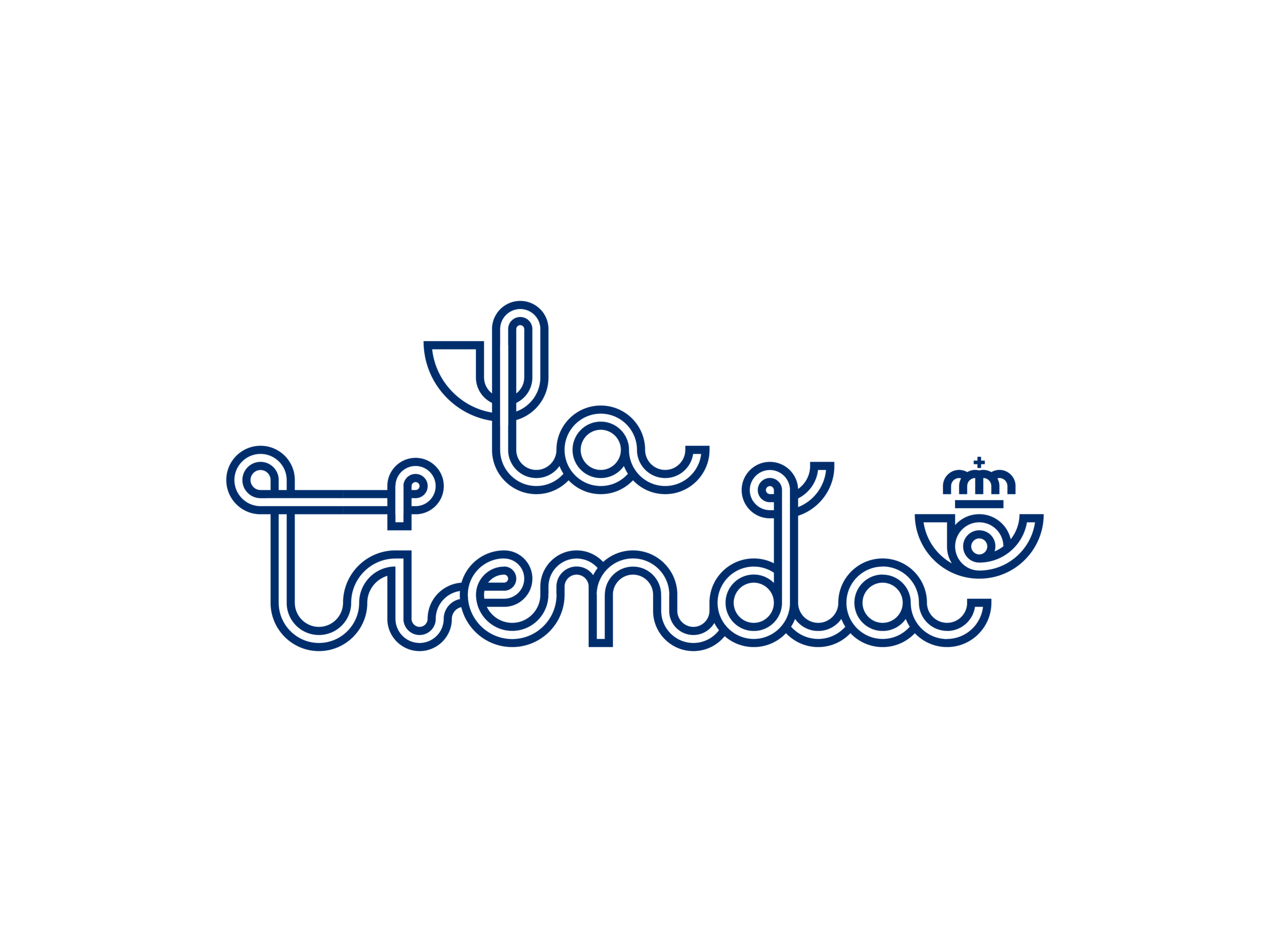
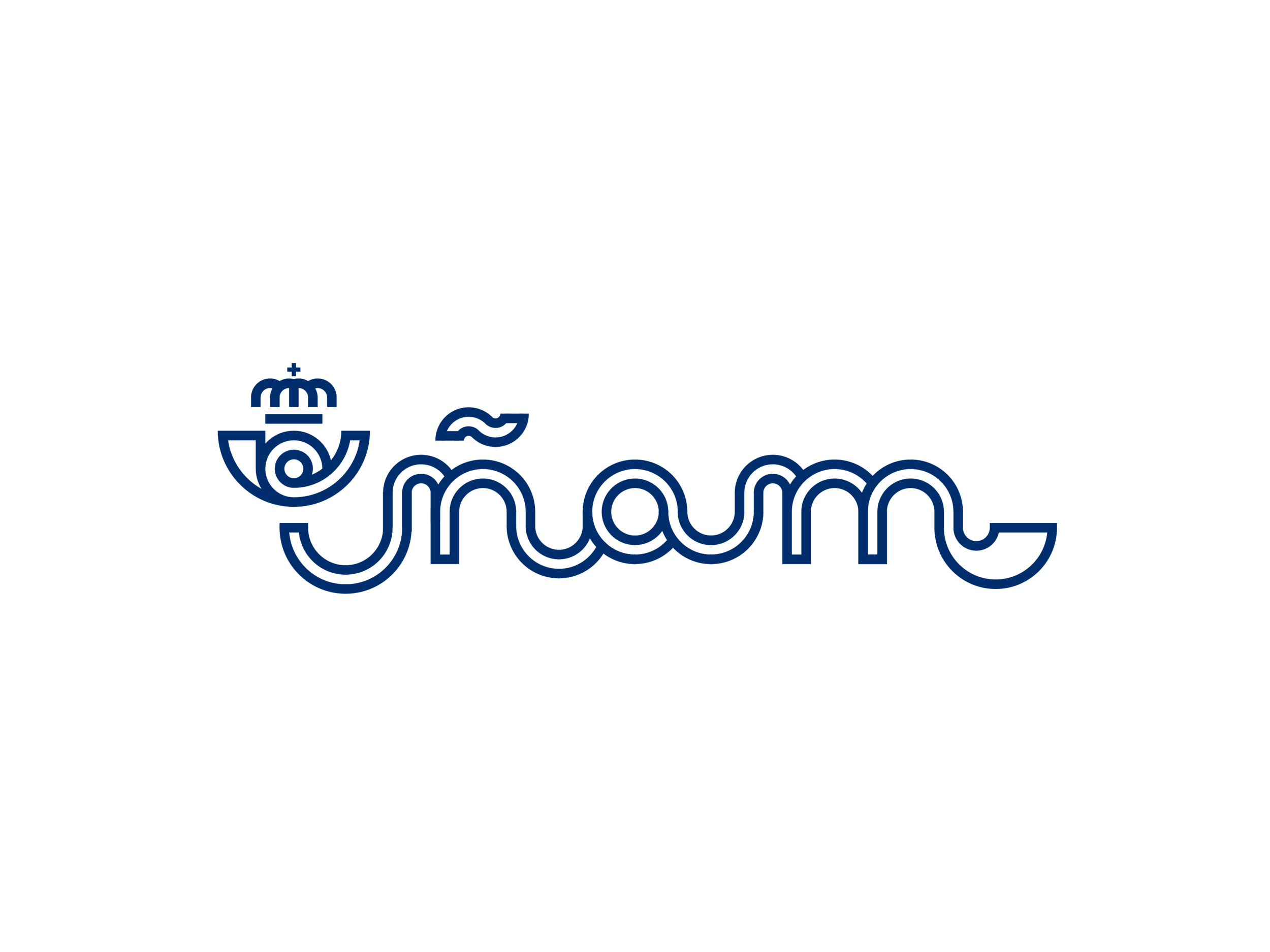
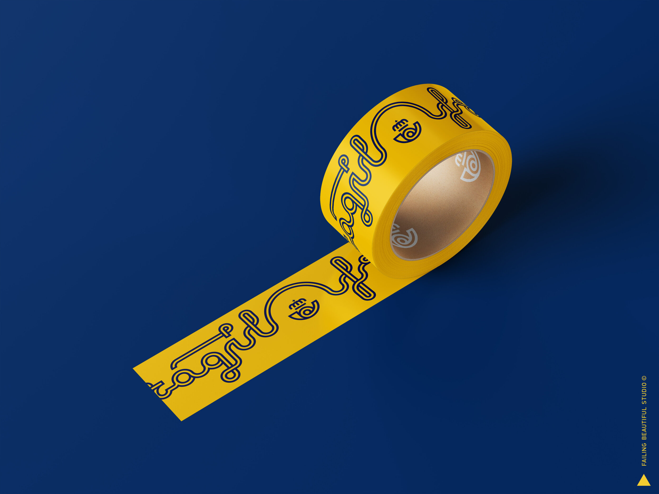
Inspired in the original Cruz Novillo logo, the typeface is designed to bring together the IP ecosystem of the brand products and services.
The following is a speculative exploration of its possibilities.
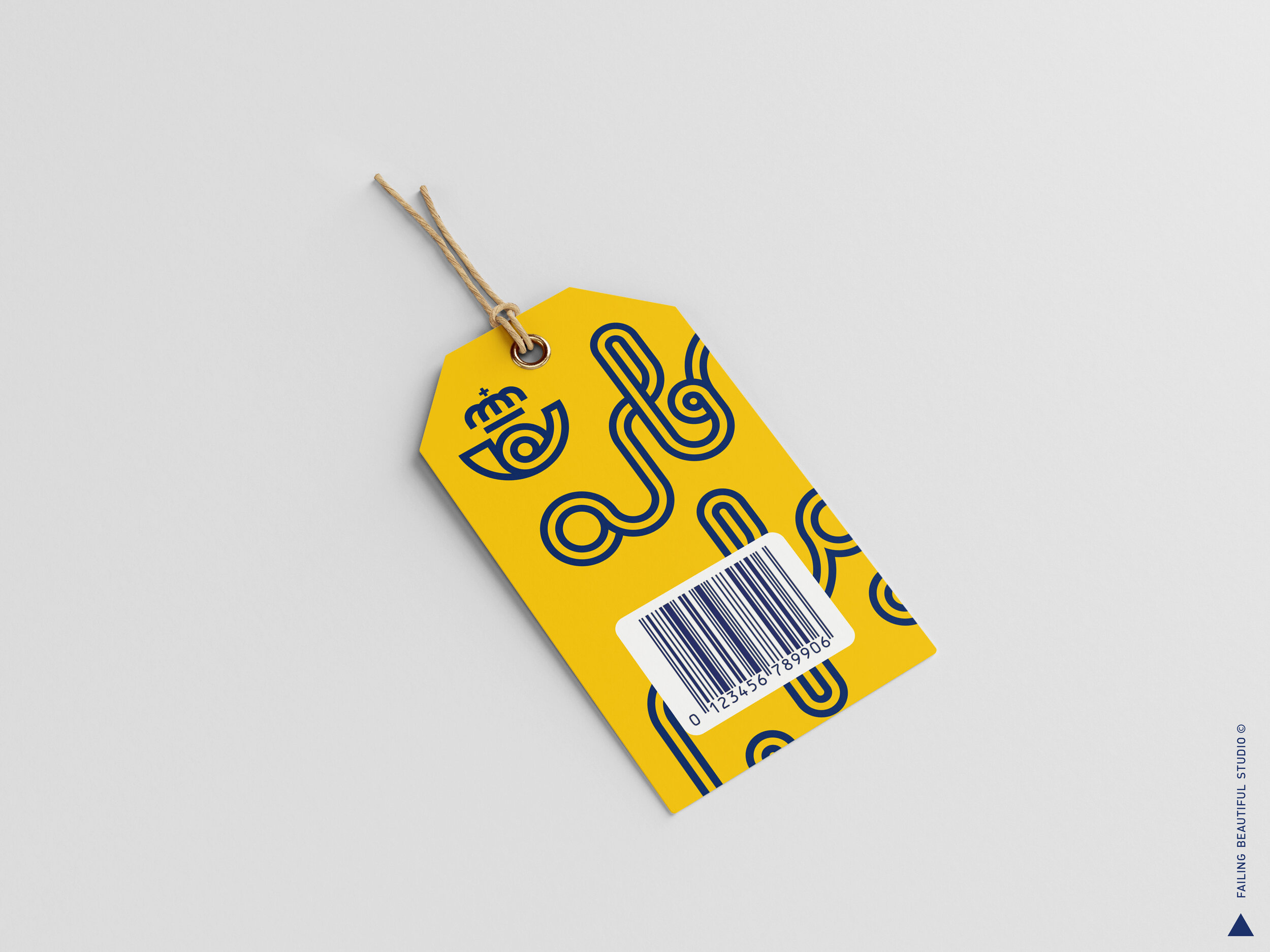
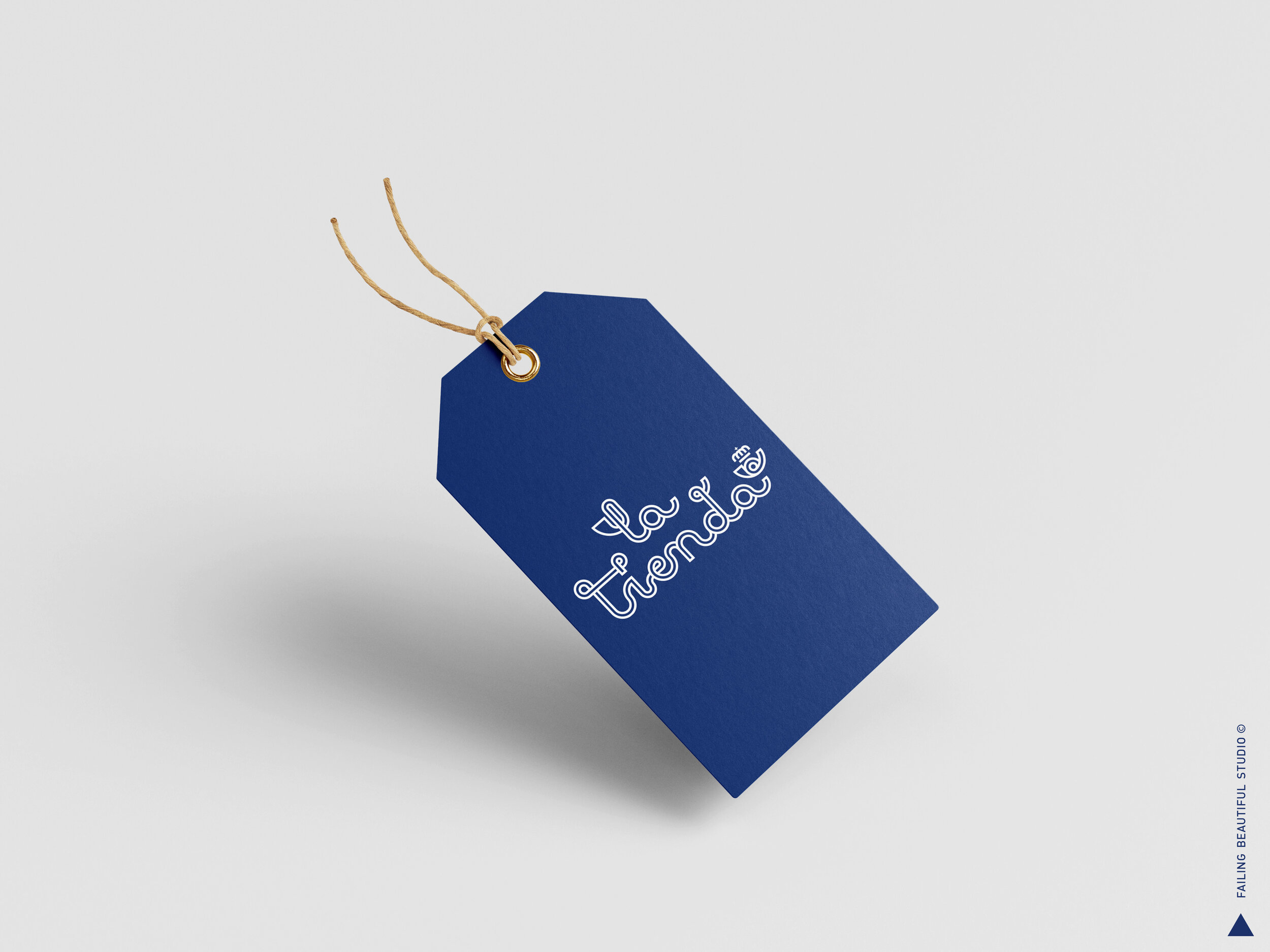
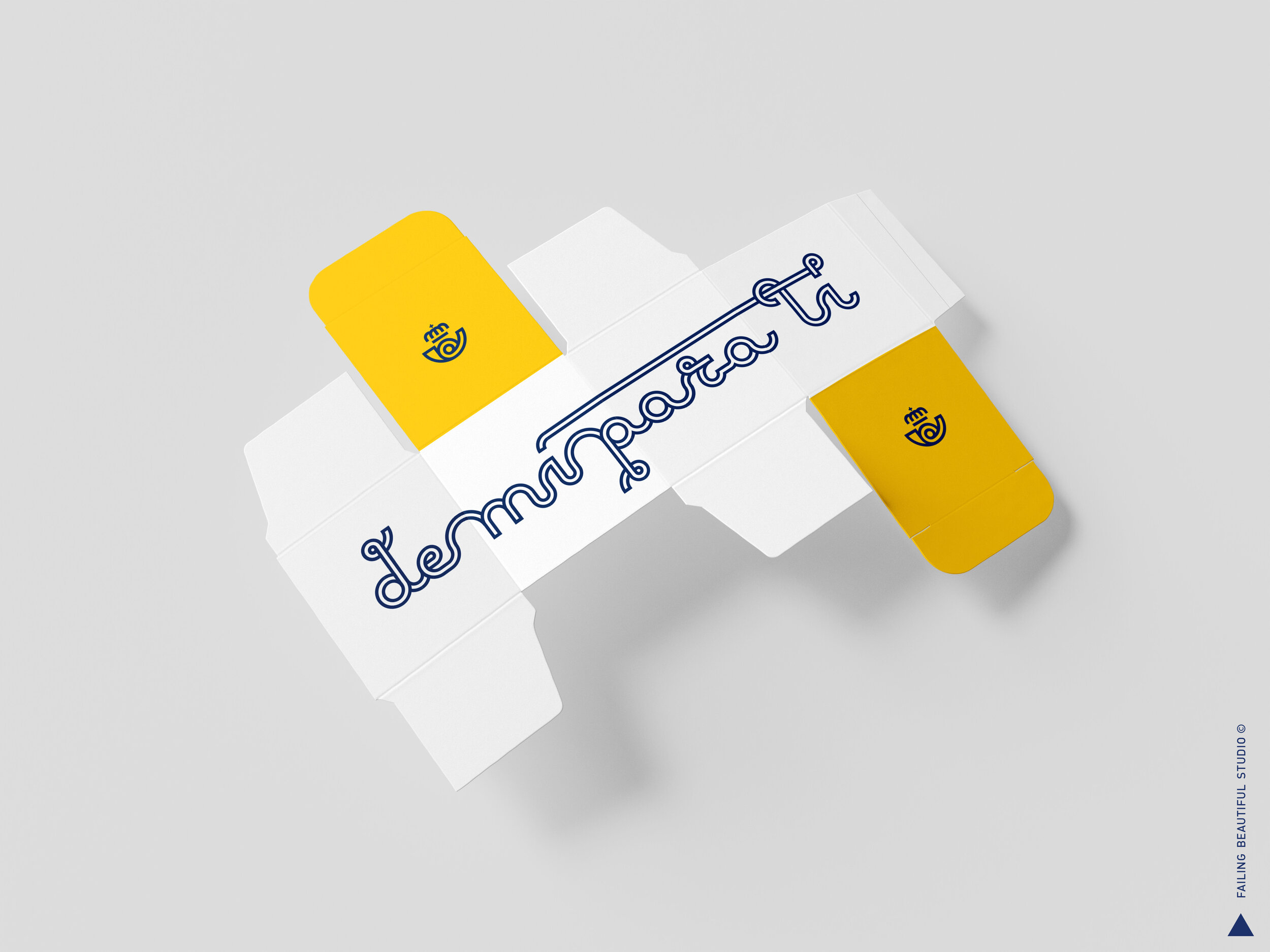
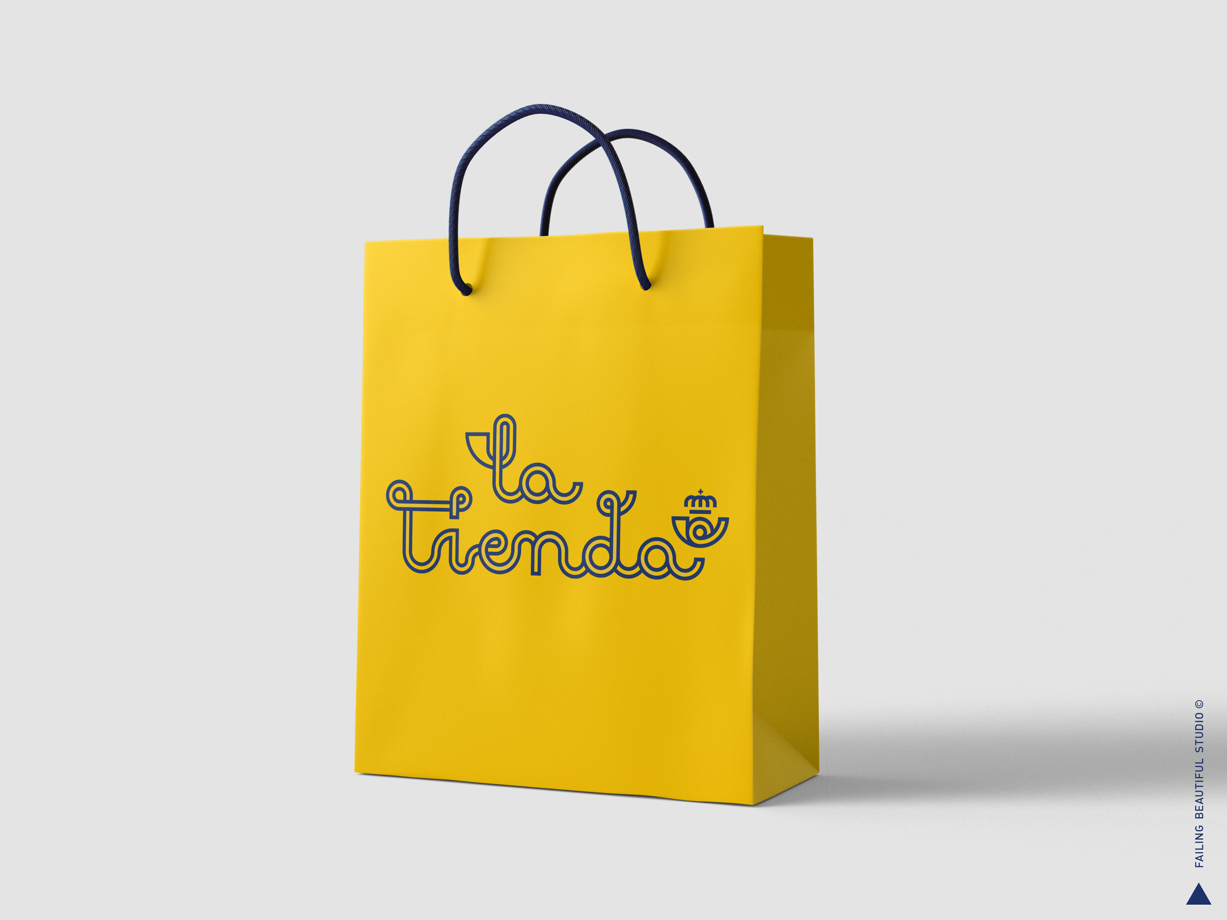
LA TIENDA / THE SHOP
Merchandising exploration for the most iconic and ubiquitous Spanish brand.

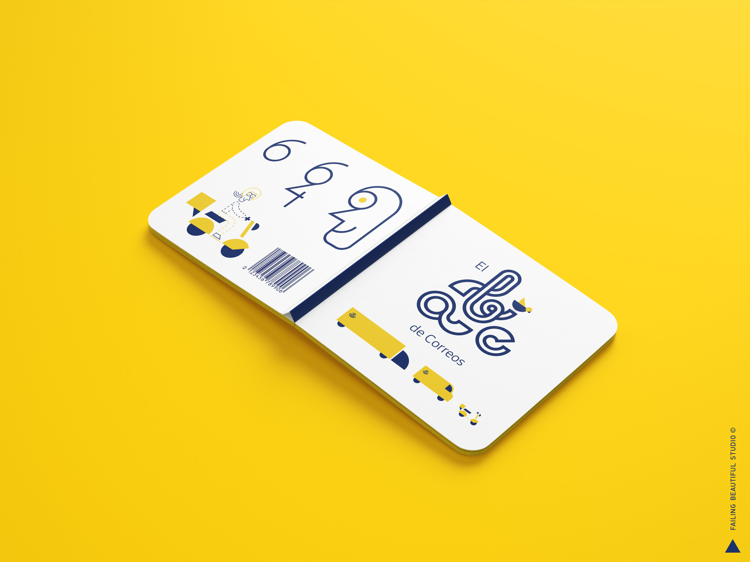
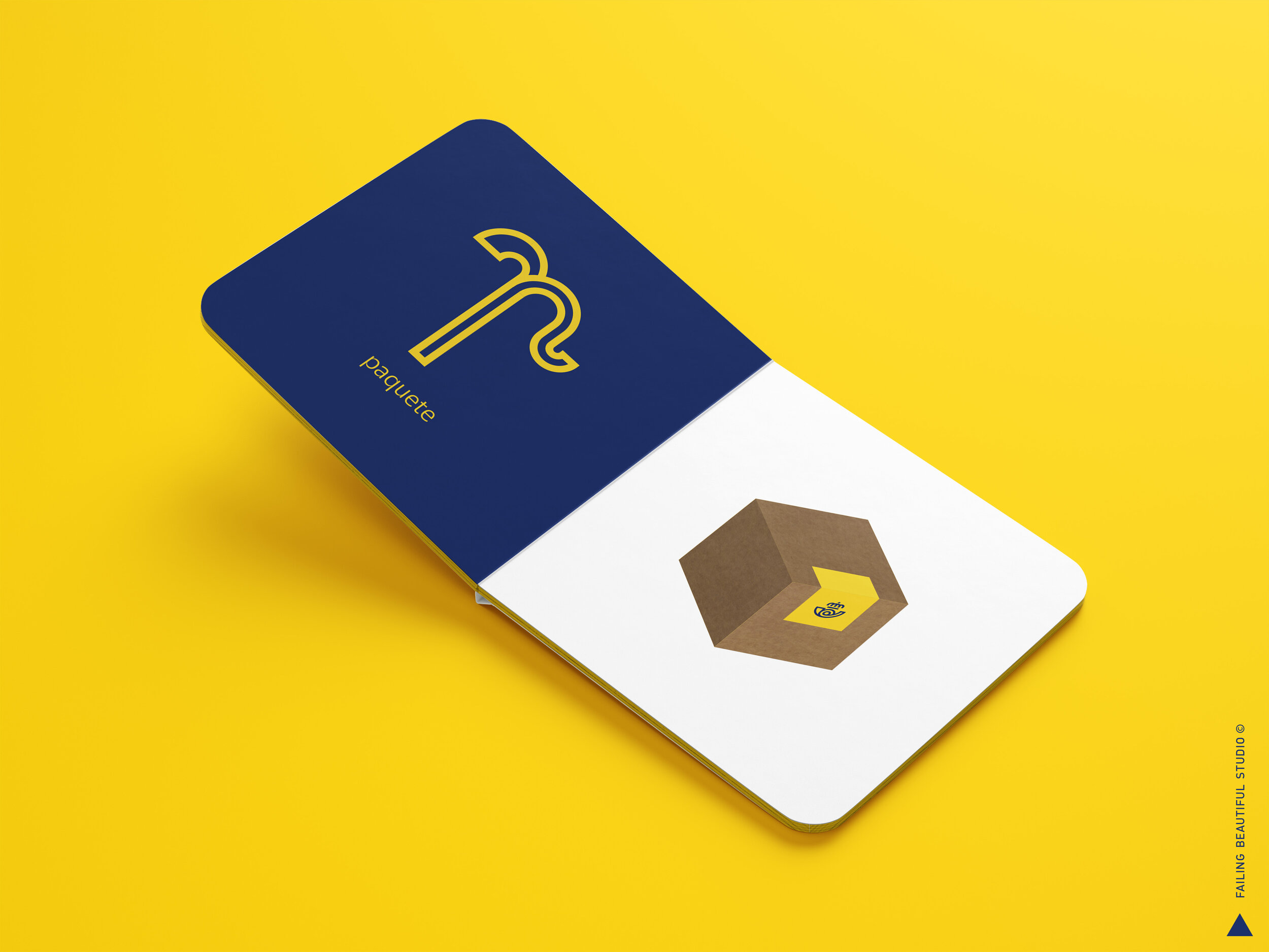
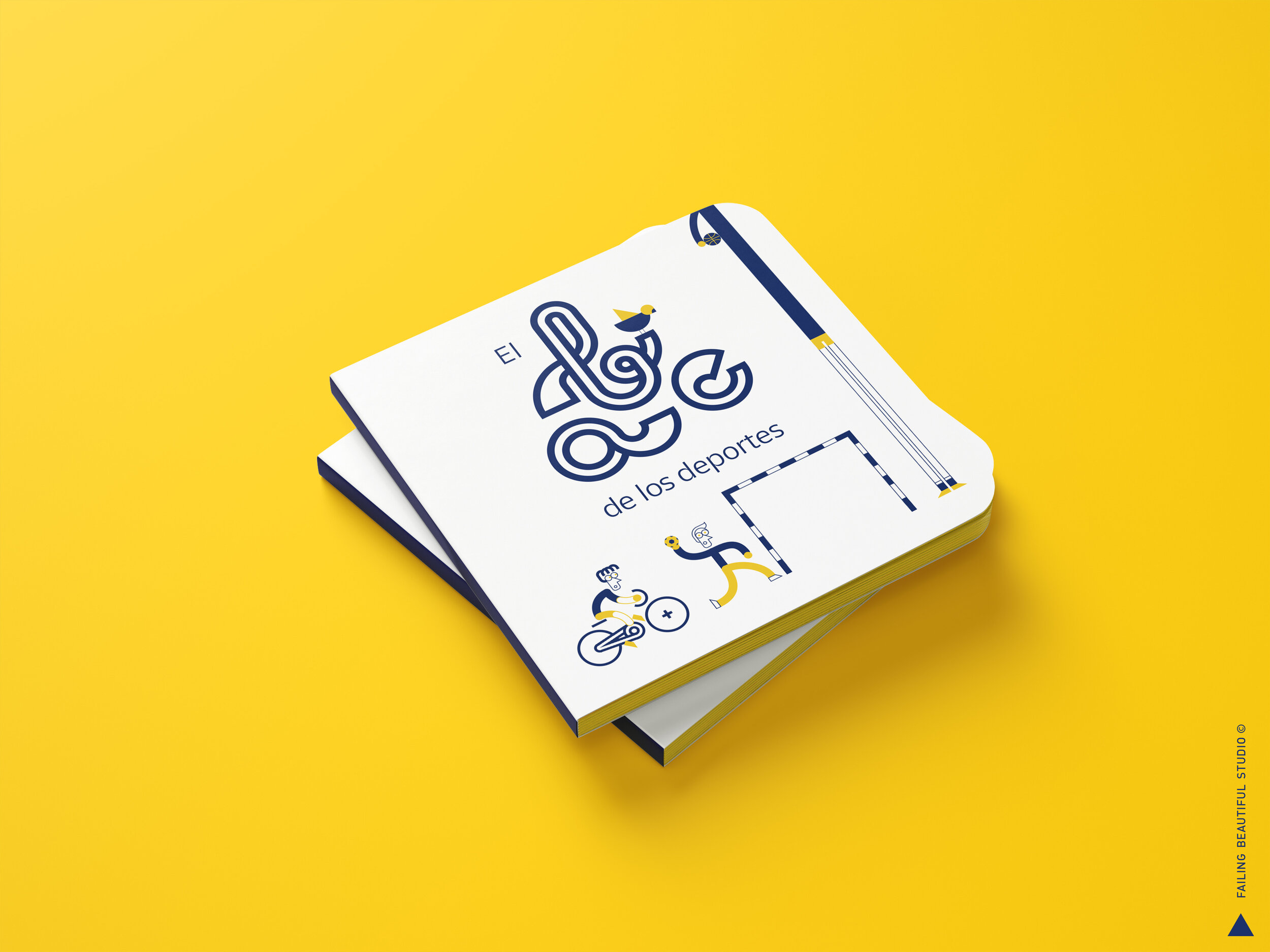
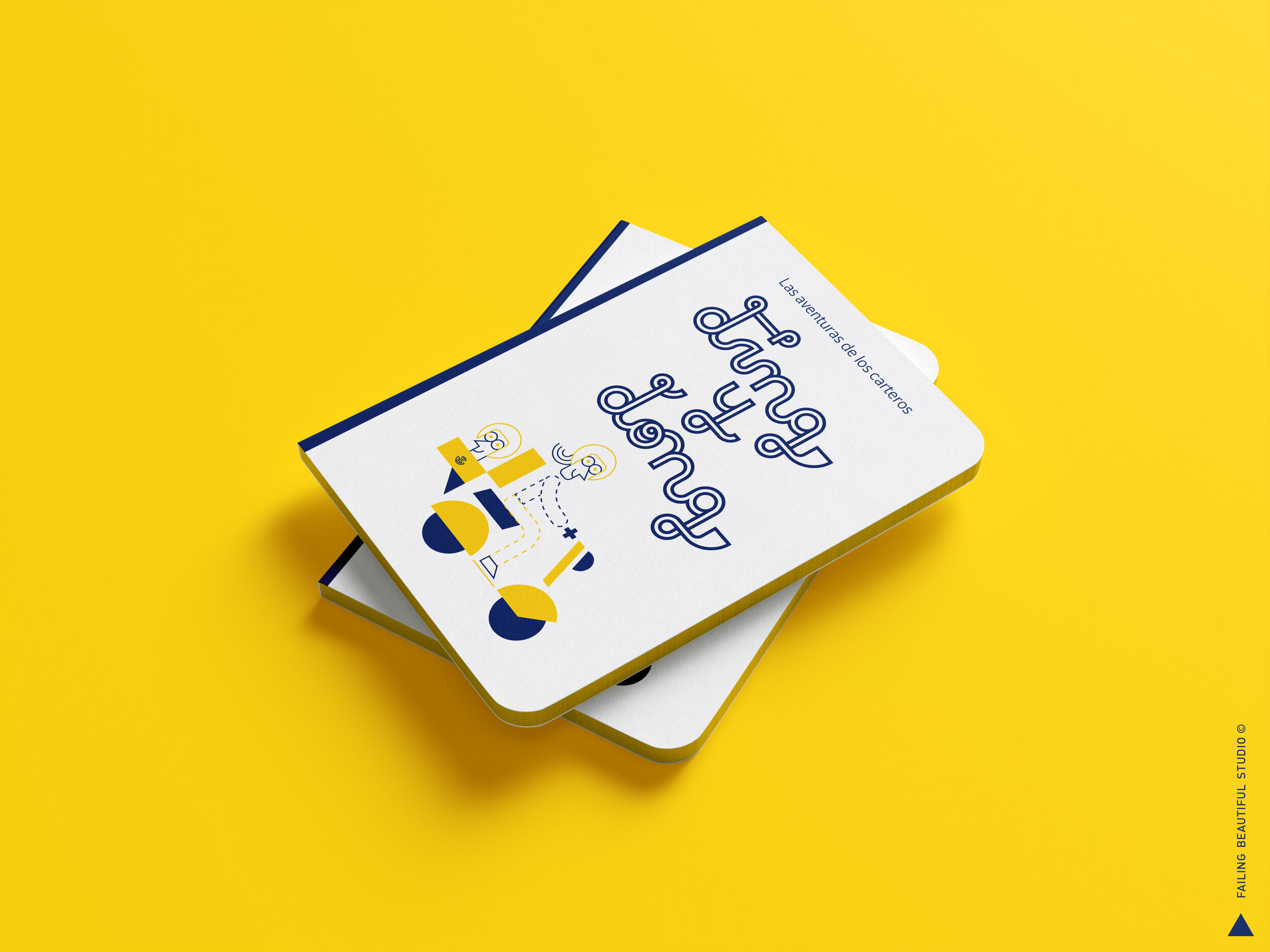
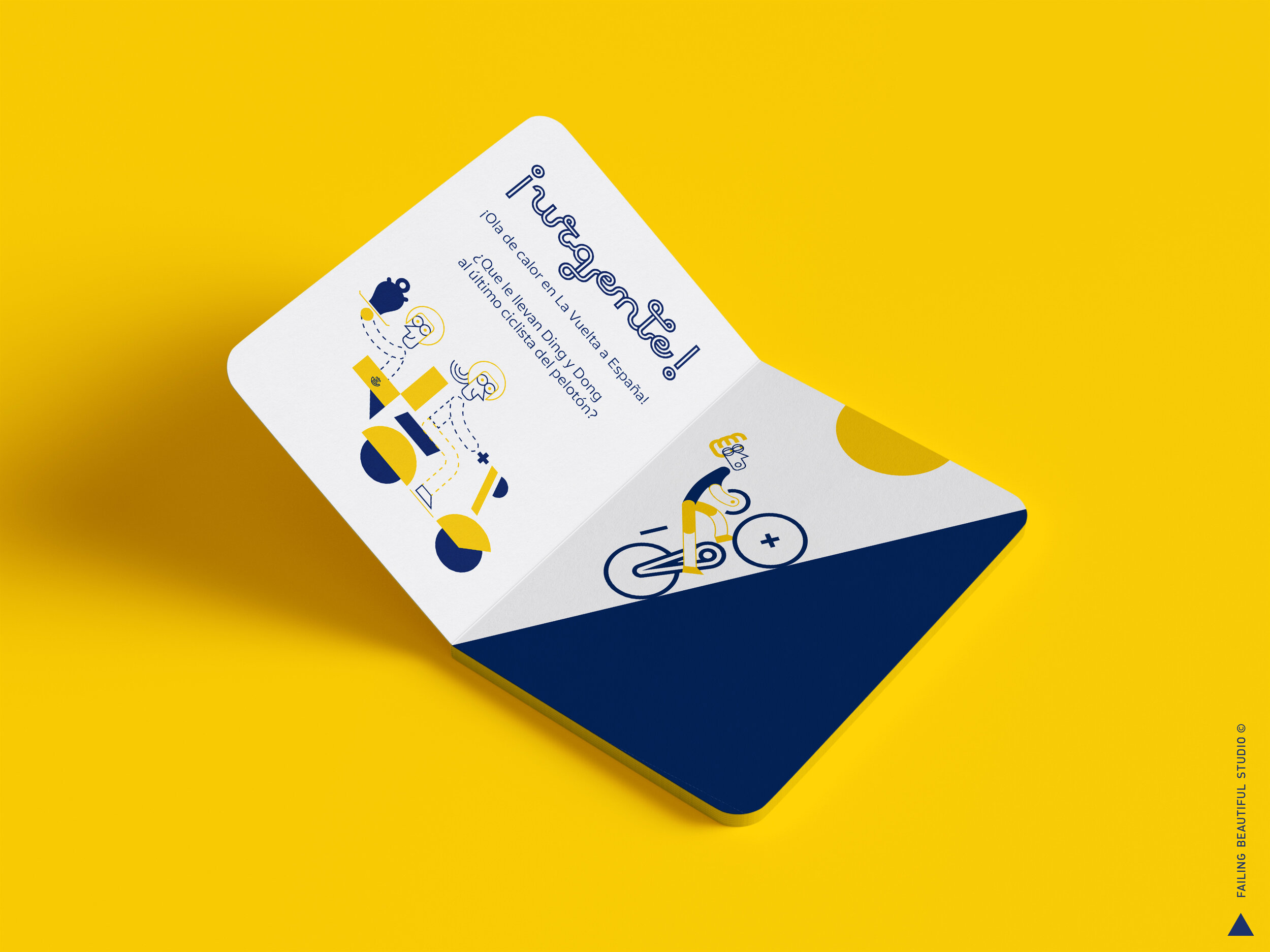
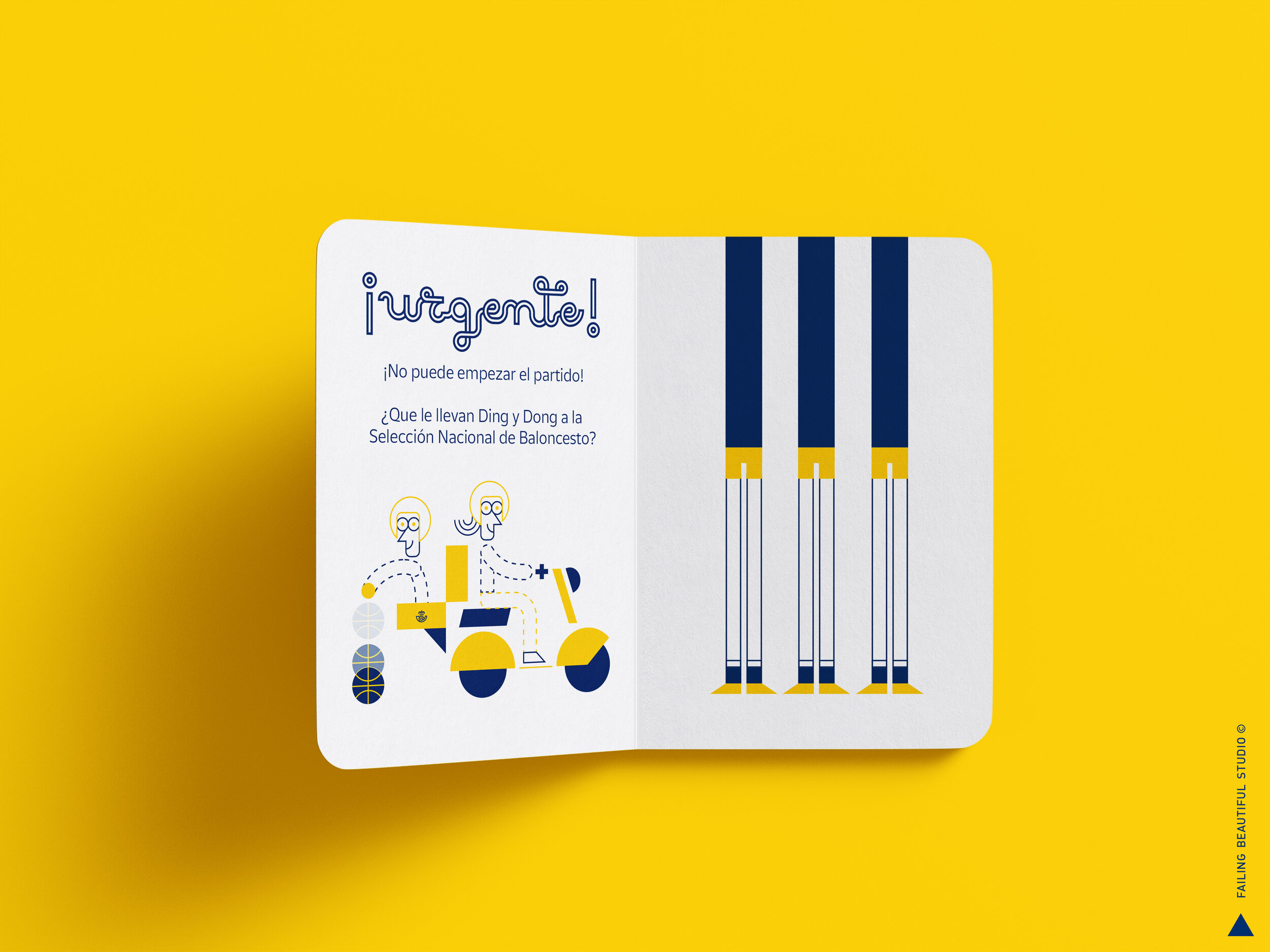
CHILDREN BOOKS
Learning to read with a brand that belongs to all spaniards big and small.
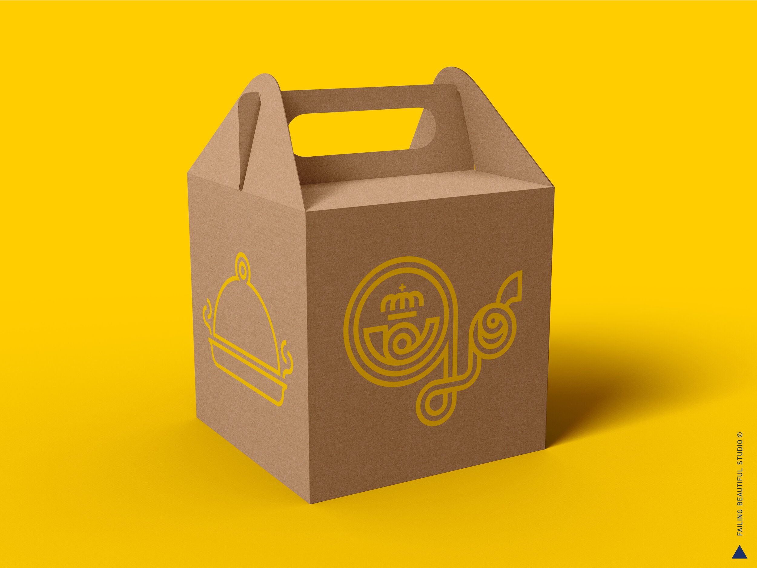
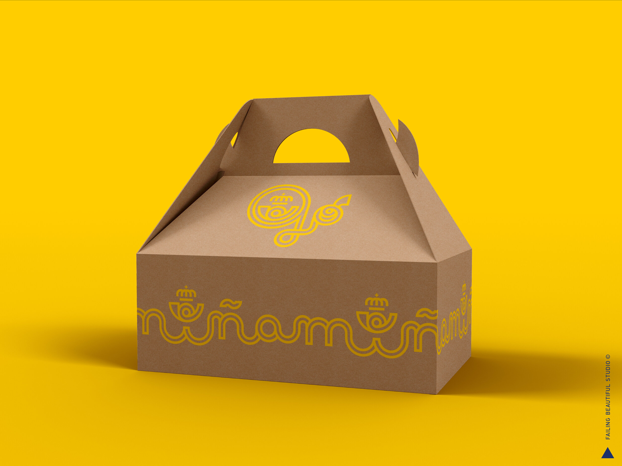
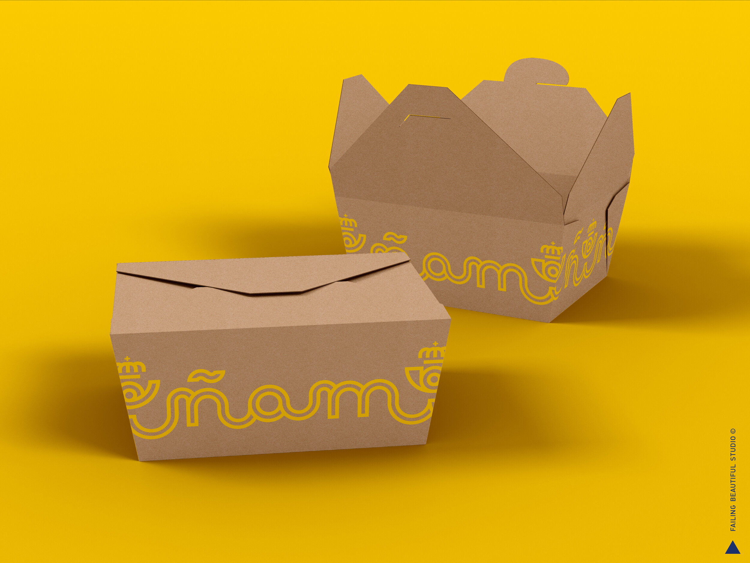
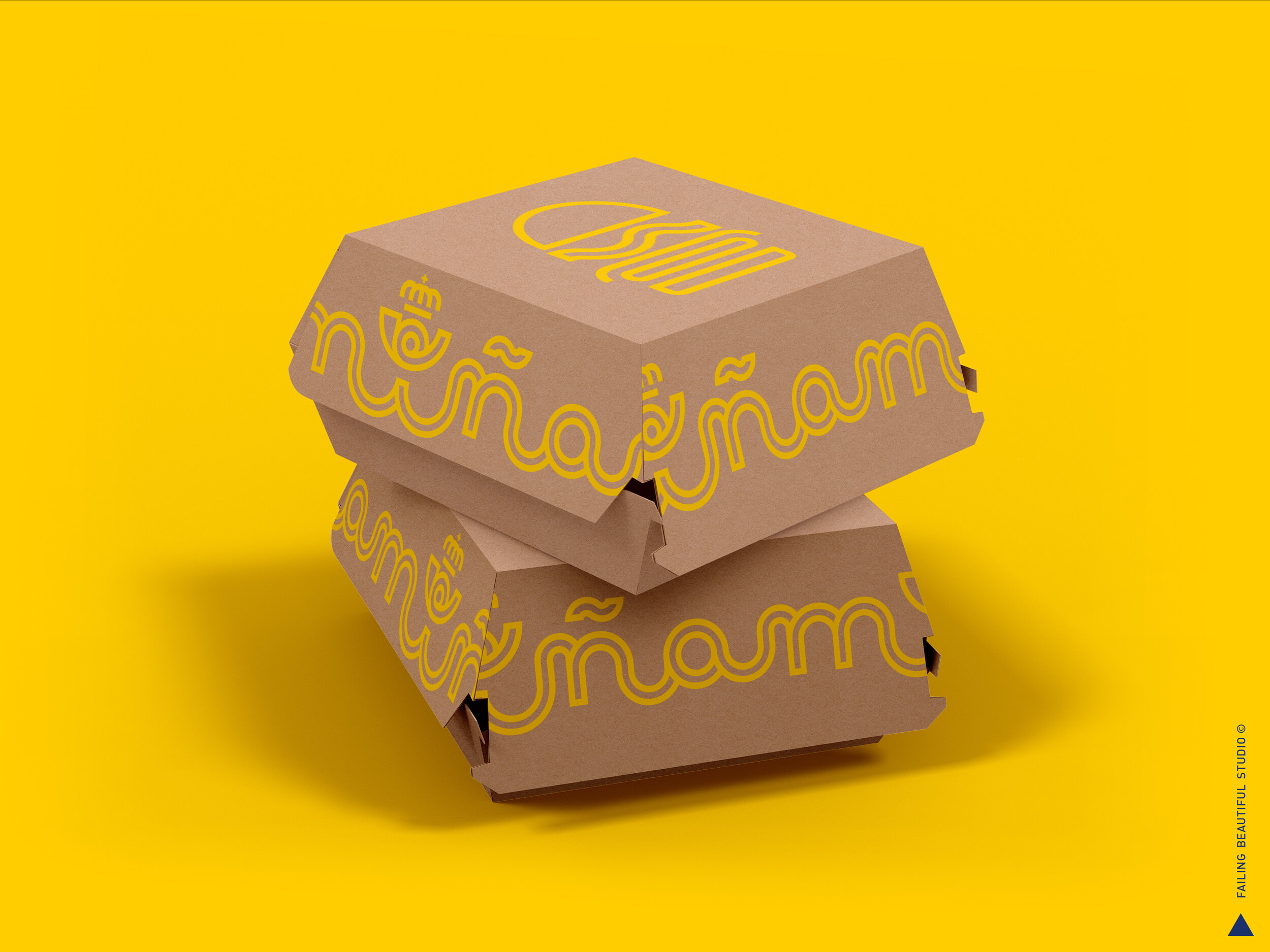
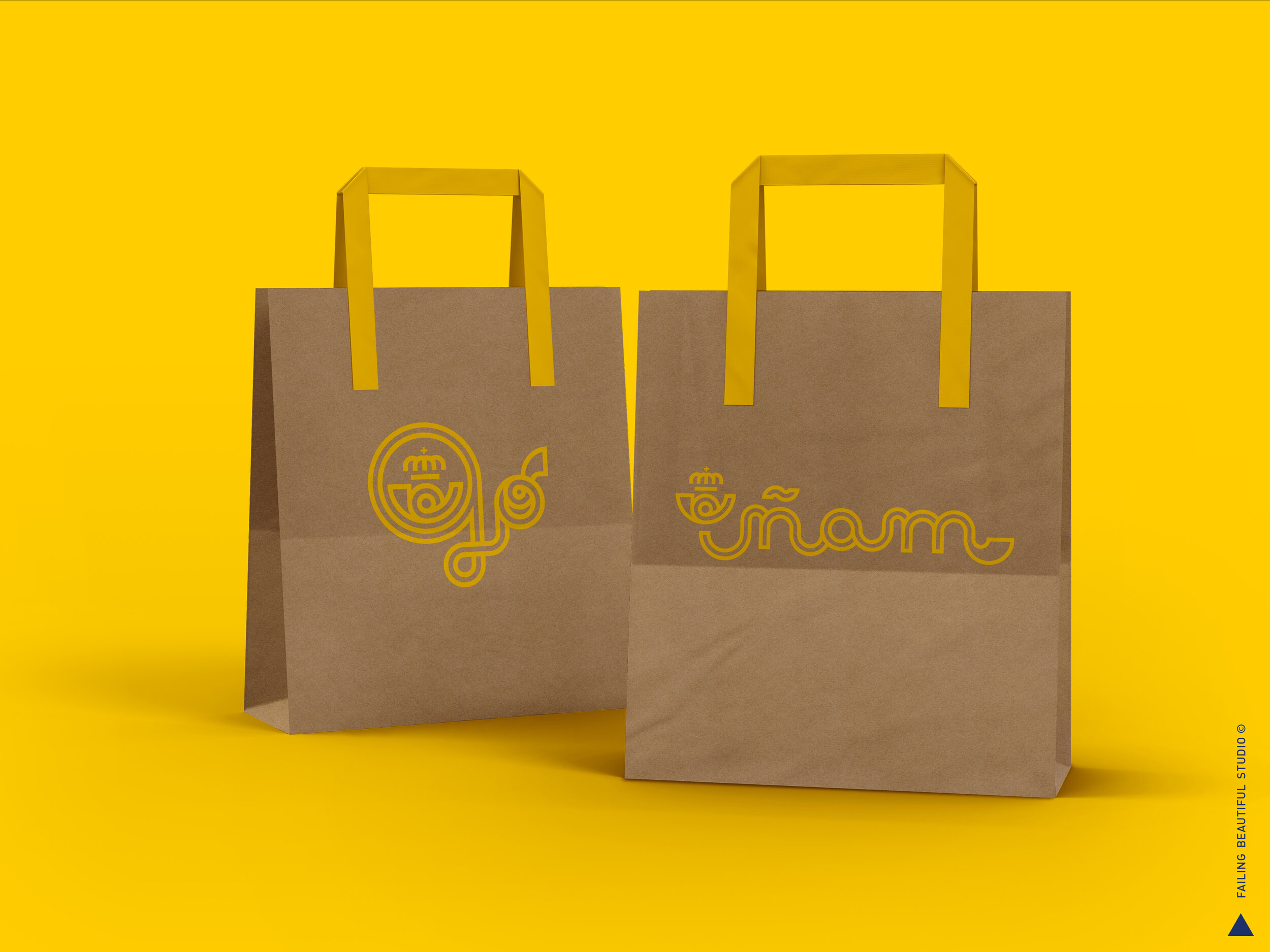
FOOD TO GO
A fictional service for Spanish restaurants to deliver food.
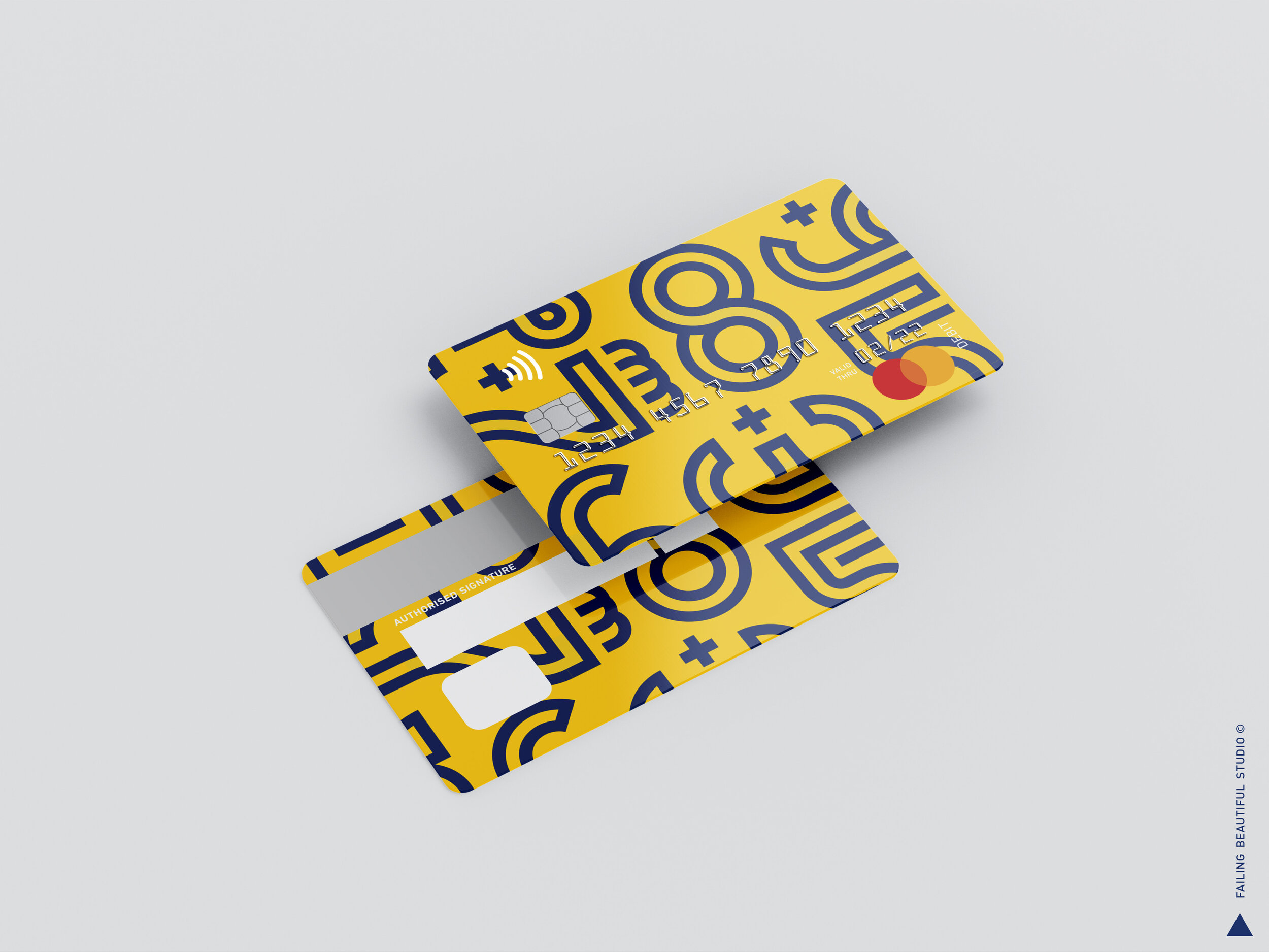
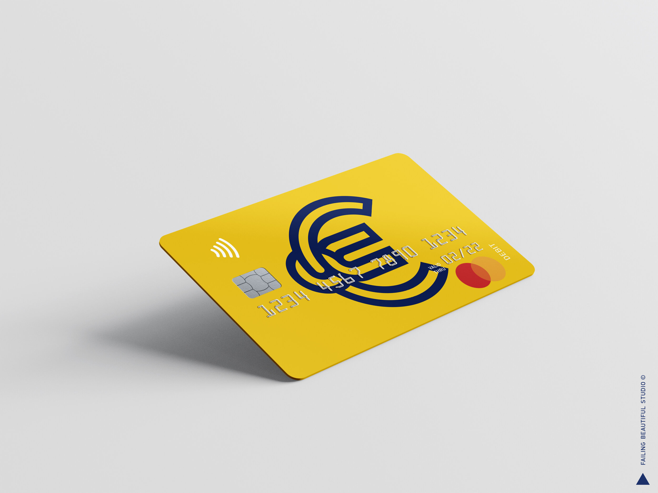
BANKING
Fictional public banking service.
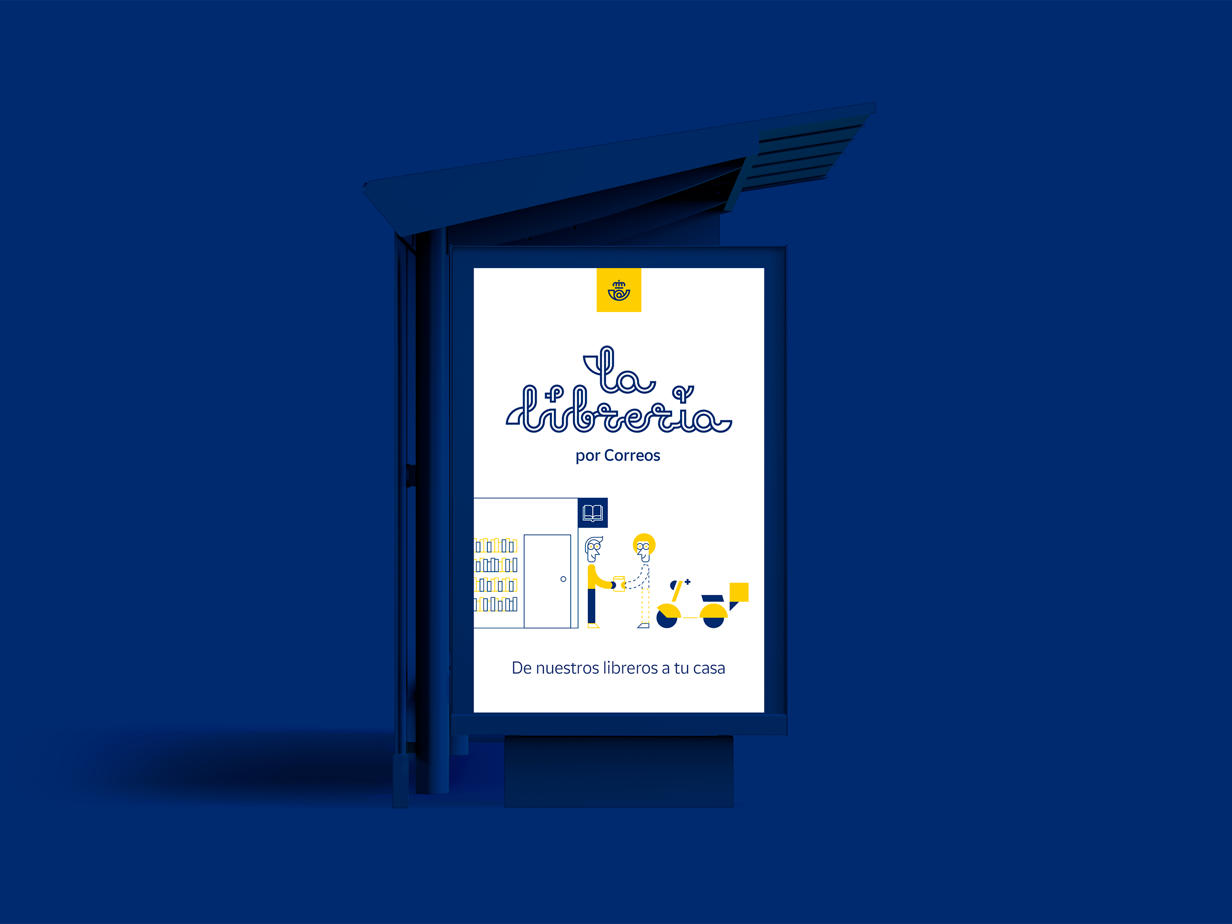
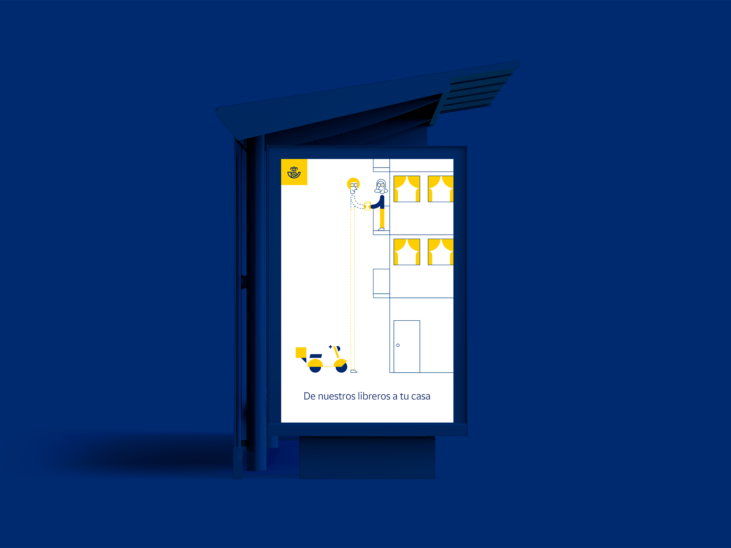
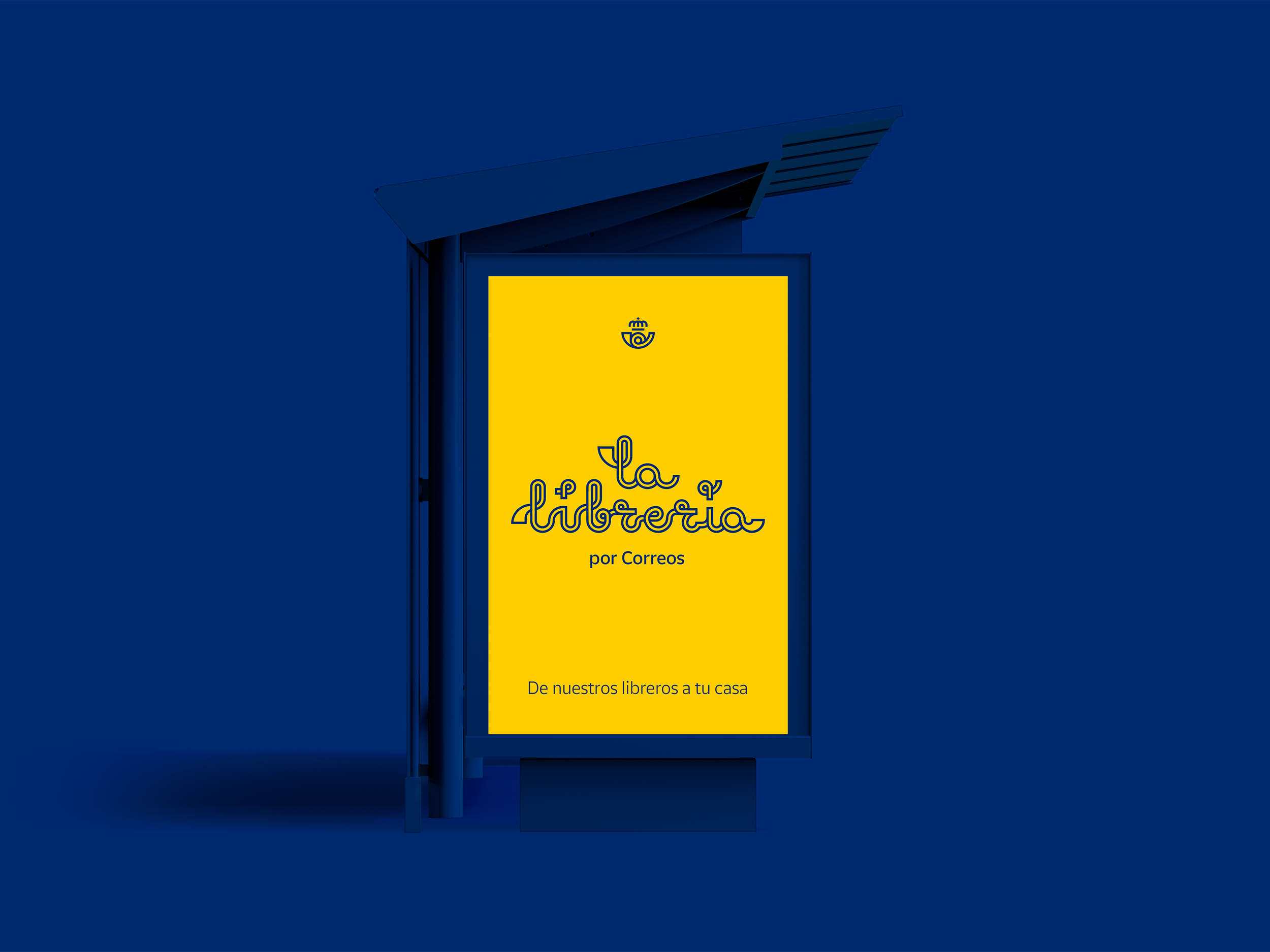
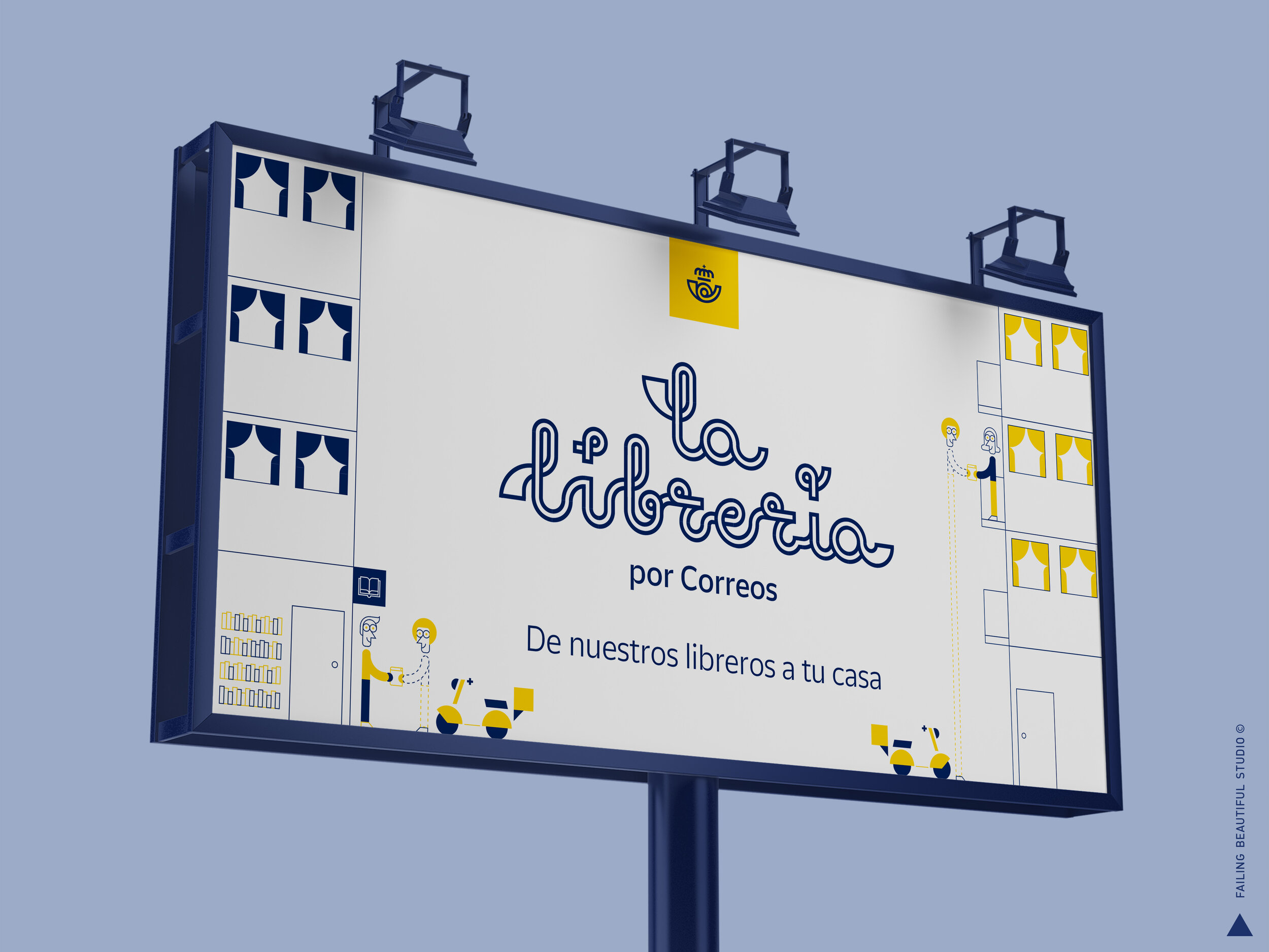
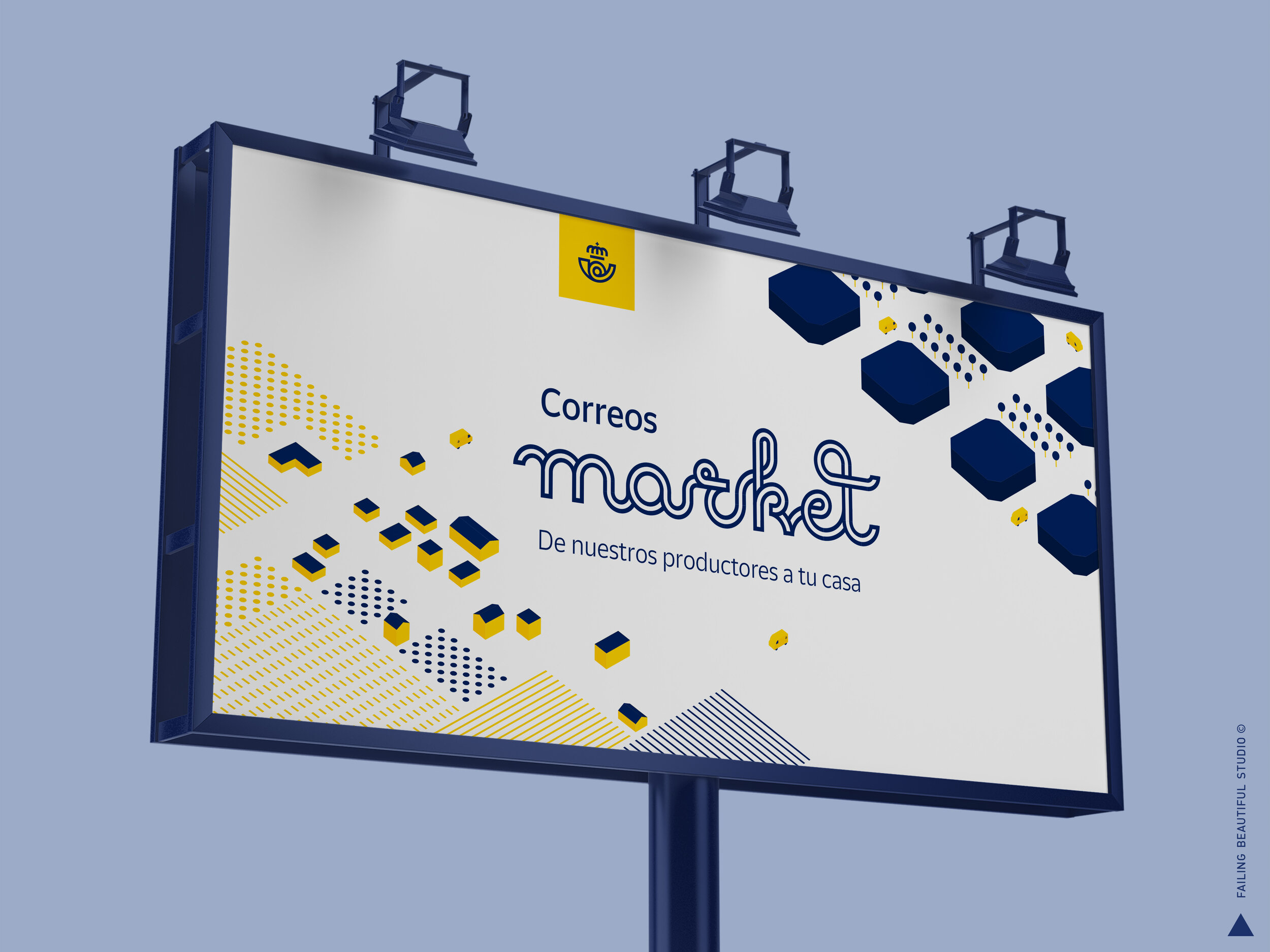
OOH
Application examples for comms.

Matador magazine is a renowned ongoingcultural project 25 years in the making.
Every year one edition is published after one of the letters of the alphabet.
When it reaches the Z, the MATADOR body of work will be completed.
In the 2020 25th edition, the letter was W.


CREATIVE ROLE: Everything.