
FILM
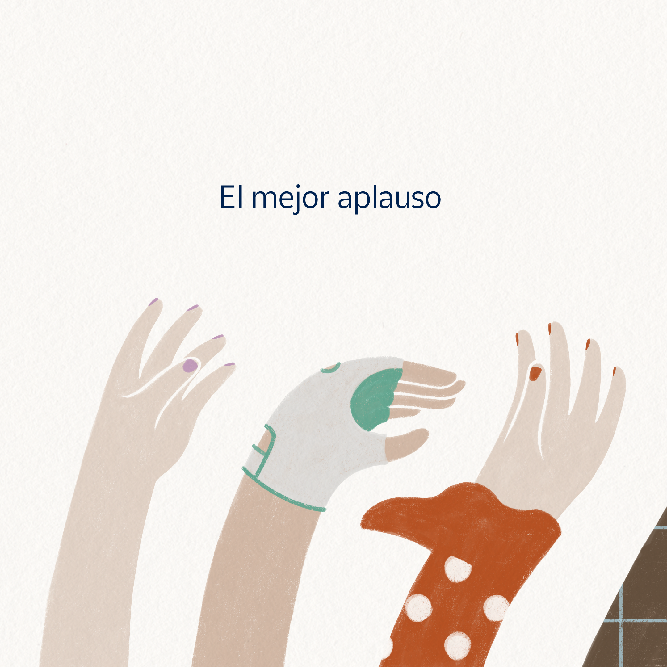
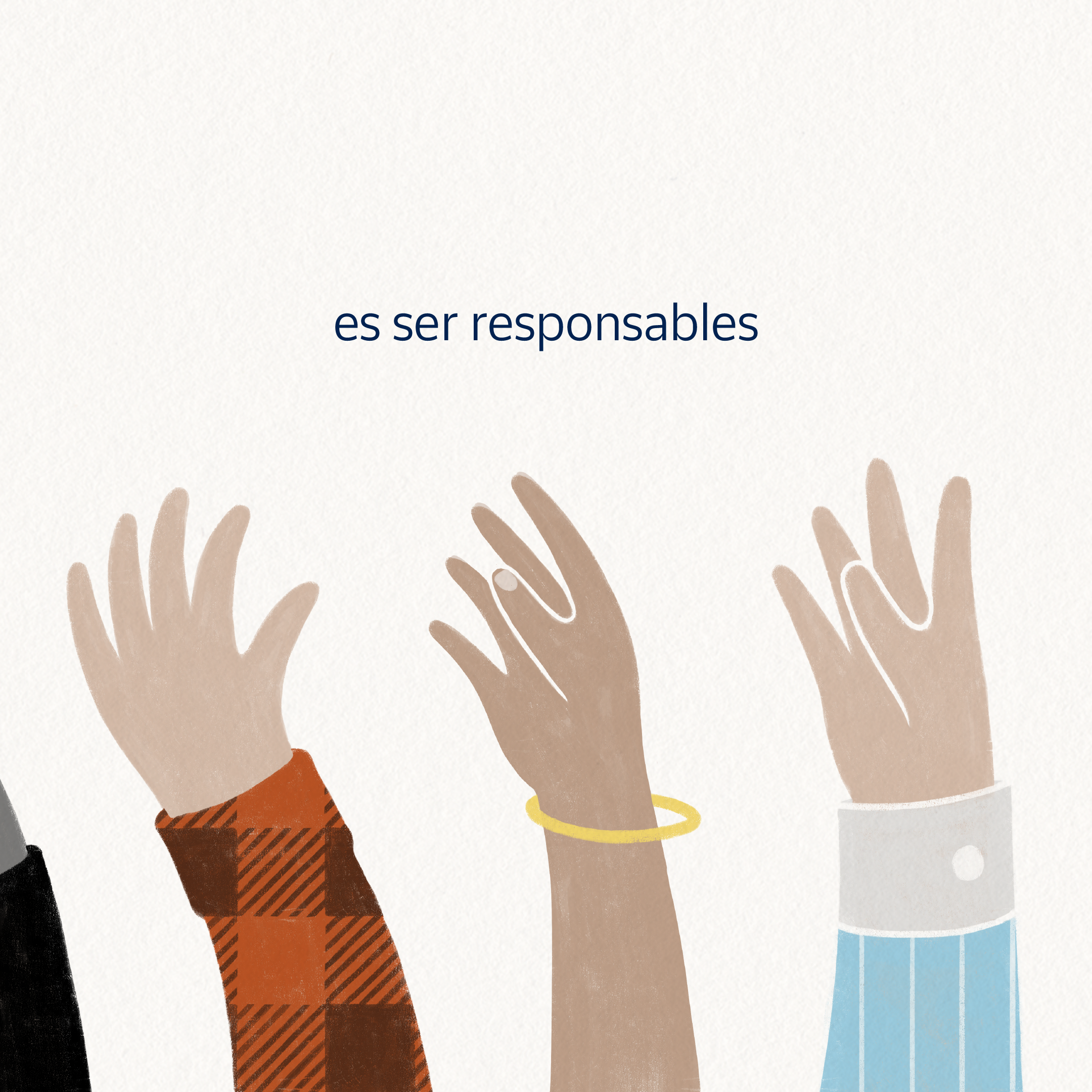
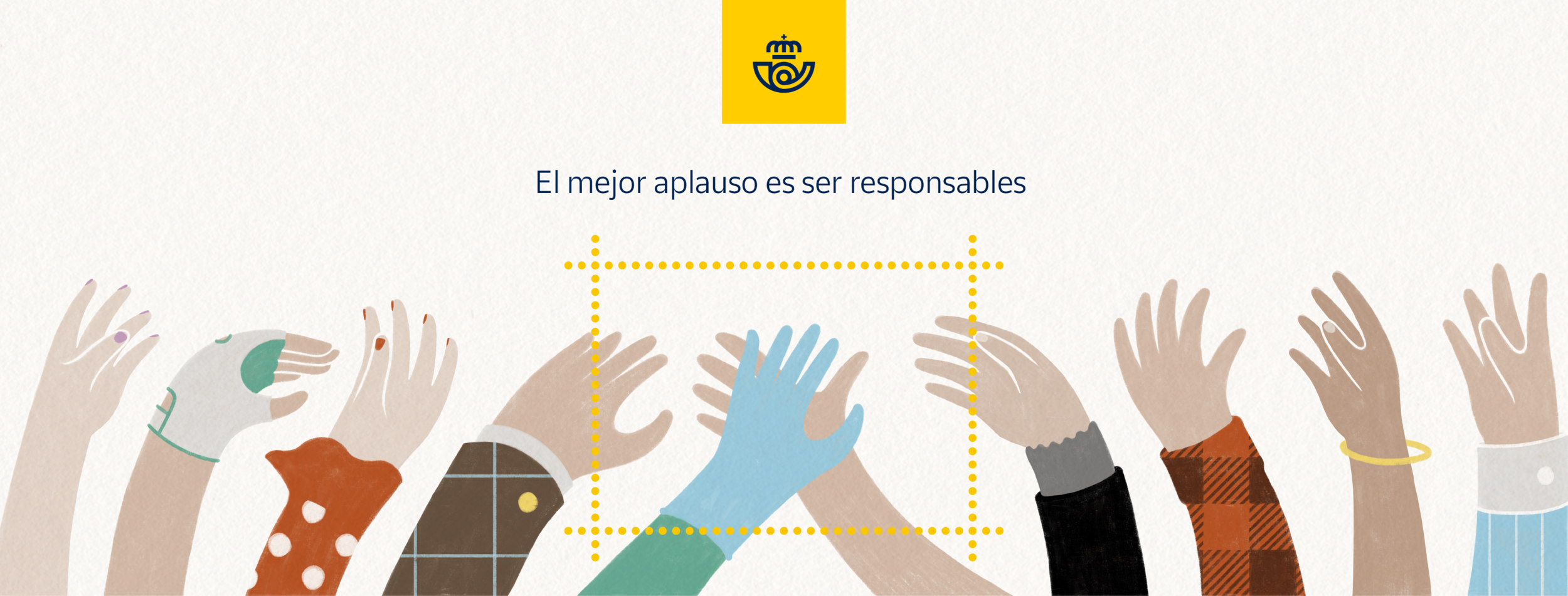
THE BEST APPLAUSE IS TO ACT RESPONSIBLY
After a summer of excessive social relaxation in Spain among family members and friends, the launch of the stamp (designed 3 months earlier) came at the time the second wave of the virus was starting to hit. That’s why we turned a simple stamp launch into an opportunity for a soft public awareness campaign.
Because truly, the best way to thank Spanish health workers is not with daily ovations, nor stamps. The best way to honor their epic effort is that each and everyone of us act more responsibly in order to make their workload manageable.
STAMP DESIGN
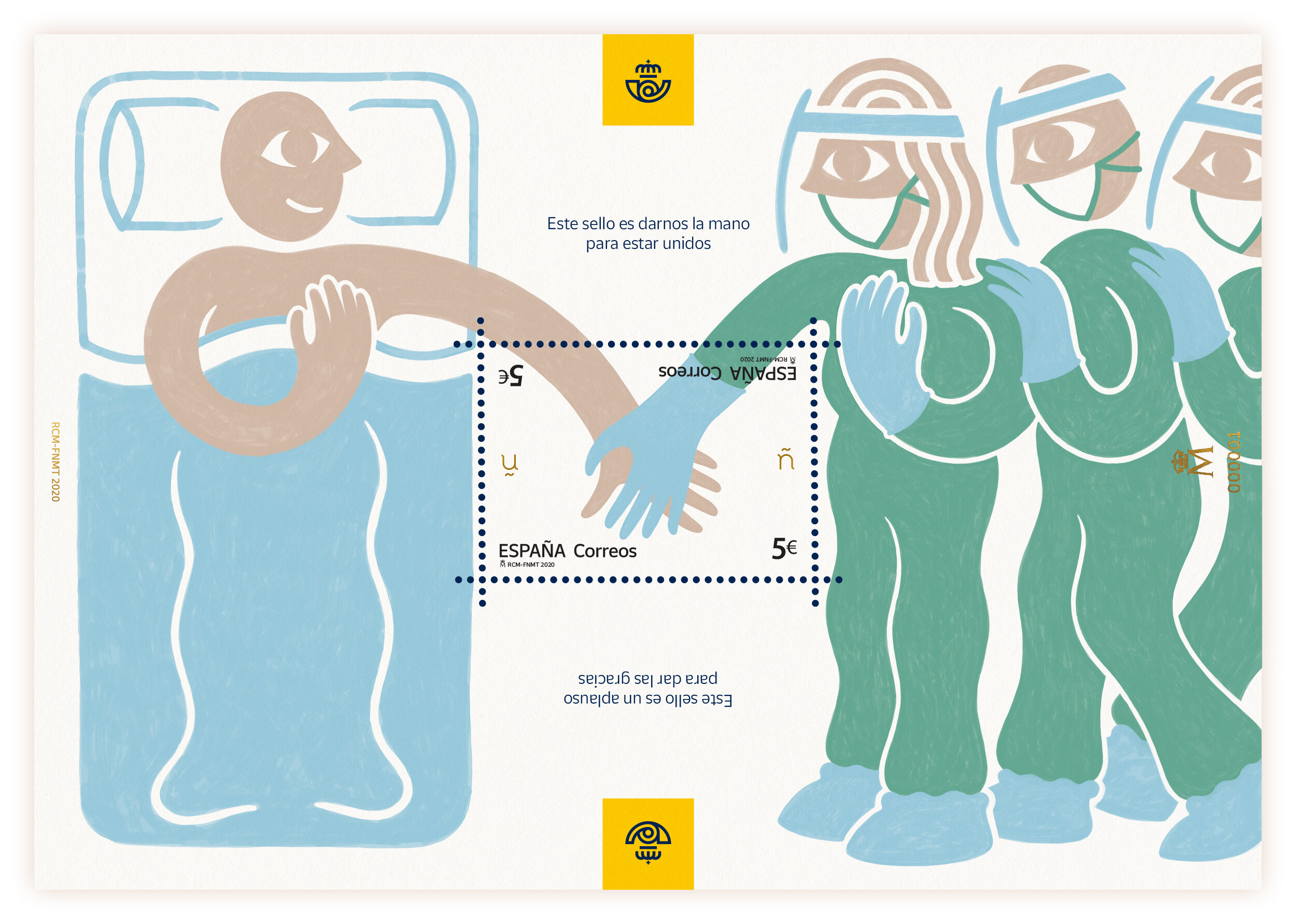
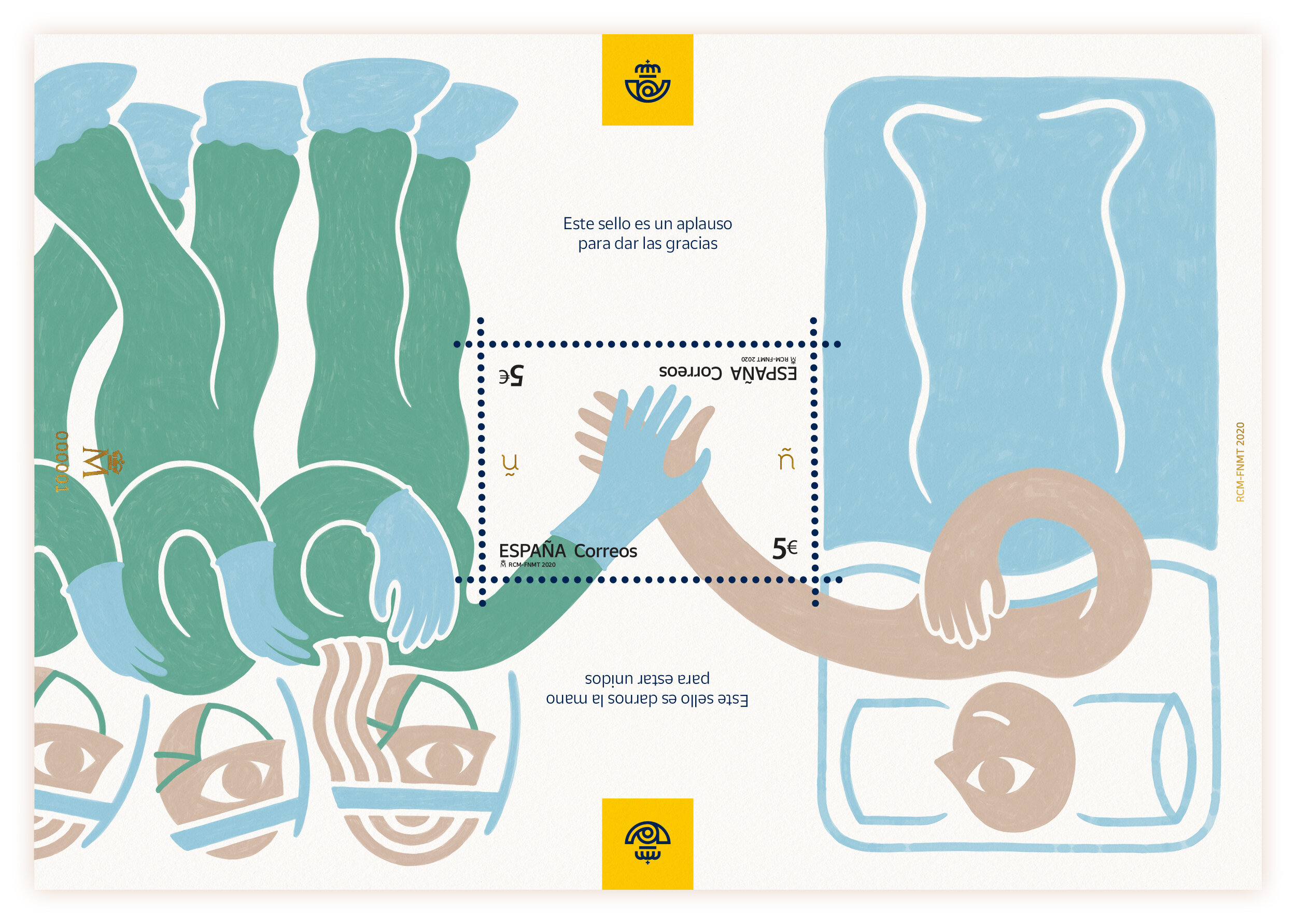
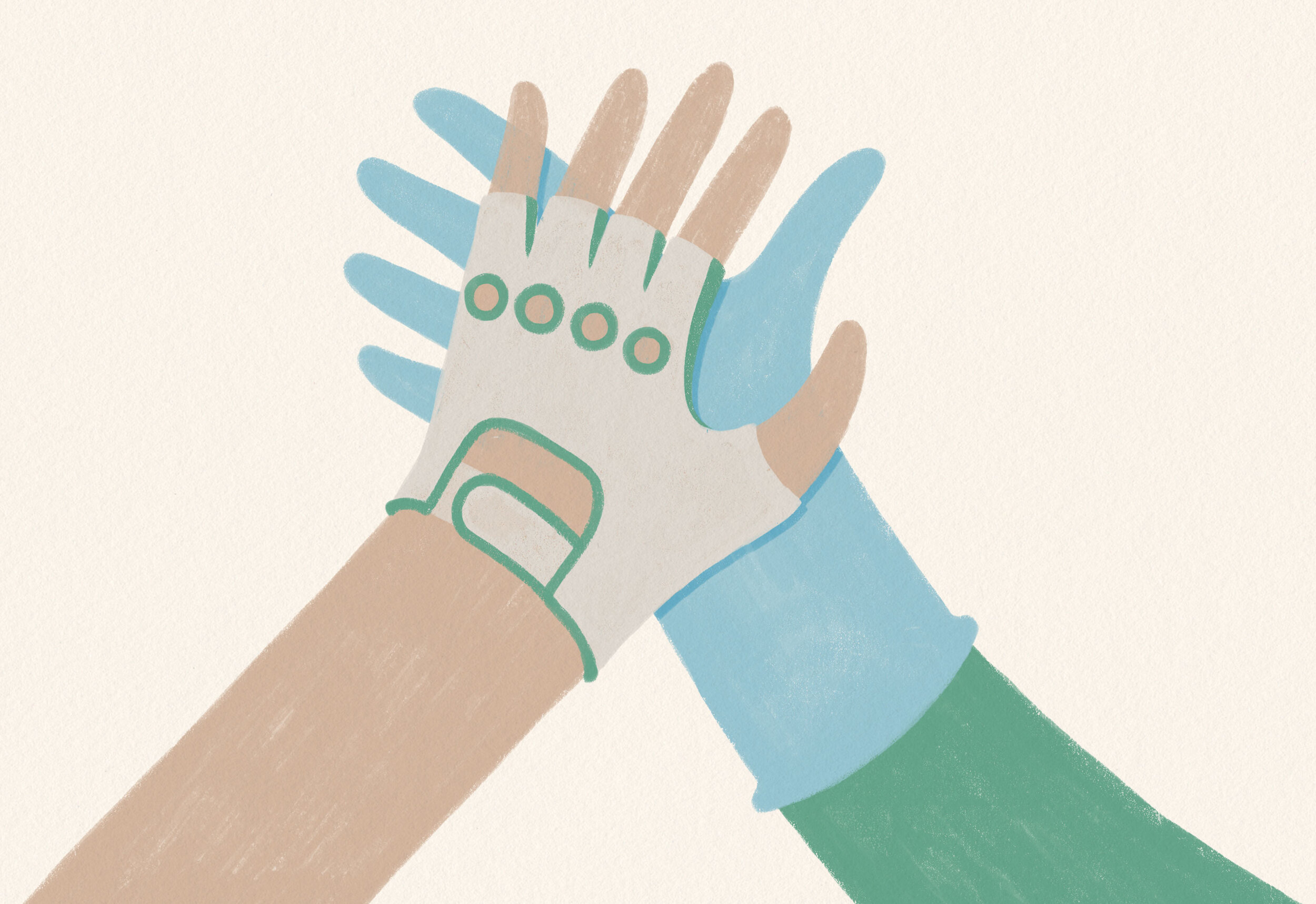
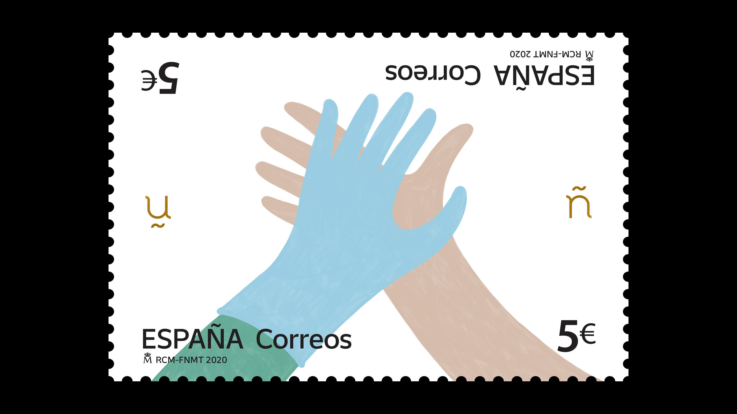
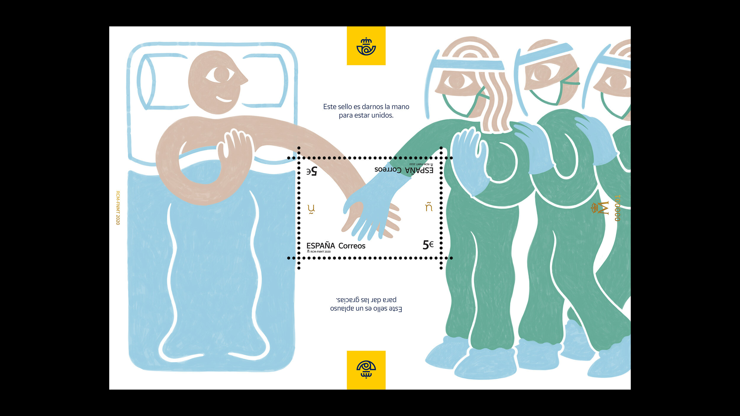
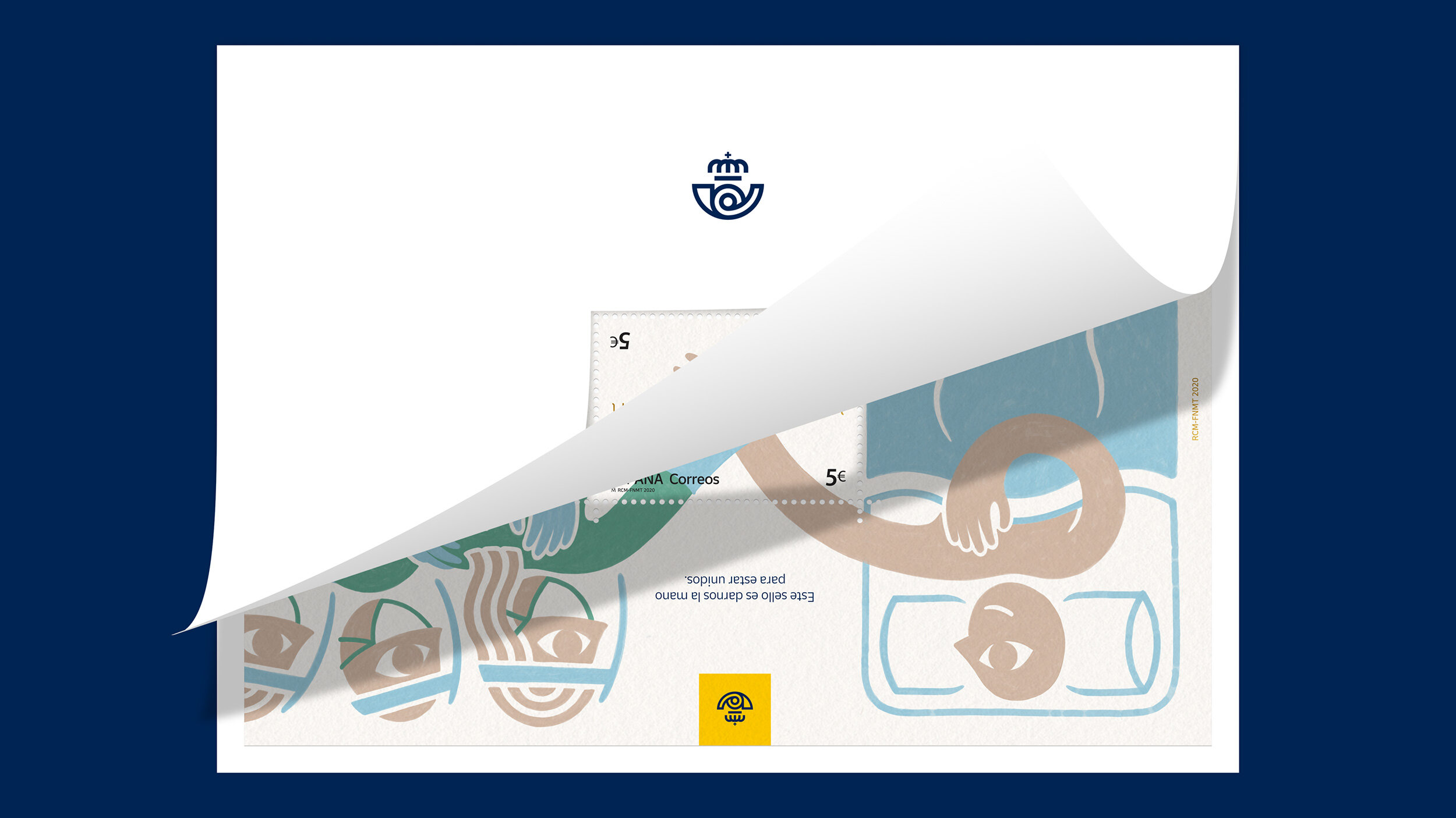
The miniature sheet made clear the double reading of the stamp on each side:
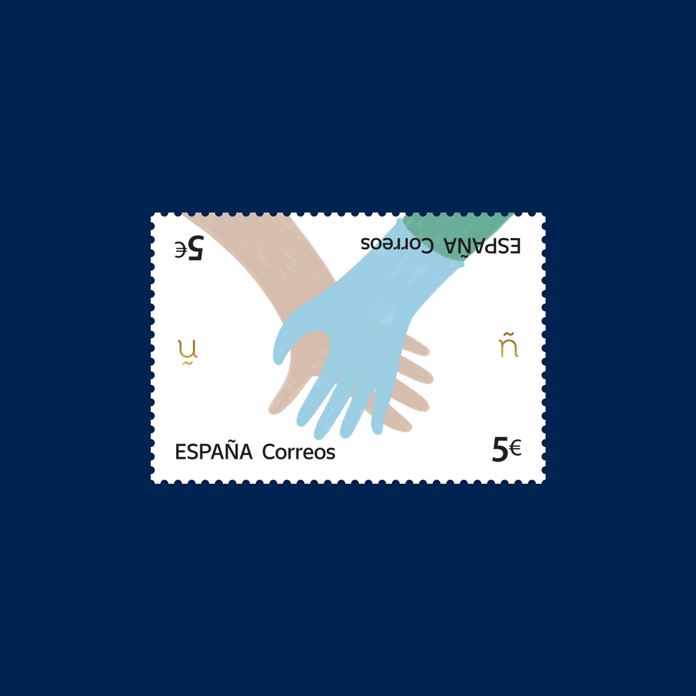
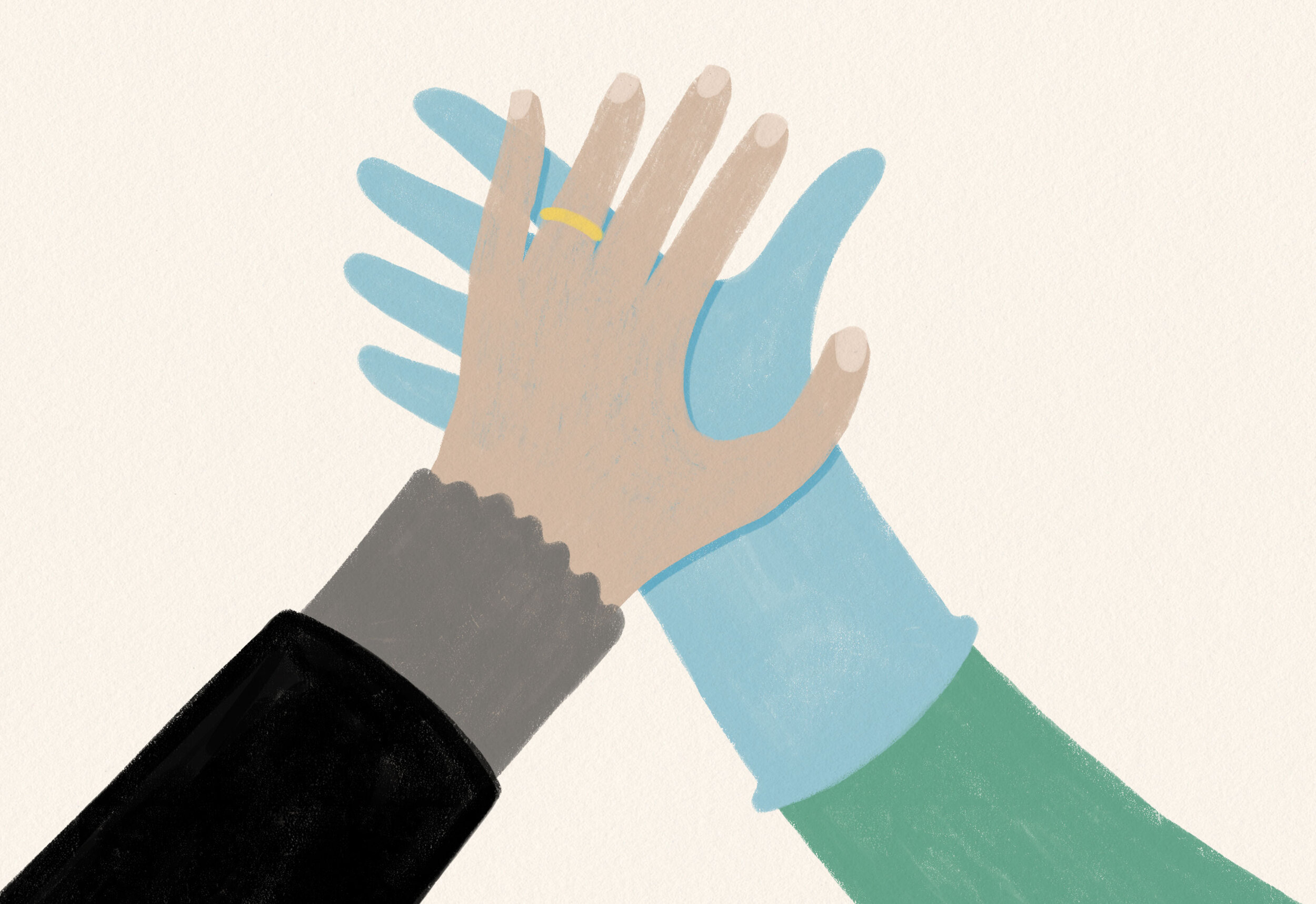
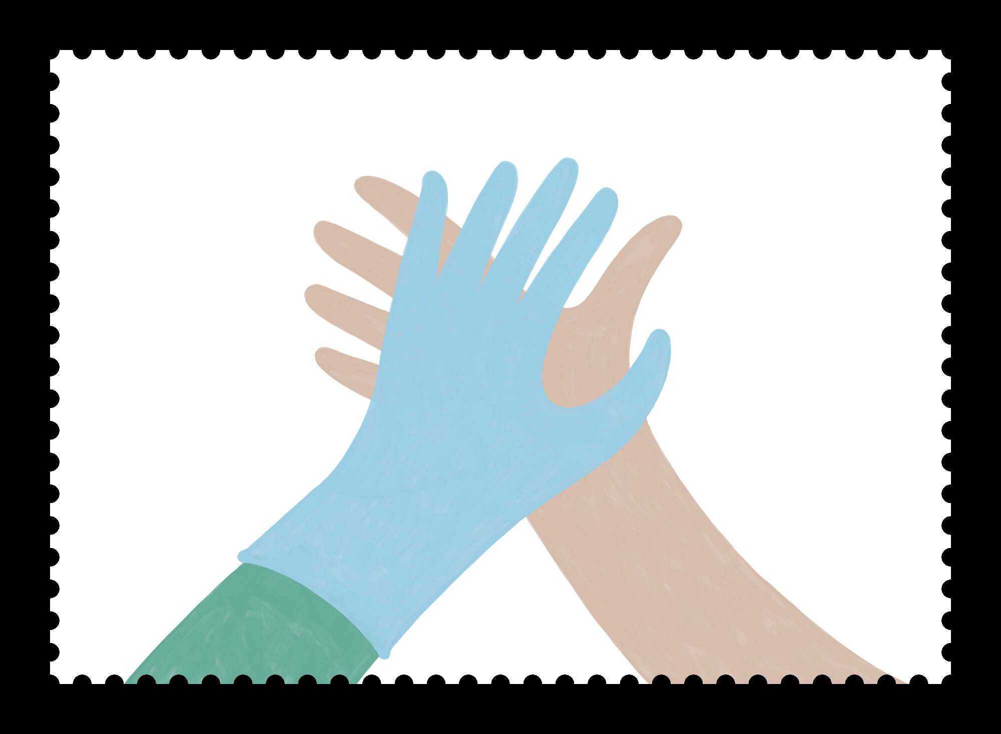
This stamp is taking our hands to face this together.
This stamp is an applause to say thank you.
SOCIAL MEDIA
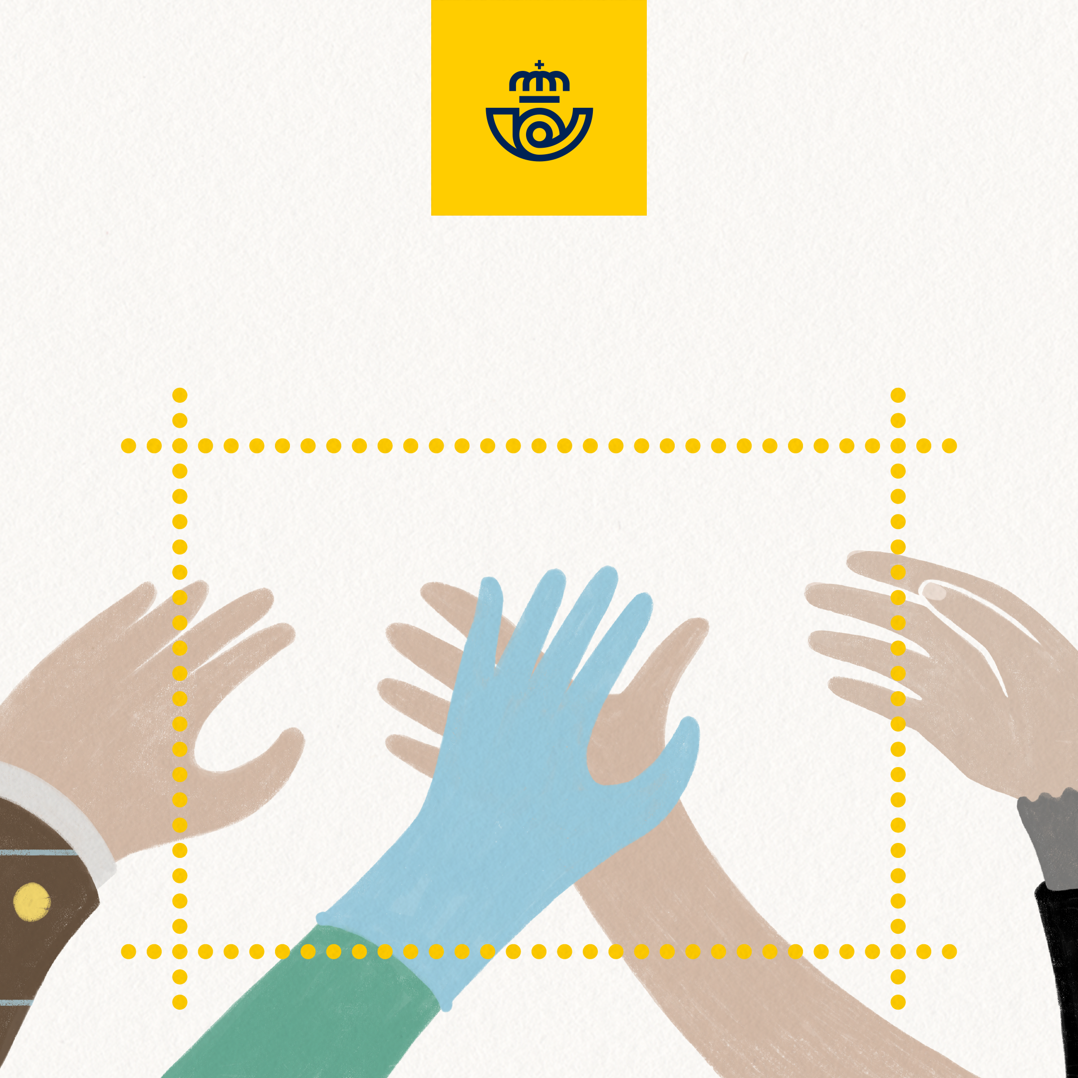
The message stretched into social media with two small “pill” videos based on the double reading of the stamp. Given the increasing differences of political and public opinion about the pandemic management, one pill pivoted around the message of facing this problem together, and the other one around the idea of showing gratitude by acting more responsibly: Not a new message, but certainly the right one to insist upon.
INSTAGRAM WALL LAUNCH
INSTAGRAM STORIES
Similar “pill” videos were created for Instagram Stories:
KEY VISUAL / OOH
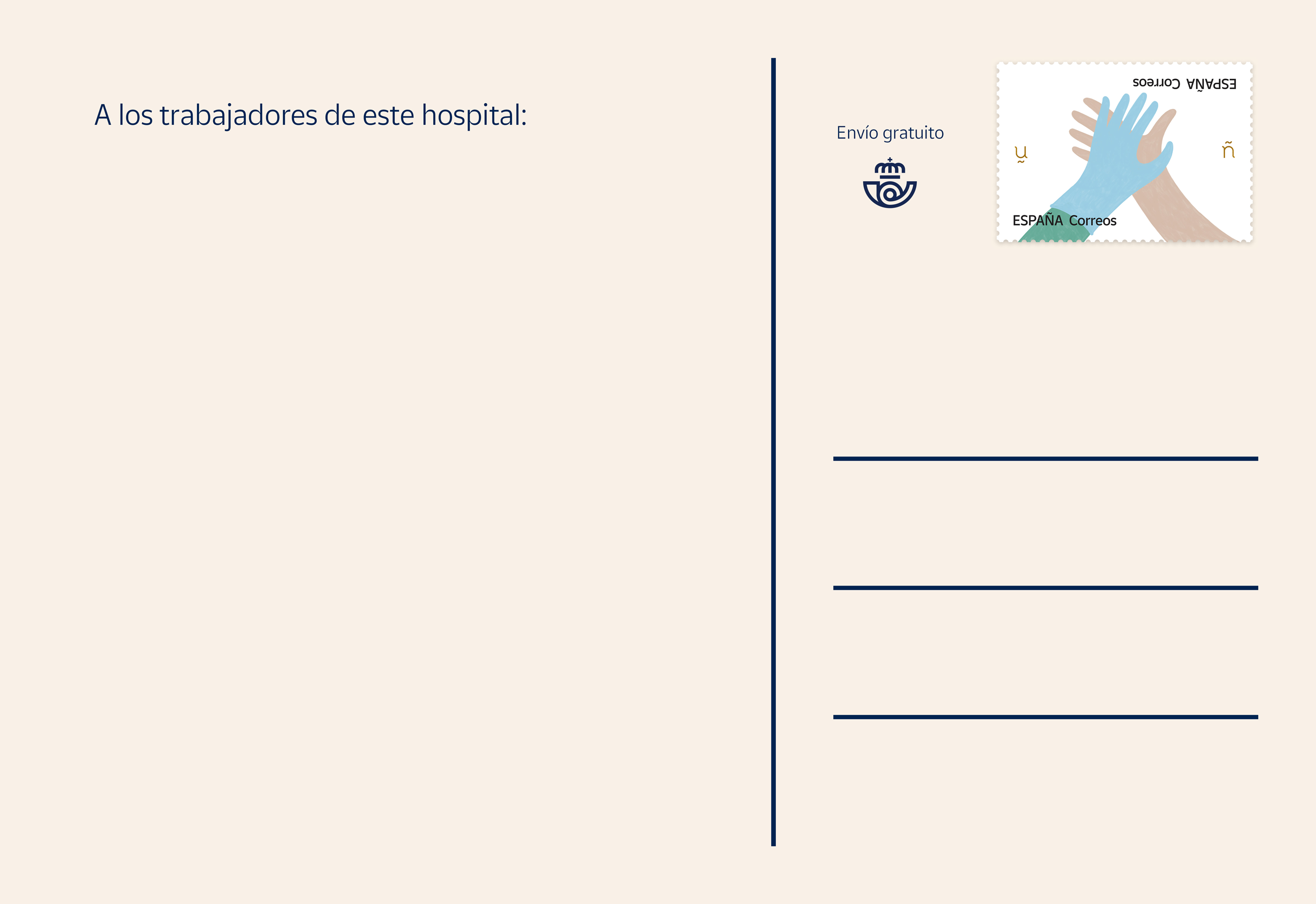
REAL POSTCARDS
In the main film we hid a written postcard: a message from a COVID-19 recovered patient, thanking the nurse that took care of her/him in the hospital. A small “inception” idea, hoping some people would see it and think of doing the same thing.
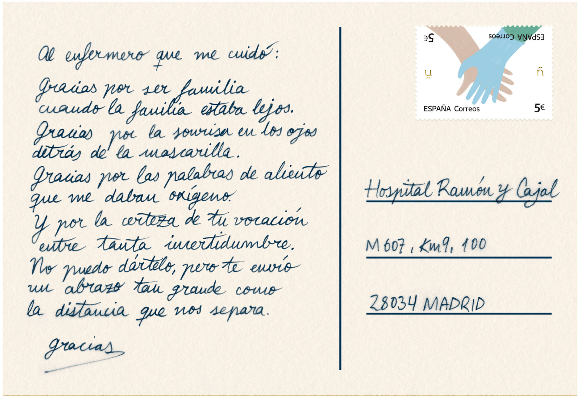
To further this idea we proposed the creation of postcards with hands representing all kinds of spaniards, reaching out to “touch” health workers with some words of support. This postcards were to be delivered to random hospitals all around Spain by Correos.


CREATIVE ROLE: Creative & art & film direction, copywriting, animation, illustration.
DESIGN & ANIMATION PROCESS
I had wanted to design a stamp for a long time (specially after my working days with Robert Nakata, who often told me about stamp design). However, the deadline for this first stamp was funny. I was told on a tuesday at 20:00 pm and the design had to be delivered wednesday 10:00 am. Ha!
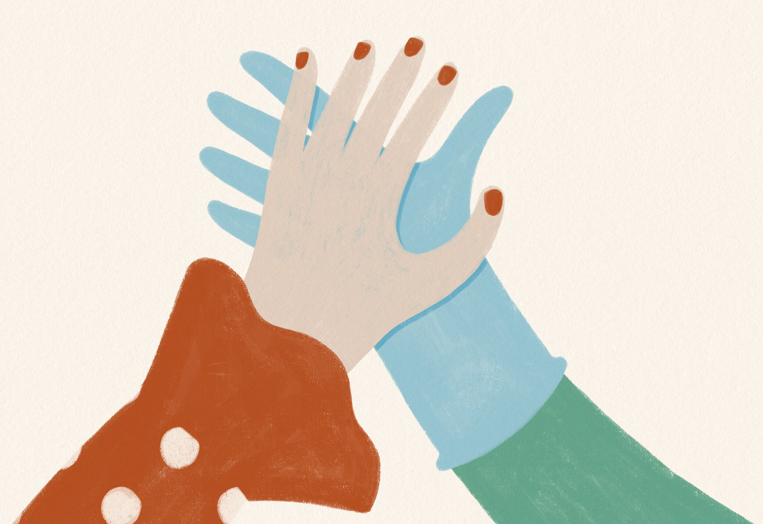
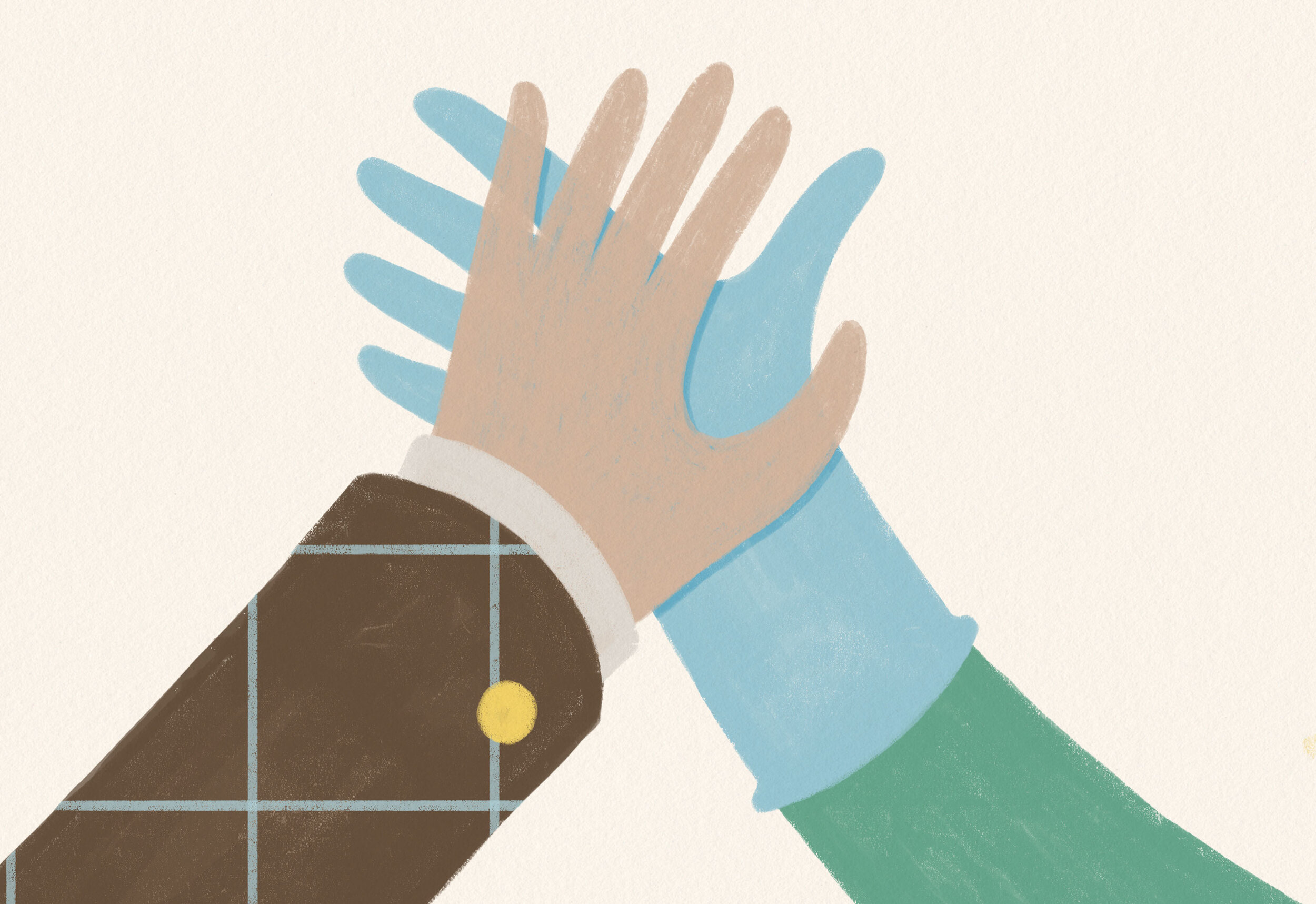
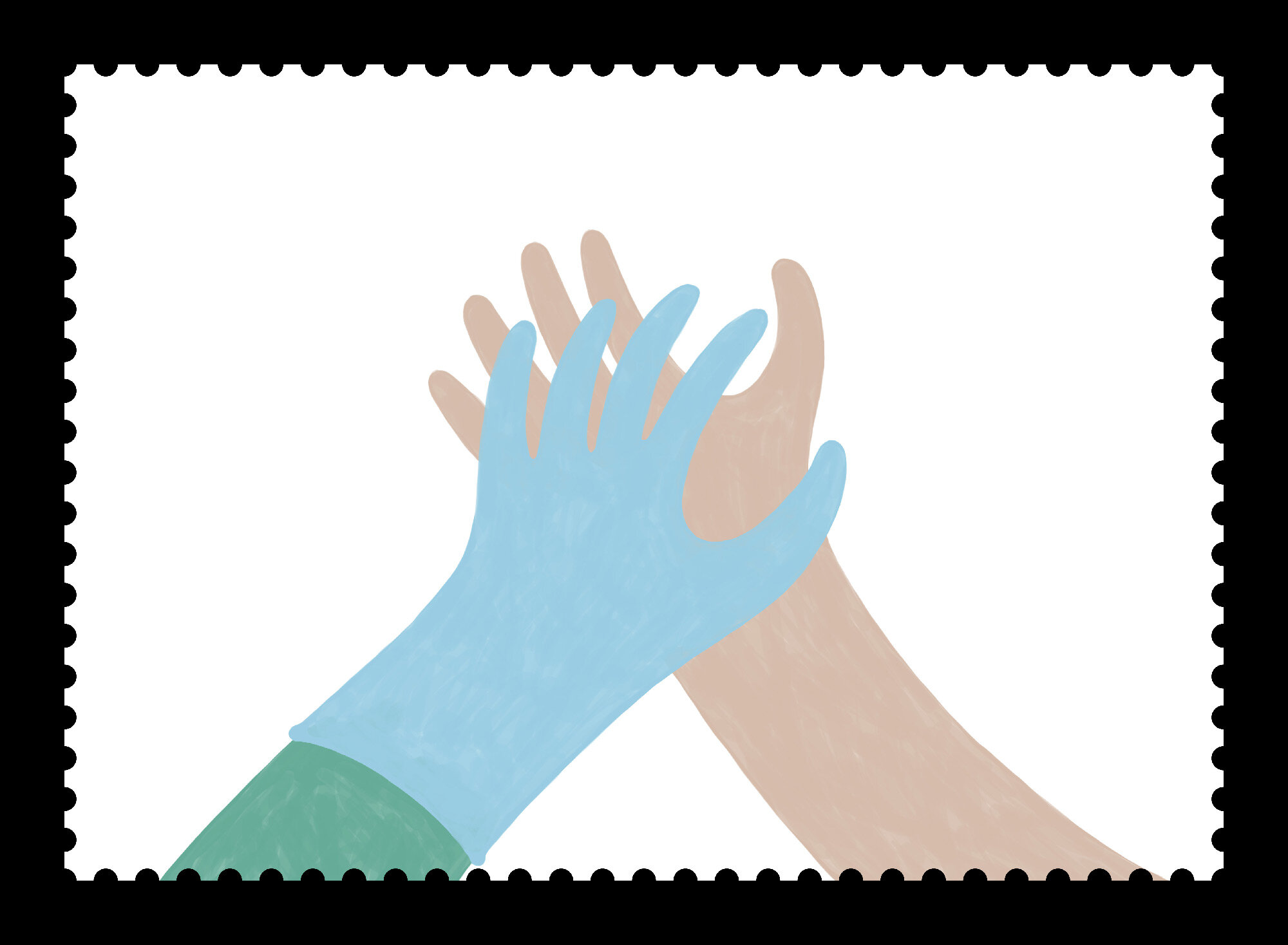
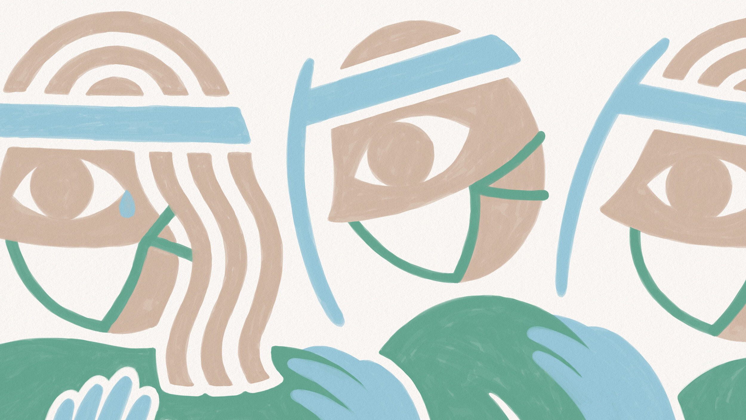
The brief clearly stated to focus on “the applause”, but somehow just two hands weren’t doing the job for such an emotional subject. I clearly remember sitting 3am on the drawing table with that feeling of “i have nothing at all”, when i saw one of the applause sketches accidentally upside down. Then and there i saw a doctor holding the hand of a patient when his/her family can’t be with them. It made me quite emotional, so from that emotion i knew there was a good idea to work towards.
In terms of execution the idea asked to be as human and “touching” as possible. With this in mind hands were drawn by hand with a minimum/soft pastel color palette.
(some design options considered)
The brief required to design both the stamp and miniature sheet. So i kept it very simple in the stamp and told the rest of the story in the miniature sheet. The back of my mind also recalled some famous and valuable British stamps that were accidentally printed with the Queen’s head upside down. So the possibility of having the stamp graphic elements in both sides, was closing the double reading very nicely (and from a collector’s point of view could make it special).
The idea for an animation came days later, with the proper time to work it out. For the same reason stated above about being as human as possible i went for frame by frame animation (animated “on twos”) with a yellowish-warm paper texture. All drawings were made in photoshop via Cintiq and compositing and editing in After Effects, after finding a song with the right emotional tone.
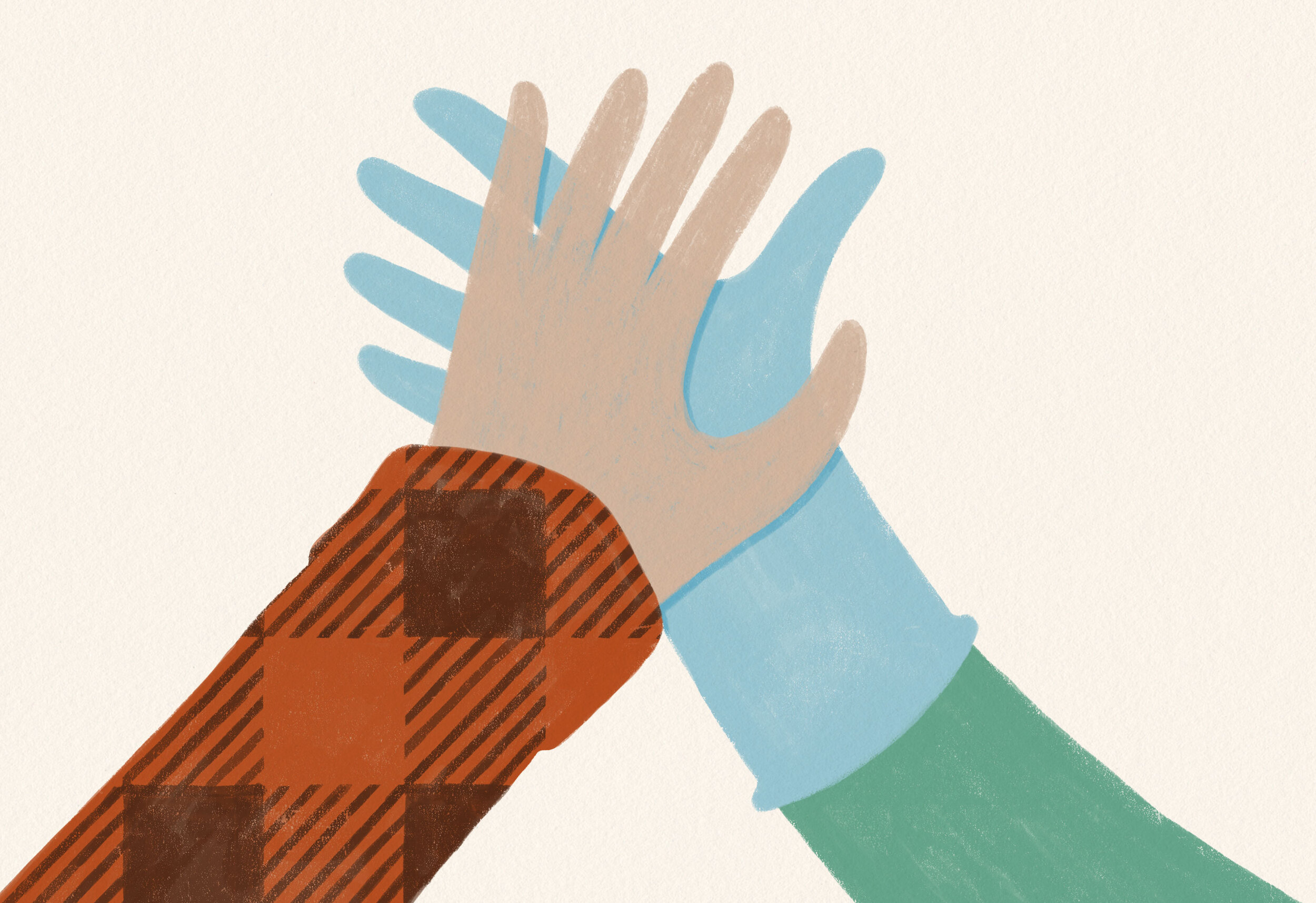
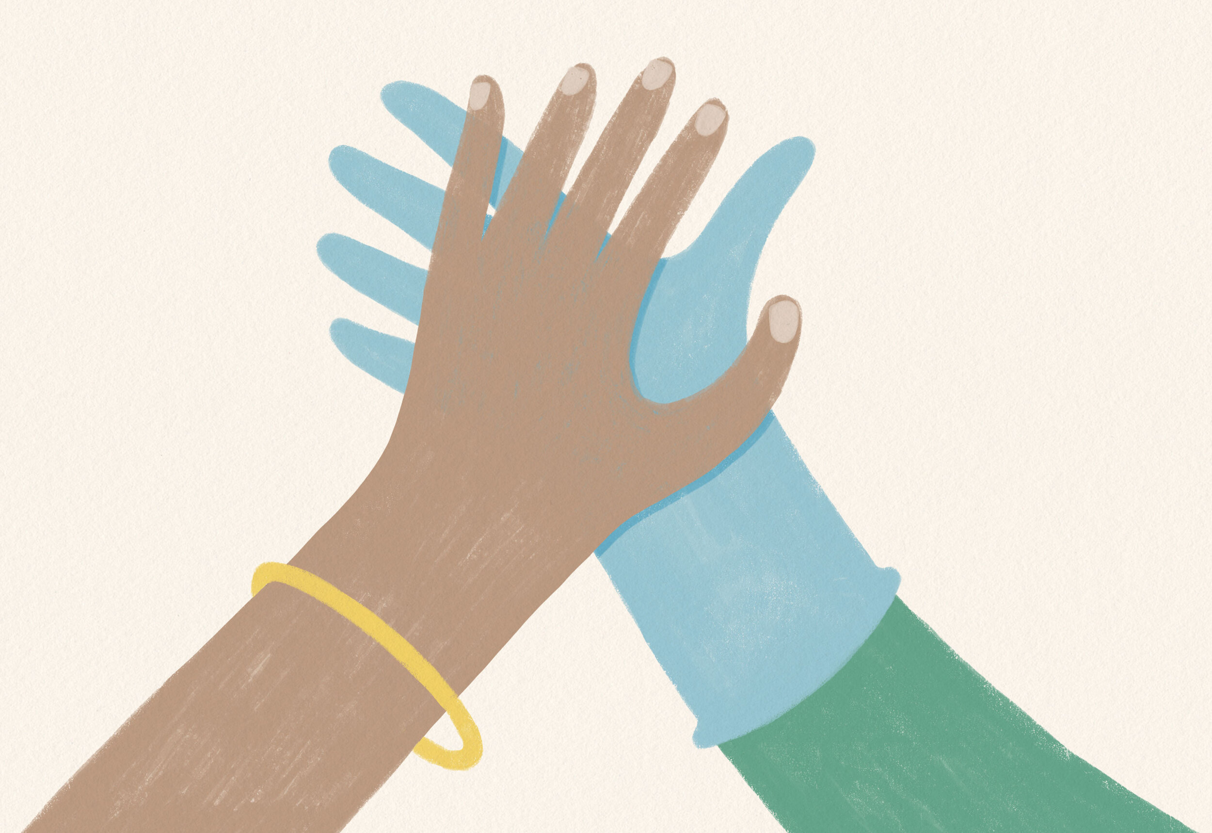
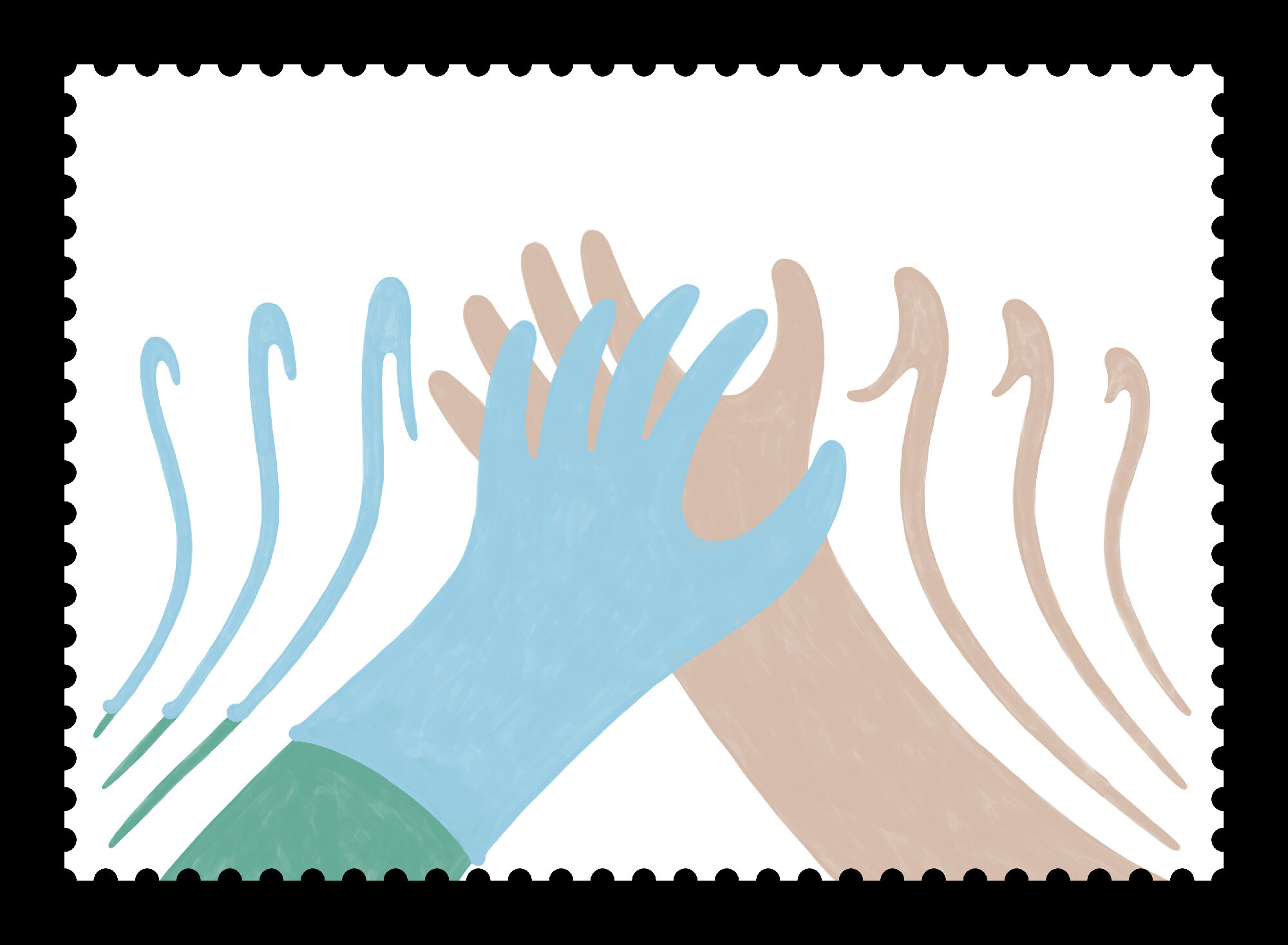
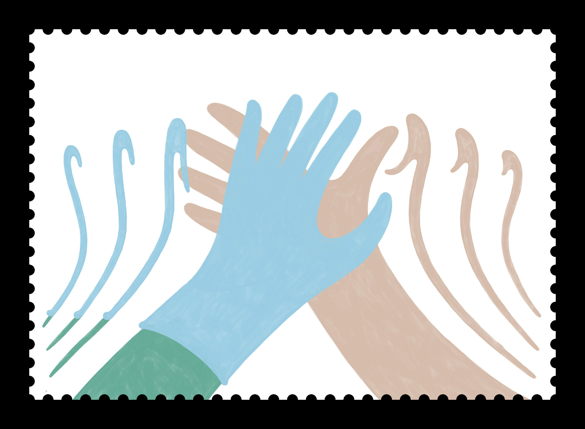
Around 40 different hands were drawn…
…out of which around 220 were individually coloured with a minimum pastel color palette, to represent a wide variety of spaniards of different genders and skin tones.

Loved this project and the opportunity to design a Spanish stamp.
Trying to make something big out of something so small.
CREATIVE ROLE: Everything.