Brand restyling for one of Spain’s oldest and most established construction firms. We crafted a renewed identity through a modular visual system, purposeful motion principles, a more expressive visual language, and a balanced color palette with solid typographic choices. We also refined OHLA’s brand marks to enhance clarity and functionality across all digital environments.
Roboto Sans · Variable type possibilities
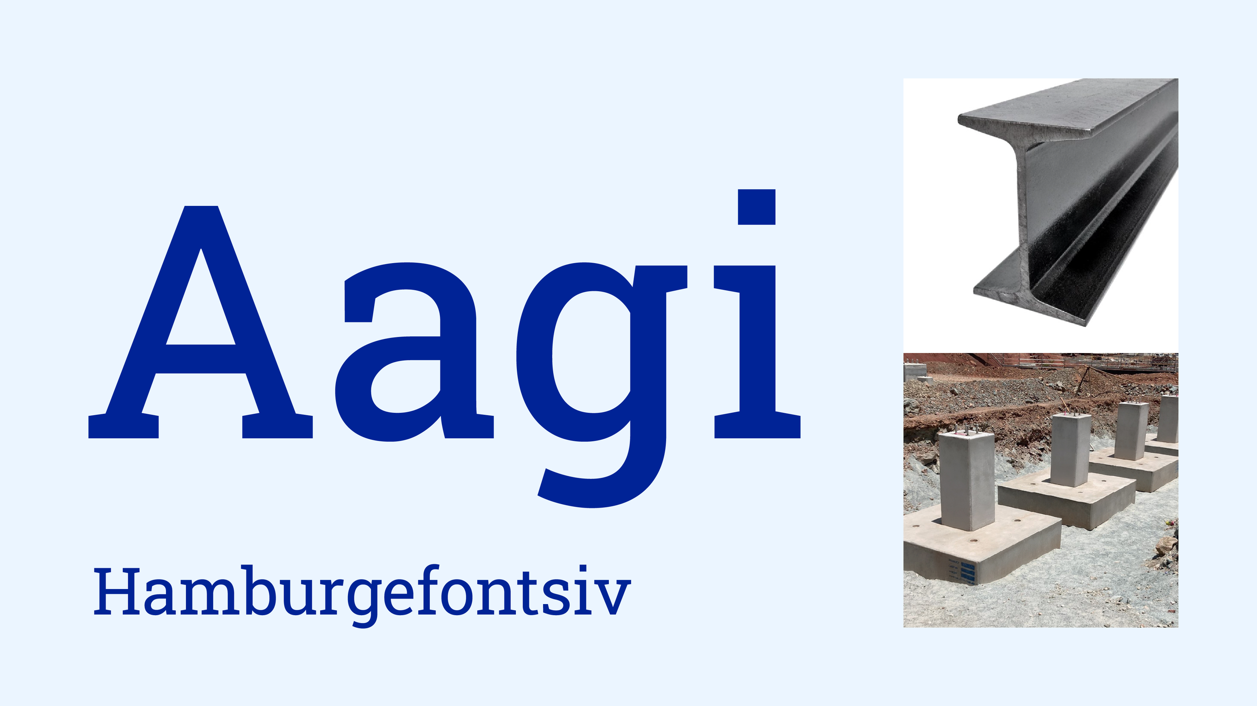
Roboto Slab · Variable type possibilities
First Principle · Build Up
Second Principle · Volume


