The beautiful gaditan “Pueblo Blanco” of Grazalema faces similar generational challenges to many other small towns across Spain. “Grazalema Regenerativa” is a non-profit initiative focused on building a healthy and resilient community that seeks a better balance of economic growth, sustainability and overall wellbeing of its citizens.
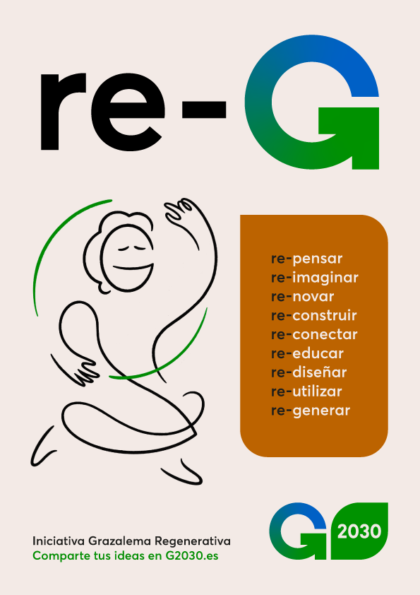
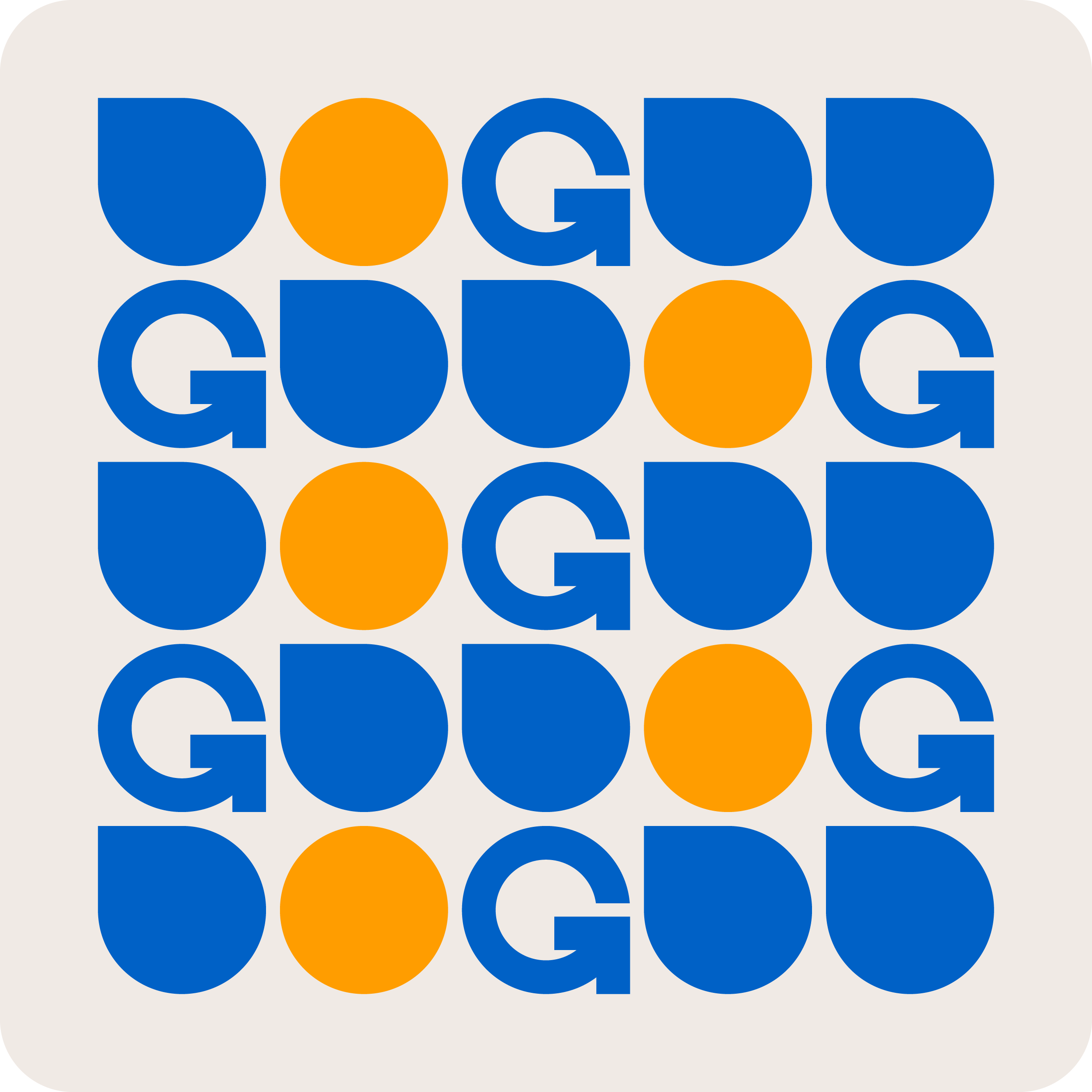
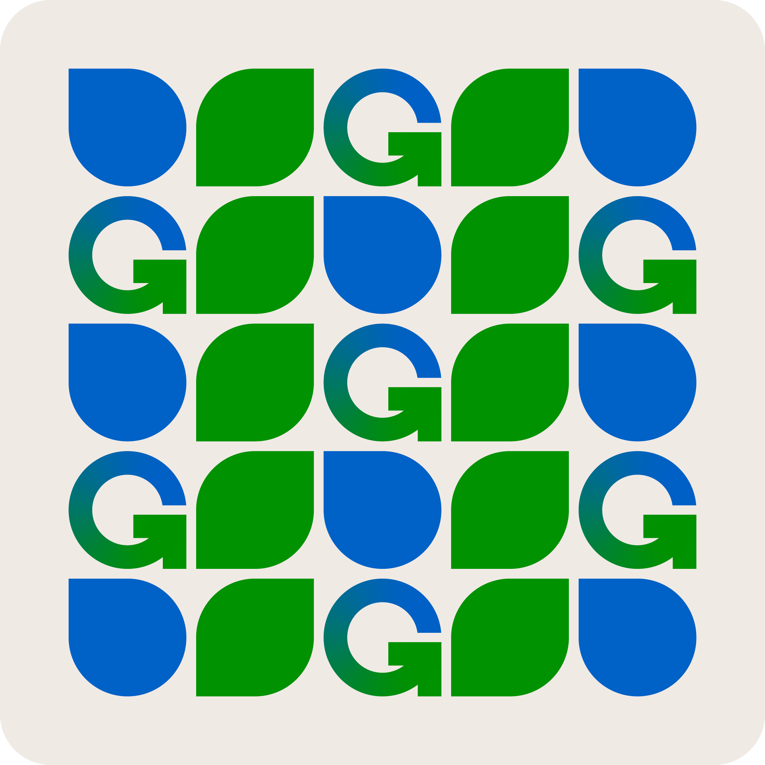
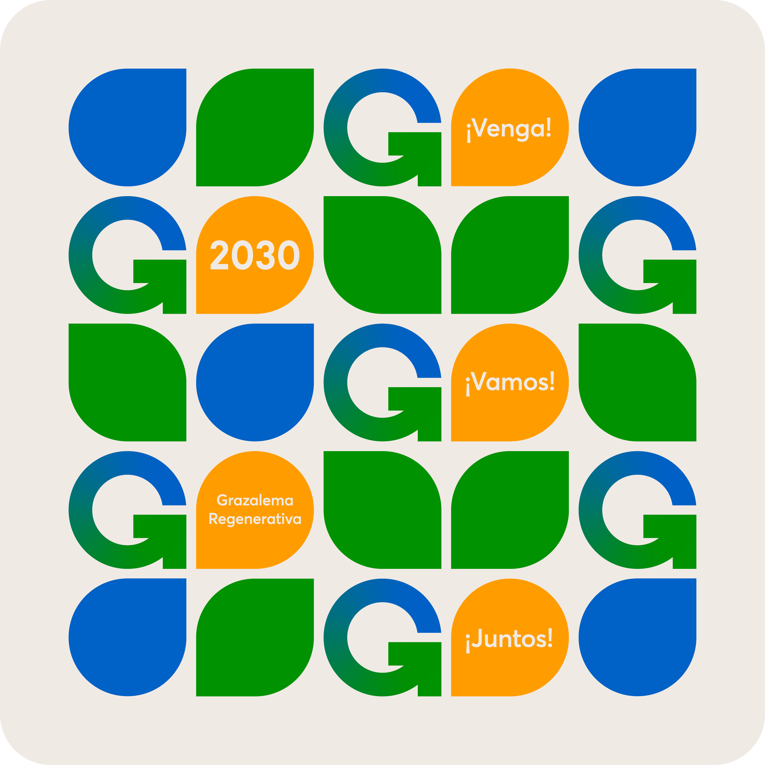
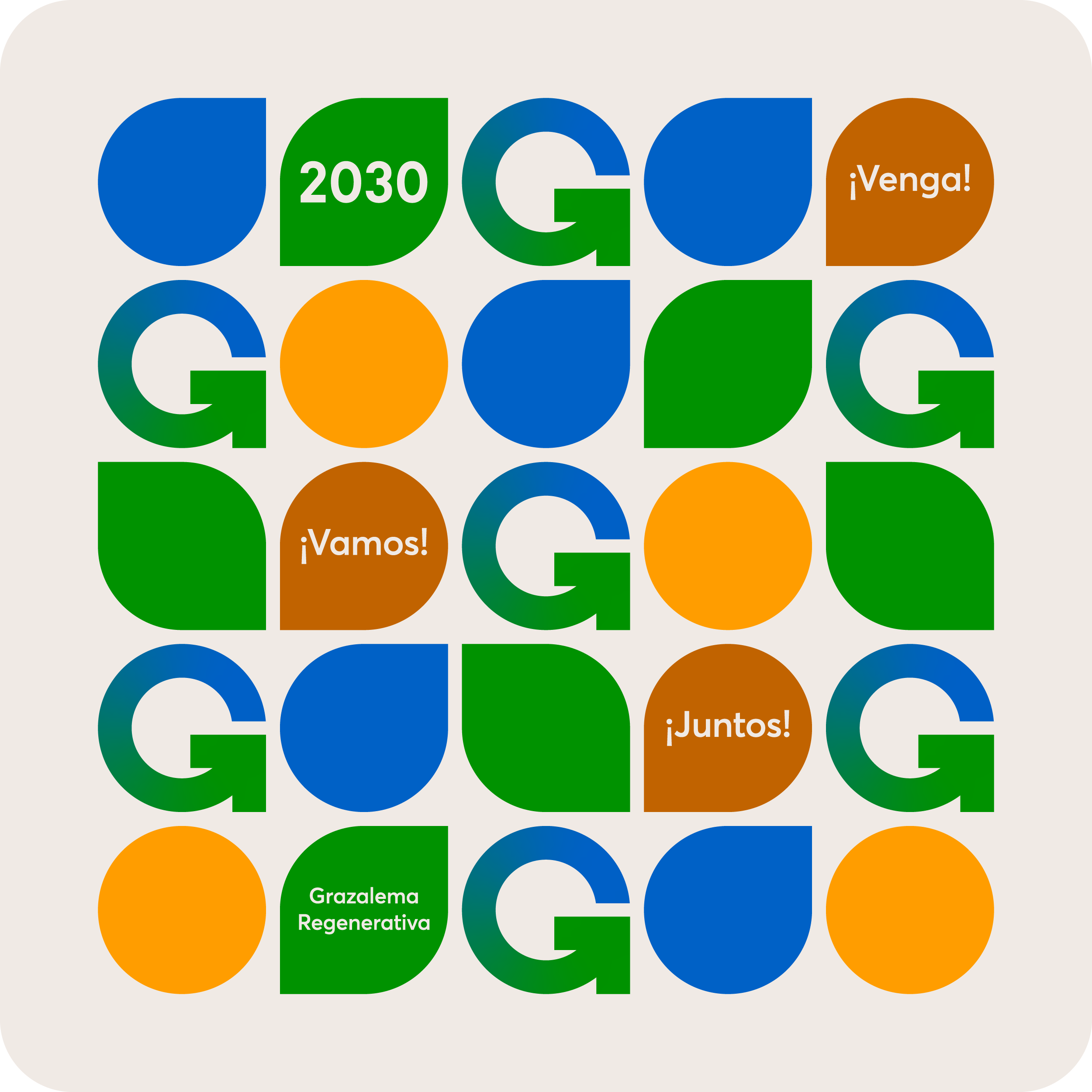
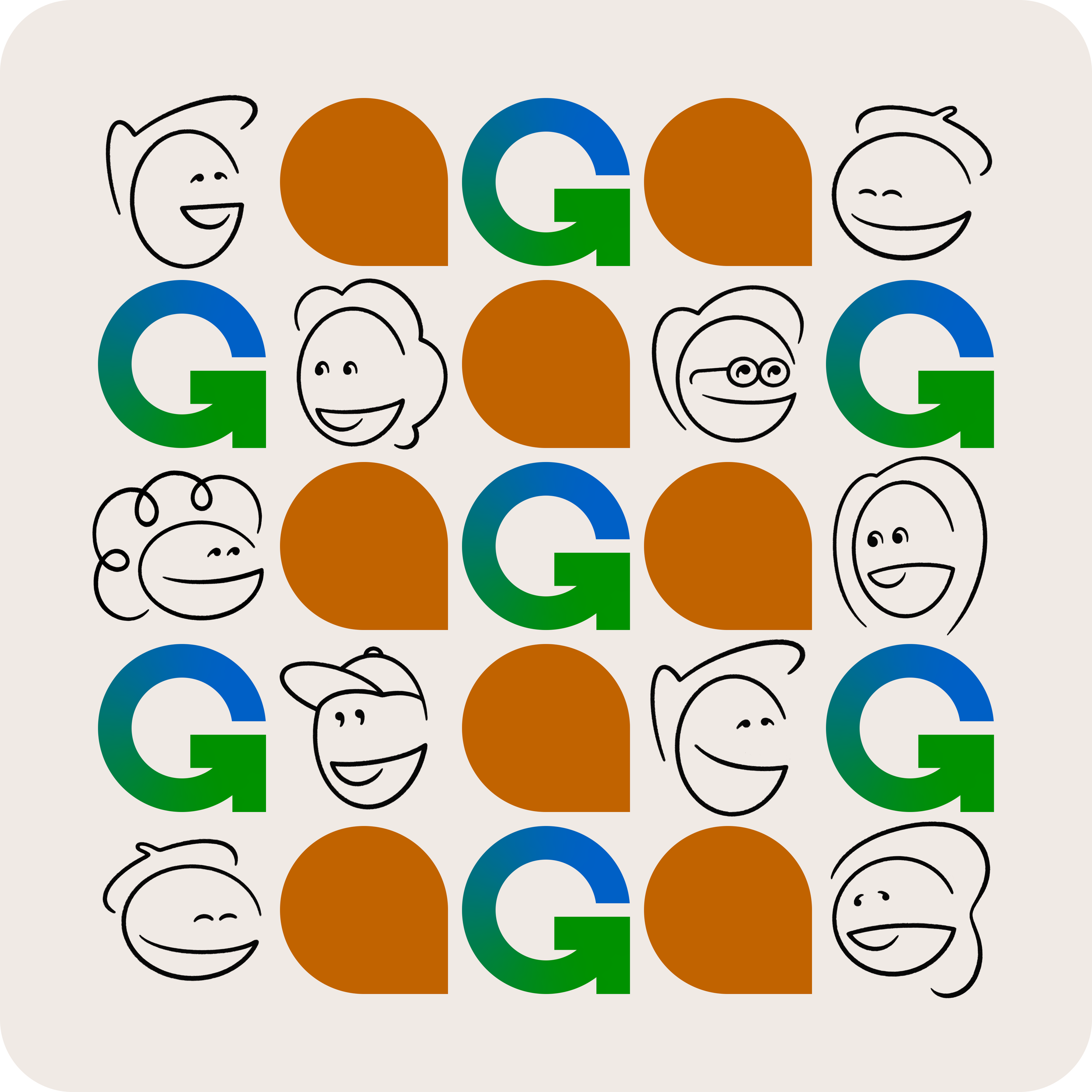
The original Name “ICR2030” (Iniciativa Comunidad Regenerativa 2030) was not helping citizens to identify with the project. The proposed solution “Grazalema Regenerativa” is embodied in the symbol of the logo: a self-generating arrow in the shape of a G.
The initiative is structured in 10 year milestones that communicate a planned commitment with longterm goals, while maintaining a sense of urgency.
PERSONA-GES
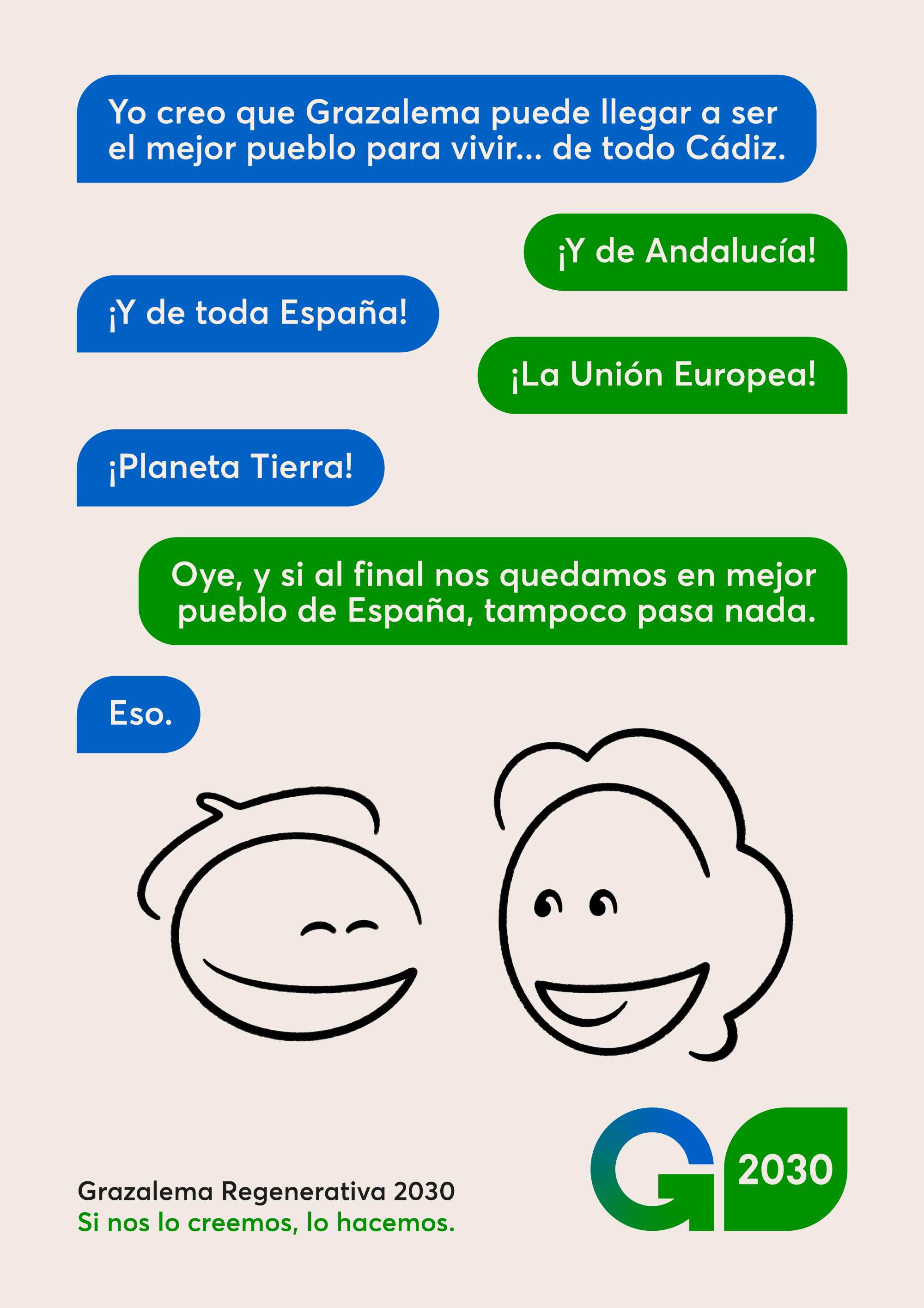
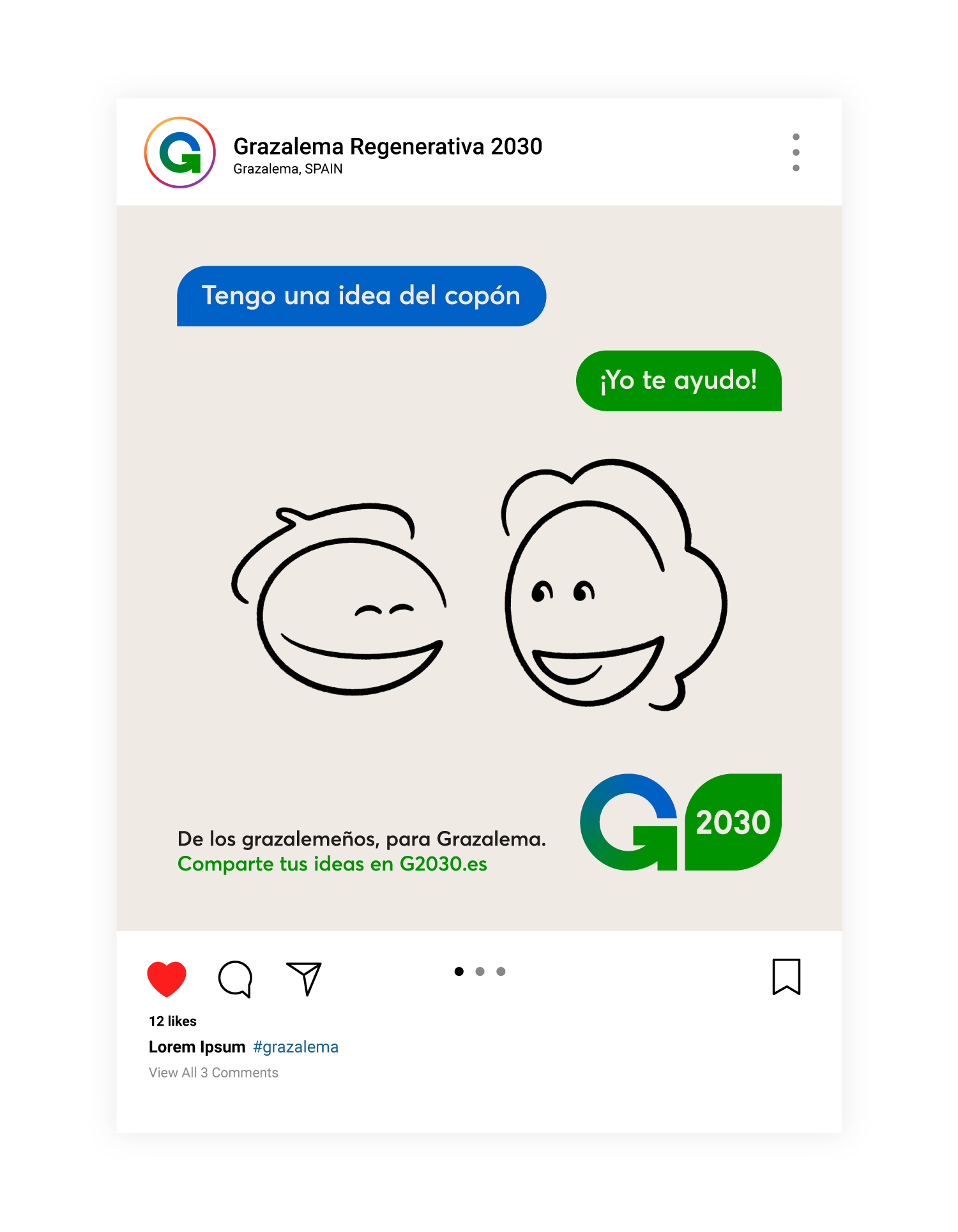
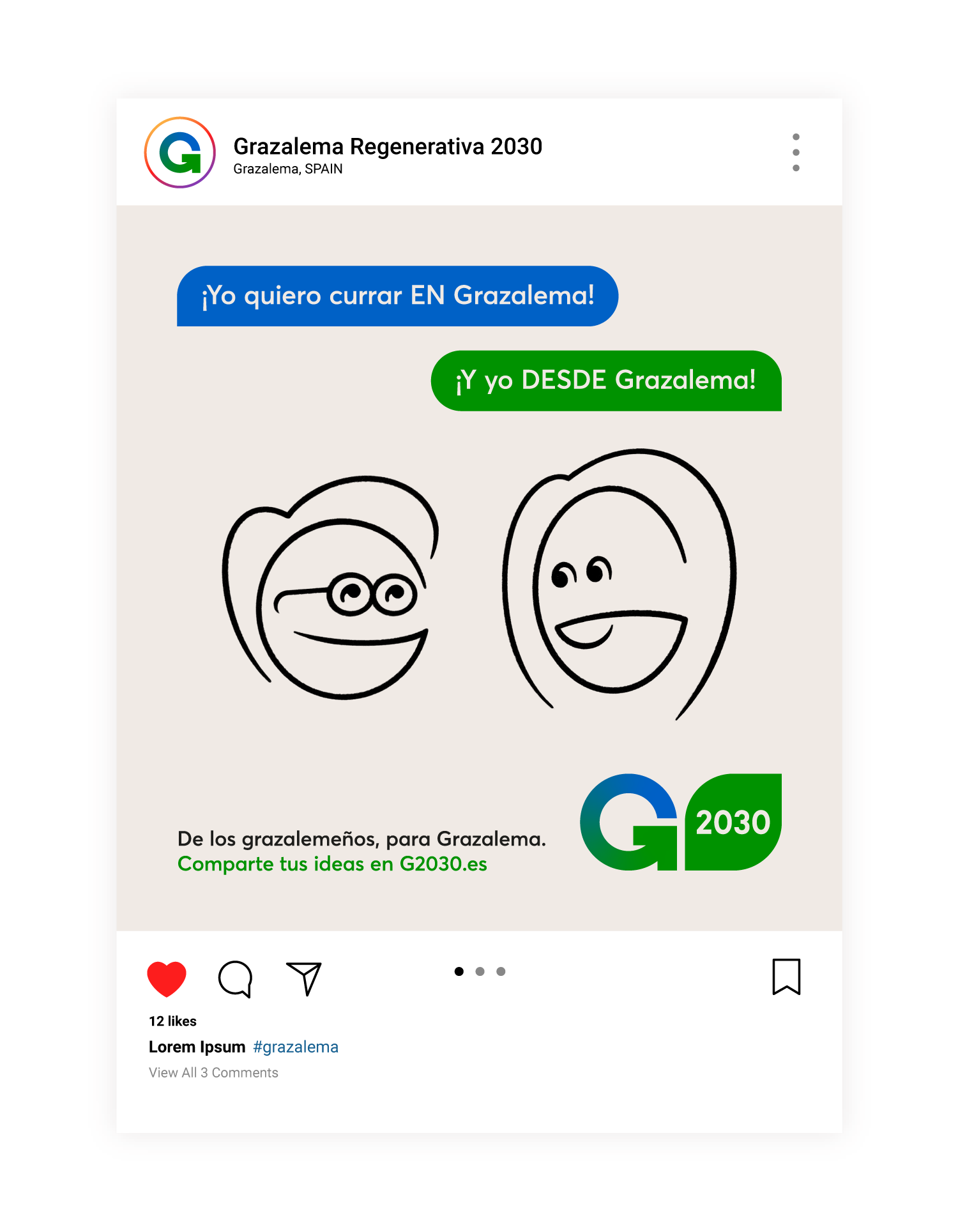
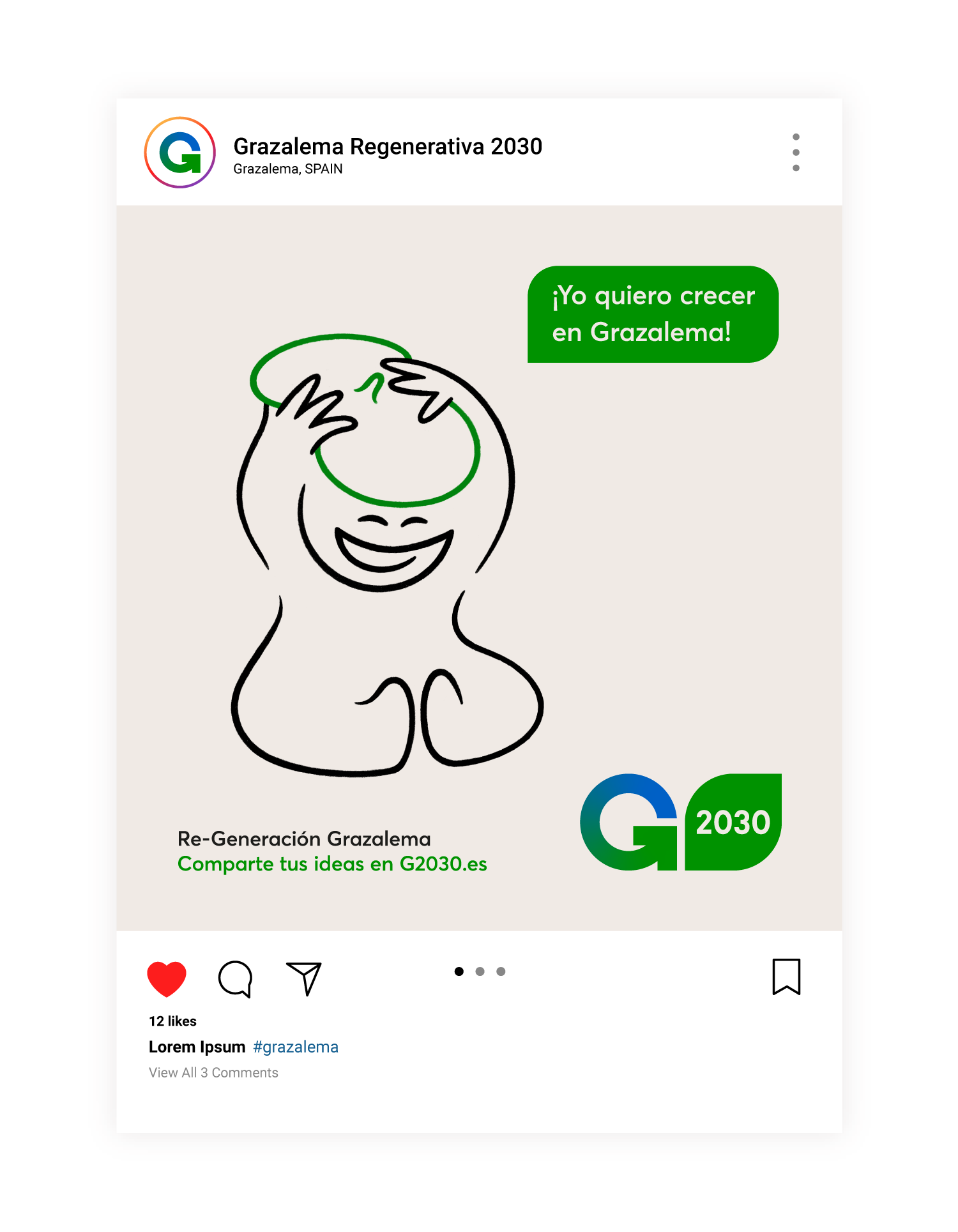
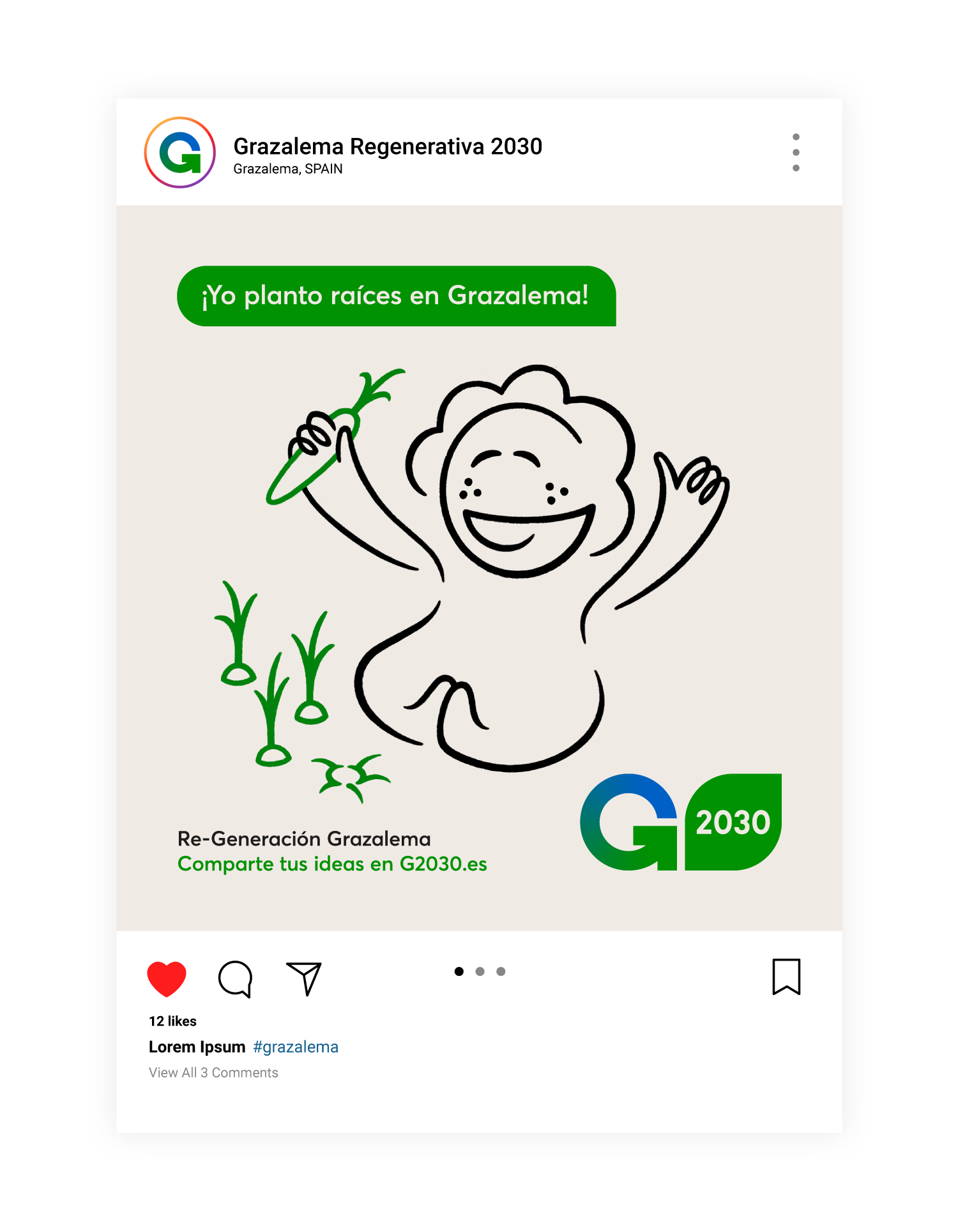
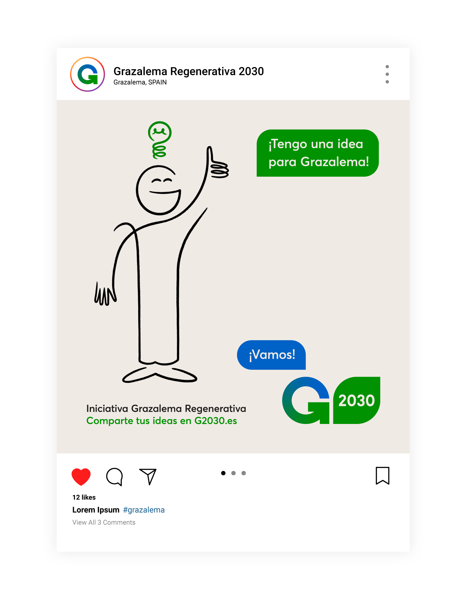
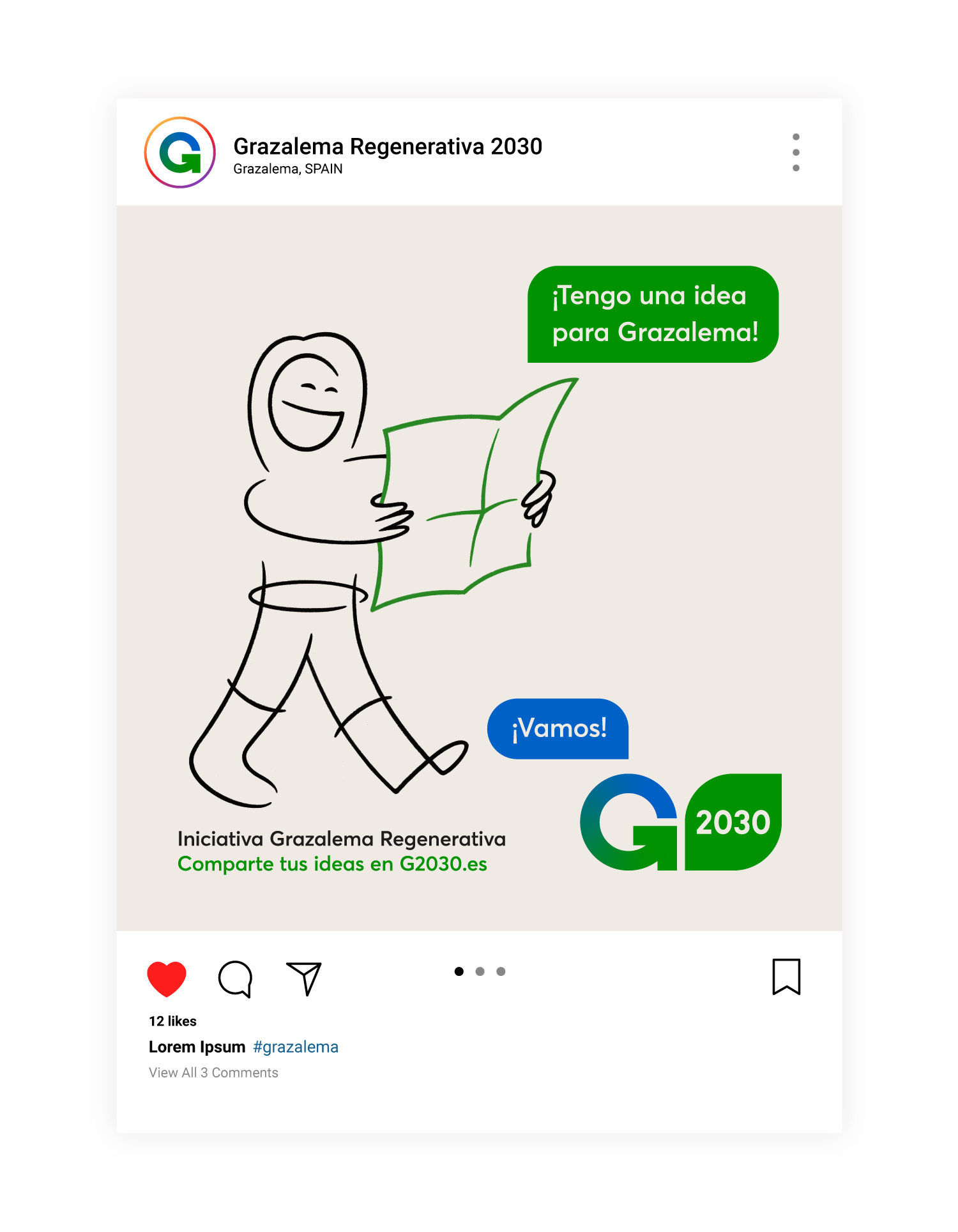
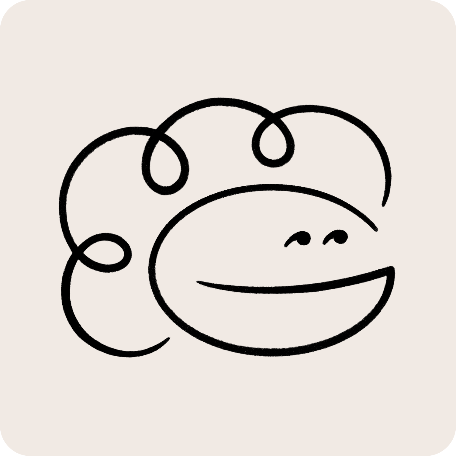
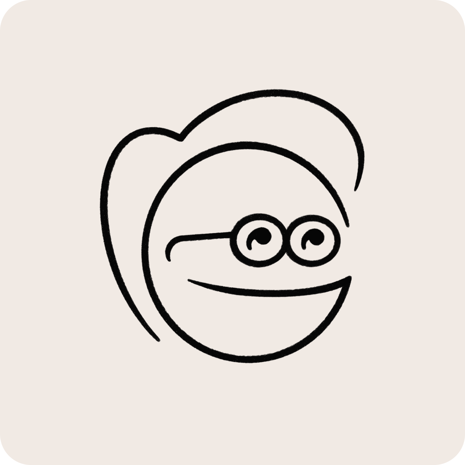
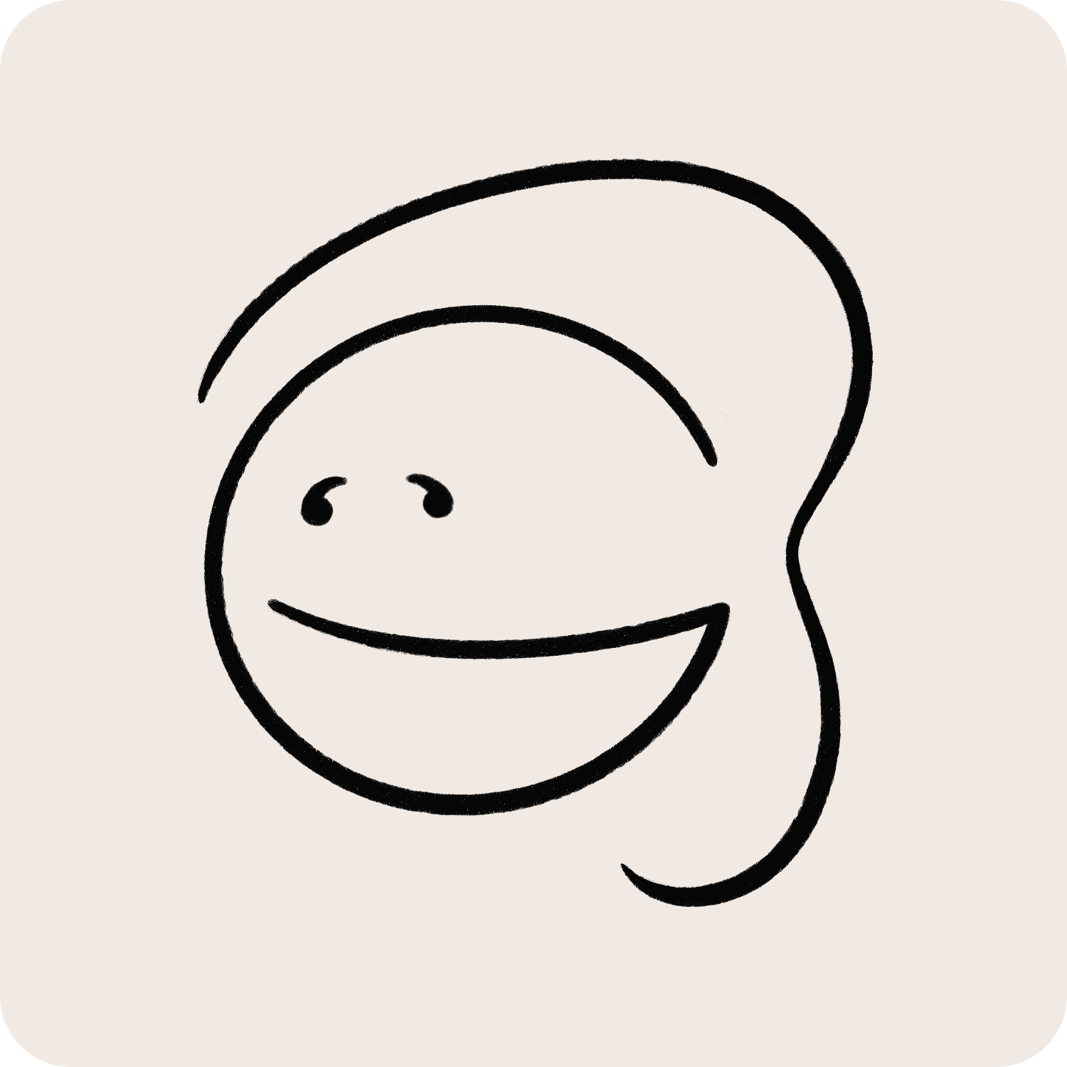
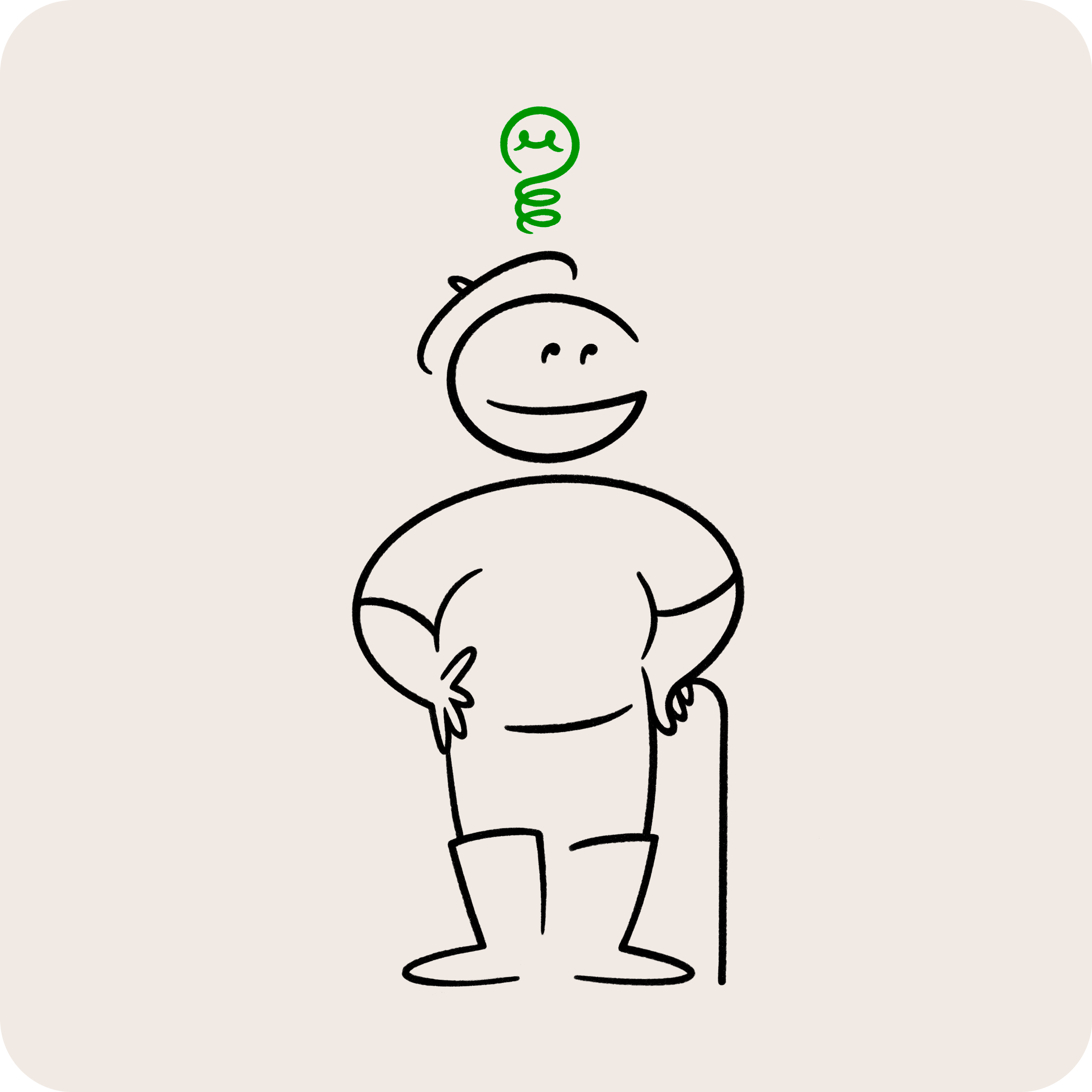
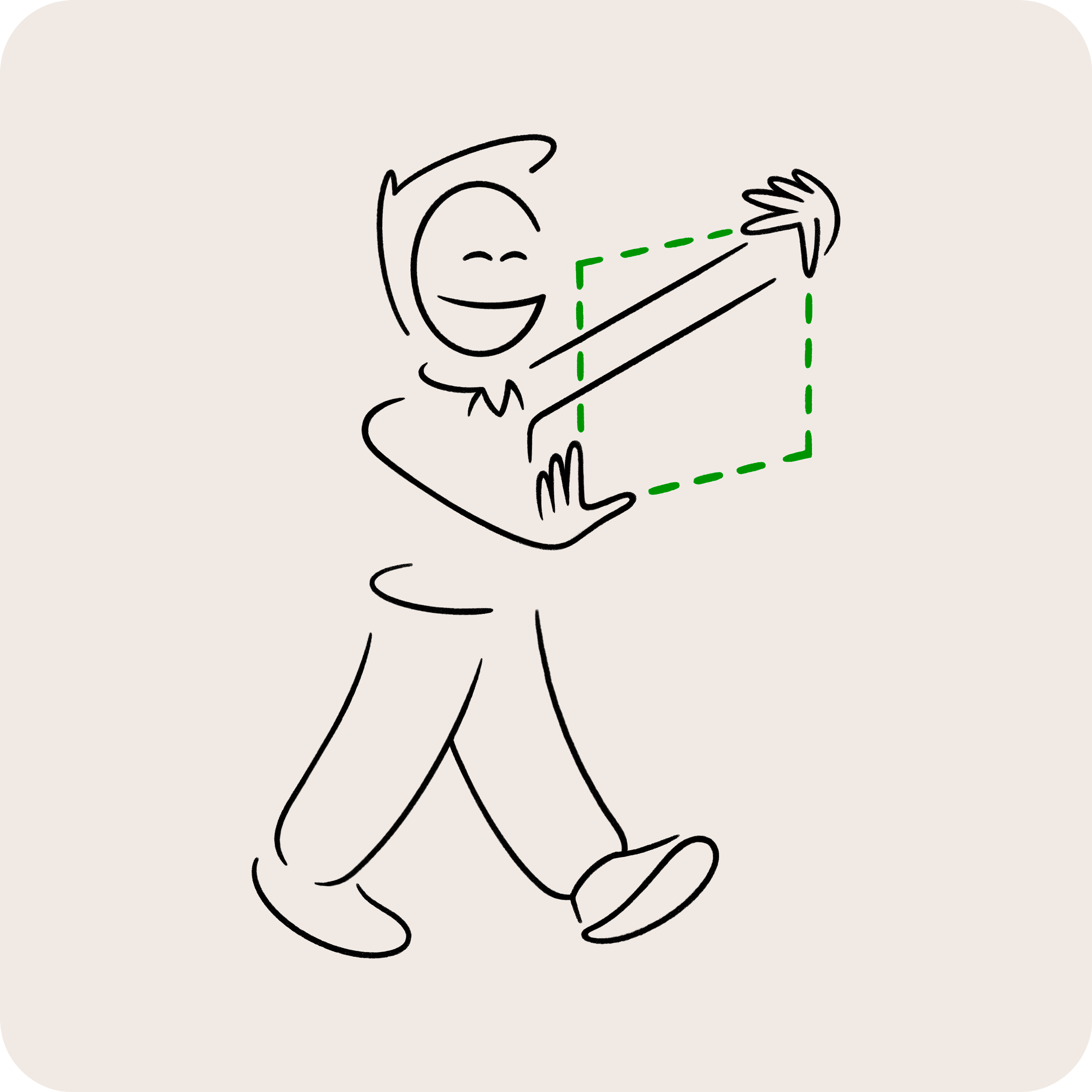
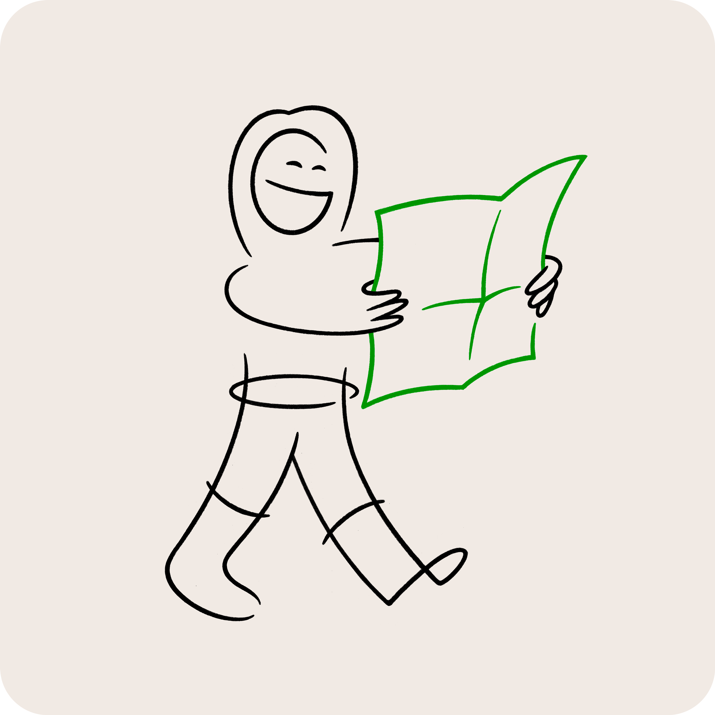
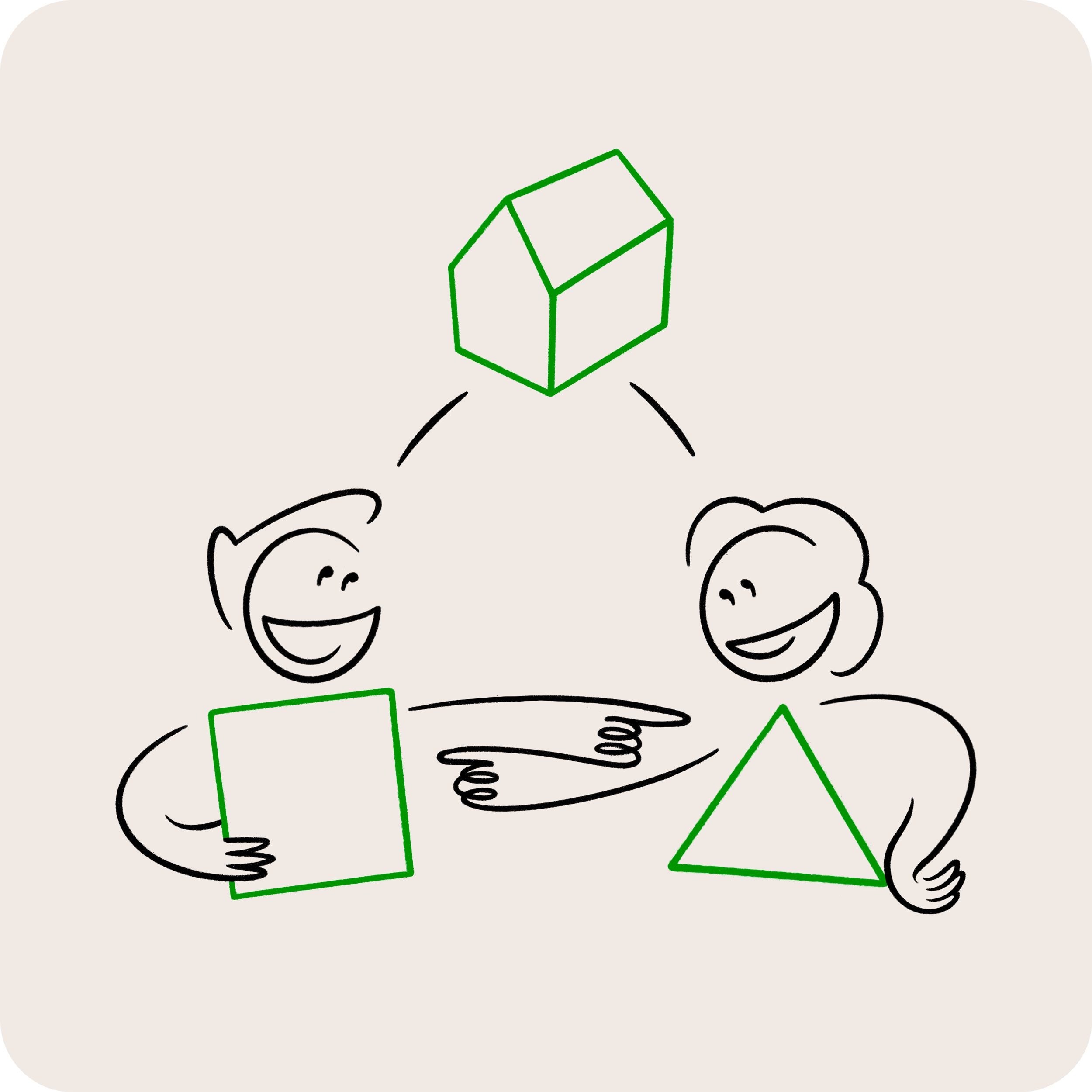
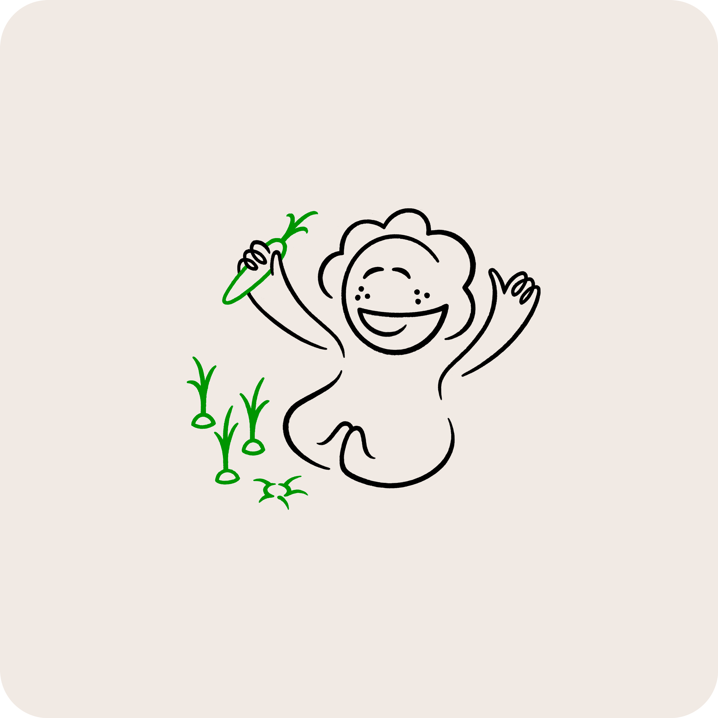
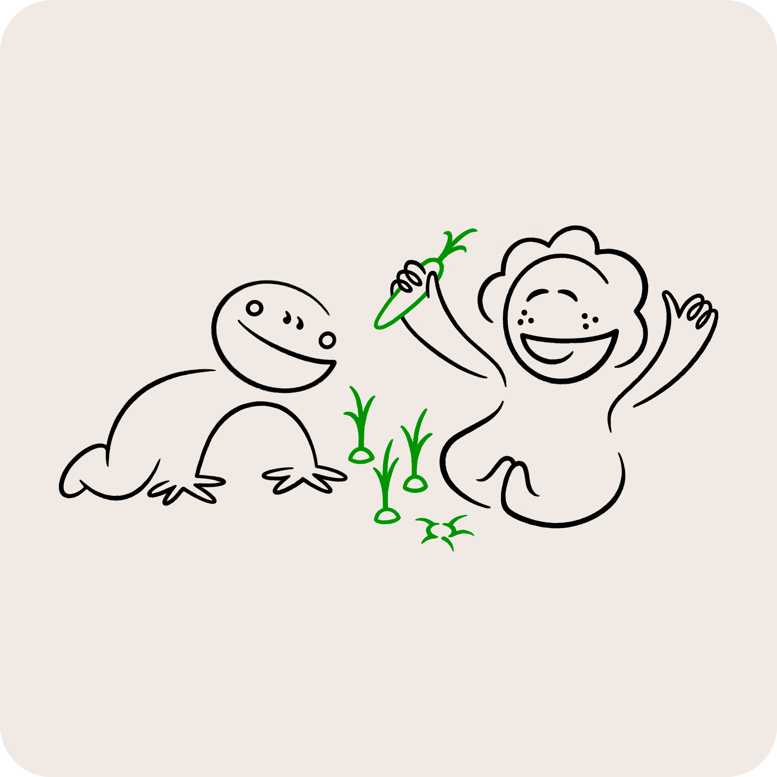
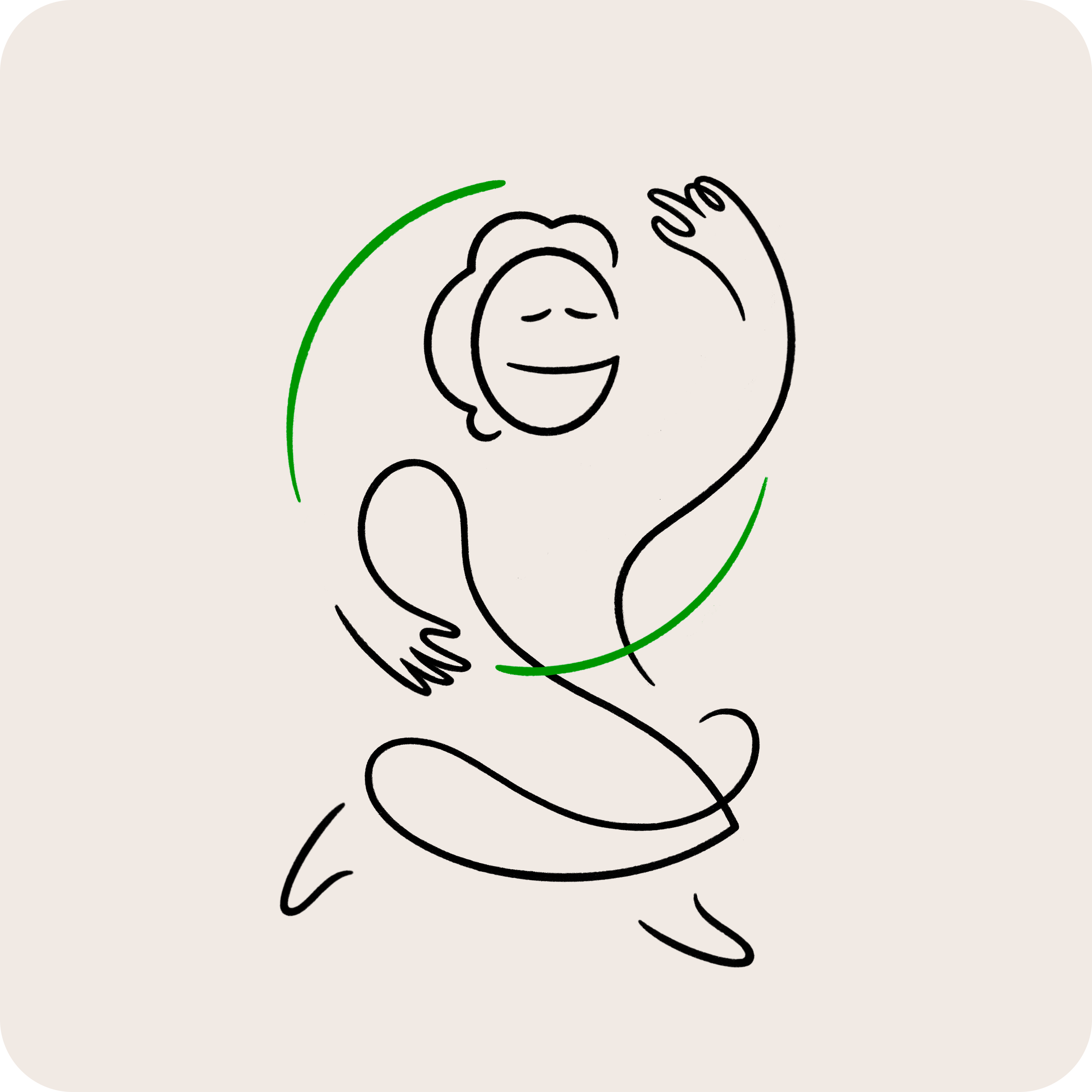
A human element was paramount in order to be perceived as approachable by the people of Grazalema. With this goal in mind we created a specific illustration style of characters made of simplified lines around a number of communication subjects.
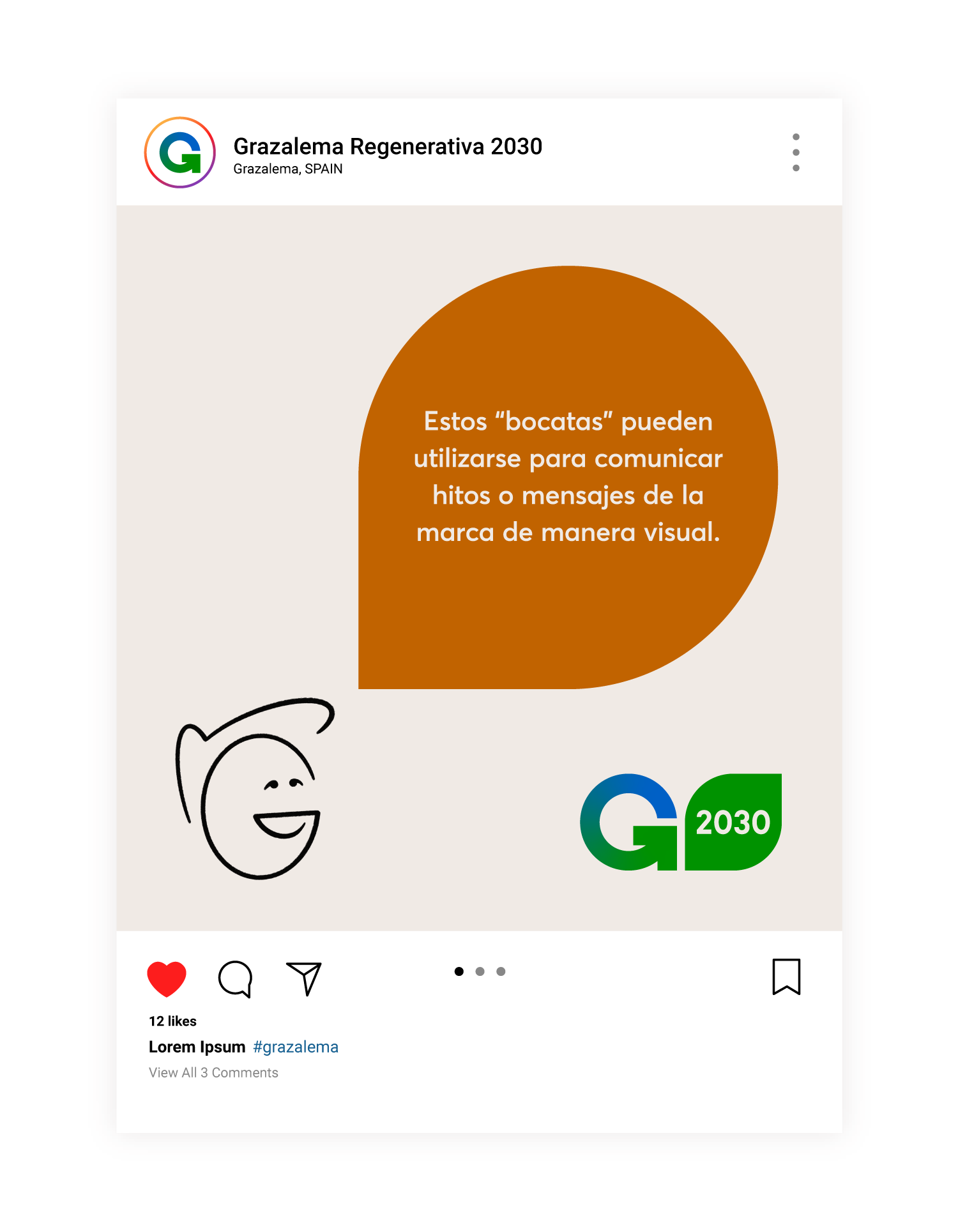
The faces of these proactive and optimistic characters are created with the shape of a “G”, representing Grazalemeños and Grazalemeñas of all ages.
DIALOGUE


SHARE YOUR IDEAS


PROYECTS & GOALS

FOR FUTURE GENERATIONS

CIRCULARITY

COMMS EXAMPLES
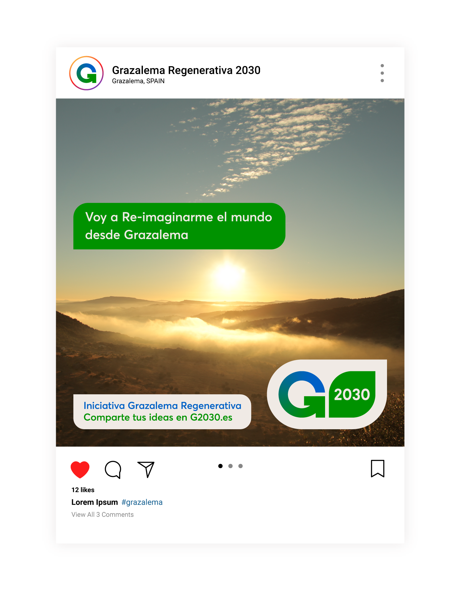
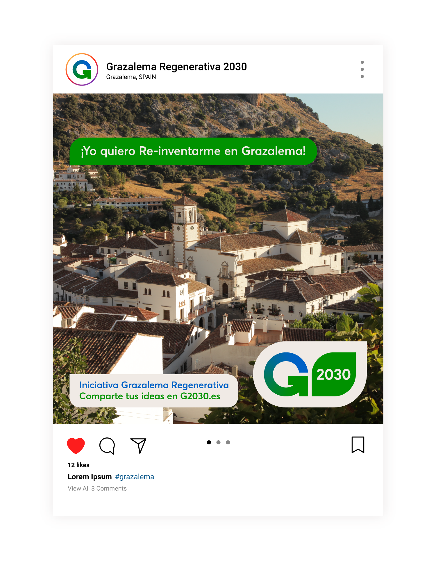
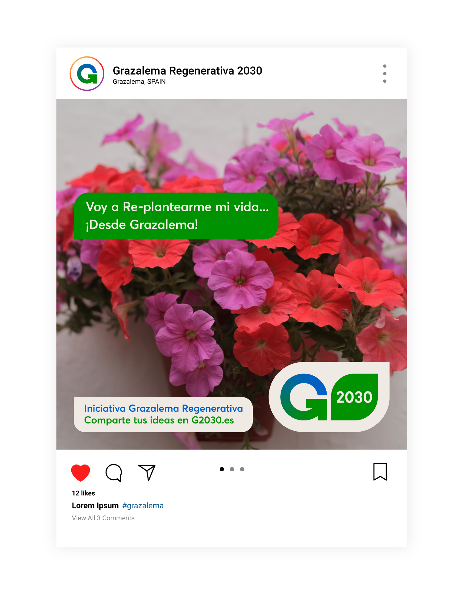
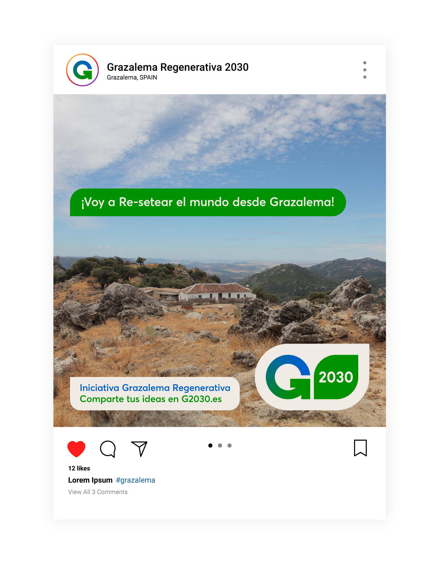
The proposed communication style is “conversational” in nature. This dialogues aim to spark a collaborative bottom-up movement among citizens of Grazalema.