
This website offers a detailed look at the design process behind the restyling of the OHLA brand for digital applications. You’ll find the thinking and explanations behind the key decisions, and most of the visual elements to be used across digital platforms.
For main deliverables visit: failingbeautiful.studio/ohla-deliverables
For video-toolkit deliverables visit: failingbeautiful.studio/ohla-videotoolkit
Color

From the new proposed blue palette, Blue 10% and Blue 100% are not considered as “colors”. It’s better to understand them as our corporate “white and black”, adapted by “Simultaneous Contrast” (a property of colors).
Here, on this presentation website, Blue 100% (Black) and especially Blue 10% (White) are clearly visible because we see them against a pure white background #FFFFFF. But on a future OHLA website where the main blue dominates, they would be perceived by the eye almost like a white and a black.
These nuances or “approaches” between colors reduce the often excessive contrast of screens, making the viewing/reading experience more pleasant, and solidifying OHLA’s identification as a blue brand.
This minimally blue-tinted white is only proposed for digital. In print, pure white will continue to be used to save on ink costs.
Grid
IMPORTANT:
In this video, only the rectangular “spaces” of the grid have been shown. Later, in the “Motion System” video, we’ll see examples of how to fill these spaces with a variety of horizontal lines from OHLA’s visual language.


The grid from which all proposed digital assets are created is based on a simple square structure with a rhythm of 1, 2, 4, 8, 16, etc. The margins (in pink) are defined by the maximum space created by two squares, equally distanced from the vertical and horizontal margins.
With this simple grid, we visually simplify all applications, maintaining harmonious proportions that make them easily understandable and digestible. We also always work with pixel-perfect precision, which results in better display quality.
The grid is optimized for the rectangular 16:9 format (both vertical and horizontal), which is and will continue to be the standard for screen display, despite possible variations on some social networks. Naturally, the grid will also perfectly adapt to square formats, which are also very common.
·
Based on the same principles, a grid could be created for print in DIN-A formats, thus unifying the look of applications across different media. While this goes beyond the scope of this project, you can see an example below:


Wordmark Refinement
This video shows how the current Wordmark was constructed based on the FS Matthew Bold typeface, and explains some minor adjustments made to it. The reason to revise the morphology of the Wordmark is to get it right before moving into the animation of each individual letter.
The spacing between the “L” and the “A” is the most obvious problem, especially noticeable when the brand is applied at small sizes. It appears that the original type’s kerning was not properly reviewed and must be very slightly adjusted (imperceptible as a brand change).
The leg of the “L” is considered to have an unnecessarily different thickness compared to the stems. These optical compensations are normally needed in type design, since the human eye perceives the same horizontal mass as thicker than the vertical. But in this case, is considered that it creates an unnecessary “third thickness” (besides the one common to all letters and that of the “crossbars” of the “H” and “A”). In the modified version, stem and leg are still not equal, but the optical compensation is more balanced.
The “ink trapping” on the “A” has also been removed. “Ink trapping” is a space in a typeface that compensates for ink overload in small-scale print formats. In the inward spaces of a physical “type” where more ink accumulates, a bit of space is subtracted with this “ink trap,” so when printed, the excess ink fills that reduced space. Therefore, it’s more of a feature tied to traditional printing, and does not have a proper function in a logo, which should have a more “sculptural” character.
Similar criteria applies to the “A” as a whole, which was slightly tilted to the right for optical compensation. It is considered that the logo should be “sculptural” and the tilt is corrected to achieve perfect symmetry.
Below you can see the minor adjustments compared to the current wordmark:


Motion Principles
Build up & Volume
First Principle · Build Up
Second Principle · Volume
Wordmark Motion
Given the morphology of the current Wordmark letters, initial animation tests on how to make it “appear” were unconvincing. This Build up & Volume solution, revealing the brand with a flat lateral turn, is a good solution to “solidify” the brand and give it attributes that convey ideas of “construction”.
Symbol Refinement
Unlike the Wordmark case, the changes here are practically imperceptible, but correcting them makes it easier to animate its elements at a technical level.

Symbol Motion
The “Construction Wordmark”
The Construction Wordmark
The “Construction Wordmark” was part of an exploration and is considered to help position the company in the “construction” sector: its most realistic identification.
Its purpose is not to replace the current Wordmark and should be understood as a special execution of the visual language of lines. Although in the current presentation it is explored in different formats (monoblock, horizontal, vertical, and vertical+building), its use is recommended only for specific applications and contexts.
From a graphic standpoint, as if it were a real construction system, it is designed based on simple and orthogonal proportions, making it easy to fit and connect.
In static format, it’s built by two rectangular shapes and the spaces they define, also following a visual rhythm of 1, 2, 4 (space, height, base). When we see it in motion, we see that both shapes are actually a single volume, which, when rotated, shapes the letters of the company name.
The number of lines (5) is determined by the minimum number necessary to represent all the letters, including the “crossbars” of the H and A.
The result is considered to be a very simple (and therefore memorable) design that helps the brand to be tied with “construction”.
Motion System


Project Data Boxes


Project Carousel
IMPORTANT: The previous video is only a sample of movement for the project pages and the “Data Box” elements. It has not yet been properly edited for comfortable reading of the information.


Icons
Typography
Google Fonts alternatives are proposed to avoid licensing costs associated to the current typeface, FS Matthew. On top of that, the FS Matthew character set only covers Latin languages, which does not seem ideal for a company with multinational ambitions. (An auto-translation of the website to another language would replace FS Matthew with a system font, resulting in a loss of control over the website’s look.)
The proposed Google Fonts are free, high-quality, with extensive families and broad language coverage. We briefly discuss them:
Ubuntu is proposed as an alternative to FS Matthew because they share some attributes. To the point where the change might not even be perceived, and we would have a free typeface with a wide family and greater linguistic coverage.
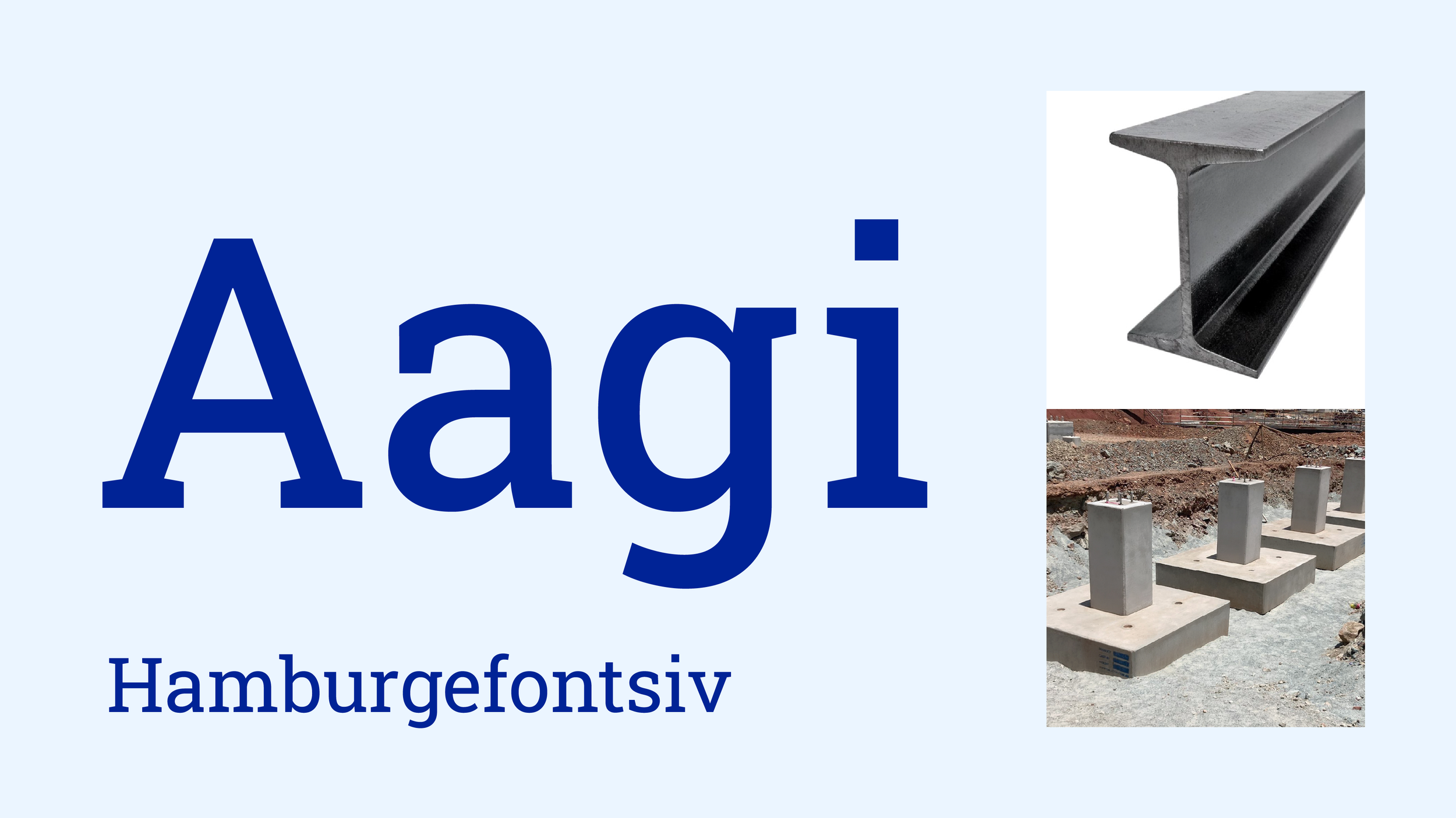
But the recommended option is to use the Roboto family. As a general rule, Roboto Sans should be used, and occasionally, for headlines and more display uses, Roboto Slab should be used.
As you can see in the PDF presentation, conceptually a Slab typeface seems to fit well with the idea of a construction company. That “structural solidity” of the letters translates into a perception of the company’s solidity. Of foundations, of construction.
In recent years, there’s been a strong shift by brands towards Sans typefaces (“palo seco” or without serifs). This, jokingly called the “Serifacide” among graphic designers, has helped convey a certain idea of modernity, but has also resulted in a loss of personality and differentiation among brands.
Roboto Slab is a very modern geometric Slab that, in my opinion, brings together both worlds very well: the legacy of a historic company, and the future/progress to come. A serious company, with solid foundations.
Both Ubuntu and Roboto are also variable fonts (the most advanced thing in typography today). This means they allow dynamic control of some of their attributes, such as weight, slant, etc. Here are a couple of animations to show this “variability” of Roboto’s weight:
Roboto Sans · Variable type possibilities


Roboto Slab · Variable type possibilities


Web Design


Interactive Elements & Effects
Horizon whisper climb flower moment drift courage mirror basket thunder quiet whisper branch fire lantern stream velvet hidden laughter compass journey ocean dusk feather wind shimmer whisper clock garden frost marble silence sparkle crystal canyon emerald whisper meadow hollow star. This paragraph is now longer and will more clearly demonstrate the effect of line-by-line highlighting. The width is fixed and does not adapt when you resize your window.
Key Points Takeaway
“Engineering a brand for an
engineering company”
· Simplify the color strategy for greater impact and (therefore) memorability.
· Apply animation principles that associate the brand with the “construction industry”.
· Alternative typography for both practical reasons (zero cost, variety of styles, greater language coverage) and semantic reasons (personality it conveys).
· Overall, strengthen the brand personality to convey visual connotations of Solidity, Precision, Systematization, and Trust.
Overall Brand Analysis
The previous explanations have already provided factual arguments about certain shortcomings of the current graphic brand in terms of palette and color usage. Below is a design assessment of the brand as a whole.
The building symbol does not fail semantically (it is clear what it does represent) but its excessive complexity and lines narrowness may cause issues in small-scale applications.
The current OHLA wordmark does not fail graphically and its possible drawbacks are more subjective than those of the symbol. One notable feature is the change in thickness in the crossbars of the H and the A. This appears to be a deliberate device by its original creators to bring together visually the wordmark and the building symbol, via matching the thickness of those lines to those on the left side of the building symbol.
However, the combination of the symbol’s verticality and the wordmark’s horizontality makes the lock-up (the sum of both marks) quite difficult to apply, especially in extreme vertical or horizontal formats. Adapting to these formats forces a reduction in size, which considerably lessens visual impact, and therefore visual retention.
If the symbol is omitted and only the OHLA Wordmark is used, the brand becomes much easier to apply (though as a result the mark might lack “construction personality”). Additionally, the building represented by the symbol, while it currently houses the company’s headquarters in Madrid, is no longer owned by the company. Over-identifying the brand with this building could therefore be counterproductive in the long term.
The morphology of the letters in the OHLA wordmark do not naturally associate the company with the construction sector, nor does it convey a strong personality. It is considered that the proposed “Construction Wordmark” provides a clearer identification with the construction sector as self-standing mark. But given that a substantial rebranding is not currently under consideration, it is recommended to maintain the current wordmark on its own (mostly without the symbol) and to use the “Construction Wordmark” selectively as support.
Its use is therefore restricted only to specific contexts and only in its monoblock, vertical, or vertical+building applications. When possible, it should be used as part of the visual line language, in order to reduce its prominence and importance compared to the main Wordmark.
Thanks for reading this far